Robustness in Quantitative Research and Trading

What is Strategy Robustness?  What is its relevance to Quantitative Research and Trading?

One of the most highly desired properties of any financial model or investment strategy, by investors and managers alike, is robustness.  I would define robustness as the ability of the strategy to deliver a consistent  results across a wide range of market conditions.  It, of course, by no means the only desirable property – investing in Treasury bills is also a pretty robust strategy, although the returns are unlikely to set an investor’s pulse racing – but it does ensure that the investor, or manager, is unlikely to be on the receiving end of an ugly surprise when market conditions adjust.

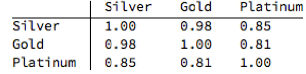
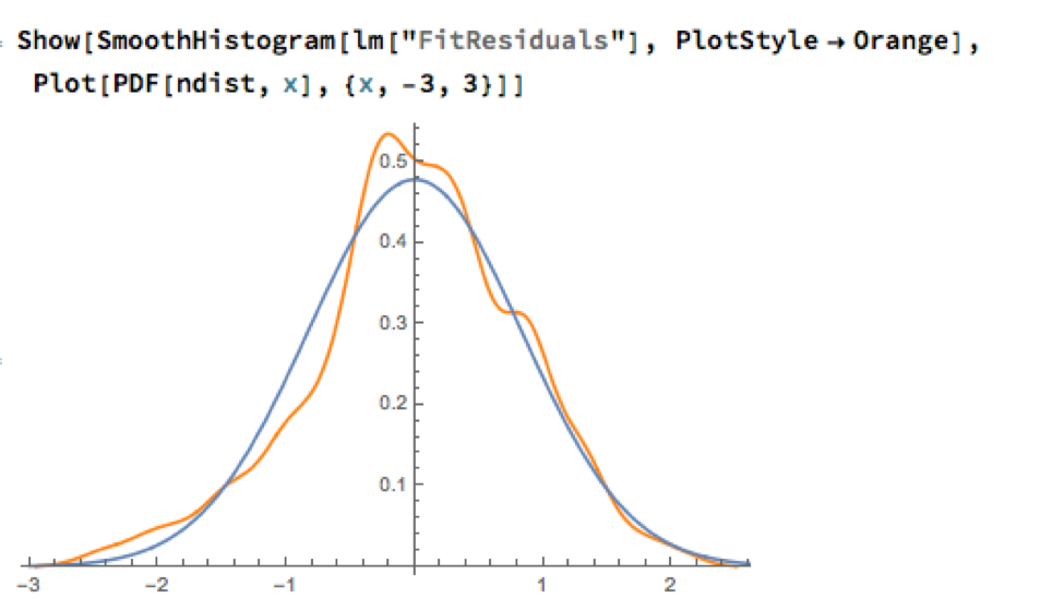
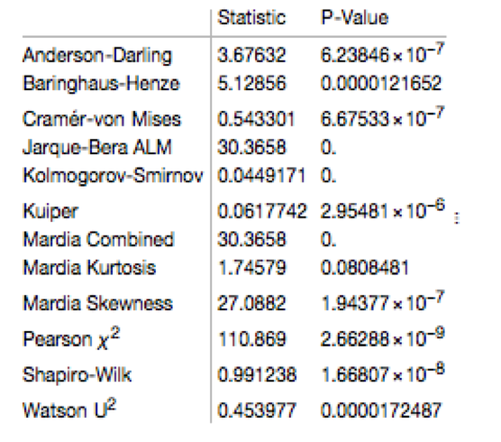
Robustness is not the same thing as low volatility, which also tends to be a characteristic highly prized by many investors.  A strategy may operate consistently, with low volatility in certain market conditions, but behave very differently in other.  For instance, a delta-hedged short-volatility book containing exotic derivative positions.   The point is that empirical researchers do not know the true data-generating process for the markets they are modeling. When specifying an empirical model they need to make arbitrary assumptions. An example is the common assumption that assets returns follow a Gaussian distribution.  In fact, the empirical distribution of the great majority of asset process exhibit the characteristic of “fat tails”, which can result from the interplay between multiple market states with random transitions.  See this post for details:

http://jonathankinlay.com/2014/05/a-quantitative-analysis-of-stationarity-and-fat-tails/


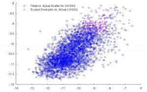
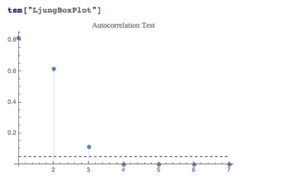
In statistical arbitrage, for example, quantitative researchers often make use of cointegration models to build pairs trading strategies.  However the testing procedures used in current practice are not sufficient powerful to distinguish between cointegrated processes and those whose evolution just happens to correlate temporarily, resulting in the frequent breakdown in cointegrating relationships.  For instance, see this post:

http://jonathankinlay.com/2017/06/statistical-arbitrage-breaks/

Modeling Assumptions are Often Wrong – and We Know It

We are, of course, not the first to suggest that empirical models are misspecified:

“All models are wrong, but some are useful” (Box 1976, Box and Draper 1987).


Martin Feldstein (1982: 829): “In practice all econometric specifications are necessarily false models.”


Luke Keele (2008: 1): “Statistical models are always simplifications, and even the most complicated model will be a pale imitation of reality.”


Peter Kennedy (2008: 71): “It is now generally acknowledged that econometric models are false and there is no hope, or pretense, that through them truth will be found.”

During the crash of 2008 quantitative Analysts and risk managers found out the hard way that the assumptions underpinning the copula models used to price and hedge credit derivative products were highly sensitive to market conditions.  In other words, they were not robust.  See this post for more on the application of copula theory in risk management:

http://jonathankinlay.com/2017/01/copulas-risk-management/


Robustness Testing in Quantitative Research and Trading

We interpret model misspecification as model uncertainty. Robustness tests analyze model uncertainty by comparing a baseline model to plausible alternative model specifications.  Rather than trying to specify models correctly (an impossible task given causal complexity), researchers should test whether the results obtained by their baseline model, which is their best attempt of optimizing the specification of their empirical model, hold when they systematically replace the baseline model specification with plausible alternatives. This is the practice of robustness testing.

SSALGOTRADING AD

Robustness testing analyzes the uncertainty of models and tests whether estimated effects of interest are sensitive to changes in model specifications. The uncertainty about the baseline model’s estimated effect size shrinks if the robustness test model finds the same or similar point estimate with smaller standard errors, though with multiple robustness tests the uncertainty likely increases. The uncertainty about the baseline model’s estimated effect size increases of the robustness test model obtains different point estimates and/or gets larger standard errors. Either way, robustness tests can increase the validity of inferences.

Robustness testing replaces the scientific crowd by a systematic evaluation of model alternatives.

Robustness in Quantitative Research

In the literature, robustness has been defined in different ways:

  • as same sign and significance (Leamer)
  • as weighted average effect (Bayesian and Frequentist Model Averaging)
  • as effect stability We define robustness as effect stability.

Parameter Stability and Properties of Robustness

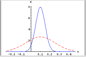
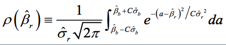
Robustness is the share of the probability density distribution of the baseline model that falls within the 95-percent confidence interval of the baseline model.  In formulaeic terms:

Formula

  • Robustness is left-–right symmetric: identical positive and negative deviations of the robustness test compared to the baseline model give the same degree of robustness.
  • If the standard error of the robustness test is smaller than the one from the baseline model, ρ converges to 1 as long as the difference in point estimates is negligible.
  • For any given standard error of the robustness test, ρ is always and unambiguously smaller the larger the difference in point estimates.
  • Differences in point estimates have a strong influence on ρ if the standard error of the robustness test is small but a small influence if the standard errors are large.

Robustness Testing in Four Steps

  1. Define the subjectively optimal specification for the data-generating process at hand. Call this model the baseline model.
  2. Identify assumptions made in the specification of the baseline model which are potentially arbitrary and that could be replaced with alternative plausible assumptions.
  3. Develop models that change one of the baseline model’s assumptions at a time. These alternatives are called robustness test models.
  4. Compare the estimated effects of each robustness test model to the baseline model and compute the estimated degree of robustness.

Model Variation Tests

Model variation tests change one or sometimes more model specification assumptions and replace with an alternative assumption, such as:

  • change in set of regressors
  • change in functional form
  • change in operationalization
  • change in sample (adding or subtracting cases)

Example: Functional Form Test

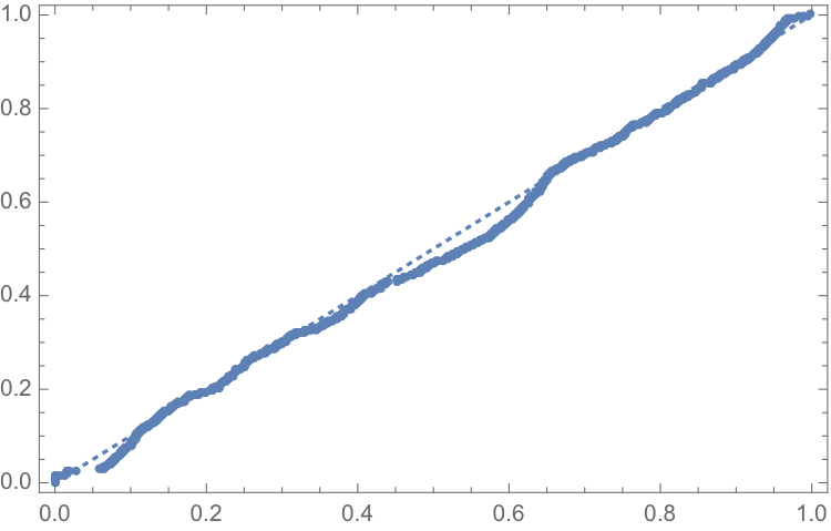
The functional form test examines the baseline model’s functional form assumption against a higher-order polynomial model. The two models should be nested to allow identical functional forms. As an example, we analyze the ‘environmental Kuznets curve’ prediction, which suggests the existence of an inverse u-shaped relation between per capita income and emissions.

Emissions and percapitaincome

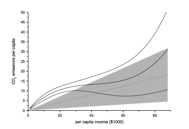
Note: grey-shaded area represents confidence interval of baseline model

Another example of functional form testing is given in this review of Yield Curve Models:

http://jonathankinlay.com/2018/08/modeling-the-yield-curve/

Random Permutation Tests

Random permutation tests change specification assumptions repeatedly. Usually, researchers specify a model space and randomly and repeatedly select model from this model space. Examples:

  • sensitivity tests (Leamer 1978)
  • artificial measurement error (Plümper and Neumayer 2009)
  • sample split – attribute aggregation (Traunmüller and Plümper 2017)
  • multiple imputation (King et al. 2001)

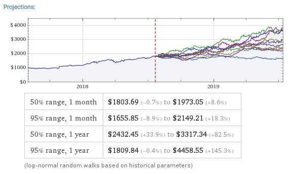
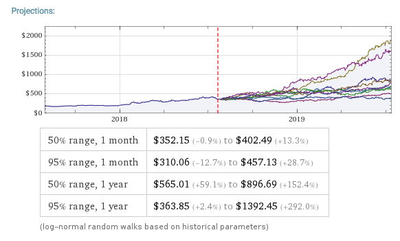
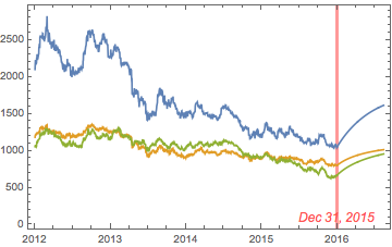
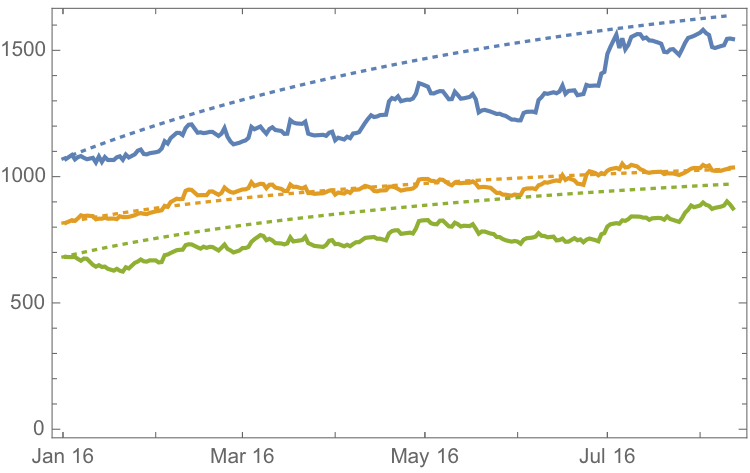
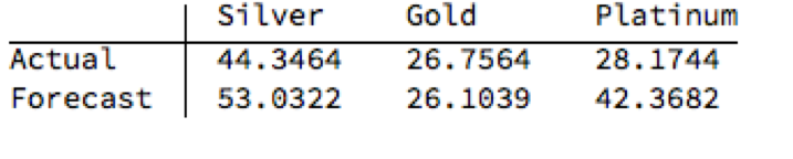
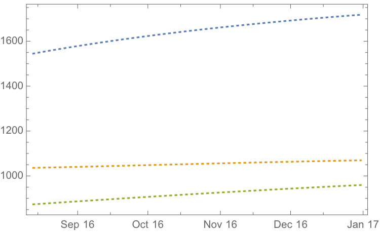
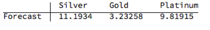
We use Monte Carlo simulation to test the sensitivity of the performance of our Quantitative Equity strategy to changes in the price generation process and also in model parameters:

http://jonathankinlay.com/2017/04/new-longshort-equity/

Structured Permutation Tests

Structured permutation tests change a model assumption within a model space in a systematic way. Changes in the assumption are based on a rule, rather than random.  Possibilities here include:

  • sensitivity tests (Levine and Renelt)
  • jackknife test
  • partial demeaning test

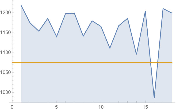
Example: Jackknife Robustness Test

The jackknife robustness test is a structured permutation test that systematically excludes one or more observations from the estimation at a time until all observations have been excluded once. With a ‘group-wise jackknife’ robustness test, researchers systematically drop a set of cases that group together by satisfying a certain criterion – for example, countries within a certain per capita income range or all countries on a certain continent. In the example, we analyse the effect of earthquake propensity on quake mortality for countries with democratic governments, excluding one country at a time. We display the results using per capita income as information on the x-axes.

jackknife

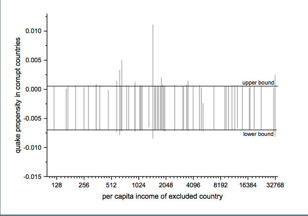
Upper and lower bound mark the confidence interval of the baseline model.

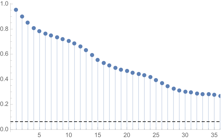
Robustness Limit Tests

Robustness limit tests provide a way of analyzing structured permutation tests. These tests ask how much a model specification has to change to render the effect of interest non-robust. Some examples of robustness limit testing approaches:

  • unobserved omitted variables (Rosenbaum 1991)
  • measurement error
  • under- and overrepresentation
  • omitted variable correlation

For an example of limit testing, see this post on a review of the Lognormal Mixture Model:

http://jonathankinlay.com/2018/08/the-lognormal-mixture-variance-model/

Summary on Robustness Testing

Robustness tests have become an integral part of research methodology. Robustness tests allow to study the influence of arbitrary specification assumptions on estimates. They can identify uncertainties that otherwise slip the attention of empirical researchers. Robustness tests offer the currently most promising answer to model uncertainty.

Forecasting Volatility in the S&P500 Index

Several people have asked me for copies of this research article, which develops a new theoretical framework, the ARFIMA-GARCH model as a basis for forecasting volatility in the S&P 500 Index.  I am in the process of updating the research, but in the meantime a copy of the original paper is available here

In this analysis we are concerned with the issue of whether market forecasts of volatility, as expressed in the Black-Scholes implied volatilities of at-the-money European options on the S&P500 Index, are superior to those produced by a new forecasting model in the GARCH framework which incorporates long-memory effects.  The ARFIMA-GARCH model, which uses high frequency data comprising 5-minute returns, makes volatility the subject process of interest, to which innovations are introduced via a volatility-of-volatility (kurtosis) process.  Despite performing robustly in- and out-of-sample, an encompassing regression indicates that the model is unable to add to the information already contained in market forecasts.  However, unlike model forecasts, implied volatility forecasts show evidence of a consistent and substantial bias.  Furthermore, the model is able to correctly predict the direction of volatility approximately 62% of the time whereas market forecasts have very poor direction prediction ability.  This suggests that either option markets may be inefficient, or that the option pricing model is mis-specified.  To examine this hypothesis, an empirical test is carried out in which at-the-money straddles are bought or sold (and delta-hedged) depending on whether the model forecasts exceed or fall below implied volatility forecasts.  This simple strategy generates an annual compound return of 18.64% over a four year out-of-sample period, during which the annual return on the S&P index itself was -7.24%.  Our findings suggest that, over the period of analysis, investors required an additional risk premium of 88 basis points of incremental return for each unit of volatility risk.

Learning the Kalman Filter

Michael Kleder’s “Learning the Kalman Filter” mini tutorial, along with the great feedback it has garnered (73 comments and 67 ratings, averaging 4.5 out of 5 stars),  is one of the most popular downloads from Matlab Central and for good reason.

In his in-file example, Michael steps through a Kalman filter example in which a voltmeter is used to measure the output of a 12-volt automobile battery. The model simulates both randomness in the output of the battery, and error in the voltmeter readings. Then, even without defining an initial state for the true battery voltage, Michael demonstrates that with only 5 lines of code, the Kalman filter can be implemented to predict the true output based on (not-necessarily-accurate) uniformly spaced, measurements:


This is a simple but powerful example that shows the utility and potential of Kalman filters. It’s sure to help those who are trepid about delving into the world of Kalman filtering.

Using Volatility to Predict Market Direction

Decomposing Asset Returns


We can decompose the returns process Rt as follows:

While the left hand side of the equation is essentially unforecastable, both of the right-hand-side components of returns display persistent dynamics and hence are forecastable. Both the signs of returns and magnitude of returns are conditional mean dependent and hence forecastable, but their product is conditional mean independent and hence unforecastable. This is an example of a nonlinear “common feature” in the sense of Engle and Kozicki (1993).

Although asset returns are essentially unforecastable, the same is not true for asset return signs (i.e. the direction-of-change). As long as expected returns are nonzero, one should expect sign dependence, given the overwhelming evidence of volatility dependence. Even in assets where expected returns are zero, sign dependence may be induced by skewness in the asset returns process.  Hence market timing ability is a very real possibility, depending on the relationship between the mean of the asset returns process and its higher moments. The highly nonlinear nature of the relationship means that conditional sign dependence is not likely to be found by traditional measures such as signs autocorrelations, runs tests or traditional market timing tests. Sign dependence is likely to be strongest at intermediate horizons of 1-3 months, and unlikely to be important at very low or high frequencies. Empirical tests demonstrate that sign dependence is very much present in actual US equity returns, with probabilities of positive returns rising to 65% or higher at various points over the last 20 years. A simple logit regression model captures the essentials of the relationship very successfully.

Now consider the implications of dependence and hence forecastability in the sign of asset returns, or, equivalently, the direction-of-change. It may be possible to develop profitable trading strategies if one can successfully time the market, regardless of whether or not one is able to forecast the returns themselves.  

There is substantial evidence that sign forecasting can often be done successfully. Relevant research on this topic includes Breen, Glosten and Jaganathan (1989), Leitch and Tanner (1991), Wagner, Shellans and Paul (1992), Pesaran and Timmerman (1995), Kuan and Liu (1995), Larsen and Wozniak (10050, Womack (1996), Gencay (1998), Leung Daouk and Chen (1999), Elliott and Ito (1999) White (2000), Pesaran and Timmerman (2000), and Cheung, Chinn and Pascual (2003).

There is also a huge body of empirical research pointing to the conditional dependence and forecastability of asset volatility. Bollerslev, Chou and Kramer (1992) review evidence in the GARCH framework, Ghysels, Harvey and Renault (1996) survey results from stochastic volatility modeling, while Andersen, Bollerslev and Diebold (2003) survey results from realized volatility modeling.

Sign Dynamics Driven By Volatility Dynamics

Let the returns process Rt be Normally distributed with mean m and conditional volatility st.

The probability of a positive return Pr[Rt+1 >0] is given by the Normal CDF F=1-Prob[0,f]


For a given mean return, m, the probability of a positive return is a function of conditional volatility st. As the conditional volatility increases, the probability of a positive return falls, as illustrated in Figure 1 below with m = 10% and st = 5% and 15%.

In the former case, the probability of a positive return is greater because more of the probability mass lies to the right of the origin. Despite having the same, constant expected return of 10%, the process has a greater chance of generating a positive return in the first case than in the second. Thus volatility dynamics drive sign dynamics.  

 Figure 1

Email me at jkinlay@investment-analytics.com.com for a copy of the complete article.


Understanding Stock Price Range Forecasts

Stock Price Range Forecasts

Range forecasts are produced by estimating the parameters of a Geometric Brownian Motion process from historical data and using the model to project a large number of sample paths for the stock price over the coming month and year.

For example, this is a range forecast for Netflix, Inc. (NFLX) as at 7/27/2018 when the price of the stock stood at $355.21:

$NFLX

As you can see, the great majority of the simulated price paths trend upwards.  This is typical for most stocks on account of their upward drift, a tendency to move higher over time.  The statistical table below the chart tells you that in 50% of cases the ending stock price 1 month from the date of forecast was in the range $352.15 to $402.49. Similarly, around 50% of the time the price of the stock in one year’s time were found to be in the range $565.01 to $896.69.  Notice that the end points of the one-year range far exceed the end points of the one-month range forecast – again this is a feature of the upward drift in stocks.

If you want much greater certainty about the outcome, you should look at the 95% ranges.  So, for NFLX, the one month 95% range was projected to be $310.06 to $457.13.  Here, only 1 in 20 of the simulated price paths produced one month forecasts that were higher than $457.13, or lower than $310.06.

Notice that the spread of the one month and one year 95% ranges is much larger than of the corresponding 50% ranges.  This demonstrates the fundamental tradeoff between “accuracy” (the spread of the range) and “certainty”, (the probability of the outcome being with the projected range).  If you want greater certainty of the outcome, you have to allow for a broader span of possibilities, i.e. a wider range.

SSALGOTRADING AD

Uses of Range Forecasts

Most stock analysts tend to produce single price “targets”, rather than a range – these are known as “point forecasts” by econometricians.  So what’s the thinking behind range forecasts?

Range forecasts are arguably more useful than simple point forecasts.  Point forecasts make no guarantee as to the likelihood of the projected price – the only thing we know for sure about such forecasts is that they will be wrong!  Is the forecast target price optimistic or pessimistic?  We have no way to tell.

With range forecasts the situation is very different.  We can talk about the likelihood of a stock being within a specified range at a certain point in time.  If we want to provide a pessimistic forecast for the price in NFLX in one month’s time, for example, we could quote the value $352.15, the lower end of the 50% range forecast.  If we wanted to provide a very pessimistic forecast, one that is very likely to be exceeded, we could quote the bottom of the 95% range: $310.06.

The range also tells us about the future growth prospects for the firm.  So, for example, with NFLX, based on past performance, it is highly likely that the stock price will grow at a rate of more than 2.4% and, optimistically, might increase by almost 3x in the coming year (see the growth rates calculated for the 95% range values).

One specific use of range forecasts is in options trading.  If a trader is bullish on NFLX, instead of buying the stock, he might instead choose to sell one-month put options with a strike price below $352 (the lower end of the 50% one-month range).  If the trader wanted to be more conservative, he might look for put options struck at around $310, the bottom of the 95% range.  A more complex strategy might be to buy calls struck near the top of the 50% range, and sell more calls struck near the top of the 95% range (the theory being that the stock is quite likely to exceed the top of the 50% one-month range, but much less likely to reach the high end of the 95% range).

Limitations of Range Forecasts

Range forecasts are produced by using historical data to estimate the parameters of a particular type of mathematical model, known as a Geometric Brownian Motion process.  For those who are interested in the mechanics of how the forecasts are produced, I have summarized the relevant background theory below.

While there are grounds for challenging the use of such models in this context, it has to be acknowledged that the GBM process is one of the most successful mathematical models in finance today.  The problem lies not so much in the model, as in one of the key assumptions underpinning the approach:  specifically, that the characteristics of the stock process will remain as they are today (and as they have been in the historical past).  This assumption is manifestly untenable when applied to many stocks:  a company that was a high-growth $100M start-up is unlikely to demonstrate the same  rate of growth ten years later, as a $10Bn enterprise.  A company like Amazon that started out as an online book seller has fundamentally different characteristics today, as an online retail empire.  In such cases, forecasts about the future stock price – whether point or range forecasts – based on outdated historical informations are likely to be wrong, sometimes wildly so.

Having said that, there are a great many companies that have evolved to a point of relative stability over a period of perhaps several decades: for example, a company like Caterpillar Inc. (CAT).  In such cases the parameters of the GBM process underpinning the stock price are unlikely to fluctuate widely in the short term, so range forecasts are consequently more likely to be useful.

Another factor to consider are quarterly earnings reports, which can influence stock prices considerably in the short term, and corporate actions (mergers, takeovers, etc) that can change the long term characteristics of a firm and its stock price process in a fundamental way.  In these situations any forecast methodology is likely to unreliable, at least for a while, until the event has passed.  It’s best to avoid taking positions based on projections from historical data at times like this.

Review of Background Theory


GBM1

GBM2 GBM3 GBM4 GBM5

Correlation Cointegration

In a previous post I looked at ways of modeling the relationship between the CBOE VIX Index and the Year 1 and Year 2 CBOE Correlation Indices:

http://jonathankinlay.com/2017/08/modeling-volatility-correlation/


The question was put to me whether the VIX and correlation indices might be cointegrated.

Let’s begin by looking at the pattern of correlation between the three indices:

VIX-Correlation1 VIX-Correlation2 VIX-Correlation3

If you recall from my previous post, we were able to fit a linear regression model with the Year 1 and Year 2 Correlation Indices that accounts for around 50% in the variation in the VIX index.  While the model certainly has its shortcomings, as explained in the post, it will serve the purpose of demonstrating that the three series are cointegrated.  The standard Dickey-Fuller test rejects the null hypothesis of a unit root in the residuals of the linear model, confirming that the three series are cointegrated, order 1.

SSALGOTRADING AD

UnitRootTest


Vector Autoregression

We can attempt to take the modeling a little further by fitting a VAR model.  We begin by splitting the data into an in-sample period from Jan 2007 to Dec 2015 and an out-of-sample test period from Jan 2016  to Aug 2017.  We then fit a vector autoregression model to the in-sample data:

VAR Model

When we examine how the model performs on the out-of-sample data, we find that it fails to pick up on much of the variation in the series – the forecasts are fairly flat and provide quite poor predictions of the trends in the three series over the period from 2016-2017:

VIX-CorrelationForecast

Conclusion

The VIX and Correlation Indices are not only highly correlated, but also cointegrated, in the sense that a linear combination of the series is stationary.

One can fit a weakly stationary VAR process model to the three series, but the fit is quite poor and forecasts from the model don’t appear to add much value.  It is conceivable that a more comprehensive model involving longer lags would improve forecasting performance.


Conditional Value at Risk Models

One of the most widely used risk measures is the Value-at-Risk, defined as the expected loss on a portfolio at a specified confidence level. In other words, VaR is a percentile of a loss distribution.
But despite its popularity VaR suffers from well-known limitations: its tendency to underestimate the risk in the (left) tail of the loss distribution and its failure to capture the dynamics of correlation between portfolio components or nonlinearities in the risk characteristics of the underlying assets.

SSALGOTRADING AD

One method of seeking to address these shortcomings is discussed in a previous post Copulas in Risk Management. Another approach known as Conditional Value at Risk (CVaR), which seeks to focus on tail risk, is the subject of this post.  We look at how to estimate Conditional Value at Risk in both Gaussian and non-Gaussian frameworks, incorporating loss distributions with heavy tails and show how to apply the concept in the context of nonlinear time series models such as GARCH.


Var, CVaR and Heavy Tails


Metal Logic

Picture1

Precious metals have been in free-fall for several years, as a consequence of the Fed’s actions to stimulate the economy that have also had the effect of goosing the equity and fixed income markets.  All that changed towards the end of 2015, as the Fed moved to a tightening posture.   So far, 2016 has been a banner year for metal, with spot prices for platinum, gold and silver up 26%, 28% and 44% respectively.

So what are the prospects for metals through the end of the year?  We take a shot at predicting the outcome, from a quantitative perspective.

Picture2

Picture23

  Source: Wolfram Alpha. Spot silver prices are scaled x100


Metals as Correlated Processes

One of the key characteristics of metals is the very high levels of price-correlation between them.  Over the period under investigation, Jan 2012 to Aug 2016, the estimated correlation coefficients are as follows:

Picture4


A plot of the join density of spot gold and silver prices indicates low- and high-price regimes in which the metals display similar levels of linear correlation.

Picture24


Picture5

Simple Metal Trading Models

Levels of correlation that are consistently as high as this over extended periods of time are fairly unusual in financial markets and this presents a potential trading opportunity. One common approach is to use the ratios of metal prices as a trading signal.  However, taking the ratio of gold to silver spot prices as an example, a plot of the series demonstrates that it is highly unstable and susceptible to long term trends.

A more formal statistical test fails to reject the null hypothesis of a unit root.  In simple terms, this means we cannot reliably distinguish between the gold/silver price ratio and a random walk.

Picture6


Along similar lines, we might consider the difference in log prices of the series.  If this proved to be stationary then the log-price series would be cointegrated order 1 and we could build a standard pairs trading model to buy or sell the spread when prices become too far unaligned.  However, we find once again that the log-price difference can wander arbitrarily far from its mean, and we are unable to reject the null hypothesis that the series contains a unit root.

SSALGOTRADING AD


Picture7


Linear Models

We can hope to do better with a standard linear model, regressing spot silver prices against spot gold prices.  The fit of the best linear model is very good, with an R-sq of over 96%:

Picture8


A trader might look to exploit the correlation relationship by selling silver when its market price is greater than the value estimated by the model (and buying when the model price exceeds the market price).  Typically the spread is bought or sold when the log-price differential exceeds a threshold level that is set at twice the standard deviation of the price-difference series.  The threshold levels derive from the assumption of Normality, which in fact does not apply here, as we can see from an examination of the residuals of the linear model:

Picture9 Picture10


Given the evident lack of fit, especially in the left tail of the distribution, it is unsurprising that all of the formal statistical tests for Normality easily reject the null hypothesis:

Picture11


However, Normality, or the lack of it, is not the issue here:  one could just as easily set the 2.5% and 97.5% percentiles of the empirical distribution as trade entry points.  The real problem with the linear model is that it fails to take into account the time dependency in the price series.  An examination of the residual autocorrelations reveals significant patterning, indicating that the model tends to under-or over-estimate the spot price of silver for long periods of time:

Picture12


As the following chart shows, the cumulative difference between model and market prices can become very large indeed.  A trader risks going bust waiting for the market to revert to model prices.

Picture13


How does one remedy this?  The shortcoming of the simple linear model is that, while it captures the interdependency between the price series very well, it fails to factor in the time dependency of the series. What is required is a model that will account for both features.


Multivariate Vector Autoregression Model

Rather than modeling the metal prices individually, or in pairs, we instead adopt a multivariate vector autoregression approach, modeling all three spot price processes together.  The essence of the idea is that spot prices in each metal may be influenced, not only by historical values of the series, but also potentially by current and lagged prices of the other two metals.

Before proceeding we divide the data into two parts: an in-sample data set comprising data from 2012 to the end of 2015 and an out-of-sample period running from Jan-Aug 2016, which we use for model testing purposes.  In what follows, I make the simplifying assumption that a vector autoregressive moving average process of order (1, 1) will suffice for modeling purposes, although in practice one would go through a procedure to test a wide spectrum of possible models incorporating moving average and autoregressive terms of varying dimensions.

In any event, our simplified VAR model is estimated as follows:

Picture22


The chart below combines the actual, in-sample data from 2012-2015, together with the out-of-sample forecasts for each spot metal from January 2016.


Pic45

Picture23

It is clear that the model projects a recovery in spot metal prices from the end of 2015.  How did the forecasts turn out?  In the chart below we compare the actual spot prices with the model forecasts, over the period from Jan to Aug 2016.

Picture16

Picture23


The actual and forecast percentage change in the spot metal prices over the out-of-sample period are as follows:

Picture18

The VAR model does a good job of forecasting the strong upward trend in metal prices over the first eight months of 2016.  It performs exceptionally well in its forecast of gold prices, although its forecasts for silver and platinum are somewhat over-optimistic.  Nevertheless, investors would have made money taking a long position in any of the metals on the basis of the model projections.


Relative Value Trade

Another way to apply the model would be to implement a relative value trade, based on the model’s forecast that silver would outperform gold and platinum.  Indeed, despite the model’s forecast of silver prices turning out to be over-optimistic, a relative value trade in silver vs. gold or platinum would have performed well:  silver gained 44% in the period form Jan-Aug 2016, compared to only 26% for gold and 28% for platinum.  A relative value trade entailing a purchase of silver and simultaneous sale of gold or platinum would have produced a gross return of 17% and 15% respectively.

A second relative value trade indicated by the model forecasts, buying platinum and selling gold, would have turned out less successfully, producing a gross return of less than 2%.  We will examine the reasons for this in the next section.


Forecasts and Trading Opportunities Through 2016

If we re-estimate the VAR model using all of the the available data through mid-Aug 2016 and project metal prices through the end of the year, the outcome is as follows:

Picture19

Picture23

While the positive trend in all three metals is forecast to continue, the new model (which incorporates the latest data) anticipates lower percentage rates of appreciation going forward:

Picture21

Once again, the model predicts higher rates of appreciation for both silver and platinum relative to gold.  So investors have the option to take a relative value trade, hedging a long position in silver or platinum with a short position in gold.  While the forecasts for all three metals appear reasonable, the projections for platinum strike me as the least plausible.

The reason is that the major applications of platinum are industrial, most often as a catalyst: the metal is used as a catalytic converter in automobiles and in the chemical process of converting naphthas into higher-octane gasolines. Although gold is also used in some industrial applications, its demand is not so driven by industrial uses. Consequently, during periods of sustained economic stability and growth, the price of platinum tends to be as much as twice the price of gold, whereas during periods of economic uncertainty, the price of platinum tends to decrease due to reduced industrial demand, falling below the price of gold. Gold prices are more stable in slow economic times, as gold is considered a safe haven.

This is the most likely explanation of why the gold-platinum relative value trade has not worked out as expected hitherto and is perhaps unlikely to do so in the months ahead, as the slowdown in the global economy continues.

Conclusion

We have shown that simple models of the ratio or differential in the prices of precious metals are unlikely to provide a sound basis for forecasting or trading, due to non-stationarity and/or temporal dependencies in the residuals from such models.

On the other hand, a vector autoregression model that models all three price processes simultaneously, allowing both cross correlations and autocorrelations to be captured, performs extremely well in terms of forecast accuracy in out-of-sample tests over the period from Jan-Aug 2016.

Looking ahead over the remainder of the year, our updated VAR model predicts a continuation of the price appreciation, albeit at a slower rate, with silver and platinum expected to continue outpacing gold.  There are reasons to doubt whether the appreciation of platinum relative to gold will materialize, however, due to falling industrial demand as the global economy cools.


Falling Water

The current 15-year drought in the South West is the most severe since recordkeeping for the Colorado River began in 1906.  Lake Mead, which supplies much of the water to Colorado Basin communities, is now more than half empty.

bathrub

A 120 foot high band of rock, bleached white by the water, and known as the “bathtub ring” encircles the lake, a stark reminder of the water crisis that has enveloped the surrounding region.  The Colorado River takes a 1,400 mile journey from the Rockies to Mexico, irrigating over 5 million acres of farmland in the Basin states of Wyoming, Utah, Colorado, New Mexico, Nevada, Arizona, and California.


map

The Colorado River Compact signed in 1922 enshrined the States’ water rights in law and Mexico was added to the roster in 1994, taking the total allocation to over 16.5 million acre-feet per year.  But the average freshwater input to the lake over the century from 1906 to 2005 reached only 15 million acre-feet.  The river can’t come close to meeting current demand and the problem is only likely to get worse. A 2009 study found that rainfall in the Colorado Basin could fall as much as 15% over the next 50 years and the shortfall in deliveries could reach 60% to 90% of the time.


Impact on Las Vegas

With an average of only 4 inches of rain a year, and a daily high temperatures of 103 o F during the summer, Las Vegas is perhaps the most hard pressed to meet the demand of its 2 million residents and 40 million visitors annually.   bellagio

Despite its conspicuous consumption, from the tumbling fountains of the Bellagio to the Venetian’s canals, since 2002, Las Vegas has been obliged to cut its water use by a third, from 314 gallons per capita a day to 212. The region recycles around half of its wastewater which is piped back into Lake Mead, after cleaning and treatment.  Residents are allowed to water their gardens no more than one day a week in peak season, and there are stiff fines for noncompliance.

SSALGOTRADING AD

The Third Straw

WATER_Last straw_sidebar 02_1

Historically, two intake pipes carried water from Lake Mead to Las Vegas, about 25 miles to the west. In 2012, realizing that the highest of these, at 1050 feet, would soon be sucking air, the Southern Nevada Water Authority began construction of a new pipeline. Known as the Third Straw, Intake No. 3 reaches 200 feet deeper into the lake—to keep water flowing for as long as there’s water to pump.  The new pipeline, which commenced operations in 2015, doesn’t draw more water from the lake than before, or make the surface level drop any faster. But it will keep taps flowing in Las Vegas homes and casinos even if drought-stricken Lake Mead drops to its lowest levels.

WATER_three images


Modeling Water Levels in Lake Mead

The monthly reported water levels in Lake Mead from Feb 1935 to June 2016 are shown in the chart below. The reference line is the drought level, historically defined as 1,125 feet.

chart1


One statistical technique widely applied in hydrology involves fitting a Kumaraswamy distribution to the relative water level.  According to the Arizona Game and Fish Department, the maximum lake level is 1229 feet.  We model the water level relative to the maximum level, as follows.

code1


chart2

The fit of the distribution appears quite good, even in the tails:

ProbabilityPlot[relativeLevels, edist]

chart3


Since water levels have been below the drought level for some time, let’s instead consider the “emergency” level, 1,075 feet.  According to this model, there is just over a 6% chance of Lake Mead hitting the emergency level and, consequently, a high probability of breaching the emergency threshold some time over before the end of 2017.


code2 code4

chart4


One problem with this approach is that it assumes that each observation is drawn independently from a random variable with the estimated distribution.  In reality, there are high levels of autocorrelation in the series, as might be expected:  lower levels last month typically increase the likelihood of lower levels this month.  The chart of the autocorrelation coefficients makes this pattern clear, with statistically significant coefficients at lags of up to 36 months.

ts[“ACFPlot”]

chart5


An alternative methodology that enables us to take account of the autocorrelation in the process is time series analysis.  We proceed to fit an autoregressive moving average (ARMA) model as follows:

tsm = TimeSeriesModelFit[ts, “ARMA”]

arma

The best fitting model in an ARMA(1,1) model, according to the AIC criterion:

armatable

Applying the fitted ARMA model, we forecast the water level in Lake Mead over the next ten years as shown in the chart below.  Given the mean-reverting moving average component of the model, it is not surprising to see the model forecasting a return to normal levels.

chart6


There is some evidence of lack of fit in the ARMA model, as shown in the autocorrelations of the model residuals:

chart7

A formal test reveals that residual autocorrelations at lags 4 and higher are jointly statistically significant:

chart8

The slowly decaying pattern of autocorrelations in the water level series suggests a possible “long memory” effect, which can be better modelled as a fractionally integrated process.  The forecasts from such a model, like the ARMA model forecasts, display a tendency to revert to a long term mean; but the reversion process is dampened by the reinforcing, long-memory effect captured in the FARIMA model.

chart9

The Prospects for the Next Decade

Taking the view that the water level in Lake Mead forms a stationary statistical process, the likelihood is that water levels will rise to 1,125 feet or more over the next ten years, easing the current water shortage in the region.

On the other hand, there are good reasons to believe that there are exogenous (deterministic) factors in play, specifically the over-consumption of water at a rate greater than the replenishment rate from average rainfall levels.  Added to this, plausible studies suggest that average rainfall in the Colorado Basin is expected to decline over the next fifty years.  Under this scenario, the water level in Lake Mead will likely continue to deteriorate, unless more stringent measures are introduced to regulate consumption.

 Economic Impact

The drought in the South West affects far more than just the water levels in Lake Mead, of course.  One study found that California’s agriculture sector alone had lost $2.2Bn and some 17,00 season and part time jobs in 2014, due to drought.  Agriculture uses more than 80% of the State’s water, according to Fortune magazine, which goes on to identify the key industries most affected, including agriculture, food processing, semiconductors, energy, utilities and tourism.

Dry fields and bare trees at Panoche Road, looking west, on Wednesday February 5, 2014, near San Joaquin, CA. California drought has hit the Central Valley hard.

In the energy sector, for example, the loss of hydroelectric power cost CA around $1.4Bn in 2014, according to non-profit research group Pacific Institute.  Although Intel pulled its last fabrication plant from California in 2009, semiconductor manufacturing is still a going concern in the state. Maxim Integrated, TowerJazz, and TSI Semiconductors all still have fabrication plants in the state. And they need a lot of water. A single semiconductor fabrication plant can use as much water as a small city. That means the current plants could represent three cities worth of consumption.

The drought is also bad news for water utilities, of course. The need to conserve water raises the priority on repair and maintenance, and that means higher costs and lower profit. Complicating the problem, California lacks any kind of management system for its water supply and can’t measure the inflows and outflows to ground water levels at any particular time.

The Bureau of Reclamation has studied more than two dozen options for conserving and increasing water supply, including importation, desalination and reuse. While some were disregarded for being too costly or difficult, the bureau found that the remaining options, if instituted, could yield 3.7 million acre feet per year in savings and new supplies, increasing to 7 million acre feet per year by 2060.  Agriculture is the biggest user by far and has to be part of any solution. In the near term, the agriculture industry could reduce its use by 10 to 15 percent without changing the types of crops it grows by using new technology, such as using drip irrigation instead of flood irrigation and monitoring soil moisture to prevent overwatering, the Pacific Institute found.

Conclusion

We can anticipate that a series of short term fixes, like the “Third Straw”, will be employed to kick the can down the road as far as possible, but research now appears almost unanimous in finding that drought is having a deleterious, long term affect on the economics of the South Western states.  Agriculture is likely to have to bear the brunt of the impact, but so too will adverse consequences be felt in industries as disparate as food processing, semiconductors and utilities.  California, with the largest agricultural industry, by far, is likely to be hardest hit.  The Las Vegas region may be far less vulnerable, having already taken aggressive steps to conserve and reuse water supply and charge economic rents for water usage.


Modeling Water Levels in Lake Mead


The monthly reported water levels in Lake Mead from Feb 1935 to June 2016 are shown in the chart below. The reference line is the drought level, historically defined as 1,125 feet.


One statistical technique widely applied in hydrology involves fitting a Kumaraswamy distribution to the relative water level.  According to the Arizona Game and Fish Department, the maximum lake level is 1229 feet.  We model the water level relative to the maximum level, as follows.


The fit of the distribution appears quite good, even in the tails:


ProbabilityPlot[relativeLevels, edist]


Since water levels have been below the drought level for some time, let’s instead consider the “emergency” level, 1,075 feet.  According to this model, there is just over a 6% chance of Lake Mead hitting the emergency level and, consequently, a high probability of breaching the emergency threshold some time over before the end of 2017.


One problem with this approach is that it assumes that each observation is drawn independently from a random variable with the estimated distribution.  In reality, there are high levels of autocorrelation in the series, as might be expected:  lower levels last month typically increase the likelihood of lower levels this month.  The chart of the autocorrelation coefficients makes this pattern clear, with statistically significant coefficients at lags of up to 36 months.


ts[“ACFPlot”]


An alternative methodology that enables us to take account of the autocorrelation in the process is time series analysis.  We proceed to fit an autoregressive moving average (ARMA) model as follows:


tsm = TimeSeriesModelFit[ts, “ARMA”]


The best fitting model in an ARMA(1,1) model, according to the AIC criterion:


Applying the fitted ARMA model, we forecast the water level in Lake Mead over the next ten years as shown in the chart below.  Given the mean-reverting moving average component of the model, it is not surprising to see the model forecasting a return to normal levels.


There is some evidence of lack of fit in the ARMA model, as shown in the autocorrelations of the model residuals:


A formal test reveals that residual autocorrelations at lags 4 and higher are jointly statistically significant:


The slowly decaying pattern of autocorrelations in the water level series suggests a possible “long memory” effect, which can be better modelled as a fractionally integrated process.  The forecasts from such a model, like the ARMA model forecasts, display a tendency to revert to a long term mean; but the reversion process is dampened by the reinforcing, long-memory effect captured in the FARIMA model.


The Prospects for the Next Decade

Taking the view that the water level in Lake Mead forms a stationary statistical process, the likelihood is that water levels will rise to 1,125 feet or more over the next ten years, easing the current water shortage in the region.


On the other hand, there are good reasons to believe that there are exogenous (deterministic) factors in play, specifically the over-consumption of water at a rate greater than the replenishment rate from average rainfall levels.  Added to this, plausible studies suggest that average rainfall in the Colorado Basin is expected to decline over the next fifty years.  Under this scenario, the water level in Lake Mead will likely continue to deteriorate, unless more stringent measures are introduced to regulate consumption.


Economic Impact


The drought in the South West affects far more than just the water levels in Lake Mead, of course.  One study found that California’s agriculture sector alone had lost $2.2Bn and some 17,00 season and part time jobs in 2014, due to drought.  Agriculture uses more than 80% of the State’s water, according to Fortune magazine, which goes on to identify the key industries most affected, including agriculture, food processing, semiconductors, energy, utilities and tourism.

In the energy sector, for example, the loss of hydroelectric power cost CA around $1.4Bn in 2014, according to non-profit research group Pacific Institute.


Although Intel pulled its last fabrication plant from California in 2009, semiconductor manufacturing is still a going concern in the state. Maxim Integrated, TowerJazz, and TSI Semiconductors all still have fabrication plants in the state. And they need a lot of water. A single semiconductor fabrication plant can use as much water as a small city. That means the current plants could represent three cities worth of consumption.

The drought is also bad news for water utilities, of course. The need to conserve water raises the priority on repair and maintenance, and that means higher costs and lower profit. Complicating the problem, California lacks any kind of management system for its water supply and can’t measure the inflows and outflows to ground water levels at any particular time.


The Bureau of Reclamation has studied more than two dozen options for conserving and increasing water supply, including importation, desalination and reuse. While some were disregarded for being too costly or difficult, the bureau found that the remaining options, if instituted, could yield 3.7 million acre feet per year in savings and new supplies, increasing to 7 million acre feet per year by 2060.  Agriculture is the biggest user by far and has to be part of any solution. In the near term, the agriculture industry could reduce its use by 10 to 15 percent without changing the types of crops it grows by using new technology, such as using drip irrigation instead of flood irrigation and monitoring soil moisture to prevent overwatering, the Pacific Institute found.


Conclusion

We can anticipate that a series of short term fixes, like the “Third Straw”, will be employed to kick the can down the road as far as possible, but research now appears almost unanimous in finding that drought is having a deleterious, long term affect on the economics of the South Western states.  Agriculture is likely to have to bear the brunt of the impact, but so too will adverse consequences be felt in industries as disparate as food processing, semiconductors and utilities.  California, with the largest agricultural industry, by far, is likely to be hardest hit.  The Las Vegas region may be far less vulnerable, having already taken aggressive steps to conserve and reuse water supply and charge economic rents for water usage.