Precious metals have been in free-fall for several years, as a consequence of the Fed’s actions to stimulate the economy that have also had the effect of goosing the equity and fixed income markets. All that changed towards the end of 2015, as the Fed moved to a tightening posture. So far, 2016 has been a banner year for metal, with spot prices for platinum, gold and silver up 26%, 28% and 44% respectively.
So what are the prospects for metals through the end of the year? We take a shot at predicting the outcome, from a quantitative perspective.


Source: Wolfram Alpha. Spot silver prices are scaled x100
Metals as Correlated Processes
One of the key characteristics of metals is the very high levels of price-correlation between them. Over the period under investigation, Jan 2012 to Aug 2016, the estimated correlation coefficients are as follows:

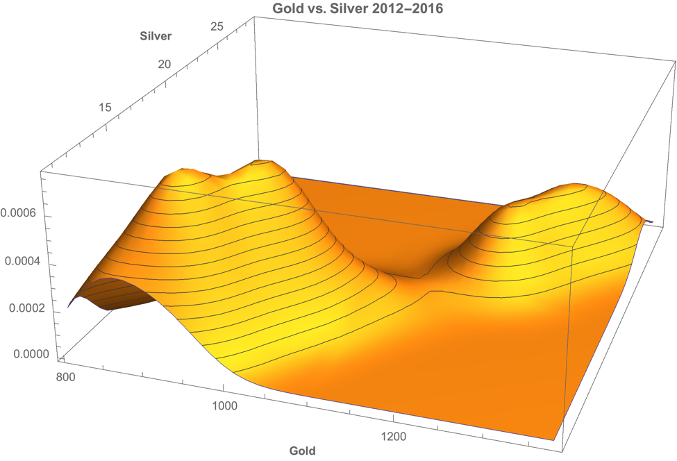
A plot of the join density of spot gold and silver prices indicates low- and high-price regimes in which the metals display similar levels of linear correlation.


Simple Metal Trading Models
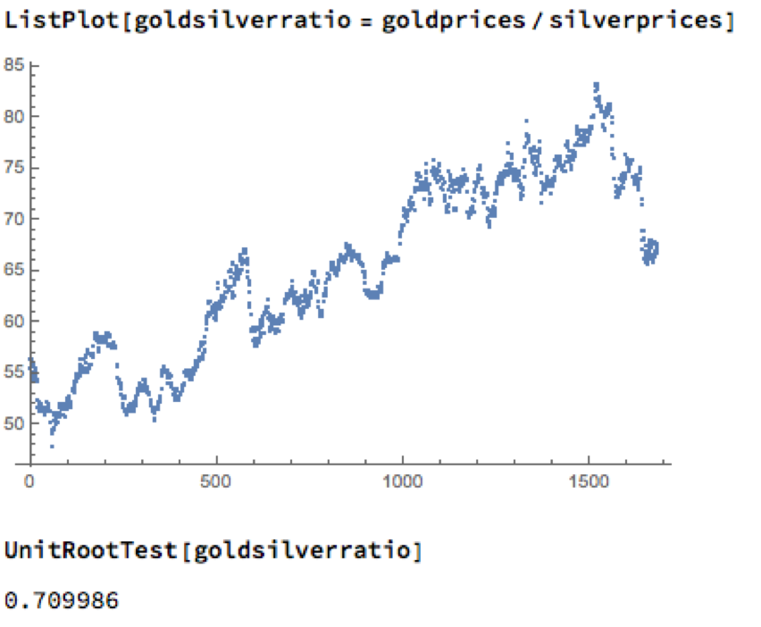
Levels of correlation that are consistently as high as this over extended periods of time are fairly unusual in financial markets and this presents a potential trading opportunity. One common approach is to use the ratios of metal prices as a trading signal. However, taking the ratio of gold to silver spot prices as an example, a plot of the series demonstrates that it is highly unstable and susceptible to long term trends.
A more formal statistical test fails to reject the null hypothesis of a unit root. In simple terms, this means we cannot reliably distinguish between the gold/silver price ratio and a random walk.

Along similar lines, we might consider the difference in log prices of the series. If this proved to be stationary then the log-price series would be cointegrated order 1 and we could build a standard pairs trading model to buy or sell the spread when prices become too far unaligned. However, we find once again that the log-price difference can wander arbitrarily far from its mean, and we are unable to reject the null hypothesis that the series contains a unit root.


Linear Models
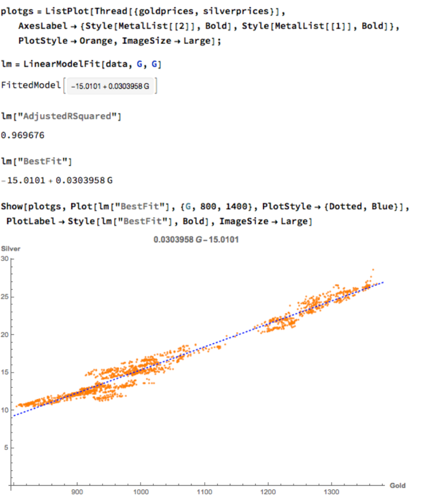
We can hope to do better with a standard linear model, regressing spot silver prices against spot gold prices. The fit of the best linear model is very good, with an R-sq of over 96%:

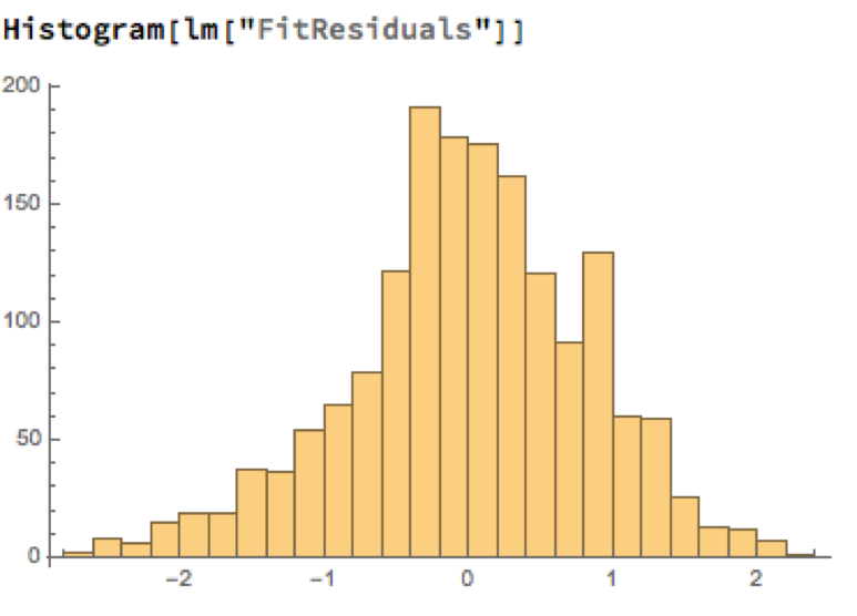
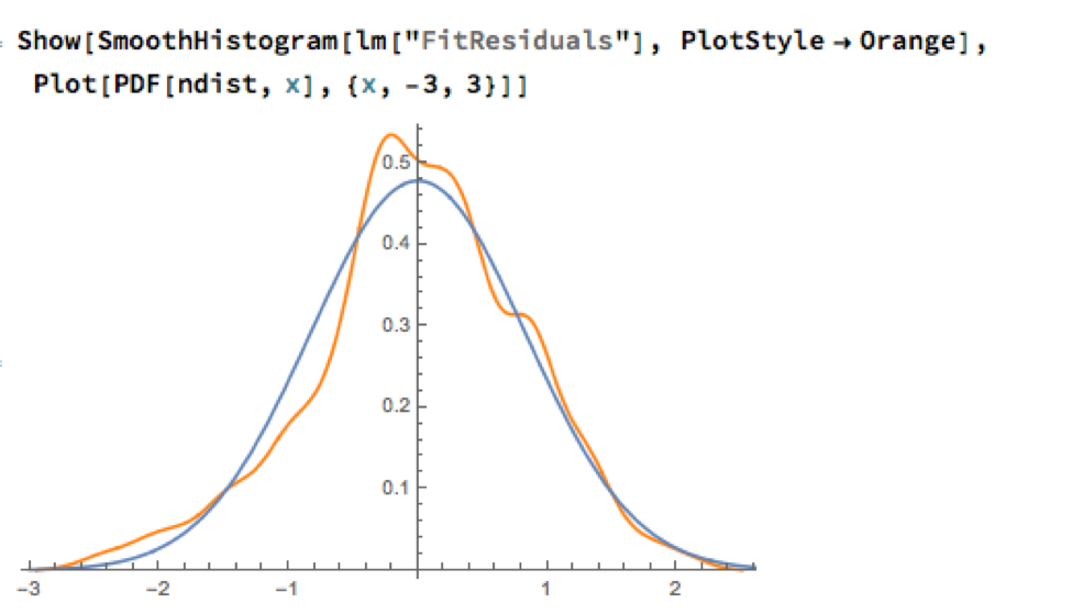
A trader might look to exploit the correlation relationship by selling silver when its market price is greater than the value estimated by the model (and buying when the model price exceeds the market price). Typically the spread is bought or sold when the log-price differential exceeds a threshold level that is set at twice the standard deviation of the price-difference series. The threshold levels derive from the assumption of Normality, which in fact does not apply here, as we can see from an examination of the residuals of the linear model:


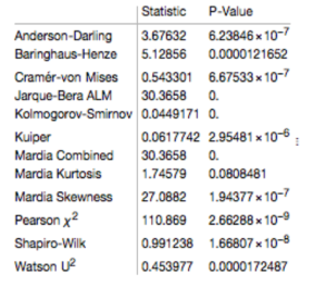
Given the evident lack of fit, especially in the left tail of the distribution, it is unsurprising that all of the formal statistical tests for Normality easily reject the null hypothesis:

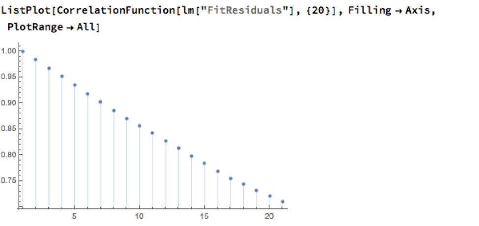
However, Normality, or the lack of it, is not the issue here: one could just as easily set the 2.5% and 97.5% percentiles of the empirical distribution as trade entry points. The real problem with the linear model is that it fails to take into account the time dependency in the price series. An examination of the residual autocorrelations reveals significant patterning, indicating that the model tends to under-or over-estimate the spot price of silver for long periods of time:

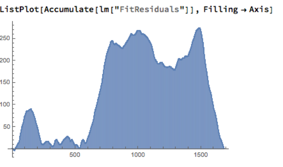
As the following chart shows, the cumulative difference between model and market prices can become very large indeed. A trader risks going bust waiting for the market to revert to model prices.

How does one remedy this? The shortcoming of the simple linear model is that, while it captures the interdependency between the price series very well, it fails to factor in the time dependency of the series. What is required is a model that will account for both features.
Multivariate Vector Autoregression Model
Rather than modeling the metal prices individually, or in pairs, we instead adopt a multivariate vector autoregression approach, modeling all three spot price processes together. The essence of the idea is that spot prices in each metal may be influenced, not only by historical values of the series, but also potentially by current and lagged prices of the other two metals.
Before proceeding we divide the data into two parts: an in-sample data set comprising data from 2012 to the end of 2015 and an out-of-sample period running from Jan-Aug 2016, which we use for model testing purposes. In what follows, I make the simplifying assumption that a vector autoregressive moving average process of order (1, 1) will suffice for modeling purposes, although in practice one would go through a procedure to test a wide spectrum of possible models incorporating moving average and autoregressive terms of varying dimensions.
In any event, our simplified VAR model is estimated as follows:

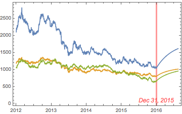
The chart below combines the actual, in-sample data from 2012-2015, together with the out-of-sample forecasts for each spot metal from January 2016.


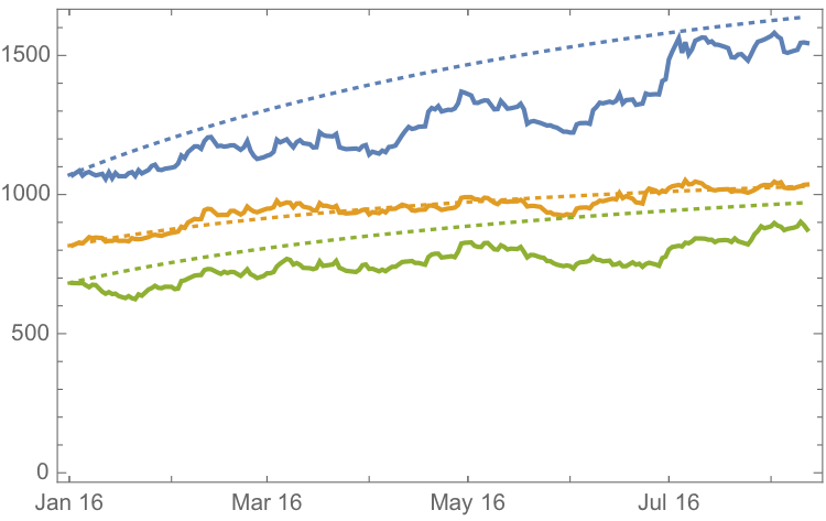
It is clear that the model projects a recovery in spot metal prices from the end of 2015. How did the forecasts turn out? In the chart below we compare the actual spot prices with the model forecasts, over the period from Jan to Aug 2016.


The actual and forecast percentage change in the spot metal prices over the out-of-sample period are as follows:

The VAR model does a good job of forecasting the strong upward trend in metal prices over the first eight months of 2016. It performs exceptionally well in its forecast of gold prices, although its forecasts for silver and platinum are somewhat over-optimistic. Nevertheless, investors would have made money taking a long position in any of the metals on the basis of the model projections.
Relative Value Trade
Another way to apply the model would be to implement a relative value trade, based on the model’s forecast that silver would outperform gold and platinum. Indeed, despite the model’s forecast of silver prices turning out to be over-optimistic, a relative value trade in silver vs. gold or platinum would have performed well: silver gained 44% in the period form Jan-Aug 2016, compared to only 26% for gold and 28% for platinum. A relative value trade entailing a purchase of silver and simultaneous sale of gold or platinum would have produced a gross return of 17% and 15% respectively.
A second relative value trade indicated by the model forecasts, buying platinum and selling gold, would have turned out less successfully, producing a gross return of less than 2%. We will examine the reasons for this in the next section.
Forecasts and Trading Opportunities Through 2016
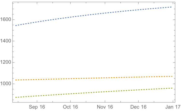
If we re-estimate the VAR model using all of the the available data through mid-Aug 2016 and project metal prices through the end of the year, the outcome is as follows:


While the positive trend in all three metals is forecast to continue, the new model (which incorporates the latest data) anticipates lower percentage rates of appreciation going forward:

Once again, the model predicts higher rates of appreciation for both silver and platinum relative to gold. So investors have the option to take a relative value trade, hedging a long position in silver or platinum with a short position in gold. While the forecasts for all three metals appear reasonable, the projections for platinum strike me as the least plausible.
The reason is that the major applications of platinum are industrial, most often as a catalyst: the metal is used as a catalytic converter in automobiles and in the chemical process of converting naphthas into higher-octane gasolines. Although gold is also used in some industrial applications, its demand is not so driven by industrial uses. Consequently, during periods of sustained economic stability and growth, the price of platinum tends to be as much as twice the price of gold, whereas during periods of economic uncertainty, the price of platinum tends to decrease due to reduced industrial demand, falling below the price of gold. Gold prices are more stable in slow economic times, as gold is considered a safe haven.
This is the most likely explanation of why the gold-platinum relative value trade has not worked out as expected hitherto and is perhaps unlikely to do so in the months ahead, as the slowdown in the global economy continues.
Conclusion
We have shown that simple models of the ratio or differential in the prices of precious metals are unlikely to provide a sound basis for forecasting or trading, due to non-stationarity and/or temporal dependencies in the residuals from such models.
On the other hand, a vector autoregression model that models all three price processes simultaneously, allowing both cross correlations and autocorrelations to be captured, performs extremely well in terms of forecast accuracy in out-of-sample tests over the period from Jan-Aug 2016.
Looking ahead over the remainder of the year, our updated VAR model predicts a continuation of the price appreciation, albeit at a slower rate, with silver and platinum expected to continue outpacing gold. There are reasons to doubt whether the appreciation of platinum relative to gold will materialize, however, due to falling industrial demand as the global economy cools.
