Volatility Clustering Across Asset Classes: GARCH and EGARCH Analysis with Python (2015–2026)


Introduction

If you’ve been trading anything other than cash over the past eighteen months, you’ve noticed something peculiar: periods of calm tend to persist, but so do periods of chaos. A quiet Tuesday in January rarely suddenly explodes into volatility on Wednesday—market turbulence comes in clusters. This isn’t market inefficiency; it’s a fundamental stylized fact of financial markets, one that most quant models fail to properly account for.

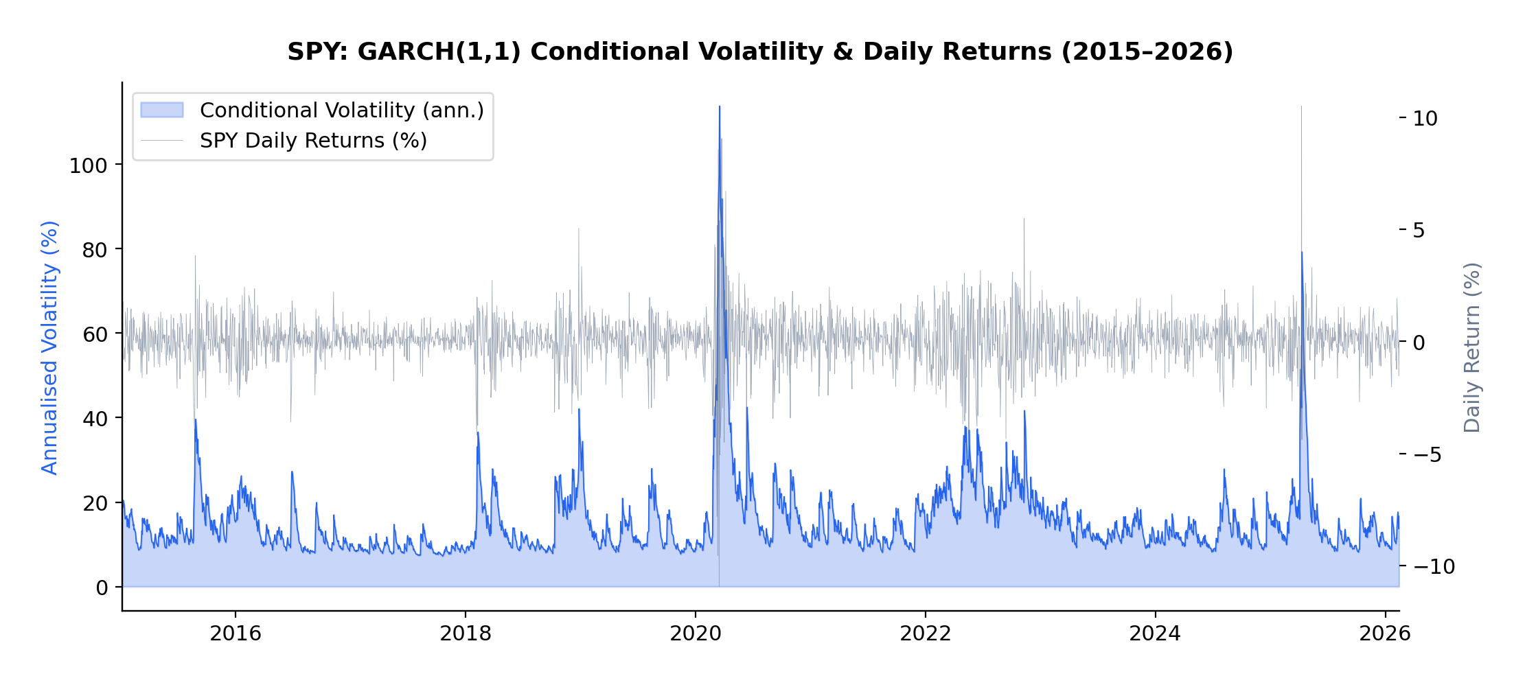
The current volatility regime we’re navigating in early 2026 provides a perfect case study. Following the Federal Reserve’s policy pivot late in 2025, equity markets experienced a sharp correction, with the VIX spiking from around 15 to above 30 in a matter of weeks. But here’s what interests me as a researcher: that elevated volatility didn’t dissipate overnight. It lingered, exhibiting the characteristic “slow decay” that the GARCH framework was designed to capture.

In this article, I present an empirical analysis of volatility dynamics across five major asset classes—the S&P 500 (SPY), US Treasuries (TLT), Gold (GLD), Oil (USO), and Bitcoin (BTC-USD)—over the ten-year period from January 2015 to February 2026. Using both GARCH(1,1) and EGARCH(1,1,1) models, I characterize volatility persistence and leverage effects, revealing striking differences across asset classes that have direct implications for risk management and trading strategy design.

This extends my earlier work on VIX derivatives and correlation trading, where understanding the time-varying nature of volatility is essential for pricing complex derivatives and managing portfolio risk through volatile regimes.


Understanding Volatility Clustering

Before diving into the results, let’s build some intuition about what GARCH actually captures—and why it matters.

Volatility clustering refers to the empirical observation that large price changes tend to be followed by large price changes, and small changes tend to follow small changes. If the market experiences a turbulent day, don’t expect immediate tranquility the next day. Conversely, a period of quiet trading often continues uninterrupted.

This phenomenon was formally modeled by Robert Engle in his landmark 1982 paper, “Autoregressive Conditional Heteroskedasticity with Estimates of the Variance of United Kingdom Inflation,” which introduced the ARCH (Autoregressive Conditional Heteroskedasticity) model. Engle’s insight was revolutionary: rather than assuming constant variance (homoskedasticity), he modeled variance itself as a time-varying process that depends on past shocks.

Tim Bollerslev extended this work in 1986 with the GARCH (Generalized ARCH) model, which proved more parsimonious and flexible. Then, in 1991, Daniel Nelson introduced the EGARCH (Exponential GARCH) model, which could capture the asymmetric response of volatility to positive versus negative returns—the famous “leverage effect” where negative shocks tend to increase volatility more than positive shocks of equal magnitude.

The Mathematics

The standard GARCH(1,1) model specifies:

\sigma_t^2 = \omega + \alpha r_{t-1}^2 + \beta \sigma_{t-1}^2

where:

  • σt2 is the conditional variance at time t
  • rt-12 is the squared return from the previous period (the “shock”)
  • σt-12 is the previous period’s conditional variance
  • α measures how quickly volatility responds to new shocks
  • β measures the persistence of volatility shocks
  • The sum α + β represents overall volatility persistence

The key parameter here is α + β. If this sum is close to 1 (as it typically is for financial assets), volatility shocks decay slowly—a phenomenon I observed firsthand during the 2025-2026 correction. We can calculate the “half-life” of a volatility shock as:

\text{Half-life} = \frac{\ln(0.5)}{\ln(\alpha + \beta)}

For example, with α + β = 0.97, a volatility shock takes approximately ln(0.5)/ln(0.97) ≈ 23 days to decay by half.

The EGARCH model modifies this framework to capture asymmetry:

\ln(\sigma_t^2) = \omega + \alpha \left(\frac{r_{t-1}}{\sigma_{t-1}}\right) + \gamma \left(\frac{|r_{t-1}|}{\sigma_{t-1}}\right) + \beta \ln(\sigma_{t-1}^2)

The parameter γ (gamma) captures the leverage effect. A negative γ means that negative returns generate more volatility than positive returns of equal magnitude—which is precisely what we observe in equity markets and, as we’ll see, in Bitcoin.


Methodology

For each asset in the sample, I computed daily log returns as:

r_t = 100 \times \ln\left(\frac{P_t}{P_{t-1}}\right)

The multiplication by 100 converts returns to percentage terms, which improves numerical convergence when estimating the models.

I then fitted two volatility models to each asset’s return series:

  • GARCH(1,1): The workhorse model that captures volatility clustering through the autoregressive structure of conditional variance
  • EGARCH(1,1,1): The exponential GARCH model that additionally captures leverage effects through the asymmetric term

All models were estimated using Python’s arch package with normally distributed innovations. The sample period spans January 2015 to February 2026, encompassing multiple distinct volatility regimes including:

  • The 2015-2016 oil price collapse
  • The 2018 Q4 correction
  • The COVID-19 volatility spike of March 2020
  • The 2022 rate-hike cycle
  • The 2025-2026 post-pivot correction

This rich variety of regimes makes the sample ideal for studying volatility dynamics across different market conditions.


Results

GARCH(1,1) Estimates

The GARCH(1,1) model reveals substantial variation in volatility dynamics across asset classes:

Asset α (alpha) β (beta) Persistence (α+β) Half-life (days) AIC
S&P 500 0.1810 0.7878 0.9688 ~23 7130.4
US Treasuries 0.0683 0.9140 0.9823 ~38 7062.7
Gold 0.0631 0.9110 0.9741 ~27 7171.9
Oil 0.1271 0.8305 0.9576 ~16 11999.4
Bitcoin 0.1228 0.8470 0.9699 ~24 20789.6


EGARCH(1,1,1) Estimates

The EGARCH model additionally captures leverage effects:

Asset α (alpha) β (beta) γ (gamma) Persistence AIC
S&P 500 0.2398 0.9484 -0.1654 1.1882 7022.6
US Treasuries 0.1501 0.9806 0.0084 1.1307 7063.5
Gold 0.1205 0.9721 0.0452 1.0926 7146.9
Oil 0.2171 0.9564 -0.0668 1.1735 12002.8
Bitcoin 0.2505 0.9377 -0.0383 1.1882 20773.9


Interpretation

Volatility Persistence

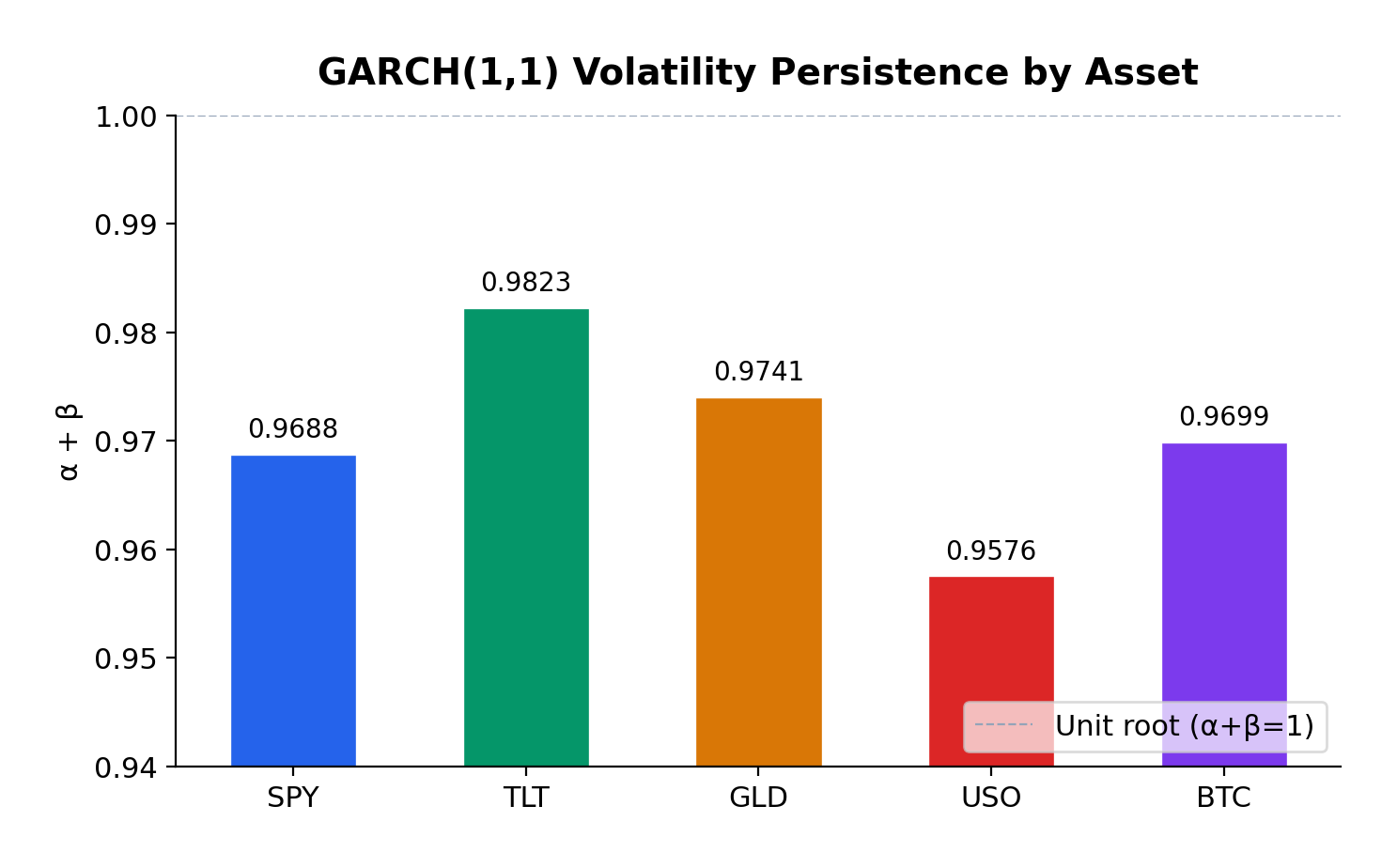
All five assets exhibit high volatility persistence, with α + β ranging from 0.9576 (Oil) to 0.9823 (US Treasuries). These values are remarkably consistent with the classic empirical findings from Engle (1982) and Bollerslev (1986), who first documented this phenomenon in inflation and stock market data respectively.

US Treasuries show the highest persistence (0.9823), meaning volatility shocks in the bond market take longer to decay—approximately 38 days to half-life. This makes intuitive sense: Federal Reserve policy changes, which are the primary drivers of Treasury volatility, tend to have lasting effects that persist through subsequent meetings and economic data releases.

Gold exhibits the second-highest persistence (0.9741), consistent with its role as a long-term store of value. Macroeconomic uncertainties—geopolitical tensions, currency debasement fears, inflation scares—don’t resolve quickly, and neither does the associated volatility.

S&P 500 and Bitcoin show similar persistence (~0.97), with half-lives of approximately 23-24 days. This suggests that equity market volatility shocks, despite their reputation for sudden spikes, actually decay at a moderate pace.

Oil has the lowest persistence (0.9576), which makes sense given the more mean-reverting nature of commodity prices. Oil markets can experience rapid shifts in sentiment based on supply disruptions or demand changes, but these shocks tend to resolve more quickly than in financial assets.

Leverage Effects


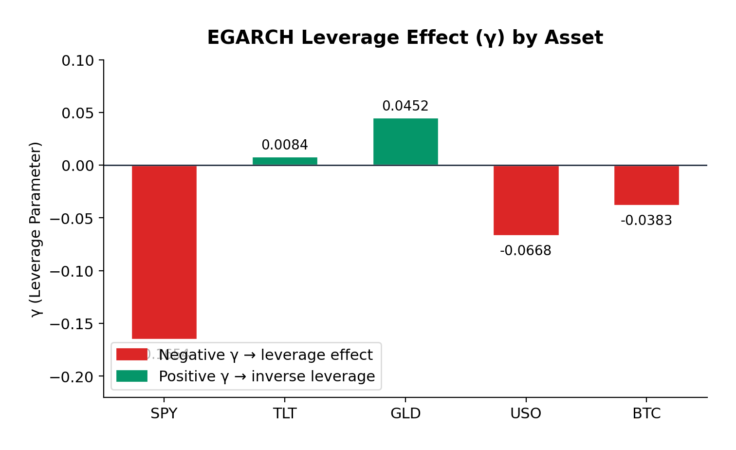
The EGARCH γ parameter reveals asymmetric volatility responses—the leverage effect that Nelson (1991) formalized:

S&P 500 (γ = -0.1654): The strongest negative leverage effect in the sample. A 1% drop in equities increases volatility significantly more than a 1% rise. This is the classic equity pattern: bad news is “stickier” than good news. For options traders, this means that protective puts are more expensive than equivalent out-of-the-money calls during volatile periods—a direct consequence of this asymmetry.

Bitcoin (γ = -0.0383): Moderate negative leverage, weaker than equities but still significant. The cryptocurrency market shows asymmetric reactions to price movements, with downside moves generating more volatility than upside moves. This is somewhat surprising given Bitcoin’s retail-dominated nature, but consistent with the hypothesis that large institutional players are increasingly active in crypto markets.

Oil (γ = -0.0668): Moderate negative leverage, similar to Bitcoin. The energy market’s reaction to geopolitical events (which tend to be negative supply shocks) contributes to this asymmetry.

Gold (γ = +0.0452): Here’s where it gets interesting. Gold exhibits a slight positive gamma—the opposite of the equity pattern. Positive returns slightly increase volatility more than negative returns. This is consistent with gold’s safe-haven role: when risk assets sell off and investors flee to gold, the resulting price spike in gold can be accompanied by increased trading activity and volatility. Conversely, gradual gold price increases during calm markets occur with declining volatility.

US Treasuries (γ = +0.0084): Essentially symmetric. Treasury volatility doesn’t distinguish between positive and negative returns—which makes sense, since Treasuries are priced primarily on interest rate expectations rather than “good” or “bad” news in the equity sense.

Model Fit

The AIC (Akaike Information Criterion) comparison shows that EGARCH provides a materially better fit for the S&P 500 (7022.6 vs 7130.4) and Bitcoin (20773.9 vs 20789.6), where significant leverage effects are present. For Gold and Treasuries, GARCH performs comparably or slightly better, consistent with the absence of significant leverage asymmetry.


Practical Implications for Traders

1. Volatility Forecasting and Position Sizing

The high persistence values across all assets have direct implications for position sizing during volatile regimes. If you’re trading options or managing a portfolio, the GARCH framework tells you that elevated volatility will likely persist for weeks, not days. This suggests:

  • Don’t reduce risk too quickly after a volatility spike. The half-life analysis shows that it takes 2-4 weeks for half of a volatility shock to dissipate. Cutting exposure immediately after a correction means you’re selling low vol into the spike.
  • Expect re-leveraging opportunities. Once vol peaks and begins decaying, there’s a window of several weeks where volatility is still elevated but declining—potentially favorable for selling vol (e.g., writing covered calls or selling volatility swaps).

2. Options Pricing

The leverage effects have material implications for option pricing:

  • Equity options (S&P 500) should price in significant skew—put options are relatively more expensive than calls. If you’re buying protection (e.g., buying SPY puts for portfolio hedge), you’re paying a premium for this asymmetry.
  • Bitcoin options show similar but weaker asymmetry. The market is still relatively young, and the vol surface may not fully price in the leverage effect—potentially an edge for sophisticated options traders.
  • Gold options exhibit the opposite pattern. Call options may be relatively cheaper than puts, reflecting gold’s tendency to experience vol spikes on rallies (as opposed to selloffs).

3. Portfolio Construction

For multi-asset portfolios, the differing persistence and leverage characteristics suggest tactical allocation shifts:

  • During risk-on regimes: Low persistence in oil suggests faster mean reversion—commodity exposure might be appropriate for shorter time horizons.
  • During risk-off regimes: High persistence in Treasuries means bond market volatility decays slowly. Duration hedges need to account for this extended volatility window.
  • Diversification benefits: The low correlation between equity and Treasury volatility dynamics supports the case for mixed-asset portfolios—but the high persistence in both suggests that when one asset class enters a high-vol regime, it likely persists for weeks.

4. Trading Volatility Directly

For traders who express views on volatility itself (VIX futures, variance swaps, volatility ETFs):

  • The persistence framework suggests that VIX spikes should be traded as mean-reverting (which they are), but with the expectation that complete normalization takes 30-60 days.
  • The leverage effect in equities means that vol strategies should be positioned for asymmetric payoffs—long vol positions benefit more from downside moves than equivalent upside moves.

Reproducible Example

At the bottom of the post is the complete Python code used to generate these results. The code uses yfinance for data download and the arch package for model estimation. It’s designed to be easily extensible—you can add additional assets, change the date range, or experiment with different GARCH variants (GARCH-M, TGARCH, GJR-GARCH) to capture different aspects of the volatility dynamics.


Conclusion

This analysis confirms that volatility clustering is a universal phenomenon across asset classes, but the specific characteristics vary meaningfully:

  • Volatility persistence is universally high (α + β ≈ 0.95–0.98), meaning volatility shocks take weeks to months to decay. This has important implications for position sizing and risk management.
  • Leverage effects vary dramatically across asset classes. Equities show strong negative leverage (bad news increases vol more than good news), while gold shows slight positive leverage (opposite pattern), and Treasuries show no meaningful asymmetry.
  • The half-life of volatility shocks ranges from approximately 16 days (oil) to 38 days (Treasuries), providing a quantitative guide for expected duration of volatile regimes.

These findings extend naturally to my ongoing work on volatility derivatives and correlation trading. Understanding the persistence and asymmetry of volatility is essential for pricing VIX options, variance swaps, and other vol-sensitive products—as well as for managing the tail risk that inevitably accompanies high-volatility regimes like the one we’re navigating in early 2026.


References

  • Engle, R.F. (1982). “Autoregressive Conditional Heteroskedasticity with Estimates of the Variance of United Kingdom Inflation.” Econometrica, 50(4), 987-1007.
  • Bollerslev, T. (1986). “Generalized Autoregressive Conditional Heteroskedasticity.” Journal of Econometrics, 31(3), 307-327.
  • Nelson, D.B. (1991). “Conditional Heteroskedasticity in Asset Returns: A New Approach.” Econometrica, 59(2), 347-370.

All models estimated using Python’s arch package with normal innovations. Data source: Yahoo Finance. The analysis covers the period January 2015 through February 2026, comprising approximately 2,800 trading days.


"""
GARCH Analysis: Volatility Clustering Across Asset Classes
============================================== ==============
- Downloads daily adjusted close prices (2015–2026)
- Computes log returns (in percent)
- Fits GARCH(1,1) and EGARCH(1,1) models to each asset
- Reports key parameters: alpha, beta, persistence, gamma (leverage in EGARCH)
- Highlights potential leverage effects when |γ| > 0.05

Assets included: SPY, TLT, GLD, USO, BTC-USD
"""

import yfinance as yf
import pandas as pd
import numpy as np
from arch import arch_model
import warnings

# Suppress arch model convergence warnings for cleaner output
warnings.filterwarnings('ignore', category=UserWarning)

# ────────────────────────────────────────────────
# Configuration
# ────────────────────────────────────────────────
ASSETS = ['SPY', 'TLT', 'GLD', 'USO', 'BTC-USD']
START_DATE = '2015-01-01'
END_DATE = '2026-02-14'

# ────────────────────────────────────────────────
# 1. Download price data
# ────────────────────────────────────────────────
print("=" * 70)
print("GARCH(1,1) & EGARCH(1,1) Analysis – Volatility Clustering")
print("=" * 70)
print()

print("1. Downloading daily adjusted close prices...")
price_data = {}

for asset in ASSETS:
 try:
 df = yf.download(asset, start=START_DATE, end=END_DATE,
 progress=False, auto_adjust=True)
 if df.empty:
 print(f" {asset:6s} → No data retrieved")
 continue
 price_data[asset] = df['Close']
 print(f" {asset:6s} → {len(df):5d} observations")
 except Exception as e:
 print(f" {asset:6s} → Download failed: {e}")

# Combine into single DataFrame and drop rows with any missing values
prices = pd.DataFrame(price_data).dropna()
print(f"\nCombined clean dataset: {len(prices):,} trading days")

# ────────────────────────────────────────────────
# 2. Calculate log returns (in percent)
# ────────────────────────────────────────────────
print("\n2. Computing log returns...")
returns = np.log(prices / prices.shift(1)).dropna() * 100
print(f"Log returns ready: {len(returns):,} observations\n")

# ────────────────────────────────────────────────
# 3. Fit GARCH(1,1) and EGARCH(1,1) models
# ────────────────────────────────────────────────
print("3. Fitting models...")
print("-" * 70)

results = []

for asset in ASSETS:
 if asset not in returns.columns:
 print(f"{asset:6s} → Skipped (no data)")
 continue

 print(f"\n{asset}")
 print("─" * 40)

 asset_returns = returns[asset].dropna()

 # Default missing values
 row = {
 'Asset': asset,
 'Alpha_GARCH': np.nan, 'Beta_GARCH': np.nan, 'Persist_GARCH': np.nan,
 'LL_GARCH': np.nan, 'AIC_GARCH': np.nan,
 'Alpha_EGARCH': np.nan, 'Gamma_EGARCH': np.nan, 'Beta_EGARCH': np.nan,
 'Persist_EGARCH': np.nan
 }

 # ───── GARCH(1,1) ─────
 try:
 model_garch = arch_model(
 asset_returns,
 vol='Garch', p=1, q=1,
 dist='normal',
 mean='Zero' # common choice for pure volatility models
 )
 res_garch = model_garch.fit(disp='off', options={'maxiter': 500})

 row['Alpha_GARCH'] = res_garch.params.get('alpha[1]', np.nan)
 row['Beta_GARCH'] = res_garch.params.get('beta[1]', np.nan)
 row['Persist_GARCH'] = row['Alpha_GARCH'] + row['Beta_GARCH']
 row['LL_GARCH'] = res_garch.loglikelihood
 row['AIC_GARCH'] = res_garch.aic

 print(f"GARCH(1,1) α = {row['Alpha_GARCH']:8.4f} "
 f"β = {row['Beta_GARCH']:8.4f} "
 f"persistence = {row['Persist_GARCH']:6.4f}")
 except Exception as e:
 print(f"GARCH(1,1) failed: {e}")

 # ───── EGARCH(1,1) ─────
 try:
 model_egarch = arch_model(
 asset_returns,
 vol='EGARCH', p=1, o=1, q=1,
 dist='normal',
 mean='Zero'
 )
 res_egarch = model_egarch.fit(disp='off', options={'maxiter': 500})

 row['Alpha_EGARCH'] = res_egarch.params.get('alpha[1]', np.nan)
 row['Gamma_EGARCH'] = res_egarch.params.get('gamma[1]', np.nan)
 row['Beta_EGARCH'] = res_egarch.params.get('beta[1]', np.nan)
 row['Persist_EGARCH'] = row['Alpha_EGARCH'] + row['Beta_EGARCH']

 print(f"EGARCH(1,1) α = {row['Alpha_EGARCH']:8.4f} "
 f"γ = {row['Gamma_EGARCH']:8.4f} "
 f"β = {row['Beta_EGARCH']:8.4f} "
 f"persistence = {row['Persist_EGARCH']:6.4f}")

 if abs(row['Gamma_EGARCH']) > 0.05:
 print(" → Significant leverage effect (|γ| > 0.05)")
 except Exception as e:
 print(f"EGARCH(1,1) failed: {e}")

 results.append(row)

# ────────────────────────────────────────────────
# 4. Summary table
# ────────────────────────────────────────────────
print("\n" + "=" * 70)
print("SUMMARY OF RESULTS")
print("=" * 70)

df_results = pd.DataFrame(results)
df_results = df_results.round(4)

# Reorder columns for readability
cols = [
 'Asset',
 'Alpha_GARCH', 'Beta_GARCH', 'Persist_GARCH',
 'Alpha_EGARCH', 'Gamma_EGARCH', 'Beta_EGARCH', 'Persist_EGARCH',
 #'LL_GARCH', 'AIC_GARCH' # uncomment if you want log-likelihood & AIC
]

print(df_results[cols].to_string(index=False))
print()

print("Done."). 

Outperforming in Chaos: How Strategic Scenario Portfolios Are Beating the Market in 2025’s Geopolitical Storm

“The first rule of investing isn’t ‘Don’t lose money.’ It’s ‘Recognize when the rules are changing.'”

UPDATE: MAY 1 2025

The February 2025 European semiconductor export restrictions sent markets into a two-day tailspin, wiping $1.3 trillion from global equities. For most investors, it was another stomach-churning reminder of how traditional portfolios falter when geopolitics overwhelms fundamentals.

But for a growing cohort of forward-thinking portfolio managers, it was validation. Their Strategic Scenario Portfolios—deliberately constructed to thrive during specific geopolitical events—delivered positive returns amid the chaos.

I’m not talking about theoretical models. I’m talking about real money, real returns, and a methodology you can implement right now.

What Exactly Is a Strategic Scenario Portfolio?

A Strategic Scenario Portfolio (SSP) is an investment allocation designed to perform robustly during specific high-impact events—like trade wars, sanctions, regional conflicts, or supply chain disruptions.

Unlike conventional approaches that react to crises, SSPs anticipate them. They’re narrative-driven, built around specific, plausible scenarios that could reshape markets. They’re thematically concentrated, focusing on sectors positioned to benefit from that scenario rather than broad diversification. They maintain asymmetric balance, incorporating both downside protection and upside potential. And perhaps most importantly, they’re ready for deployment before markets fully price in the scenario.

Think of SSPs as portfolio “insurance policies” that also have the potential to deliver substantial alpha.

“Why didn’t I know about this before now?” SSPs aren’t new—institutional investors have quietly used similar approaches for decades. What’s new is systematizing this approach for broader application.

Real-World Proof: Two Case Studies That Speak for Themselves

Case Study #1: The 2018-2019 US-China Trade War

When trade tensions escalated in 2018, we constructed the “USChinaTradeWar2018” portfolio with a straightforward mandate: protect capital while capitalizing on trade-induced dislocations.

The portfolio allocated 25% to SPDR Gold Shares (GLD) as a core risk-off hedge. Another 20% went to Consumer Staples (VDC) for defensive positioning, while 15% was invested in Utilities (XLU) for stable returns and low volatility. The remaining 40% was distributed equally among Walmart (WMT), Newmont Mining (NEM), Procter & Gamble (PG), and Industrials (XLI), creating a balanced mix of defensive positioning with selective tactical exposure.

The results were remarkable. From May 2018 to December 2019, this portfolio delivered a total return of 30.2%, substantially outperforming the S&P 500’s 22.0%. More impressive than the returns, however, was the risk profile. The portfolio achieved a Sharpe ratio of 1.8 (compared to the S&P 500’s 0.6), demonstrating superior risk-adjusted performance. Its maximum drawdown was a mere 2.2%, while the S&P 500 experienced a 14.0% drawdown during the same period. With a beta of just 0.26 and alpha of 11.7%, this portfolio demonstrated precisely what SSPs are designed to deliver: outperformance with dramatically reduced correlation to broader market movements.

Note: Past performance is not indicative of future results. Performance calculated using total return with dividends reinvested, compared against S&P 500 total return.

Case Study #2: The 2025 Tariff War Portfolio

Fast forward to January 2025. With new tariffs threatening global trade, we developed the “TariffWar2025” portfolio using a similar strategic framework but adapted to the current environment.

The core of the portfolio (50%) established a defensive foundation across Utilities (XLU), Consumer Staples (XLP), Healthcare (XLV), and Gold (GLD). We allocated 20% toward domestic industrial strength through Industrials (XLI) and Energy (XLE) to capture reshoring benefits and energy independence trends. Another 20% targeted strategic positioning with Lockheed Martin (LMT) benefiting from increased defense spending and Cisco (CSCO) offering exposure to domestic technology infrastructure with limited Chinese supply chain dependencies. The remaining 10% created balanced treasury exposure across long-term (TLT) and short-term (VGSH) treasuries to hedge against both economic slowdown and rising rates.

The results through Q1 2025 have been equally impressive. While the S&P 500 declined 4.6%, the TariffWar2025 portfolio generated a positive 4.3% return. Its Sharpe ratio of 8.4 indicates exceptional risk-adjusted performance, and remarkably, the portfolio experienced zero drawdown during a period when the S&P 500 fell by as much as 7.1%. With a beta of 0.20 and alpha of 31.9%, the portfolio again demonstrated the power of scenario-based investing in navigating geopolitical turbulence.

Note: Past performance is not indicative of future results. Performance calculated using total return with dividends reinvested, compared against S&P 500 total return.

Why Traditional Portfolios Fail When You Need Them Most

Traditional portfolio construction relies heavily on assumptions that often crumble during times of geopolitical stress. Historical correlations, which form the backbone of most diversification strategies, routinely break during crises. Mean-variance optimization, a staple of modern portfolio theory, falters dramatically when markets exhibit non-normal distributions, which is precisely what happens during geopolitical events. And the broad diversification that works so well in normal times often converges in stressed markets, leaving investors exposed just when protection is most needed.

When markets fracture along geopolitical lines, these assumptions collapse spectacularly. Consider the March 2023 banking crisis: correlations between tech stocks and regional banks—historically near zero—suddenly jumped to 0.75. Or recall how in 2022, both stocks AND bonds declined simultaneously, shattering the foundation of 60/40 portfolios.

What geopolitical scenario concerns you most right now, and how is your portfolio positioned for it? This question reveals the central value proposition of Strategic Scenario Portfolios.

Building Your Own Strategic Scenario Portfolio: A Framework for Success

You don’t need a quant team to implement this approach. The framework begins with defining a clear scenario. Rather than vague concerns about “volatility” or “recession,” an effective SSP requires a specific narrative. For example: “Europe imposes carbon border taxes, triggering retaliatory measures from major trading partners.”

From this narrative foundation, you can map the macro implications. Which regions would face the greatest impact? What sectors would benefit or suffer? How might interest rates, currencies, and commodities respond? This mapping process translates your scenario into investment implications.

The next step involves identifying asymmetric opportunities—situations where the market is underpricing both risks and potential benefits related to your scenario. These asymmetries create the potential for alpha generation within your protective framework.

Structure becomes critical at this stage. A typical SSP balances defensive positions (usually 60-75% of the allocation) with opportunity capture (25-40%). This balance ensures capital preservation while maintaining upside potential if your scenario unfolds as anticipated.

Finally, establish monitoring criteria. Define what developments would strengthen or weaken your scenario’s probability, and set clear guidelines for when to increase exposure, reduce positions, or exit entirely.

For those new to this approach, start with a small allocation—perhaps 5-10% of your portfolio—as a satellite to your core holdings. As your confidence or the scenario probability increases, you can scale up exposure accordingly.

Common Questions About Strategic Scenario Portfolios

“Isn’t this just market timing in disguise?” This question arises frequently, but the distinction is important. Market timing attempts to predict overall market movements—when the market will rise or fall. SSPs are fundamentally different. They’re about identifying specific scenarios and their sectoral impacts, regardless of broad market direction. The focus is on relative performance within a defined context, not on predicting market tops and bottoms.

“How do I know when to exit an SSP position?” The key is defining exit criteria in advance. This might include scenario resolution (like a trade agreement being signed), time limits (reviewing the position after a predefined period), or performance thresholds (taking profits or cutting losses at certain levels). Clear exit strategies prevent emotional decision-making when markets become volatile.

“Do SSPs work in all market environments?” This question reveals a misconception about their purpose. SSPs aren’t designed to outperform in all environments. They’re specifically built to excel during their target scenarios, while potentially underperforming in others. That’s why they work best as tactical overlays to core portfolios, rather than as stand-alone investment approaches.

“How many scenarios should I plan for simultaneously?” Start with one or two high-probability, high-impact scenarios. Too many simultaneous SSPs can dilute your strategic focus and create unintended exposures. As you gain comfort with the approach, you can expand your scenario coverage while maintaining portfolio coherence.

Tools for the Forward-Thinking Investor

Implementing SSPs effectively requires both qualitative and quantitative tools. Systems like the Equities Entity Store for MATLAB provide institutional-grade capabilities for modeling multi-asset correlations across different regimes. They enable stress-testing portfolios against specific geopolitical scenarios, optimizing allocations based on scenario probabilities, and tracking exposures to factors that become relevant primarily in crisis periods.

These tools help translate scenario narratives into precise portfolio allocations with targeted risk exposures. While sophisticated analytics enhance the process, the core methodology remains accessible even to investors without advanced quantitative resources.

The Path Forward in a Fractured World

The investment landscape of 2025 is being shaped by forces that traditional models struggle to capture. Deglobalization and reshoring are restructuring supply chains and changing regional economic dependencies. Resource nationalism and energy security concerns are creating new commodity dynamics. Strategic competition between major powers is manifesting in investment restrictions, export controls, and targeted sanctions. Technology fragmentation along geopolitical lines is creating parallel innovation systems with different winners and losers.

In this environment, passive diversification is necessary but insufficient. Strategic Scenario Portfolios provide a disciplined framework for navigating these challenges, protecting capital, and potentially generating significant alpha when markets are most volatile.

The question isn’t whether geopolitical disruptions will continue—they will. The question is whether your portfolio is deliberately designed to withstand them.

Next Steps: Getting Started With SSPs

The journey toward implementing Strategic Scenario Portfolios begins with identifying your most concerning scenario. What geopolitical or policy risk keeps you up at night? Is it escalation in the South China Sea? New climate regulations? Central bank digital currencies upending traditional banking?

Once you’ve identified your scenario, assess your current portfolio’s exposure. Would your existing allocations benefit, suffer, or remain neutral if this scenario materialized? This honest assessment often reveals vulnerabilities that weren’t apparent through traditional risk measures.

Design a prototype SSP focused on your scenario. Start small, perhaps with a paper portfolio that you can monitor without committing capital immediately. Track both the portfolio’s performance and developments related to your scenario, refining your approach as you gain insights.

For many investors, this process benefits from professional guidance. Complex scenario mapping requires a blend of geopolitical insight, economic analysis, and portfolio construction expertise that often exceeds the resources of individual investors or even smaller investment teams.


About the Author: Jonathan Kinlay, PhD is Principal Partner at Golden Bough Partners LLC, a quantitative proprietary trading firm, and managing partner of Intelligent Technologies. With experience as a finance professor at NYU Stern and Carnegie Mellon, he specializes in advanced portfolio construction, algorithmic trading systems, and quantitative risk management. His latest book, “Equity Analytics” (2024), explores modern approaches to market resilience. Jonathan works with select institutional clients and fintech ventures as a strategic advisor, helping them develop robust quantitative frameworks that deliver exceptional risk-adjusted returns. His proprietary trading systems have consistently achieved Sharpe ratios 2-3× industry benchmarks.


📬 Let’s Connect: Have you implemented scenario-based approaches in your investment process? What geopolitical risks are you positioning for? Share your thoughts in the comments or connect with me directly.

Disclaimer: This article is for informational purposes only and does not constitute investment advice. The performance figures presented are based on actual portfolios but may not be achievable for all investors. Always conduct your own research and consider your financial situation before making investment decisions.

Developing Trading Strategies With Synthetic Data

One of the main criticisms levelled at systematic trading over the last few years is that the over-use of historical market data has tended to produce curve-fitted strategies that perform poorly out of sample in a live trading environment. This is indeed a valid criticism – given enough attempts one is bound to arrive eventually at a strategy that performs well in backtest, even on a holdout data sample. But that by no means guarantees that the strategy will continue to perform well going forward.

The solution to the problem has been clear for some time: what is required is a method of producing synthetic market data that can be used to build a strategy and test it under a wide variety of simulated market conditions. A strategy built in this way is more likely to survive the challenge of live trading than one that has been developed using only a single historical data path.

The problem, however, has been in implementation. Up until now all the attempts to produce credible synthetic price data have failed, for one reason or another, as I described in an earlier post:

I have been able to devise a completely new algorithm for generating artificial price series that meet all of the key requirements, as follows:

  • Computational simplicity & efficiency. Important if we are looking to mass-produce synthetic series for a large number of assets, for a variety of different applications. Some deep learning methods would struggle to meet this requirement, even supposing that transfer learning is possible.
  • The ability to produce price series that are internally consistent (i.e High > Low, etc) in every case .
  • Should be able to produce a range of synthetic series that vary widely in their correspondence to the original price series. In some case we want synthetic price series that are highly correlated to the original; in other cases we might want to test our investment portfolio or risk control systems under extreme conditions never before seen in the market.
  • The distribution of returns in the synthetic series should closely match the historical series, being non-Gaussian and with “fat-tails”.
  • The ability to incorporate long memory effects in the sequence of returns.
  • The ability to model GARCH effects in the returns process.

This means that we are now in a position to develop trading strategies without any direct reference to the underlying market data. Consequently we can then use all of the real market data for out-of-sample back-testing.

Developing a Trading Strategy for the S&P 500 Index Using Synthetic Market Data

To illustrate the procedure I am going to use daily synthetic price data for the S&P 500 Index over the period from Jan 1999 to July 2022. Details of the the characteristics of the synthetic series are given in the post referred to above.

This image has an empty alt attribute; its file name is Fig3-12.png

Because we want to create a trading strategy that will perform under market conditions close to those currently prevailing, I will downsample the synthetic series to include only those that correlate quite closely, i.e. with a minimum correlation of 0.75, with the real price data.

Why do this? Surely if we want to make a strategy as robust as possible we should use all of the synthetic data series for model development?

The reason is that I believe that some of the more extreme adverse scenarios generated by the algorithm may occur quite rarely, perhaps once in every few decades. However, I am principally interested in a strategy that I can apply under current market conditions and I am prepared to take my chances that the worst-case scenarios are unlikely to come about any time soon. This is a major design decision, one that you may disagree with. Of course, one could make use of every available synthetic data series in the development of the trading model and by doing so it is likely that you would produce a model that is more robust. But the training could take longer and the performance during normal market conditions may not be as good.

Having generated the price series, the process I am going to follow is to use genetic programming to develop trading strategies that will be evaluated on all of the synthetic data series simultaneously. I will then use the performance of the aggregate portfolio, i.e. the outcome of all of the trades generated by the strategy when applied to all of the synthetic series, to assess the overall performance. In order to be considered, candidate strategies have to perform well under all of the different market scenarios, or at least the great majority of them. This ensures that the strategy is likely to prove more robust across different types of market conditions, rather than on just the single type of market scenario observed in the real historical series.

As usual in these cases I will reserve a portion (10%) of each data series for testing each strategy, and a further 10% sample for out-of-sample validation. This isn’t strictly necessary: since the real data series has not be used directly in the development of the trading system, we can later test the strategy on all of the historical data and regard this as an out-of-sample backtest.

To implement the procedure I am going to use Mike Bryant’s excellent Adaptrade Builder software.

This is an exemplar of outstanding software engineering and provides a broad range of features for generating trading strategies of every kind. One feature of Builder that is particularly useful in this context is its ability to construct strategies and test them on up to 20 data series concurrently. This enables us to develop a strategy using all of the synthetic data series simultaneously, showing the performance of each individual strategy as well for as the aggregate portfolio.

After evolving strategies for 50 generations we arrive at the following outcome:

The equity curve for the aggregate portfolio is shown in blue, while the equity curves for the strategy applied to individual synthetic data series are shown towards the bottom of the chart. Of course, the performance of the aggregate portfolio appears much superior to any of the individual strategies, because it is effectively the arithmetic sum of the individual equity curves. And just because the aggregate portfolio appears to perform well both in-sample and out-of-sample, that doesn’t imply that the strategy works equally well for every individual market scenario. In some scenarios it performs better than in others, as can be observed from the individual equity curves.

But, in any case, our objective here is not to create a stock portfolio strategy, but rather to trade a single asset – the S&P 500 Index. The role of the aggregate portfolio is simply to suggest that we may have found a strategy that is sufficiently robust to work well across a variety of market conditions, as represented by the various synthetic price series.

Builder generates code for the strategies it evolves in a number of different languages and in this case we take the EasyLanguage code for the fittest strategy #77 and apply it to a daily chart for the S&P 500 Index – i.e. the real data series – in Tradestation, with the following results:

The strategy appears to work well “out-of-the-box”, i,e, without any further refinement. So our quest for a robust strategy appears to have been quite successful, given that none of the 23-year span of real market data on which the strategy was tested was used in the development process.

We can take the process a little further, however, by “optimizing” the strategy. Traditionally this would mean finding the optimal set of parameters that produces the highest net profit on the test data. But this would be curve fitting in the worst possible sense, and is not at all what I am suggesting.

Instead we use a procedure known as Walk Forward Optimization (WFO), as described in this post:

The goal of WFO is not to curve-fit the best parameters, which would entirely defeat the object of using synthetic data. Instead, its purpose is to test the robustness of the strategy. We accomplish this by using a sequence of overlapping in-sample and out-of-sample periods to evaluate how well the strategy stands up, assuming the parameters are optimized on in-sample periods of varying size and start date and tested of similarly varying out-of-sample periods. A strategy that fails a cluster of such tests is unlikely to prove robust in live trading. A strategy that passes a test cluster at least demonstrates some capability to perform well in different market regimes.

To some extent we might regard such a test as unnecessary, given that the strategy has already been observed to perform well under several different market conditions, encapsulated in the different synthetic price series, in addition to the real historical price series. Nonetheless, we conduct a WFO cluster test to further evaluate the robustness of the strategy.

As the goal of the procedure is not to maximize the theoretical profitability of the strategy, but rather to evaluate its robustness, we select a criterion other than net profit as the factor to optimize. Specifically, we select the sum of the areas of the strategy drawdowns as the quantity to minimize (by maximizing the inverse of the sum of drawdown areas, which amounts to the same thing). This requires a little explanation.

If we look at the strategy drawdown periods of the equity curve, we observe several periods (highlighted in red) in which the strategy was underwater:

The area of each drawdown represents the length and magnitude of the drawdown and our goal here is to minimize the sum of these areas, so that we reduce both the total duration and severity of strategy drawdowns.

In each WFO test we use different % of OOS data and a different number of runs, assessing the performance of the strategy on a battery of different criteria:

x

These criteria not only include overall profitability, but also factors such as parameter stability, profit consistency in each test, the ratio of in-sample to out-of-sample profits, etc. In other words, this WFO cluster analysis is not about profit maximization, but robustness evaluation, as assessed by these several different metrics. And in this case the strategy passes every test with flying colors:

Other than validating the robustness of the strategy’s performance, the overall effect of the procedure is to slightly improve the equity curve by diminishing the magnitude and duration of the drawdown periods:

Conclusion

We have shown how, by using synthetic price series, we can build a robust trading strategy that performs well under a variety of different market conditions, including on previously “unseen” historical market data. Further analysis using cluster WFO tests strengthens the assessment of the strategy’s robustness.

Measuring Toxic Flow for Trading & Risk Management

A common theme of microstructure modeling is that trade flow is often predictive of market direction.  One concept in particular that has gained traction is flow toxicity, i.e. flow where resting orders tend to be filled more quickly than expected, while aggressive orders rarely get filled at all, due to the participation of informed traders trading against uninformed traders.  The fundamental insight from microstructure research is that the order arrival process is informative of subsequent price moves in general and toxic flow in particular.  This is turn has led researchers to try to measure the probability of informed trading  (PIN).  One recent attempt to model flow toxicity, the Volume-Synchronized Probability of Informed Trading (VPIN)metric, seeks to estimate PIN based on volume imbalance and trade intensity.  A major advantage of this approach is that it does not require the estimation of unobservable parameters and, additionally, updating VPIN in trade time rather than clock time improves its predictive power.  VPIN has potential applications both in high frequency trading strategies, but also in risk management, since highly toxic flow is likely to lead to the withdrawal of liquidity providers, setting up the conditions for a flash-crash” type of market breakdown.

The procedure for estimating VPIN is as follows.  We begin by grouping sequential trades into equal volume buckets of size V.  If the last trade needed to complete a bucket was for a size greater than needed, the excess size is given to the next bucket.  Then we classify trades within each bucket into two volume groups:  Buys (V(t)B) and Sells (V(t)S), with V = V(t)B + V(t)S
The Volume-Synchronized Probability of Informed Trading is then derived as:

risk management

Typically one might choose to estimate VPIN using a moving average over n buckets, with n being in the range of 50 to 100.

Another related statistic of interest is the single-period signed VPIN. This will take a value of between -1 and =1, depending on the proportion of buying to selling during a single period t.

Toxic Flow

Fig 1. Single-Period Signed VPIN for the ES Futures Contract

It turns out that quote revisions condition strongly on the signed VPIN. For example, in tests of the ES futures contract, we found that the change in the midprice from one volume bucket the next  was highly correlated to the prior bucket’s signed VPIN, with a coefficient of 0.5.  In other words, market participants offering liquidity will adjust their quotes in a way that directly reflects the direction and intensity of toxic flow, which is perhaps hardly surprising.

Of greater interest is the finding that there is a small but statistically significant dependency of price changes, as measured by first buy (sell) trade price to last sell (buy) trade price, on the prior period’s signed VPIN.  The correlation is positive, meaning that strongly toxic flow in one direction has a tendency  to push prices in the same direction during the subsequent period. Moreover, the single period signed VPIN turns out to be somewhat predictable, since its autocorrelations are statistically significant at two or more lags.  A simple linear auto-regression ARMMA(2,1) model produces an R-square of around 7%, which is small, but statistically significant.

A more useful model, however , can be constructed by introducing the idea of Markov states and allowing the regression model to assume different parameter values (and error variances) in each state.  In the Markov-state framework, the system transitions from one state to another with conditional probabilities that are estimated in the model.

SSALGOTRADING AD

An example of such a model  for the signed VPIN in ES is shown below. Note that the model R-square is over 27%, around 4x larger than for a standard linear ARMA model.

We can describe the regime-switching model in the following terms.  In the regime 1 state  the model has two significant autoregressive terms and one significant moving average term (ARMA(2,1)).  The AR1 term is large and positive, suggesting that trends in VPIN tend to be reinforced from one period to the next. In other words, this is a momentum state. In the regime 2 state the AR2 term is not significant and the AR1 term is large and negative, suggesting that changes in VPIN in one period tend to be reversed in the following period, i.e. this is a mean-reversion state.

The state transition probabilities indicate that the system is in mean-reversion mode for the majority of the time, approximately around 2 periods out of 3.  During these periods, excessive flow in one direction during one period tends to be corrected in the
ensuring period.  But in the less frequently occurring state 1, excess flow in one direction tends to produce even more flow in the same direction in the following period.  This first state, then, may be regarded as the regime characterized by toxic flow.

Markov State Regime-Switching Model

Markov Transition Probabilities

P(.|1)       P(.|2)

P(1|.)        0.54916      0.27782

P(2|.)       0.45084      0.7221

Regime 1:

AR1           1.35502    0.02657   50.998        0

AR2         -0.33687    0.02354   -14.311        0

MA1          0.83662    0.01679   49.828        0

Error Variance^(1/2)           0.36294     0.0058

Regime 2:

AR1      -0.68268    0.08479    -8.051        0

AR2       0.00548    0.01854    0.296    0.767

MA1     -0.70513    0.08436    -8.359        0

Error Variance^(1/2)           0.42281     0.0016

Log Likelihood = -33390.6

Schwarz Criterion = -33445.7

Hannan-Quinn Criterion = -33414.6

Akaike Criterion = -33400.6

Sum of Squares = 8955.38

R-Squared =  0.2753

R-Bar-Squared =  0.2752

Residual SD =  0.3847

Residual Skewness = -0.0194

Residual Kurtosis =  2.5332

Jarque-Bera Test = 553.472     {0}

Box-Pierce (residuals):         Q(9) = 13.9395 {0.124}

Box-Pierce (squared residuals): Q(12) = 743.161     {0}


A Simple Trading Strategy

One way to try to monetize the predictability of the VPIN model is to use the forecasts to take directional positions in the ES
contract.  In this simple simulation we assume that we enter a long (short) position at the first buy (sell) price if the forecast VPIN exceeds some threshold value 0.1  (-0.1).  The simulation assumes that we exit the position at the end of the current volume bucket, at the last sell (buy) trade price in the bucket.

This simple strategy made 1024 trades over a 5-day period from 8/8 to 8/14, 90% of which were profitable, for a total of $7,675 – i.e. around ½ tick per trade.

The simulation is, of course, unrealistically simplistic, but it does give an indication of the prospects for  more realistic version of the strategy in which, for example, we might rest an order on one side of the book, depending on our VPIN forecast.

informed trading

Figure 2 – Cumulative Trade PL

References

Easley, D., Lopez de Prado, M., O’Hara, M., Flow Toxicity and Volatility in a High frequency World, Johnson School Research paper Series # 09-2011, 2011

Easley, D. and M. O‟Hara (1987), “Price, Trade Size, and Information in Securities Markets”, Journal of Financial Economics, 19.

Easley, D. and M. O‟Hara (1992a), “Adverse Selection and Large Trade Volume: The Implications for Market Efficiency”,
Journal of Financial and Quantitative Analysis, 27(2), June, 185-208.

Easley, D. and M. O‟Hara (1992b), “Time and the process of security price adjustment”, Journal of Finance, 47, 576-605.


Robustness in Quantitative Research and Trading

What is Strategy Robustness?  What is its relevance to Quantitative Research and Trading?

One of the most highly desired properties of any financial model or investment strategy, by investors and managers alike, is robustness.  I would define robustness as the ability of the strategy to deliver a consistent  results across a wide range of market conditions.  It, of course, by no means the only desirable property – investing in Treasury bills is also a pretty robust strategy, although the returns are unlikely to set an investor’s pulse racing – but it does ensure that the investor, or manager, is unlikely to be on the receiving end of an ugly surprise when market conditions adjust.

Robustness is not the same thing as low volatility, which also tends to be a characteristic highly prized by many investors.  A strategy may operate consistently, with low volatility in certain market conditions, but behave very differently in other.  For instance, a delta-hedged short-volatility book containing exotic derivative positions.   The point is that empirical researchers do not know the true data-generating process for the markets they are modeling. When specifying an empirical model they need to make arbitrary assumptions. An example is the common assumption that assets returns follow a Gaussian distribution.  In fact, the empirical distribution of the great majority of asset process exhibit the characteristic of “fat tails”, which can result from the interplay between multiple market states with random transitions.  See this post for details:

http://jonathankinlay.com/2014/05/a-quantitative-analysis-of-stationarity-and-fat-tails/


In statistical arbitrage, for example, quantitative researchers often make use of cointegration models to build pairs trading strategies.  However the testing procedures used in current practice are not sufficient powerful to distinguish between cointegrated processes and those whose evolution just happens to correlate temporarily, resulting in the frequent breakdown in cointegrating relationships.  For instance, see this post:

http://jonathankinlay.com/2017/06/statistical-arbitrage-breaks/

Modeling Assumptions are Often Wrong – and We Know It

We are, of course, not the first to suggest that empirical models are misspecified:

“All models are wrong, but some are useful” (Box 1976, Box and Draper 1987).


Martin Feldstein (1982: 829): “In practice all econometric specifications are necessarily false models.”


Luke Keele (2008: 1): “Statistical models are always simplifications, and even the most complicated model will be a pale imitation of reality.”


Peter Kennedy (2008: 71): “It is now generally acknowledged that econometric models are false and there is no hope, or pretense, that through them truth will be found.”

During the crash of 2008 quantitative Analysts and risk managers found out the hard way that the assumptions underpinning the copula models used to price and hedge credit derivative products were highly sensitive to market conditions.  In other words, they were not robust.  See this post for more on the application of copula theory in risk management:

http://jonathankinlay.com/2017/01/copulas-risk-management/


Robustness Testing in Quantitative Research and Trading

We interpret model misspecification as model uncertainty. Robustness tests analyze model uncertainty by comparing a baseline model to plausible alternative model specifications.  Rather than trying to specify models correctly (an impossible task given causal complexity), researchers should test whether the results obtained by their baseline model, which is their best attempt of optimizing the specification of their empirical model, hold when they systematically replace the baseline model specification with plausible alternatives. This is the practice of robustness testing.

SSALGOTRADING AD

Robustness testing analyzes the uncertainty of models and tests whether estimated effects of interest are sensitive to changes in model specifications. The uncertainty about the baseline model’s estimated effect size shrinks if the robustness test model finds the same or similar point estimate with smaller standard errors, though with multiple robustness tests the uncertainty likely increases. The uncertainty about the baseline model’s estimated effect size increases of the robustness test model obtains different point estimates and/or gets larger standard errors. Either way, robustness tests can increase the validity of inferences.

Robustness testing replaces the scientific crowd by a systematic evaluation of model alternatives.

Robustness in Quantitative Research

In the literature, robustness has been defined in different ways:

  • as same sign and significance (Leamer)
  • as weighted average effect (Bayesian and Frequentist Model Averaging)
  • as effect stability We define robustness as effect stability.

Parameter Stability and Properties of Robustness

Robustness is the share of the probability density distribution of the baseline model that falls within the 95-percent confidence interval of the baseline model.  In formulaeic terms:

Formula

  • Robustness is left-–right symmetric: identical positive and negative deviations of the robustness test compared to the baseline model give the same degree of robustness.
  • If the standard error of the robustness test is smaller than the one from the baseline model, ρ converges to 1 as long as the difference in point estimates is negligible.
  • For any given standard error of the robustness test, ρ is always and unambiguously smaller the larger the difference in point estimates.
  • Differences in point estimates have a strong influence on ρ if the standard error of the robustness test is small but a small influence if the standard errors are large.

Robustness Testing in Four Steps

  1. Define the subjectively optimal specification for the data-generating process at hand. Call this model the baseline model.
  2. Identify assumptions made in the specification of the baseline model which are potentially arbitrary and that could be replaced with alternative plausible assumptions.
  3. Develop models that change one of the baseline model’s assumptions at a time. These alternatives are called robustness test models.
  4. Compare the estimated effects of each robustness test model to the baseline model and compute the estimated degree of robustness.

Model Variation Tests

Model variation tests change one or sometimes more model specification assumptions and replace with an alternative assumption, such as:

  • change in set of regressors
  • change in functional form
  • change in operationalization
  • change in sample (adding or subtracting cases)

Example: Functional Form Test

The functional form test examines the baseline model’s functional form assumption against a higher-order polynomial model. The two models should be nested to allow identical functional forms. As an example, we analyze the ‘environmental Kuznets curve’ prediction, which suggests the existence of an inverse u-shaped relation between per capita income and emissions.

Emissions and percapitaincome

Note: grey-shaded area represents confidence interval of baseline model

Another example of functional form testing is given in this review of Yield Curve Models:

http://jonathankinlay.com/2018/08/modeling-the-yield-curve/

Random Permutation Tests

Random permutation tests change specification assumptions repeatedly. Usually, researchers specify a model space and randomly and repeatedly select model from this model space. Examples:

  • sensitivity tests (Leamer 1978)
  • artificial measurement error (Plümper and Neumayer 2009)
  • sample split – attribute aggregation (Traunmüller and Plümper 2017)
  • multiple imputation (King et al. 2001)

We use Monte Carlo simulation to test the sensitivity of the performance of our Quantitative Equity strategy to changes in the price generation process and also in model parameters:

http://jonathankinlay.com/2017/04/new-longshort-equity/

Structured Permutation Tests

Structured permutation tests change a model assumption within a model space in a systematic way. Changes in the assumption are based on a rule, rather than random.  Possibilities here include:

  • sensitivity tests (Levine and Renelt)
  • jackknife test
  • partial demeaning test

Example: Jackknife Robustness Test

The jackknife robustness test is a structured permutation test that systematically excludes one or more observations from the estimation at a time until all observations have been excluded once. With a ‘group-wise jackknife’ robustness test, researchers systematically drop a set of cases that group together by satisfying a certain criterion – for example, countries within a certain per capita income range or all countries on a certain continent. In the example, we analyse the effect of earthquake propensity on quake mortality for countries with democratic governments, excluding one country at a time. We display the results using per capita income as information on the x-axes.

jackknife

Upper and lower bound mark the confidence interval of the baseline model.

Robustness Limit Tests

Robustness limit tests provide a way of analyzing structured permutation tests. These tests ask how much a model specification has to change to render the effect of interest non-robust. Some examples of robustness limit testing approaches:

  • unobserved omitted variables (Rosenbaum 1991)
  • measurement error
  • under- and overrepresentation
  • omitted variable correlation

For an example of limit testing, see this post on a review of the Lognormal Mixture Model:

http://jonathankinlay.com/2018/08/the-lognormal-mixture-variance-model/

Summary on Robustness Testing

Robustness tests have become an integral part of research methodology. Robustness tests allow to study the influence of arbitrary specification assumptions on estimates. They can identify uncertainties that otherwise slip the attention of empirical researchers. Robustness tests offer the currently most promising answer to model uncertainty.

Market Stress Test Signals Danger Ahead

One metric of market stress is the VX Ratio, defined as the ratio of the CBOE VVIX Index to the VIX Index. The former measures the volatility of the VIX, or the volatility of volatility.  When markets are very quiet and the VIX Index is low the ratio moves to higher levels. During periods of market stress the ratio moves down as the VIX Index skyrockets.

Below we chart the daily movement in the ratio over the period from 2007, when it peaked at just over 8, before collapsing to a low of 1.3 during the financial crisis of 2008.

Fig 1


Highest Level in a Decade

During the market run-up from 2009 the VX Ratio once more climbed to nosebleed levels, exceeding the peak achieved in 2007 as the VIX Index declined to single-digit values last seen a decade ago.

A histogram of the VX Ratio shows that in only 68 out of the 3,844-day history of the series (around 1.7%) has the ratio reached the level we are seeing currently.

SSALGOTRADING AD

That said, the time series doesn’t appear to be stationary, so the ratio could continue on its upward trajectory almost indefinitely, in theory. My sense, however, is that this is unlikely to happen. Instead, I expect a significant market decline, accompanied by higher levels in the VIX index and a reversion of the VX Ratio to intermediate levels.

This isn’t a new call, of course – the general consensus appears to be that it is a matter of when, not if, we can expect a market correction. Based on the VX Ratio and other measures, such as forward P/E, the market does appear to be over-extended and likely to correct in the third quarter of 2017, as the Fed tightens further.


Fig2

Decoupling

Underpinning the concerns about the continued rally in equities is the disconnect from economic fundamentals, specifically Industrial Production, which has been moving sideways since the end of 2014 during the continued upward surge in equities.

IP


Of course, all this illustrates is that markets can remain “irrational” for longer than you can remain solvent (if you trade from the short side).

One chart that might provide a clue as to the timing of a significant market pullback is the level of short interest, which has fallen the lowest level since the market peak in 2007:

Short Interest


However, before concluding that the sky is imminently about to fall, we might take note of the fact that short interest was at even lower levels during the mid-2000’s, when market conditions were benign.  Furthermore, despite short interest declining precipitously from mid-2011 to mid-2012, the market continued serenely on its upward trajectory.   In other words, if past history is any guide, short interest could continue lower, or reverse course and trend higher, without any corresponding change in the market’s overall direction of travel.

Conclusion

All this goes to show just how difficult it is, in a post-QE world, to forecast the timing of a possible market correction.  For what it’s worth I doubt we will see a major economic slowdown, or mild recession, until late 2018. But I believe that we are likely to see escalating levels of volatility accompanied by periodic short-term market turbulence well before then.  My best guess is that we may see a repeat of the Aug 2015 downdraft later this year, in the September/October time-frame.  But if that scenarios does play out I would expect the market to recover quickly and rally into the end of the year.

Ethical Strategy Design

It isn’t often that you see an equity curve like the one shown below, which was produced by a systematic strategy built on 1-minute bars in the ProShares Ultra VIX Short-Term Futures ETF (UVXY):
Fig3

As the chart indicates, the strategy is very profitable, has a very high overall profit factor and a trade win rate in excess of 94%:

Fig4


FIG5


So, what’s not to like?  Well, arguably, one would like to see a strategy with a more balanced P&L, capable of producing profitable trades on the long as well as the short side. That would give some comfort that the strategy will continue to perform well regardless of whether the market tone is bullish or bearish. That said, it is understandable that the negative drift from carry in volatility futures, amplified by the leverage in the leveraged ETF product, makes it is much easier to make money by selling short.  This is  analogous to the long bias in the great majority of equity strategies, which relies on the positive drift in stocks.  My view would be that the short bias in the UVXY strategy is hardly a sufficient reason to overlook its many other very attractive features, any more than long bias is a reason to eschew equity strategies.

SSALGOTRADING AD

This example is similar to one we use in our training program for proprietary and hedge fund traders, to illustrate some of the pitfalls of strategy development.  We point out that the strategy performance has held up well out of sample – indeed, it matches the in-sample performance characteristics very closely.  When we ask trainees how they could test the strategy further, the suggestion is often made that we use Monte-Carlo simulation to evaluate the performance across a wider range of market scenarios than seen in the historical data.  We do this by introducing random fluctuations into the ETF prices, as well as in the strategy parameters, and by randomizing the start date of the test period.  The results are shown below. As you can see, while there is some variation in the strategy performance, even the worst simulated outcome appears very benign.


Fig2

Around this point trainees, at least those inexperienced in trading system development, tend to run out of ideas about what else could be done to evaluate the strategy.  One or two will mention drawdown risk, but the straight-line equity curve indicates that this has not been a problem for the strategy in the past, while the results of simulation testing suggest that drawdowns are unlikely to be a significant concern, across a broad spectrum of market conditions.  Most trainees simply want to start trading the strategy as soon as possible (although the more cautious of them will suggest trading in simulation mode for a while).

As this point I sometimes offer to let trainees see the strategy code, on condition that they agree to trade the strategy with their own capital.   Being smart people, they realize something must be wrong, even if they are unable to pinpoint what the problem may be.  So the discussion moves on to focus in more detail the question of strategy risk.

A Deeper Dive into Strategy Risk

At this stage I point out to trainees that the equity curve shows the result from realized gains and losses. What it does not show are the fluctuations in equity that occurred before each trade was closed.

That information is revealed by the following report on the maximum adverse excursion (MAE), which plots the maximum drawdown in each trade vs. the final trade profit or loss.  Once trainees understand the report, the lights begin to come on.  We can see immediately that there were several trades which were underwater to the tune of $30,000, $50,000, or even $70,000 , or more, before eventually recovering to produce a profit.  In the most extreme case the trade was almost $80,000 underwater, before producing a profit of only a few hundred dollars. Furthermore, the drawdown period lasted for several weeks, which represents almost geological time for a strategy operating on 1-minute bars. It’s not hard to grasp the concept that risking $80,000 of your own money in order to make $250 is hardly an efficient use of capital, or an acceptable level of risk-reward.


FIG6 FIG7


FIG8


Next, I ask for suggestions for how to tackle the problem of drawdown risk in the strategy.   Most trainees will suggest implementing a stop-loss strategy, similar to those employed by thousands of  trading firms.  Looking at the MAE chart, it appears that we can avert the worst outcomes with a stop loss limit of, say, $25,000.  However, when we implement a stop loss strategy at this level, here’s the outcome it produces:


FIG9

Now we see the difficulty.  Firstly, what a stop-loss strategy does is simply crystallize the previously unrealized drawdown losses.  Consequently, the equity curve looks a great deal less attractive than it did before.  The second problem is more subtle: the conditions that produced the loss-making trades tend to continue for some time, perhaps as long as several days, or weeks.  So, a strategy that has a stop loss risk overlay will tend to exit the existing position, only to reinstate a similar position more or less immediately.  In other words, a stop loss achieves very little, other than to force the trader to accept losses that the strategy would have made up if it had been allowed to continue.  This outcome is a difficult one to accept, even in the face of the argument that a stop loss serves the purpose of protecting the trader (and his firm) from an even more catastrophic loss.  Because if the strategy tends to re-enter exactly the same position shortly after being stopped out, very little has been gained in terms of catastrophic risk management.

Luck and the Ethics of Strategy Design

What are the learning points from this exercise in trading system development?  Firstly, one should resist being beguiled by stellar-looking equity curves: they may disguise the true risk characteristics of the strategy, which can only be understood by a close study of strategy drawdowns and  trade MAE.  Secondly, a lesson that many risk managers could usefully take away is that a stop loss is often counter-productive, serving only to cement losses that the strategy would otherwise have recovered from.

A more subtle point is that a Geometric Brownian Motion process has a long-term probability of reaching any price level with certainty.  Accordingly, in theory one has only to wait long enough to recover from any loss, no matter how severe.   Of course, in the meantime, the accumulated losses might be enough to decimate the trading account, or even bring down the entire firm (e.g. Barings).  The point is,  it is not hard to design a system with a very seductive-looking backtest performance record.

If the solution is not a stop loss, how do we avoid scenarios like this one?  Firstly, if you are trading someone else’s money, one answer is: be lucky!  If you happened to start trading this strategy some time in 2016, you would probably be collecting a large bonus.  On the other hand, if you were unlucky enough to start trading in early 2017, you might be collecting a pink slip very soon.  Although unethical, when you are gambling with other people’s money, it makes economic sense to take such risks, because the potential upside gain is so much greater than the downside risk (for you). When you are risking with your own capital, however, the calculus is entirely different.  That is why we always trade strategies with our own capital before opening them to external investors (and why we insist that our prop traders do the same).

As a strategy designer, you know better, and should act accordingly.  Investors, who are relying on your skills and knowledge, can all too easily be seduced by the appearance of a strategy’s outstanding performance, overlooking the latent risks it hides.  We see this over and over again in option-selling strategies, which investors continue to pile into despite repeated demonstrations of their capital-destroying potential.  Incidentally, this is not a point about backtest vs. live trading performance:  the strategy illustrated here, as well as many option-selling strategies, are perfectly capable of producing live track records similar to those seen in backtest.  All you need is some luck and an uneventful period in which major drawdowns don’t arise.  At Systematic Strategies, our view is that the strategy designer is under an obligation to shield his investors from such latent risks, even if they may be unaware of them.  If you know that a strategy has such risk characteristics, you should avoid it, and design a better one.  The risk controls, including limitations on unrealized drawdowns (MAE) need to be baked into the strategy design from the outset, not fitted retrospectively (and often counter-productively, as we have seen here).

The acid test is this:  if you would not be prepared to risk your own capital in a strategy, don’t ask your investors to take the risk either.

The ethical principle of “do unto others as you would have them do unto you” applies no less in investment finance than it does in life.

Strategy Code

Code for UVXY Strategy