
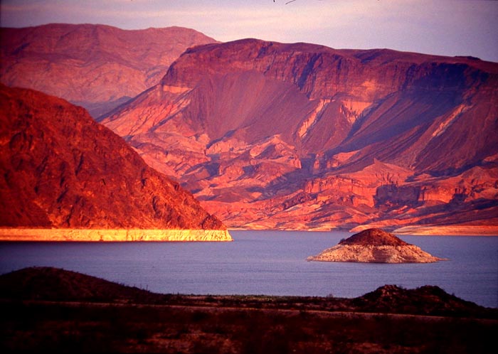
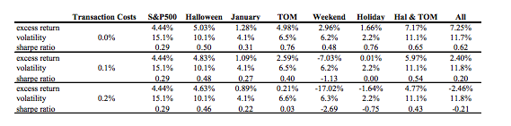
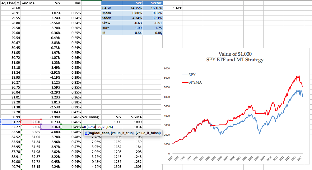
The current 15-year drought in the South West is the most severe since recordkeeping for the Colorado River began in 1906. Lake Mead, which supplies much of the water to Colorado Basin communities, is now more than half empty.
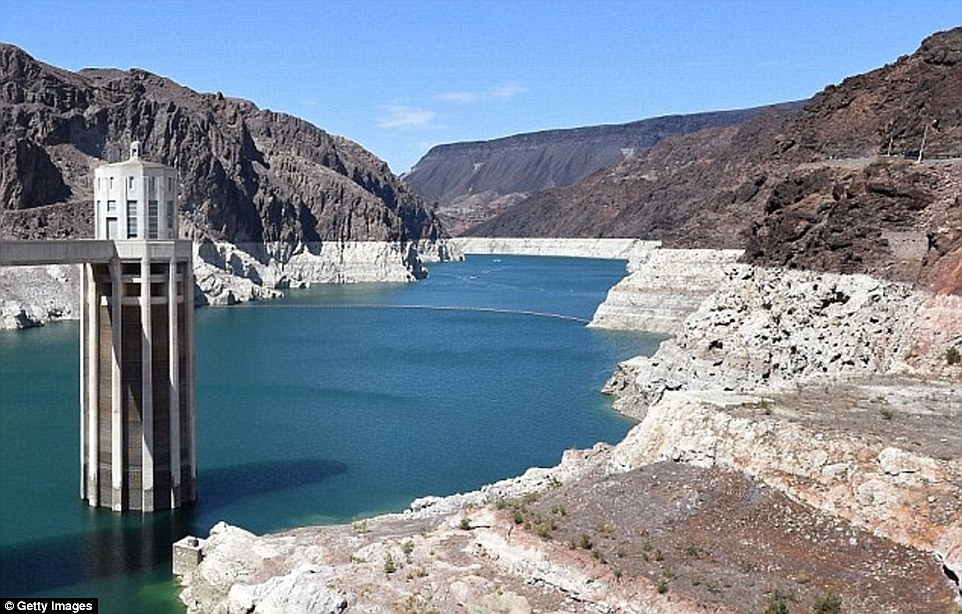
A 120 foot high band of rock, bleached white by the water, and known as the “bathtub ring” encircles the lake, a stark reminder of the water crisis that has enveloped the surrounding region. The Colorado River takes a 1,400 mile journey from the Rockies to Mexico, irrigating over 5 million acres of farmland in the Basin states of Wyoming, Utah, Colorado, New Mexico, Nevada, Arizona, and California.
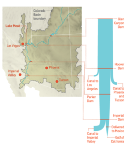
The Colorado River Compact signed in 1922 enshrined the States’ water rights in law and Mexico was added to the roster in 1994, taking the total allocation to over 16.5 million acre-feet per year. But the average freshwater input to the lake over the century from 1906 to 2005 reached only 15 million acre-feet. The river can’t come close to meeting current demand and the problem is only likely to get worse. A 2009 study found that rainfall in the Colorado Basin could fall as much as 15% over the next 50 years and the shortfall in deliveries could reach 60% to 90% of the time.
Impact on Las Vegas
With an average of only 4 inches of rain a year, and a daily high temperatures of 103 o F during the summer, Las Vegas is perhaps the most hard pressed to meet the demand of its 2 million residents and 40 million visitors annually. 
Despite its conspicuous consumption, from the tumbling fountains of the Bellagio to the Venetian’s canals, since 2002, Las Vegas has been obliged to cut its water use by a third, from 314 gallons per capita a day to 212. The region recycles around half of its wastewater which is piped back into Lake Mead, after cleaning and treatment. Residents are allowed to water their gardens no more than one day a week in peak season, and there are stiff fines for noncompliance.

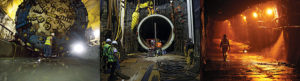
The Third Straw
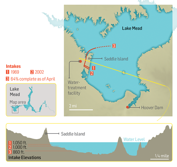
Historically, two intake pipes carried water from Lake Mead to Las Vegas, about 25 miles to the west. In 2012, realizing that the highest of these, at 1050 feet, would soon be sucking air, the Southern Nevada Water Authority began construction of a new pipeline. Known as the Third Straw, Intake No. 3 reaches 200 feet deeper into the lake—to keep water flowing for as long as there’s water to pump. The new pipeline, which commenced operations in 2015, doesn’t draw more water from the lake than before, or make the surface level drop any faster. But it will keep taps flowing in Las Vegas homes and casinos even if drought-stricken Lake Mead drops to its lowest levels.
Modeling Water Levels in Lake Mead
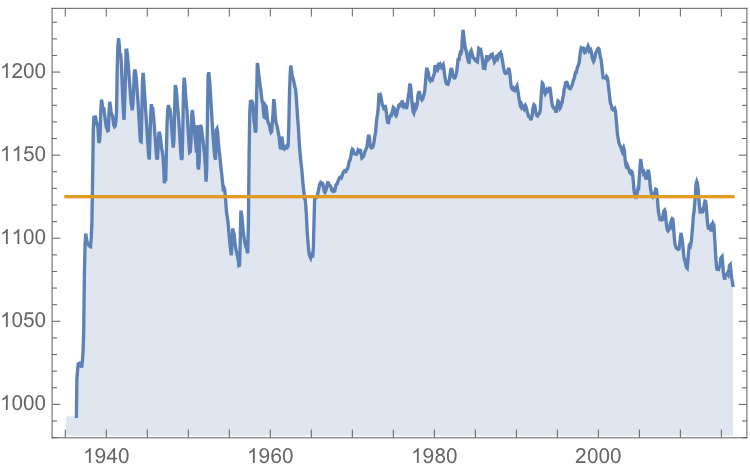
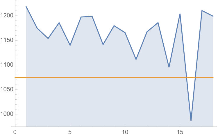
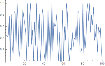
The monthly reported water levels in Lake Mead from Feb 1935 to June 2016 are shown in the chart below. The reference line is the drought level, historically defined as 1,125 feet.
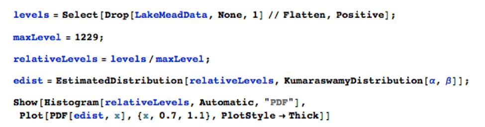
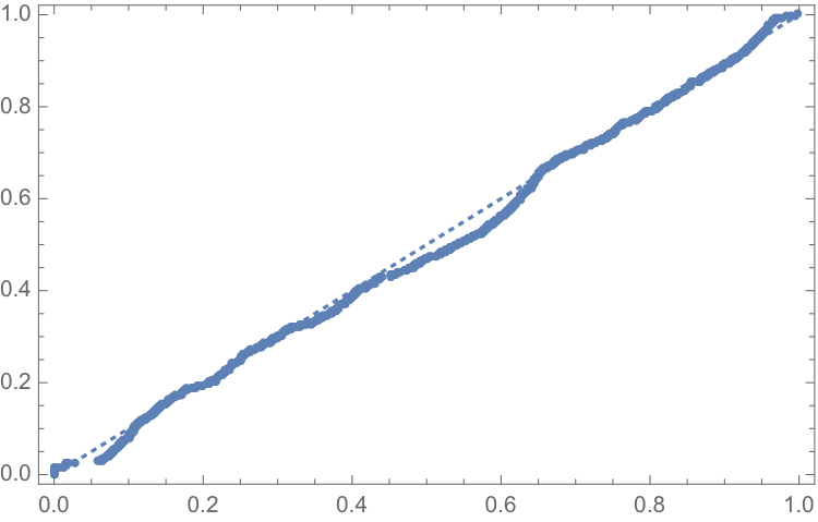
One statistical technique widely applied in hydrology involves fitting a Kumaraswamy distribution to the relative water level. According to the Arizona Game and Fish Department, the maximum lake level is 1229 feet. We model the water level relative to the maximum level, as follows.
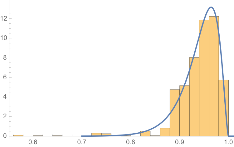
The fit of the distribution appears quite good, even in the tails:
ProbabilityPlot[relativeLevels, edist]
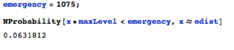
Since water levels have been below the drought level for some time, let’s instead consider the “emergency” level, 1,075 feet. According to this model, there is just over a 6% chance of Lake Mead hitting the emergency level and, consequently, a high probability of breaching the emergency threshold some time over before the end of 2017.
![]()
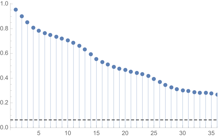
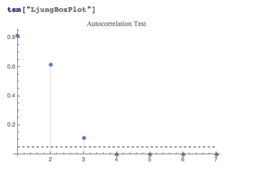
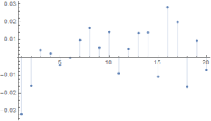
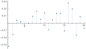
One problem with this approach is that it assumes that each observation is drawn independently from a random variable with the estimated distribution. In reality, there are high levels of autocorrelation in the series, as might be expected: lower levels last month typically increase the likelihood of lower levels this month. The chart of the autocorrelation coefficients makes this pattern clear, with statistically significant coefficients at lags of up to 36 months.
ts[“ACFPlot”]
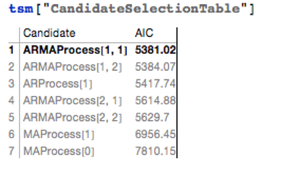
An alternative methodology that enables us to take account of the autocorrelation in the process is time series analysis. We proceed to fit an autoregressive moving average (ARMA) model as follows:
tsm = TimeSeriesModelFit[ts, “ARMA”]
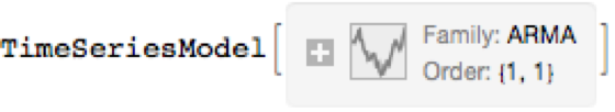
The best fitting model in an ARMA(1,1) model, according to the AIC criterion:
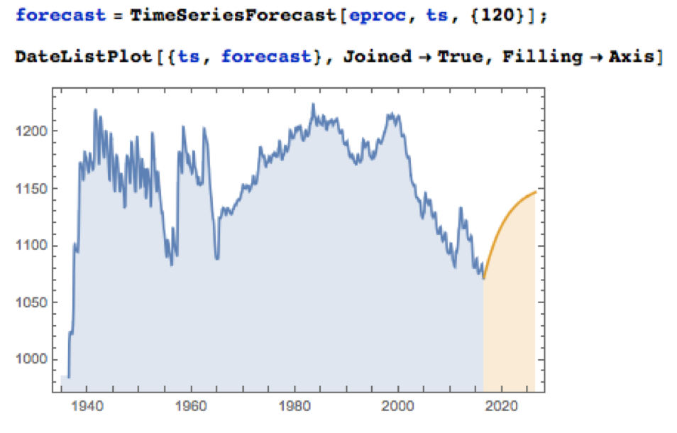
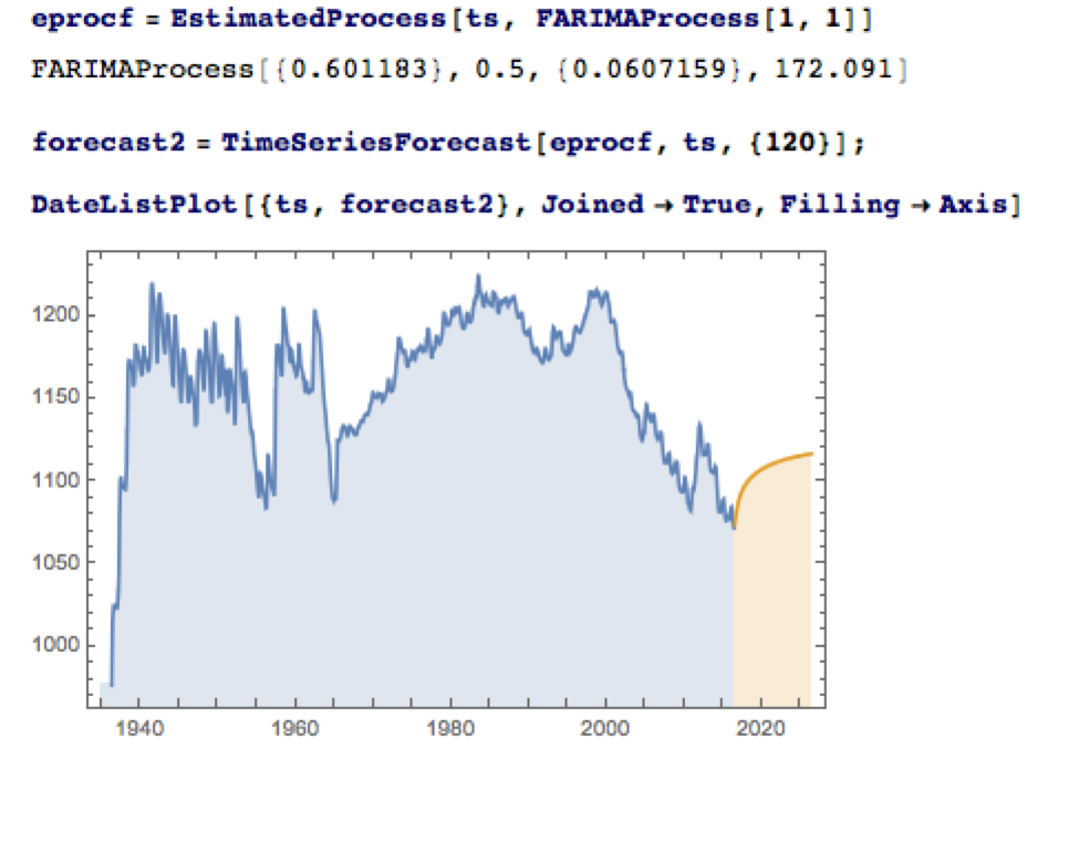
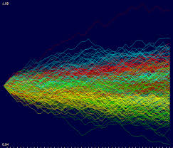
Applying the fitted ARMA model, we forecast the water level in Lake Mead over the next ten years as shown in the chart below. Given the mean-reverting moving average component of the model, it is not surprising to see the model forecasting a return to normal levels.
There is some evidence of lack of fit in the ARMA model, as shown in the autocorrelations of the model residuals:
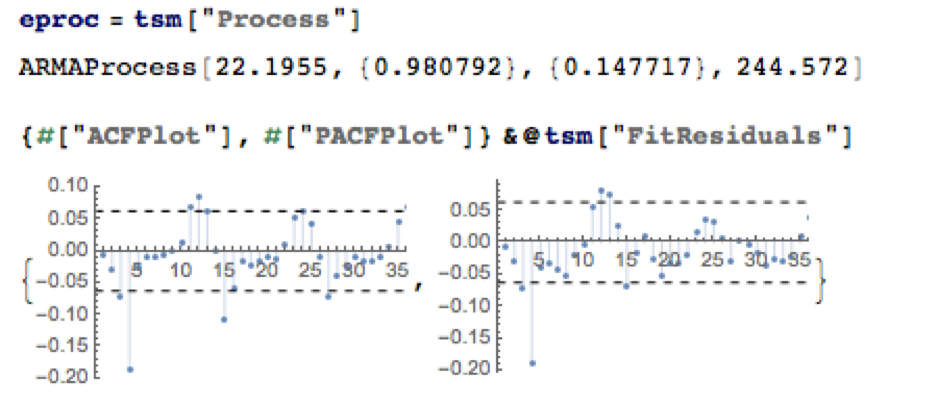
A formal test reveals that residual autocorrelations at lags 4 and higher are jointly statistically significant:
The slowly decaying pattern of autocorrelations in the water level series suggests a possible “long memory” effect, which can be better modelled as a fractionally integrated process. The forecasts from such a model, like the ARMA model forecasts, display a tendency to revert to a long term mean; but the reversion process is dampened by the reinforcing, long-memory effect captured in the FARIMA model.
The Prospects for the Next Decade
Taking the view that the water level in Lake Mead forms a stationary statistical process, the likelihood is that water levels will rise to 1,125 feet or more over the next ten years, easing the current water shortage in the region.
On the other hand, there are good reasons to believe that there are exogenous (deterministic) factors in play, specifically the over-consumption of water at a rate greater than the replenishment rate from average rainfall levels. Added to this, plausible studies suggest that average rainfall in the Colorado Basin is expected to decline over the next fifty years. Under this scenario, the water level in Lake Mead will likely continue to deteriorate, unless more stringent measures are introduced to regulate consumption.
Economic Impact
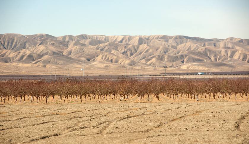
The drought in the South West affects far more than just the water levels in Lake Mead, of course. One study found that California’s agriculture sector alone had lost $2.2Bn and some 17,00 season and part time jobs in 2014, due to drought. Agriculture uses more than 80% of the State’s water, according to Fortune magazine, which goes on to identify the key industries most affected, including agriculture, food processing, semiconductors, energy, utilities and tourism.
In the energy sector, for example, the loss of hydroelectric power cost CA around $1.4Bn in 2014, according to non-profit research group Pacific Institute. Although Intel pulled its last fabrication plant from California in 2009, semiconductor manufacturing is still a going concern in the state. Maxim Integrated, TowerJazz, and TSI Semiconductors all still have fabrication plants in the state. And they need a lot of water. A single semiconductor fabrication plant can use as much water as a small city. That means the current plants could represent three cities worth of consumption.
The drought is also bad news for water utilities, of course. The need to conserve water raises the priority on repair and maintenance, and that means higher costs and lower profit. Complicating the problem, California lacks any kind of management system for its water supply and can’t measure the inflows and outflows to ground water levels at any particular time.
The Bureau of Reclamation has studied more than two dozen options for conserving and increasing water supply, including importation, desalination and reuse. While some were disregarded for being too costly or difficult, the bureau found that the remaining options, if instituted, could yield 3.7 million acre feet per year in savings and new supplies, increasing to 7 million acre feet per year by 2060. Agriculture is the biggest user by far and has to be part of any solution. In the near term, the agriculture industry could reduce its use by 10 to 15 percent without changing the types of crops it grows by using new technology, such as using drip irrigation instead of flood irrigation and monitoring soil moisture to prevent overwatering, the Pacific Institute found.
Conclusion
We can anticipate that a series of short term fixes, like the “Third Straw”, will be employed to kick the can down the road as far as possible, but research now appears almost unanimous in finding that drought is having a deleterious, long term affect on the economics of the South Western states. Agriculture is likely to have to bear the brunt of the impact, but so too will adverse consequences be felt in industries as disparate as food processing, semiconductors and utilities. California, with the largest agricultural industry, by far, is likely to be hardest hit. The Las Vegas region may be far less vulnerable, having already taken aggressive steps to conserve and reuse water supply and charge economic rents for water usage.
Modeling Water Levels in Lake Mead
The monthly reported water levels in Lake Mead from Feb 1935 to June 2016 are shown in the chart below. The reference line is the drought level, historically defined as 1,125 feet.
One statistical technique widely applied in hydrology involves fitting a Kumaraswamy distribution to the relative water level. According to the Arizona Game and Fish Department, the maximum lake level is 1229 feet. We model the water level relative to the maximum level, as follows.
The fit of the distribution appears quite good, even in the tails:
ProbabilityPlot[relativeLevels, edist]
Since water levels have been below the drought level for some time, let’s instead consider the “emergency” level, 1,075 feet. According to this model, there is just over a 6% chance of Lake Mead hitting the emergency level and, consequently, a high probability of breaching the emergency threshold some time over before the end of 2017.
One problem with this approach is that it assumes that each observation is drawn independently from a random variable with the estimated distribution. In reality, there are high levels of autocorrelation in the series, as might be expected: lower levels last month typically increase the likelihood of lower levels this month. The chart of the autocorrelation coefficients makes this pattern clear, with statistically significant coefficients at lags of up to 36 months.
ts[“ACFPlot”]
An alternative methodology that enables us to take account of the autocorrelation in the process is time series analysis. We proceed to fit an autoregressive moving average (ARMA) model as follows:
tsm = TimeSeriesModelFit[ts, “ARMA”]
The best fitting model in an ARMA(1,1) model, according to the AIC criterion:
Applying the fitted ARMA model, we forecast the water level in Lake Mead over the next ten years as shown in the chart below. Given the mean-reverting moving average component of the model, it is not surprising to see the model forecasting a return to normal levels.
There is some evidence of lack of fit in the ARMA model, as shown in the autocorrelations of the model residuals:
A formal test reveals that residual autocorrelations at lags 4 and higher are jointly statistically significant:
The slowly decaying pattern of autocorrelations in the water level series suggests a possible “long memory” effect, which can be better modelled as a fractionally integrated process. The forecasts from such a model, like the ARMA model forecasts, display a tendency to revert to a long term mean; but the reversion process is dampened by the reinforcing, long-memory effect captured in the FARIMA model.
The Prospects for the Next Decade
Taking the view that the water level in Lake Mead forms a stationary statistical process, the likelihood is that water levels will rise to 1,125 feet or more over the next ten years, easing the current water shortage in the region.
On the other hand, there are good reasons to believe that there are exogenous (deterministic) factors in play, specifically the over-consumption of water at a rate greater than the replenishment rate from average rainfall levels. Added to this, plausible studies suggest that average rainfall in the Colorado Basin is expected to decline over the next fifty years. Under this scenario, the water level in Lake Mead will likely continue to deteriorate, unless more stringent measures are introduced to regulate consumption.
Economic Impact
The drought in the South West affects far more than just the water levels in Lake Mead, of course. One study found that California’s agriculture sector alone had lost $2.2Bn and some 17,00 season and part time jobs in 2014, due to drought. Agriculture uses more than 80% of the State’s water, according to Fortune magazine, which goes on to identify the key industries most affected, including agriculture, food processing, semiconductors, energy, utilities and tourism.
In the energy sector, for example, the loss of hydroelectric power cost CA around $1.4Bn in 2014, according to non-profit research group Pacific Institute.
Although Intel pulled its last fabrication plant from California in 2009, semiconductor manufacturing is still a going concern in the state. Maxim Integrated, TowerJazz, and TSI Semiconductors all still have fabrication plants in the state. And they need a lot of water. A single semiconductor fabrication plant can use as much water as a small city. That means the current plants could represent three cities worth of consumption.
The drought is also bad news for water utilities, of course. The need to conserve water raises the priority on repair and maintenance, and that means higher costs and lower profit. Complicating the problem, California lacks any kind of management system for its water supply and can’t measure the inflows and outflows to ground water levels at any particular time.
The Bureau of Reclamation has studied more than two dozen options for conserving and increasing water supply, including importation, desalination and reuse. While some were disregarded for being too costly or difficult, the bureau found that the remaining options, if instituted, could yield 3.7 million acre feet per year in savings and new supplies, increasing to 7 million acre feet per year by 2060. Agriculture is the biggest user by far and has to be part of any solution. In the near term, the agriculture industry could reduce its use by 10 to 15 percent without changing the types of crops it grows by using new technology, such as using drip irrigation instead of flood irrigation and monitoring soil moisture to prevent overwatering, the Pacific Institute found.
Conclusion
We can anticipate that a series of short term fixes, like the “Third Straw”, will be employed to kick the can down the road as far as possible, but research now appears almost unanimous in finding that drought is having a deleterious, long term affect on the economics of the South Western states. Agriculture is likely to have to bear the brunt of the impact, but so too will adverse consequences be felt in industries as disparate as food processing, semiconductors and utilities. California, with the largest agricultural industry, by far, is likely to be hardest hit. The Las Vegas region may be far less vulnerable, having already taken aggressive steps to conserve and reuse water supply and charge economic rents for water usage.


