

One metric of market stress is the VX Ratio, defined as the ratio of the CBOE VVIX Index to the VIX Index. The former measures the volatility of the VIX, or the volatility of volatility. When markets are very quiet and the VIX Index is low the ratio moves to higher levels. During periods of market stress the ratio moves down as the VIX Index skyrockets.
Below we chart the daily movement in the ratio over the period from 2007, when it peaked at just over 8, before collapsing to a low of 1.3 during the financial crisis of 2008.
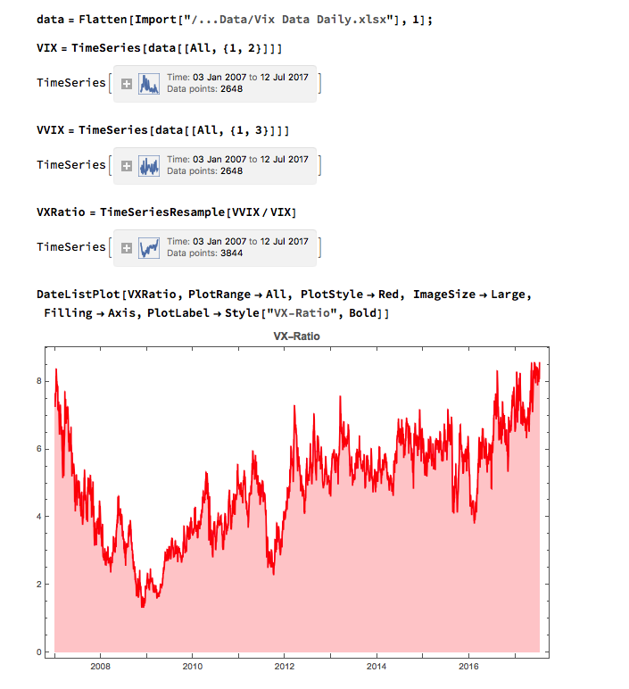
Highest Level in a Decade
During the market run-up from 2009 the VX Ratio once more climbed to nosebleed levels, exceeding the peak achieved in 2007 as the VIX Index declined to single-digit values last seen a decade ago.
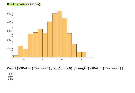
A histogram of the VX Ratio shows that in only 68 out of the 3,844-day history of the series (around 1.7%) has the ratio reached the level we are seeing currently.

That said, the time series doesn’t appear to be stationary, so the ratio could continue on its upward trajectory almost indefinitely, in theory. My sense, however, is that this is unlikely to happen. Instead, I expect a significant market decline, accompanied by higher levels in the VIX index and a reversion of the VX Ratio to intermediate levels.
This isn’t a new call, of course – the general consensus appears to be that it is a matter of when, not if, we can expect a market correction. Based on the VX Ratio and other measures, such as forward P/E, the market does appear to be over-extended and likely to correct in the third quarter of 2017, as the Fed tightens further.
Decoupling
Underpinning the concerns about the continued rally in equities is the disconnect from economic fundamentals, specifically Industrial Production, which has been moving sideways since the end of 2014 during the continued upward surge in equities.
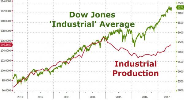
Of course, all this illustrates is that markets can remain “irrational” for longer than you can remain solvent (if you trade from the short side).
One chart that might provide a clue as to the timing of a significant market pullback is the level of short interest, which has fallen the lowest level since the market peak in 2007:
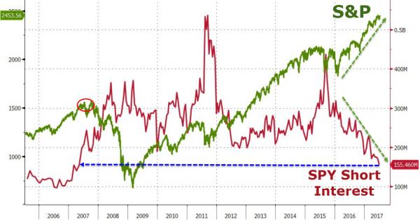
However, before concluding that the sky is imminently about to fall, we might take note of the fact that short interest was at even lower levels during the mid-2000’s, when market conditions were benign. Furthermore, despite short interest declining precipitously from mid-2011 to mid-2012, the market continued serenely on its upward trajectory. In other words, if past history is any guide, short interest could continue lower, or reverse course and trend higher, without any corresponding change in the market’s overall direction of travel.
Conclusion
All this goes to show just how difficult it is, in a post-QE world, to forecast the timing of a possible market correction. For what it’s worth I doubt we will see a major economic slowdown, or mild recession, until late 2018. But I believe that we are likely to see escalating levels of volatility accompanied by periodic short-term market turbulence well before then. My best guess is that we may see a repeat of the Aug 2015 downdraft later this year, in the September/October time-frame. But if that scenarios does play out I would expect the market to recover quickly and rally into the end of the year.