Ethical Strategy Design

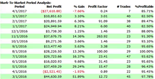
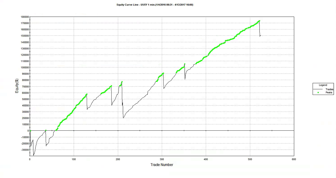
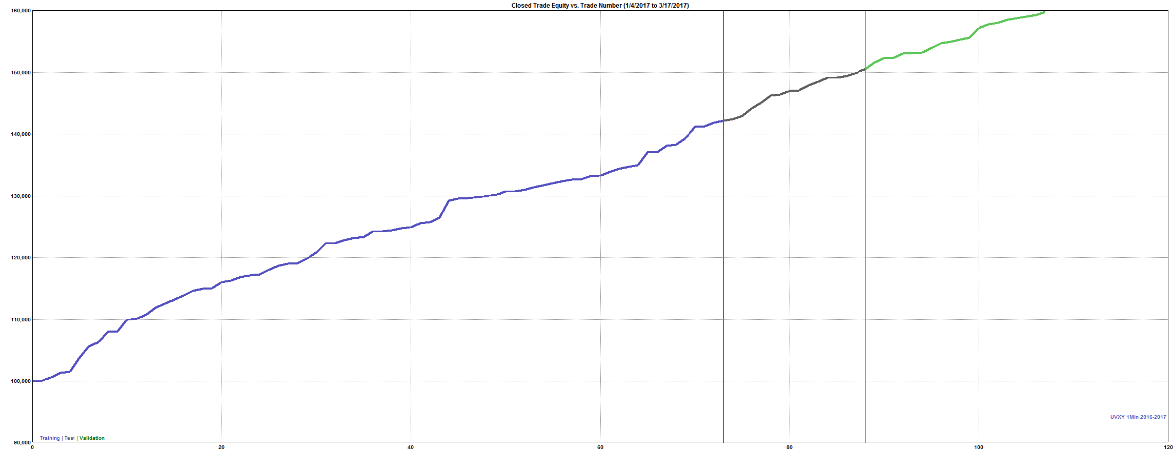
It isn’t often that you see an equity curve like the one shown below, which was produced by a systematic strategy built on 1-minute bars in the ProShares Ultra VIX Short-Term Futures ETF (UVXY):
Fig3

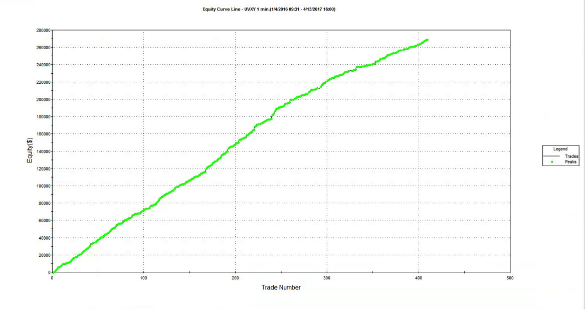
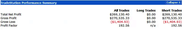
As the chart indicates, the strategy is very profitable, has a very high overall profit factor and a trade win rate in excess of 94%:

Fig4


FIG5


So, what’s not to like?  Well, arguably, one would like to see a strategy with a more balanced P&L, capable of producing profitable trades on the long as well as the short side. That would give some comfort that the strategy will continue to perform well regardless of whether the market tone is bullish or bearish. That said, it is understandable that the negative drift from carry in volatility futures, amplified by the leverage in the leveraged ETF product, makes it is much easier to make money by selling short.  This is  analogous to the long bias in the great majority of equity strategies, which relies on the positive drift in stocks.  My view would be that the short bias in the UVXY strategy is hardly a sufficient reason to overlook its many other very attractive features, any more than long bias is a reason to eschew equity strategies.

SSALGOTRADING AD

This example is similar to one we use in our training program for proprietary and hedge fund traders, to illustrate some of the pitfalls of strategy development.  We point out that the strategy performance has held up well out of sample – indeed, it matches the in-sample performance characteristics very closely.  When we ask trainees how they could test the strategy further, the suggestion is often made that we use Monte-Carlo simulation to evaluate the performance across a wider range of market scenarios than seen in the historical data.  We do this by introducing random fluctuations into the ETF prices, as well as in the strategy parameters, and by randomizing the start date of the test period.  The results are shown below. As you can see, while there is some variation in the strategy performance, even the worst simulated outcome appears very benign.


Fig2

Around this point trainees, at least those inexperienced in trading system development, tend to run out of ideas about what else could be done to evaluate the strategy.  One or two will mention drawdown risk, but the straight-line equity curve indicates that this has not been a problem for the strategy in the past, while the results of simulation testing suggest that drawdowns are unlikely to be a significant concern, across a broad spectrum of market conditions.  Most trainees simply want to start trading the strategy as soon as possible (although the more cautious of them will suggest trading in simulation mode for a while).

As this point I sometimes offer to let trainees see the strategy code, on condition that they agree to trade the strategy with their own capital.   Being smart people, they realize something must be wrong, even if they are unable to pinpoint what the problem may be.  So the discussion moves on to focus in more detail the question of strategy risk.

A Deeper Dive into Strategy Risk

At this stage I point out to trainees that the equity curve shows the result from realized gains and losses. What it does not show are the fluctuations in equity that occurred before each trade was closed.

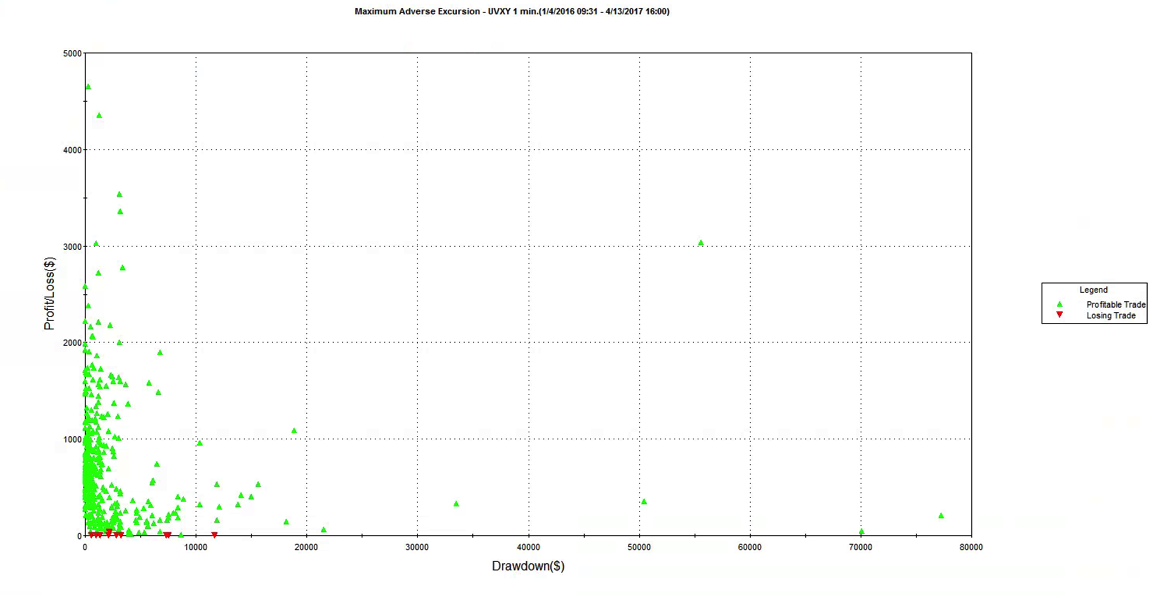
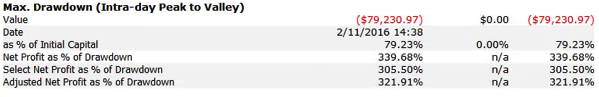
That information is revealed by the following report on the maximum adverse excursion (MAE), which plots the maximum drawdown in each trade vs. the final trade profit or loss.  Once trainees understand the report, the lights begin to come on.  We can see immediately that there were several trades which were underwater to the tune of $30,000, $50,000, or even $70,000 , or more, before eventually recovering to produce a profit.  In the most extreme case the trade was almost $80,000 underwater, before producing a profit of only a few hundred dollars. Furthermore, the drawdown period lasted for several weeks, which represents almost geological time for a strategy operating on 1-minute bars. It’s not hard to grasp the concept that risking $80,000 of your own money in order to make $250 is hardly an efficient use of capital, or an acceptable level of risk-reward.


FIG6 FIG7


FIG8


Next, I ask for suggestions for how to tackle the problem of drawdown risk in the strategy.   Most trainees will suggest implementing a stop-loss strategy, similar to those employed by thousands of  trading firms.  Looking at the MAE chart, it appears that we can avert the worst outcomes with a stop loss limit of, say, $25,000.  However, when we implement a stop loss strategy at this level, here’s the outcome it produces:


FIG9

Now we see the difficulty.  Firstly, what a stop-loss strategy does is simply crystallize the previously unrealized drawdown losses.  Consequently, the equity curve looks a great deal less attractive than it did before.  The second problem is more subtle: the conditions that produced the loss-making trades tend to continue for some time, perhaps as long as several days, or weeks.  So, a strategy that has a stop loss risk overlay will tend to exit the existing position, only to reinstate a similar position more or less immediately.  In other words, a stop loss achieves very little, other than to force the trader to accept losses that the strategy would have made up if it had been allowed to continue.  This outcome is a difficult one to accept, even in the face of the argument that a stop loss serves the purpose of protecting the trader (and his firm) from an even more catastrophic loss.  Because if the strategy tends to re-enter exactly the same position shortly after being stopped out, very little has been gained in terms of catastrophic risk management.

Luck and the Ethics of Strategy Design

What are the learning points from this exercise in trading system development?  Firstly, one should resist being beguiled by stellar-looking equity curves: they may disguise the true risk characteristics of the strategy, which can only be understood by a close study of strategy drawdowns and  trade MAE.  Secondly, a lesson that many risk managers could usefully take away is that a stop loss is often counter-productive, serving only to cement losses that the strategy would otherwise have recovered from.

A more subtle point is that a Geometric Brownian Motion process has a long-term probability of reaching any price level with certainty.  Accordingly, in theory one has only to wait long enough to recover from any loss, no matter how severe.   Of course, in the meantime, the accumulated losses might be enough to decimate the trading account, or even bring down the entire firm (e.g. Barings).  The point is,  it is not hard to design a system with a very seductive-looking backtest performance record.

If the solution is not a stop loss, how do we avoid scenarios like this one?  Firstly, if you are trading someone else’s money, one answer is: be lucky!  If you happened to start trading this strategy some time in 2016, you would probably be collecting a large bonus.  On the other hand, if you were unlucky enough to start trading in early 2017, you might be collecting a pink slip very soon.  Although unethical, when you are gambling with other people’s money, it makes economic sense to take such risks, because the potential upside gain is so much greater than the downside risk (for you). When you are risking with your own capital, however, the calculus is entirely different.  That is why we always trade strategies with our own capital before opening them to external investors (and why we insist that our prop traders do the same).

As a strategy designer, you know better, and should act accordingly.  Investors, who are relying on your skills and knowledge, can all too easily be seduced by the appearance of a strategy’s outstanding performance, overlooking the latent risks it hides.  We see this over and over again in option-selling strategies, which investors continue to pile into despite repeated demonstrations of their capital-destroying potential.  Incidentally, this is not a point about backtest vs. live trading performance:  the strategy illustrated here, as well as many option-selling strategies, are perfectly capable of producing live track records similar to those seen in backtest.  All you need is some luck and an uneventful period in which major drawdowns don’t arise.  At Systematic Strategies, our view is that the strategy designer is under an obligation to shield his investors from such latent risks, even if they may be unaware of them.  If you know that a strategy has such risk characteristics, you should avoid it, and design a better one.  The risk controls, including limitations on unrealized drawdowns (MAE) need to be baked into the strategy design from the outset, not fitted retrospectively (and often counter-productively, as we have seen here).

The acid test is this:  if you would not be prepared to risk your own capital in a strategy, don’t ask your investors to take the risk either.

The ethical principle of “do unto others as you would have them do unto you” applies no less in investment finance than it does in life.

Strategy Code

Code for UVXY Strategy


Equity Curve Money Management

Amongst a wide variety of money management methods that have evolved over the years, a perennial favorite is the use of the equity curve to guide position sizing.  The most common version of this technique is to add to the existing position (whether long or short) depending on the relationship between the current value of the account equity (realized + unrealized PL) and its moving average.  According to whether you believe that the  equity curve is momentum driven, or mean reverting, you will add to your existing position when the equity move above (or, on the case of mean-reverting, below) the long term moving average.

In this article I want to discuss a  slightly different version of equity curve money management, which is mean-reversion oriented.  The underlying thesis is that your trading strategy has good profit characteristics, and while it suffers from the occasional, significant drawdown, it can be expected to recover from the downswings.  You should therefore be looking to add to your positions when the equity curve moves down sufficiently, in the expectation that the trading strategy will recover.  The extra contracts you add to your position during such downturns  with increase the overall P&L. To illustrate the approach I am going to use a low frequency strategy on the S&P500 E-mini futures contract (ES).  The performance of the strategy is summarized in the chart and table below. EC PNL

(click to enlarge)

The overall results of the strategy are not bad:  at over 87% the  win rate is high as, too, is the profit factor of 2.72.  And the strategy’s performance, although hardly stellar, has been quite consistent over the period from 1997.  That said, most  the profits derive from the long side, and the strategy suffers from the occasional large loss, including a significant drawdown of over 18% in 2000.

I am going to use this underlying strategy to illustrate how its performance can be improved with equity curve money management (ECMM).  To start, we calculate a simple moving average of the equity curve, as before.  However, in this variation of ECMM we then calculate offsets  that are a number of standard deviations above or below the moving average.  Typical default values for the moving average length might be 50 bars for a daily series, while we might  use, say,  +/- 2 S.D. above and below the moving average as our trigger levels. The idea is that we add to our position when the equity curve falls below the lower threshold level (moving average – 2x S.D) and then crosses back above it again.  This is similar to how a trader might use Bollinger bands, or an oscillator like Stochastics.  The chart below illustrates the procedure.

ED.D Chart with ECMM

The lower and upper trigger levels are shown as green and yellow lines in the chart indicator (note that in this variant of ECMM we only use the lower level to add to positions).

After a significant drawdown early in October the equity curve begins to revert and crosses back over the lower threshold level on Oct 21.  Applying our ECMM rule, we add to our existing long position the next day, Oct 22 (the same procedure would apply to adding to short positions).  As you can see, our money management trade worked out very well, since the EC did continue to mean-revert as expected. We closed the trade on Nov 11, for a substantial, additional profit.

Now we have illustrated the procedure, let’s being to explore the potential of the ECMM idea in more detail.  The first important point to understand is what ECMM will NOT do: i.e. reduce risk.  Like all money management techniques that are designed to pyramid into positions, ECMM will INCREASE risk, leading to higher drawdowns.  But ECMM should also increase profits:  so the question is whether the potential for greater profits is sufficient to offset the risk of greater losses.  If not, then there is a simpler alternative method of increasing profits: simply increase position size!  It follows that one of the key metrics of performance to focus on in evaluating this technique is the ratio of PL to drawdown.  Let’s look at some examples for our baseline strategy.

Single Entry, 2SD

The chart shows the effect of adding a specified number of contracts to our existing long or short position whenever the equity curve crosses back above the lower trigger level, which in this case is set at 2xS.D below the 50-day moving average of the equity curve.  As expected, the overall strategy P&L increases linearly in line with the number of additional contracts traded, from a base level of around $170,000, to over $500,000 when we trade an additional five contracts.  So, too, does the profit factor rise from around 2.7 to around 5.0. That’s where the good news ends. Because, just as the strategy PL increases, so too does the size of the maximum drawdown, from $(18,500) in the baseline case to over $(83,000) when we trade an additional five contracts.  In fact, the PL/Drawdown ratio declines from over 9.0 in the baseline case, to only 6.0 when we trade the ECMM strategy with five additional contracts.  In terms of risk and reward, as measured by the PL/Drawdown ratio, we would be better off simply trading the baseline strategy:  if we traded 3 contracts instead of 1 contract, then without any money management at all we would have made total profits of around $500,000, but with a drawdown of just over $(56,000).  This is the same profit as produced with the 5-contract ECMM strategy, but with a drawdown that is $23,000 smaller.

SSALGOTRADING AD

How does this arise?  Quite simply, our ECMM money management trades as not all automatic winners from the get-go (even if they eventually produce profits.  In some cases, having crossed above the lower threshold level, the equity curve will subsequently cross back down below it again.  As it does so, the additional contracts we have traded are now adding to the strategy drawdown.

This suggests that there might be a better alternative.  How about if, instead of doing a single ECMM trade for, say, 5 additional contracts, we instead add an additional contract each time the equity curve crosses above the lower threshold level.  Sure, we might give up some extra profits, but our drawdown should be lower, right? That turns out to be true.  Unfortunately, however, profits are impacted more than the drawdown, so as a result the PL/Drawdown ratio shows the same precipitous decline:

Multiple Entry, 2SD

Once again, we would be better off trading the baseline strategy in larger size, rather than using ECMM, even when we scale into the additional contracts.

What else can we try?  An obvious trick to try is tweaking the threshold levels.  We can do this by adjusting the # of standard deviations at which to set the trigger levels.  Intuitively, it might seem that the obvious thing to do is set the threshold levels further apart, so that ECMM trades are triggered less frequently.  But, as it turns out, this does not produce the desired effect.  Instead, counter-intuitively, we have to set the threshold levels CLOSER to the moving average, at only +/-1x S.D.  The results are shown in the chart below.

Single Entry, 1SD

With these settings, the strategy PL and profit factor increase linearly, as before.  So too does the strategy drawdown, but at a slower rate.  As a consequence, the PL/Drawdown ration actually RISES, before declining at a moderate pace.  Looking at the chart, it is apparent the optimal setting is trading two additional contracts with a threshold setting one standard deviation below the 50-day moving average of the equity curve.

Below are the overall results.  With these settings the baseline strategy plus ECMM produces total profits of $334,000, a profit factor of 4.27 and a drawdown of $(35,212), making the PL/Drawdown ratio 9.50.  Producing the same rate of profits using the baseline strategy alone would require us to trade two contracts, producing a slightly higher drawdown of almost $(37,000).  So our ECMM strategy has increased overall profitability on a risk-adjusted basis.

EC with ECMM PNL ECMM

(Click to enlarge)

CONCLUSION

It is certainly feasible to improve not only the overall profitability of a strategy using equity curve money management, but also the risk-adjusted performance.  Whether ECMM will have much effect depends on the specifics of the underlying strategy, and the level at which the ECMM parameters are set to.  These can be optimized on a walk-forward basis.

EASYLANGUAGE CODE

Inputs:

MALen(50),
SDMultiple(2),
PositionMult(1),
ExitAtBreakeven(False);

Var:
OpenEquity(0),
EquitySD(0),
EquityMA(0),
UpperEquityLevel(0),
LowerEquityLevel(0),
NShares(0);

OpenEquity=OpenPositionProfit+NetProfit;a
EquitySD=stddev(OpenEquity,MALen);
EquityMA=average(OpenEquity,MALen);
UpperEquityLevel=EquityMA + SDMultiple*EquitySD;
LowerEquityLevel=EquityMA-SDMultiple*EquitySD;
NShares=CurrentContracts*PositionMult;
If OpenEquity crosses above LowerEquityLevel then begin
If Marketposition > 0 then begin
Buy(“EnMark-LMM”) NShares shares next bar at market;
end;
If Marketposition < 0 then begin
Sell Short(“EnMark-SMM”) NShares shares next bar at market;
end;
end;
If ExitAtBreakeven then begin

If OpenEquity crosses above EquityMA then begin
If Marketposition > 1 then begin
Sell Short (“ExBE-LMM”) (Currentcontracts-1) shares next bar at market;
end;
If Marketposition < -1 then begin
Buy (“ExBE-SMM”) (Currentcontracts-1) shares next bar at market;
end;

end;
end;

How to Spot a Fake

One of the issues that comes up regularly is how, as an investor or other interested party, one can protect oneself from unscrupulous scam artists posing as professional traders or money managers. This is a particular problem on web sites featuring trader forums, where individuals with unverified track records claiming stellar trading histories use their purported trading “prowess” to try to impress and intimidate other participants, usually impressionable newbies. The purpose of this post is to provide some guidance to help investors, traders and other fellow travelers sort the wheat from the chaff. We’ll be doing some forensic analysis on the track record for a strategy in NG futures that one such character recently posted in one of these forums, as a classic example of the kind of fakery I am describing.

One thing you should understand about scam artists operating on forums, is that they don’t work alone: usually they have a bunch of groupies who will shill for them at every opportunity and who will try to shout down any investigative questioning. Don’t be deterred. These know-it-alls are usually just ignorant dupes, who understand no more about trading than the scam artist. They may just as easily be fellow-scam artists themselves.

THE FIRST BIG RED FLAG: UNWILLINGNESS TO PRODUCE A TRACK RECORD
Anyone claiming to be a CTA or professional money manager (or whose shills claim he is one) has to have a track record that is freely available in the public domain. So how does a scam artist overcome a challenge to produce it? He will claim that he “can’t advertise”, or make some other, similar excuse. Don’t accept that at face value. Ask him to PM it to you. If he won’t, there’s already a high probability he’s a con artist.

THE SECOND BIG RED FLAG: CURVE FITTING
Let’s say our suspect meets the challenge and produces a track record. Ideally this will be an audited P&L statement, but let’s assume for the purposes of this discussion that he produces something along the lines of the Performance Reports produced by a product like Tradestation or MultiCharts, i.e. we are dealing with a simulated back-test.

If your suspect produces a back-test, you can be pretty sure it’s going to look good – otherwise he wouldn’t produce it. The task now is to dig into those reports to spot the red flags that give clues as to whether it might be fake.
Now of course any trading system is going to make assumptions – about fill rates, slippage, commissions, capacity etc. All that is fine, as long as the assumptions are clearly stated. You might want to challenge any or all of the assumptions, and the trader may disagree with you about some or all of them. That’s perfectly ok – it’s an honest, open discussion about a set of investment assumptions that have been revealed at the outset.

But here is what is NOT ok: any opacity about which data was used to build the trading model and which data was used to test it. The former, the in-sample (IS) data set, used to construct the model, must be entirely separate and distinct from the out-of-sample (OOS) data set. It is trivially easy using a tool like Tradestation to produce a trading system that shows stellar results in-sample, but which will immediately crash and burn when it is used in live trading. This is known as curve-fitting. And it’s by far the most common method by which scam artists try to dupe investors.

In order to demonstrate the robustness of the system prior to risking real money, a genuine trader will test his system OOS and show you the results. What you are looking for ideally is congruity between the IS and OOS results. Now by congruity, I don’t mean that they should be identical. Far from it – markets evolve and strategy performance will vary over time. But what you are hoping is that the key performance metrics in the OOS and IS periods, such as annual returns, Sharpe ratio, PNL per contract, profit ratio and win rate, will be comparable. At the very least, you would like to be able to identify some portion of the IS data set for which the strategy performance characteristics are similar to those in the OOS period.

Any – I mean ANY – ambiguity or lack of clarity about which data was used to build the model and which was used for OOS testing is a HUGE red flag. Chances are, your scam artist is already trying to fudge the issue that he curve-fitted the system.
This was the case in the recent forum post we are using as a test case. The trader made no attempt whatsoever to clarify which data was used for model development and which for testing. Immediately, I was suspicious and began looking for other evidence of curve fitting. It didn’t take me long to find it.

THE THIRD BIG RED FLAG: THE EQUITY CURVE
The first item I turned to in the performance reports was the equity curve and I immediately spotted two rather large clues that I was dealing with a fake.

The first clue was the large sign on the chart labelled “live start date”. What does this mean? This is a back-test, so all of the results are theoretical, including those after the supposed “live start date” sometime in 2013. What the faker is trying to do is imply the part of the equity curve shown after that date indicate actual performance results. He doesn’t actually claim this, so he has plausible deniability if you call him on it (“I said it was just a back test”). But he hopes that you won’t, and that, by default, you’ll accept these results are real. But they aren’t.

The second clue of fakery is much more important: the equity curve itself. When someone shows you and equity curve like the one reported by this trader, rising in a straight line from the lower left to upper right quadrants, you can be 99% confident that you are dealing with a fake.
You see, in finance there are almost never any straight lines. They are as rare as unicorns. Especially when it comes to strategy performance. They only time you will EVER see an equity curve like this is when you are looking at the equity curve of (i) a high frequency market making trading system or (ii) a fake, produced by curve fitting a strategy to the ENTIRE data set.
And this strategy was not high frequency – as we shall see, it operated on 15 minute bars, holding positions overnight.

EC Chart

THE FOURTH BIG RED FLAG: GOD’s EQUITY CURVE
I said that straight line equity curve were extremely rare. In fact, even God’s equity curve isn’t often a straight line. What does that mean?

Suppose you had a strategy that could predict with 100% accuracy whether the market would go up or down over the next bar (whether you are using daily bars, or 15 minute bars, as in our example). The system would buy (or hold) when the market was forecast to rise, and sell when the market was predicted to fall. What would the performance of such a perfect system look like? Pretty stellar, obviously. And most people would guess that the system’s equity curve would be a straight line, or maybe even exponential in shape. In fact that’s typically not the case. God’s equity curve will be sloped and kinked, just like any other equity curve. And if your suspect’s equity curve is real, it should show some commonality with God’s equity curve, by which I mean it should show changes in slope and level that reflect those seen in the perfect equity curve.

What does God’s Equity Curve look like in NG futures?

Gods EC

As you can see it’s not straight. In fact it’s concave. So a REAL equity curve should have similar characteristics, like this one, for example:

NG EC

As you can see, the equity curve of the real trading system track’s God’s Equity Curve, albeit at a much lower level. It’s concave, with an upswing during the final few months of trading, just like God’s. That’s a good sign that the strategy back-test is very likely genuine (which it is – I produced it).

Why is Gods’ Equity Curve the shape it is? The answer will vary from market to market. In the case of NG, the suggestion is that the market is becoming more efficient: simple trading strategies based on technical indicators work less well than they did five years ago. We have seen something very similar in F/X markets. During the 1970’s and 1980’s when Soros was active in the field, simple strategies like moving average crossovers made great returns, but these entirely dissipated in the 1990’s, with the advent of widely available computing power.

THE FIFTH BIG RED FLAG: THE SHILL SHOUTDOWN
When I posted my analysis, which clearly indicated fakery by this well known forum participant, I was immediately flamed by one of his supporters who shouted something to the effect that (i) everyone knows that the downward slope of God’s Equity Curve was caused by volatility and (ii) the star trader, unlike God, or me, knows about position sizing.

This attempt at misdirection in the face of awkward facts is a classic sign of fakery. What distinguishes the shill post is:

(i) Immediacy – clearly no attempt has been made to evaluate the argument or analysis. The shill simply attempts to drown out the critic with a lot of noise, as quickly as possible.

(ii) Plausibility – shills will throw around terms that lend plausibility to their objection, but which after a moment’s reflection are entirely irrelevant or, as in this case, detrimental to their own cause.

(iii) Invective – the more intemperate the post, the more likely the shill is simply trying to provide cover for the faker.

So let’s take a moment to dispose of the plausible sounding objections posted by the shill in this example.
I am going to take it as read that everyone understands that trading profitability is positively correlated with volatility. There is a huge amount of empirical research supporting that finding, but to keep it simple we can appeal to one of the cornerstones of modern finance: risk and return. The higher the volatility, i.e. the greater the risk, the greater the return traders and investors in the markets will require on their capital. This is a principle of modern financial theory that even a graduate of the Scranton college of fine art should be expected to appreciate.

So what’s the story with NG volatility? You can see the time series of NG volatility in the chart below. One feature stands out above all others: the upward slope of the curve. NG volatility has RISEN over the sample period from 2008 to 2014. Consequently, returns from trading NG futures should also have RISEN rather than fallen. One thing we can say for sure, whatever caused the concave shape in God’s Equity Curve in NG futures, it was NOT volatility!

NG Volatility

Turning to the shill’s next, plausible sounding, but dubious “explanation”, position sizing: this really is completely irrelevant. Because, as we shall see from an examination of the performance report, the track record was created by trading a constant one-lot! So this was just an attempt to sound “sophisticated” by someone trying to misdirect the reader away from the increasingly obvious evidence of fakery.

THE SIXTH BIG RED FLAG: LOW DRAWDOWNS AND OVERNIGHT GAP RISK
One of the highly unusual features of our faker’s equity curve is it’s exceptional smoothness. Low volatility in the equity curve is, in and of itself, an indicator the track record results from curve fitting. But we can get even more insight by digging into the performance report, shown below.

Perf 1
Perf 2

As you can see from the second page of the report, the strategy holds positions for an average of 57 15-minute bars, equivalent to slightly over 14 hours. So this is a low frequency strategy that takes overnight risk. Now, as any trader will know, overnight gap risk in a product like NG can be very significant and likely to be produce much larger drawdowns over a 5 year period than the $8,470 reported here.

The only other possible explanation is that the strategy is traded continuously through both day and night sessions. But this is not only itself improbable, it gives rise to another implausibility: liquidity in the overnight session is so poor that the strategy is unlikely to be able to trade more than 1-2 contracts, at most. This would be of little value to a CTA, or its customers, whatever the star trader’s protestations that his “clients are happy”.

There is no plausible way to resolve the disconnection between the low drawdown, overnight gap risk and market illiquidity. The most plausible explanation: the back-test is a curve fitting exercise.

THE SEVENTH AN FINAL BIG RED FLAG: INCONSISTENCY BETWEEN PERFORMANCE METRICS
As any experienced strategy developer knows, you can get some of the things you want, but you can never achieve all of them. Amongst the desirable features to be maximized are
• Profit factor
• Average PNL per contract
• Percentage win rate

There is a trade-off between the features. A high PNL per contract typically means you are trading less frequently, with longer hold periods, and consequently the percentage win rate tends to be lower. Alternatively, you can increase the win rate, at the cost of lowering the average PNL per contract and/or the profit factor. And so on.

This strategy purports to have it all: a high average PNL per contract resulting from low frequency trading, coupled with good percentage win rate of over 50% and profit factor. A win rate of much over 40% is highly unusual for a momentum strategy entering and exiting with market or stop orders – and its almost inconceivable for a strategy with a PNL per contract and profit factor as large as suggested here.

CONCLUSION
This back-test fails the sniff test on so many levels, I would rate the chance of it being real as less than 1 in 1000.
The final, conclusive proof of fakery is that the “star trader” responsible for producing the report was unable and/or unwilling to attempt to answer even a single one of the criticisms.

So, be warned. If you see forum members banding about track records like this one, you can be sure that they and their strategies are likely to be fake, and not to be trusted.