
The latest theories, models and investment strategies in quantitative research and trading
Author: Jonathan
Dr Jonathan Kinlay is the Head of Quantitative Trading at Systematic Strategies, LLC, a systematic hedge fund that deploys high frequency, systematic trading strategies.
Dr Kinlay, was the founder and General Partner of the Caissa Capital hedge fund, whose volatility arbitrage strategies were developed by Dr Kinlay’s investment research firm, Investment Analytics.
Dr Kinlay was formerly Global Head of Model Review at the US investment bank Bear Stearns.
Dr Kinlay holds a PhD in economics and has held positions on the faculty at New York University Stern School of Business, Carnegie Mellon and Reading Universities.
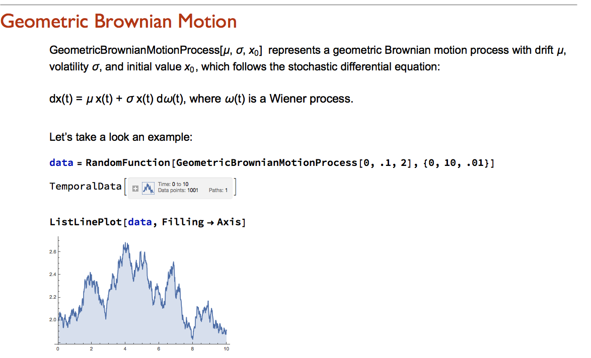
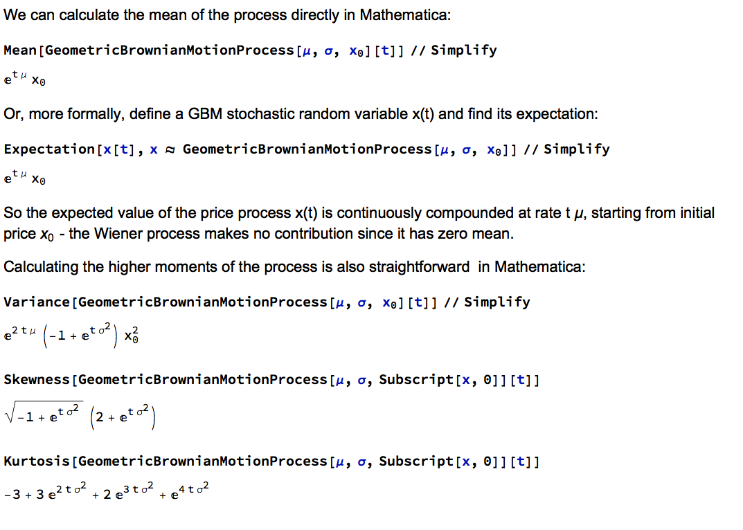
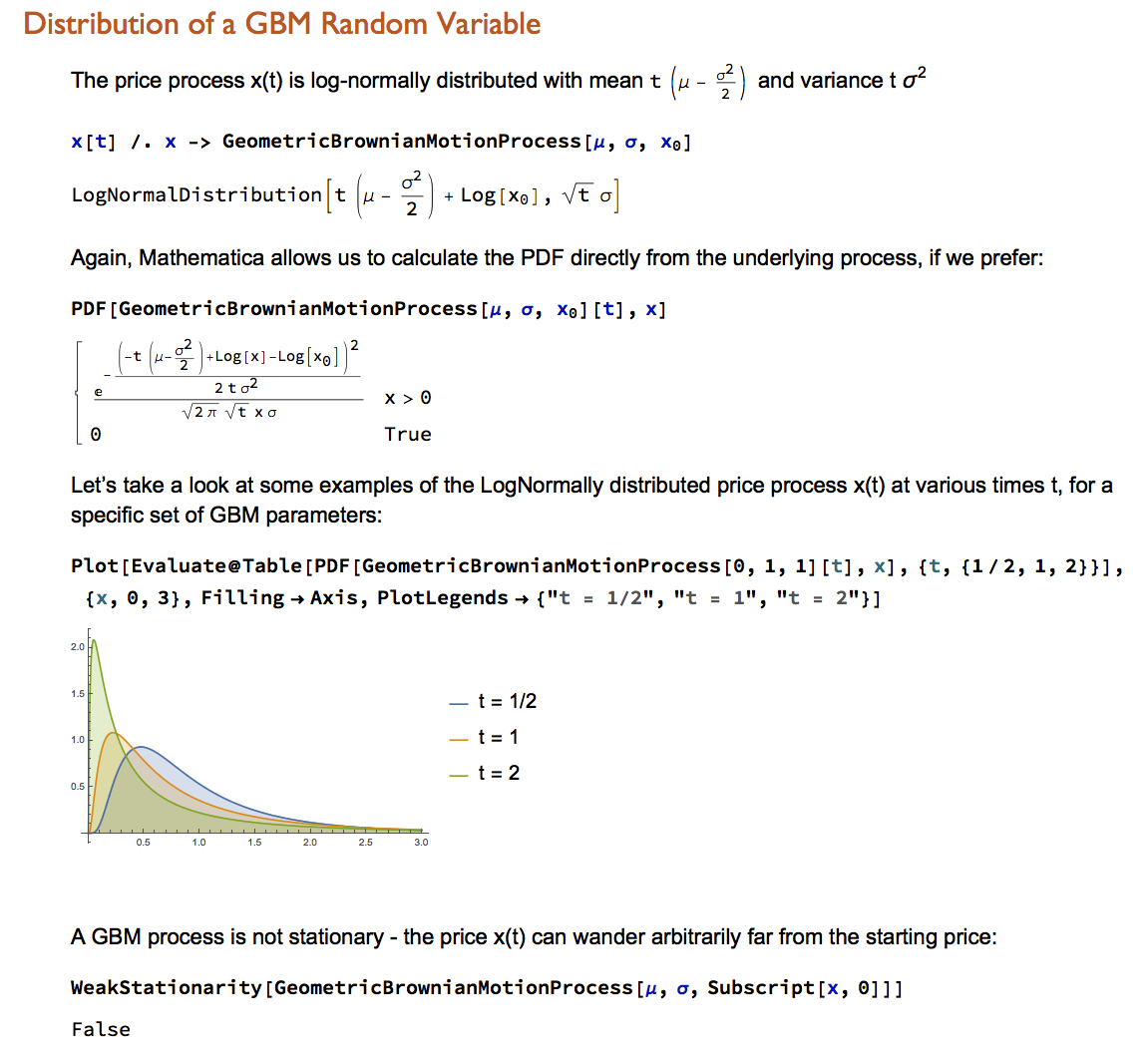
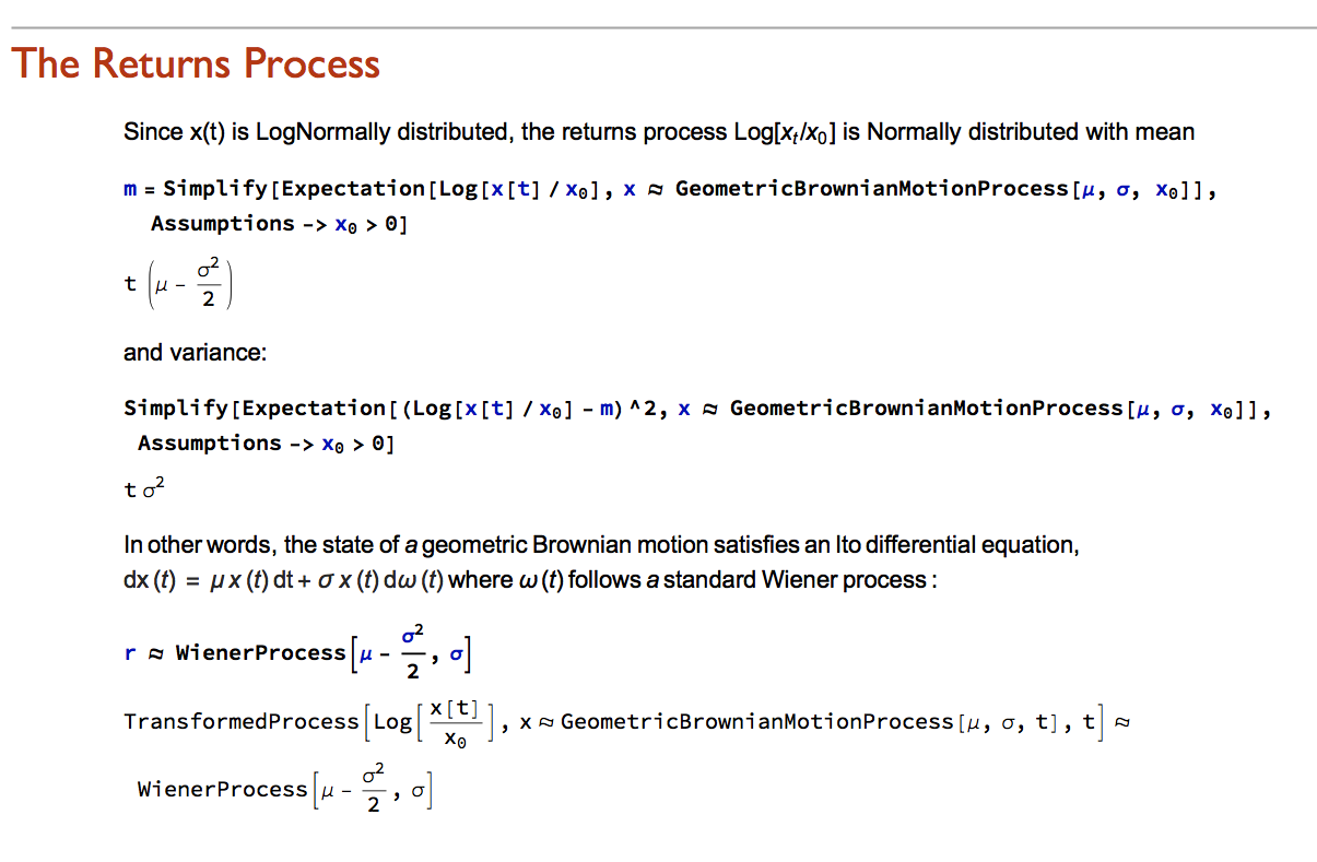
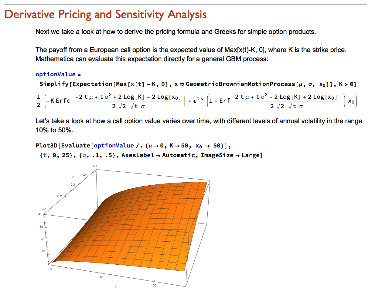
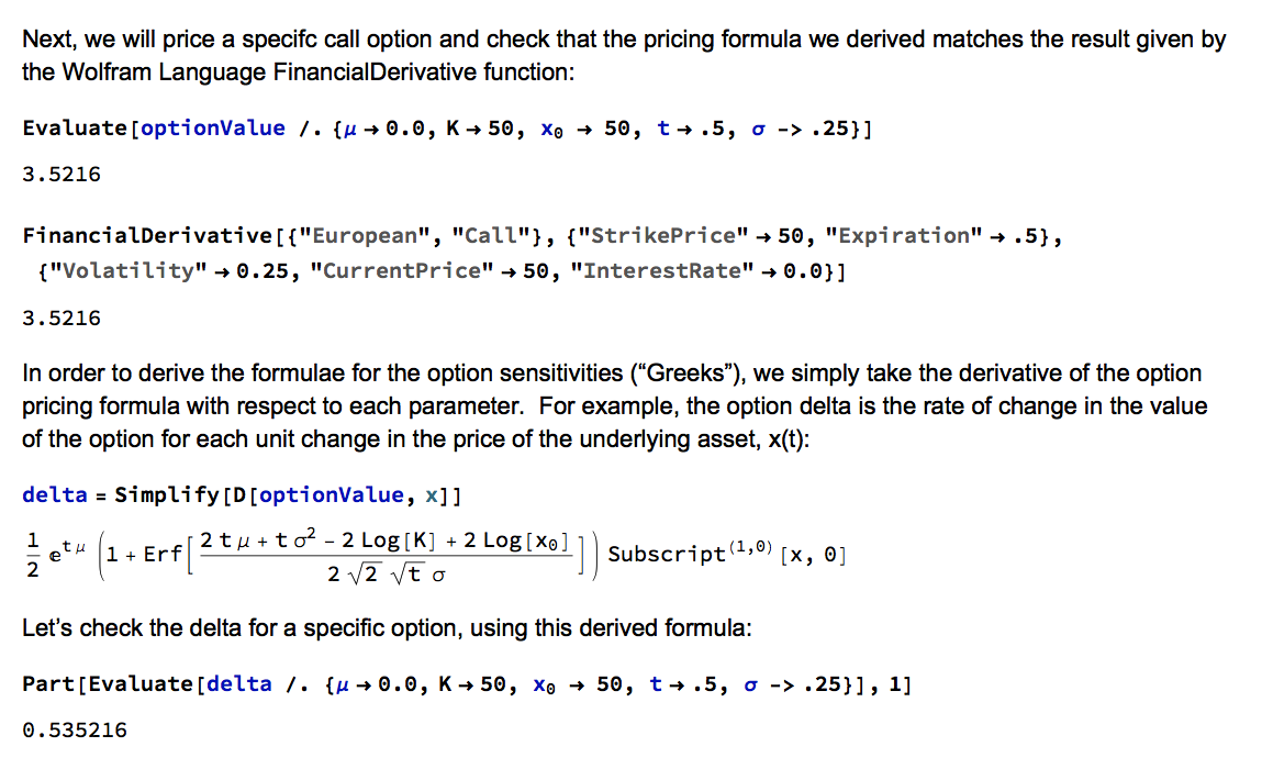
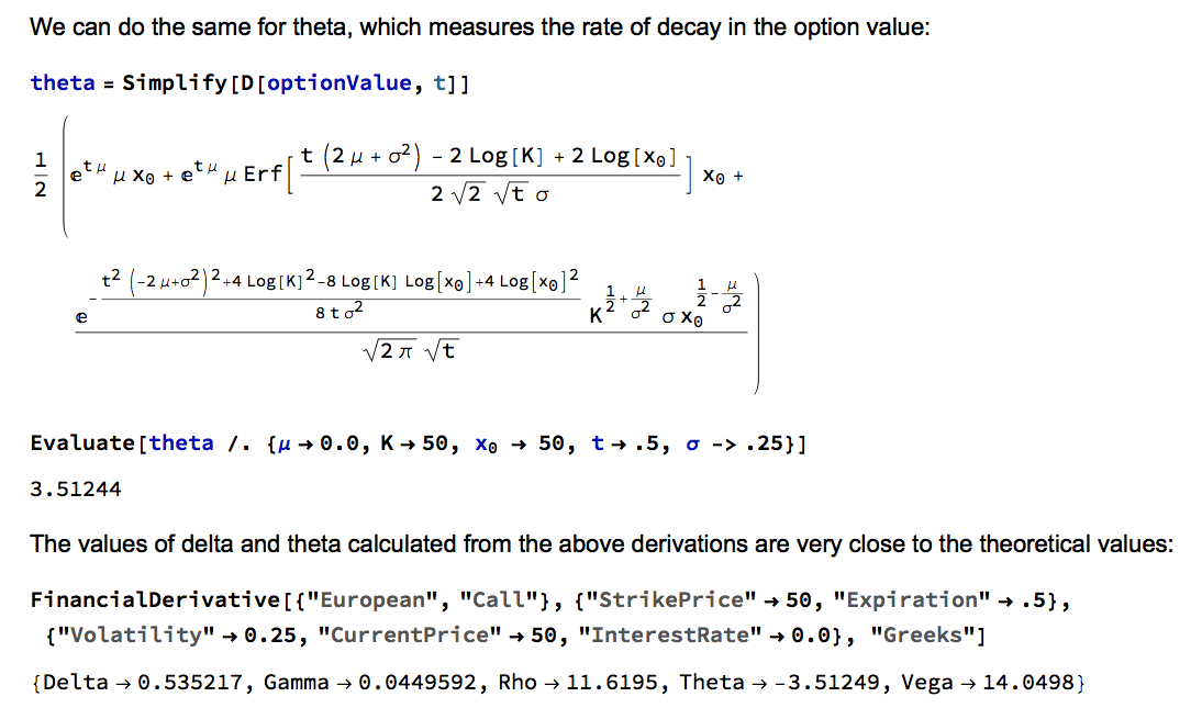
Wolfram Research introduced random processes in version 9 of Mathematica and for the first time users were able to tackle more complex modeling challenges such as those arising in stochastic calculus. The software’s capabilities in this area have grown and matured over the last two versions to a point where it is now feasible to teach stochastic calculus and the fundamentals of financial engineering entirely within the framework of the Wolfram Language. In this post we take a lightening tour of some of the software’s core capabilities and give some examples of how it can be used to create the building blocks required for a complete exposition of the theory behind modern finance.
Conclusion
Financial Engineering has long been a staple application of Mathematica, an area in which is capabilities in symbolic logic stand out. But earlier versions of the software lacked the ability to work with Ito calculus and model stochastic processes, leaving the user to fill in the gaps by other means. All that changed in version 9 and it is now possible to provide the complete framework of modern financial theory within the context of the Wolfram Language.
The advantages of this approach are considerable. The capabilities of the language make it easy to provide interactive examples to illustrate theoretical concepts and develop the student’s understanding of them through experimentation. Furthermore, the student is not limited merely to learning and applying complex formulae for derivative pricing and risk, but can fairly easily derive the results for themselves. As a consequence, a course in stochastic calculus taught using Mathematica can be broader in scope and go deeper into the theory than is typically the case, while at the same time reinforcing understanding and learning by practical example and experimentation.
Very large datasets – comprising voluminous numbers of symbols – present challenges for the analyst, not least of which is the difficulty of visualizing relationships between the individual component assets. Absent the visual clues that are often highlighted by graphical images, it is easy for the analyst to overlook important changes in relationships. One means of tackling the problem is with the use of graph theory.
DOW 30 Index Member Stocks Correlation Graph
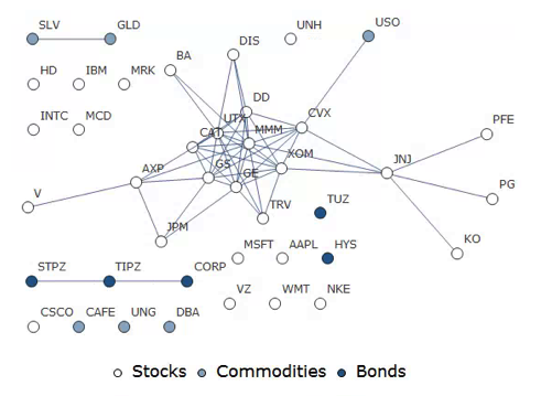
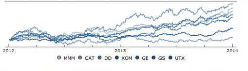
In this example I have selected a universe of the Dow 30 stocks, together with a sample of commodities and bonds and compiled a database of daily returns over the period from Jan 2012 to Dec 2013. If we want to look at how the assets are correlated, one way is to created an adjacency graph that maps the interrelations between assets that are correlated at some specified level (0.5 of higher, in this illustration).
Obviously the choice of correlation threshold is somewhat arbitrary, and it is easy to evaluate the results dynamically, across a wide range of different threshold parameters, say in the range from 0.3 to 0.75:
The choice of parameter (and time frame) may be dependent on the purpose of the analysis: to construct a portfolio we might select a lower threshold value; but if the purpose is to identify pairs for possible statistical arbitrage strategies, one will typically be looking for much higher levels of correlation.
Correlated Cliques
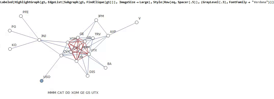
Reverting to the original graph, there is a core group of highly inter-correlated stocks that we can easily identify more clearly using the Mathematica function FindClique to specify graph nodes that have multiple connections:
We might, for example, explore the relative performance of members of this sub-group over time and perhaps investigate the question as to whether relative out-performance or under-performance is likely to persist, or, given the correlation characteristics of this group, reverse over time to give a mean-reversion effect.
Constructing a Replicating Portfolio
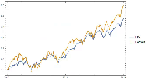
An obvious application might be to construct a replicating portfolio comprising this equally-weighted sub-group of stocks, and explore how well it tracks the Dow index over time (here I am using the DIA ETF as a proxy for the index, for the sake of convenience):
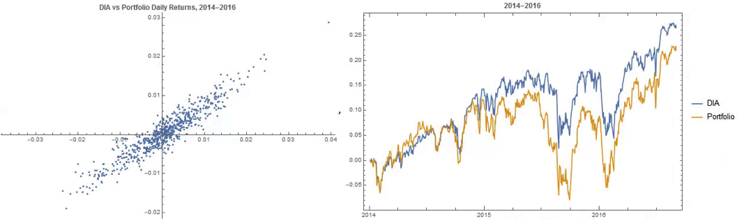
The correlation between the Dow index (DIA ETF) and the portfolio remains strong (around 0.91) throughout the out-of-sample period from 2014-2016, although the performance of the portfolio is distinctly weaker than that of the index ETF after the early part of 2014:
Constructing Robust Portfolios
Another application might be to construct robust portfolios of lower-correlated assets. Here for example we use the graph to identify independent vertices that have very few correlated relationships (designated using the star symbol in the graph below). We can then create an equally weighted portfolio comprising the assets with the lowest correlations and compare its performance against that of the Dow Index.
The new portfolio underperforms the index during 2014, but with lower volatility and average drawdown.
Conclusion – Graph Theory has Applications in Portfolio Constructions and Index Replication
Graph theory clearly has a great many potential applications in finance. It is especially useful as a means of providing a graphical summary of data sets involving a large number of complex interrelationships, which is at the heart of portfolio theory and index replication. Another useful application would be to identify and evaluate correlation and cointegration relationships between pairs or small portfolios of stocks, as they evolve over time, in the context of statistical arbitrage.
Precious metals have been in free-fall for several years, as a consequence of the Fed’s actions to stimulate the economy that have also had the effect of goosing the equity and fixed income markets. All that changed towards the end of 2015, as the Fed moved to a tightening posture. So far, 2016 has been a banner year for metal, with spot prices for platinum, gold and silver up 26%, 28% and 44% respectively.
So what are the prospects for metals through the end of the year? We take a shot at predicting the outcome, from a quantitative perspective.
Source: Wolfram Alpha. Spot silver prices are scaled x100
Metals as Correlated Processes
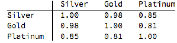
One of the key characteristics of metals is the very high levels of price-correlation between them. Over the period under investigation, Jan 2012 to Aug 2016, the estimated correlation coefficients are as follows:
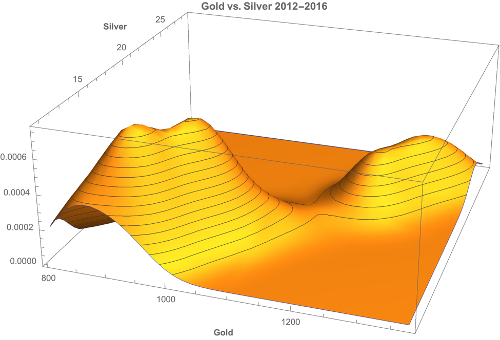
A plot of the join density of spot gold and silver prices indicates low- and high-price regimes in which the metals display similar levels of linear correlation.
Simple Metal Trading Models
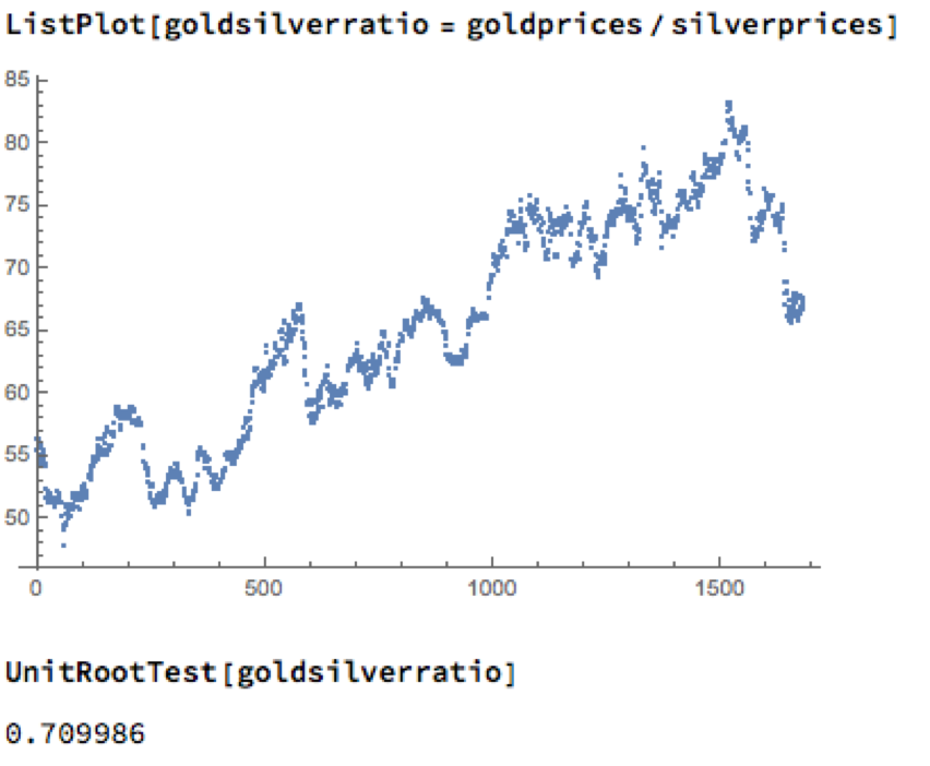
Levels of correlation that are consistently as high as this over extended periods of time are fairly unusual in financial markets and this presents a potential trading opportunity. One common approach is to use the ratios of metal prices as a trading signal. However, taking the ratio of gold to silver spot prices as an example, a plot of the series demonstrates that it is highly unstable and susceptible to long term trends.
A more formal statistical test fails to reject the null hypothesis of a unit root. In simple terms, this means we cannot reliably distinguish between the gold/silver price ratio and a random walk.
Along similar lines, we might consider the difference in log prices of the series. If this proved to be stationary then the log-price series would be cointegrated order 1 and we could build a standard pairs trading model to buy or sell the spread when prices become too far unaligned. However, we find once again that the log-price difference can wander arbitrarily far from its mean, and we are unable to reject the null hypothesis that the series contains a unit root.
Linear Models
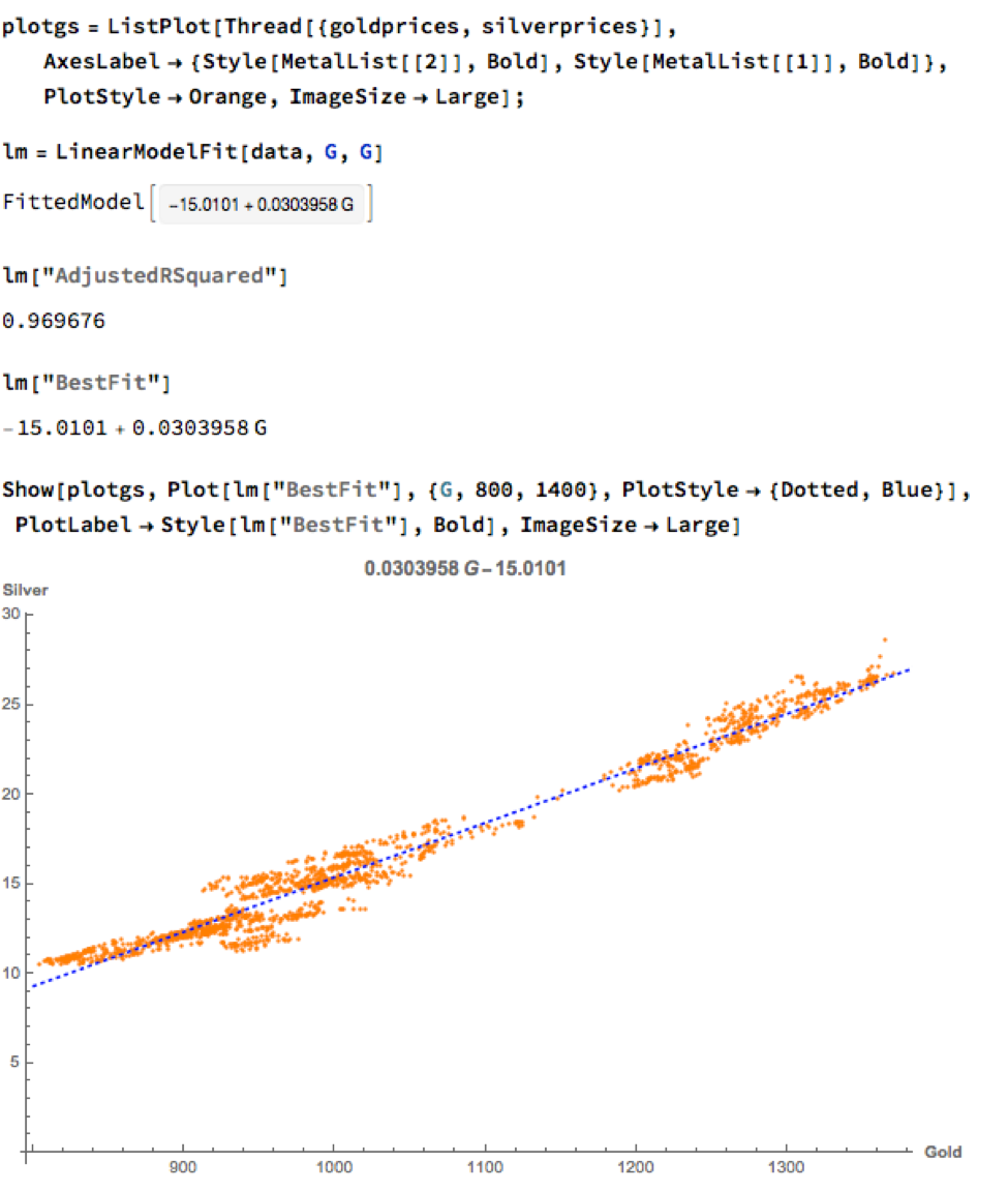
We can hope to do better with a standard linear model, regressing spot silver prices against spot gold prices. The fit of the best linear model is very good, with an R-sq of over 96%:
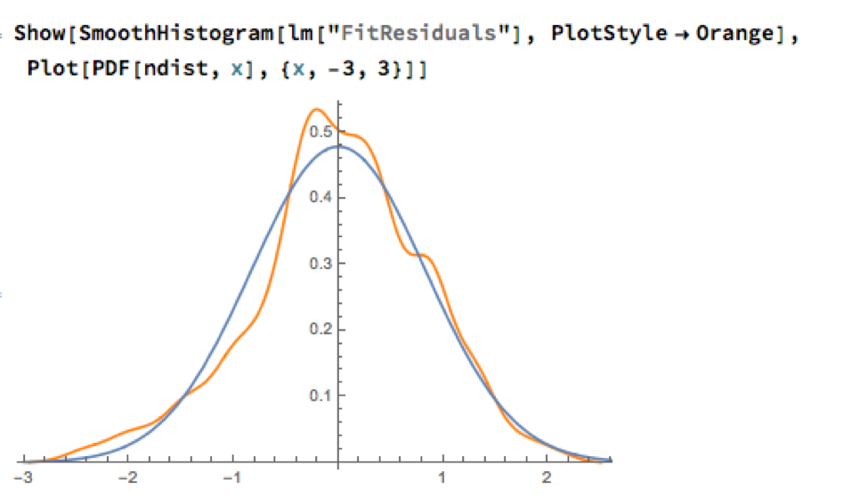
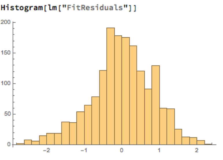
A trader might look to exploit the correlation relationship by selling silver when its market price is greater than the value estimated by the model (and buying when the model price exceeds the market price). Typically the spread is bought or sold when the log-price differential exceeds a threshold level that is set at twice the standard deviation of the price-difference series. The threshold levels derive from the assumption of Normality, which in fact does not apply here, as we can see from an examination of the residuals of the linear model:
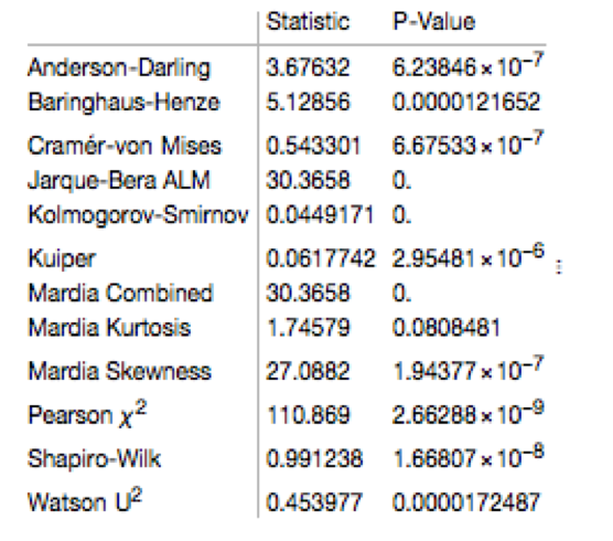
Given the evident lack of fit, especially in the left tail of the distribution, it is unsurprising that all of the formal statistical tests for Normality easily reject the null hypothesis:
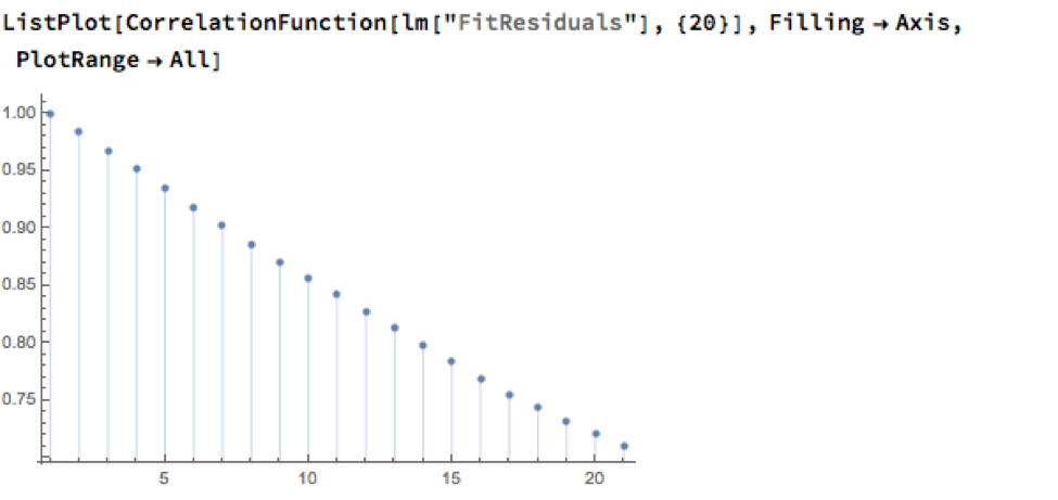
However, Normality, or the lack of it, is not the issue here: one could just as easily set the 2.5% and 97.5% percentiles of the empirical distribution as trade entry points. The real problem with the linear model is that it fails to take into account the time dependency in the price series. An examination of the residual autocorrelations reveals significant patterning, indicating that the model tends to under-or over-estimate the spot price of silver for long periods of time:
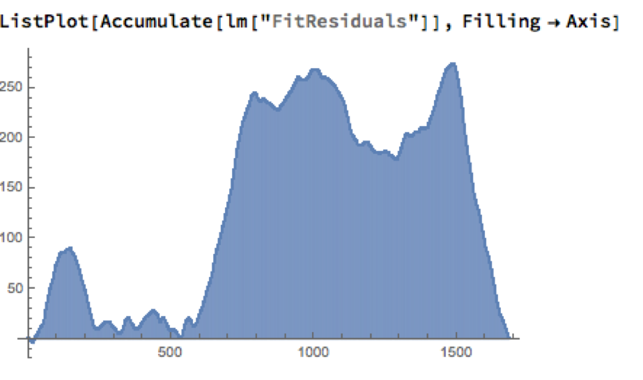
As the following chart shows, the cumulative difference between model and market prices can become very large indeed. A trader risks going bust waiting for the market to revert to model prices.
How does one remedy this? The shortcoming of the simple linear model is that, while it captures the interdependency between the price series very well, it fails to factor in the time dependency of the series. What is required is a model that will account for both features.
Multivariate Vector Autoregression Model
Rather than modeling the metal prices individually, or in pairs, we instead adopt a multivariate vector autoregression approach, modeling all three spot price processes together. The essence of the idea is that spot prices in each metal may be influenced, not only by historical values of the series, but also potentially by current and lagged prices of the other two metals.
Before proceeding we divide the data into two parts: an in-sample data set comprising data from 2012 to the end of 2015 and an out-of-sample period running from Jan-Aug 2016, which we use for model testing purposes. In what follows, I make the simplifying assumption that a vector autoregressive moving average process of order (1, 1) will suffice for modeling purposes, although in practice one would go through a procedure to test a wide spectrum of possible models incorporating moving average and autoregressive terms of varying dimensions.
In any event, our simplified VAR model is estimated as follows:
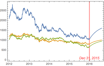
The chart below combines the actual, in-sample data from 2012-2015, together with the out-of-sample forecasts for each spot metal from January 2016.
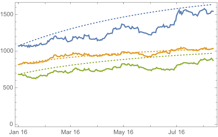
It is clear that the model projects a recovery in spot metal prices from the end of 2015. How did the forecasts turn out? In the chart below we compare the actual spot prices with the model forecasts, over the period from Jan to Aug 2016.
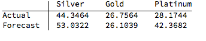
The actual and forecast percentage change in the spot metal prices over the out-of-sample period are as follows:
The VAR model does a good job of forecasting the strong upward trend in metal prices over the first eight months of 2016. It performs exceptionally well in its forecast of gold prices, although its forecasts for silver and platinum are somewhat over-optimistic. Nevertheless, investors would have made money taking a long position in any of the metals on the basis of the model projections.
Relative Value Trade
Another way to apply the model would be to implement a relative value trade, based on the model’s forecast that silver would outperform gold and platinum. Indeed, despite the model’s forecast of silver prices turning out to be over-optimistic, a relative value trade in silver vs. gold or platinum would have performed well: silver gained 44% in the period form Jan-Aug 2016, compared to only 26% for gold and 28% for platinum. A relative value trade entailing a purchase of silver and simultaneous sale of gold or platinum would have produced a gross return of 17% and 15% respectively.
A second relative value trade indicated by the model forecasts, buying platinum and selling gold, would have turned out less successfully, producing a gross return of less than 2%. We will examine the reasons for this in the next section.
Forecasts and Trading Opportunities Through 2016
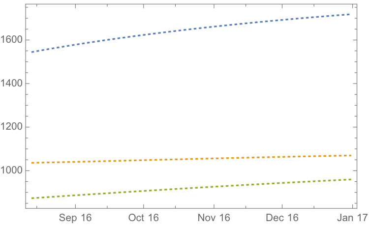
If we re-estimate the VAR model using all of the the available data through mid-Aug 2016 and project metal prices through the end of the year, the outcome is as follows:
While the positive trend in all three metals is forecast to continue, the new model (which incorporates the latest data) anticipates lower percentage rates of appreciation going forward:
Once again, the model predicts higher rates of appreciation for both silver and platinum relative to gold. So investors have the option to take a relative value trade, hedging a long position in silver or platinum with a short position in gold. While the forecasts for all three metals appear reasonable, the projections for platinum strike me as the least plausible.
The reason is that the major applications of platinum are industrial, most often as a catalyst: the metal is used as a catalytic converter in automobiles and in the chemical process of converting naphthas into higher-octane gasolines. Although gold is also used in some industrial applications, its demand is not so driven by industrial uses. Consequently, during periods of sustained economic stability and growth, the price of platinum tends to be as much as twice the price of gold, whereas during periods of economic uncertainty, the price of platinum tends to decrease due to reduced industrial demand, falling below the price of gold. Gold prices are more stable in slow economic times, as gold is considered a safe haven.
This is the most likely explanation of why the gold-platinum relative value trade has not worked out as expected hitherto and is perhaps unlikely to do so in the months ahead, as the slowdown in the global economy continues.
Conclusion
We have shown that simple models of the ratio or differential in the prices of precious metals are unlikely to provide a sound basis for forecasting or trading, due to non-stationarity and/or temporal dependencies in the residuals from such models.
On the other hand, a vector autoregression model that models all three price processes simultaneously, allowing both cross correlations and autocorrelations to be captured, performs extremely well in terms of forecast accuracy in out-of-sample tests over the period from Jan-Aug 2016.
Looking ahead over the remainder of the year, our updated VAR model predicts a continuation of the price appreciation, albeit at a slower rate, with silver and platinum expected to continue outpacing gold. There are reasons to doubt whether the appreciation of platinum relative to gold will materialize, however, due to falling industrial demand as the global economy cools.
The SPDR S&P 500 ETF (SPY) is one of the widely traded ETF products on the market, with around $200Bn in assets and average turnover of just under 200M shares daily. So the likelihood of being able to develop a money-making trading system using publicly available information might appear to be slim-to-none. So, to give ourselves a fighting chance, we will focus on an attempt to predict the overnight movement in SPY, using data from the prior day’s session.
In addition to the open/high/low and close prices of the preceding day session, we have selected a number of other plausible variables to build out the feature vector we are going to use in our machine learning model:
The daily volume
The previous day’s closing price
The 200-day, 50-day and 10-day moving averages of the closing price
The 252-day high and low prices of the SPY series
We will attempt to build a model that forecasts the overnight return in the ETF, i.e. [O(t+1)-C(t)] / C(t)
In this exercise we use daily data from the beginning of the SPY series up until the end of 2014 to build the model, which we will then test on out-of-sample data running from Jan 2015-Aug 2016. In a high frequency context a considerable amount of time would be spent evaluating, cleaning and normalizing the data. Here we face far fewer problems of that kind. Typically one would standardized the input data to equalize the influence of variables that may be measured on scales of very different orders of magnitude. But in this example all of the input variables, with the exception of volume, are measured on the same scale and so standardization is arguably unnecessary.
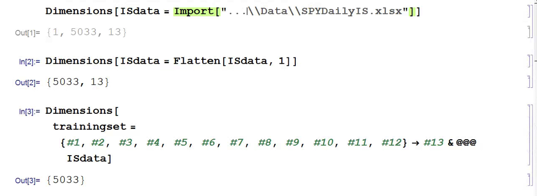
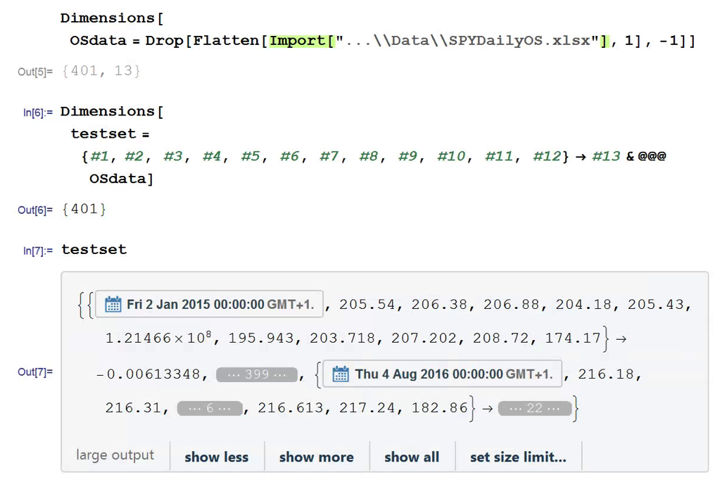
First, the in-sample data is loaded and used to create a training set of rules that map the feature vector to the variable of interest, the overnight return:
In Mathematica 10 Wolfram introduced a suite of machine learning algorithms that include regression, nearest neighbor, neural networks and random forests, together with functionality to evaluate and select the best performing machine learning technique. These facilities make it very straightfoward to create a classifier or prediction model using machine learning algorithms, such as this handwriting recognition example:
We create a predictive model on the SPY trainingset, allowing Mathematica to pick the best machine learning algorithm:
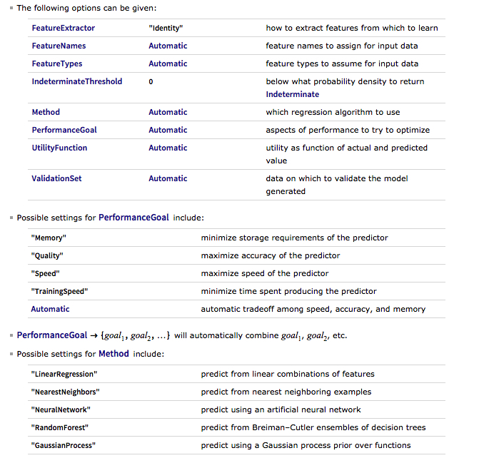
There are a number of options for the Predict function that can be used to control the feature selection, algorithm type, performance type and goal, rather than simply accepting the defaults, as we have done here:
Having built our machine learning model, we load the out-of-sample data from Jan 2015 to Aug 2016, and create a test set:
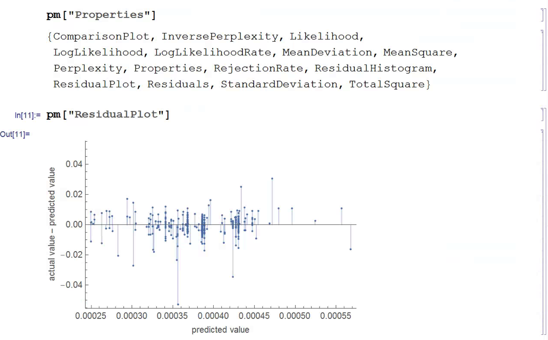
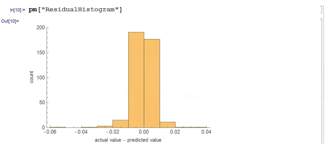
We next create a PredictionMeasurement object, using the Nearest Neighbor model , that can be used for further analysis:
There isn’t much dispersion in the model forecasts, which all have positive value. A common technique in such cases is to subtract the mean from each of the forecasts (and we may also standardize them by dividing by the standard deviation).
The scatterplot of actual vs. forecast overnight returns in SPY now looks like this:
There’s still an obvious lack of dispersion in the forecast values, compared to the actual overnight returns, which we could rectify by standardization. In any event, there appears to be a small, nonlinear relationship between forecast and actual values, which holds out some hope that the model may yet prove useful.
From Forecasting to Trading
There are various methods of deploying a forecasting model in the context of creating a trading system. The simplest route, which we will take here, is to apply a threshold gate and convert the filtered forecasts directly into a trading signal. But other approaches are possible, for example:
Combining the forecasts from multiple models to create a prediction ensemble
Using the forecasts as inputs to a genetic programming model
Feeding the forecasts into the input layer of a neural network model designed specifically to generate trading signals, rather than forecasts
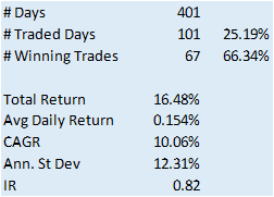
In this example we will create a trading model by applying a simple filter to the forecasts, picking out only those values that exceed a specified threshold. This is a standard trick used to isolate the signal in the model from the background noise. We will accept only the positive signals that exceed the threshold level, creating a long-only trading system. i.e. we ignore forecasts that fall below the threshold level. We buy SPY at the close when the forecast exceeds the threshold and exit any long position at the next day’s open. This strategy produces the following pro-forma results:
Conclusion
The system has some quite attractive features, including a win rate of over 66% and a CAGR of over 10% for the out-of-sample period.
Obviously, this is a very basic illustration: we would want to factor in trading commissions, and the slippage incurred entering and exiting positions in the post- and pre-market periods, which will negatively impact performance, of course. On the other hand, we have barely begun to scratch the surface in terms of the variables that could be considered for inclusion in the feature vector, and which may increase the explanatory power of the model.
In other words, in reality, this is only the beginning of a lengthy and arduous research process. Nonetheless, this simple example should be enough to give the reader a taste of what’s involved in building a predictive trading model using machine learning algorithms.
Spending 12-14 hours a day managing investors’ money doesn’t leave me a whole lot of time to sit around watching TV. And since I have probably less than 10% of the ad-tolerance of a typical American audience member, I inevitably turn to TiVo, Netflix, or similar, to watch a commercial-free show. Which means that I am inevitably several years behind the cognoscenti of the au-courant. This has its pluses: I avoid a lot of drivel that way.
So it was that I recently tuned in to watch Deadwood, a masterpiece of modern drama written by the talented David Milch, of NYPD Blue fame. The setting of the show is unpromising: a mud-caked camp in South Dakota around the turn of the 19th century that appears to portend yet another formulaic Western featuring liquor, guns, gals and gold and not much else. The first episode appeared at first to confirm my lowest expectations. I struggled through the second. But by the third I was hooked.
What makes Deadwood such a triumph are its finely crafted plots and intricate sub-plots; the many varied and often complex characters, superbly played by Ian McShane (with outstanding performances by Brad Dourif, Powers Boothe, amongst an abundance of others, no less gifted); and, of course, the dialogue.
Yes, the dialogue: hardly the crowning glory of the typical Hollywood Western. And here, to make matters worse, almost every sentence uttered by many of the characters is replete with such shocking profanity that one is eventually numbed into accepting it as normal. But once you get past that, something strange and rather wonderful overtakes you: a sense of being carried along on a river of creative wordsmith-ing that at times eddies, bubbles, plunges and roars its way through scenes that are as comedic, dramatic and action-packed as any I have seen on film. For those who have yet to enjoy the experience, I offer one small morsel:
Around the start of Series 2 a rather strange idea occurred to me that, try as I might, I was increasingly unable to suppress as the show progressed: that the writing – some of it at least – was almost Shakespearian in its ingenuity and, at times, lyrical complexity.
Convinced that I had taken leave of my senses I turned to Google and discovered, to my surprise, that there is a whole cottage industry of Deadwood fans who had made the same connection. There is even – if you can imagine it – an online quiz that tests if you are able to identify the source of a number of quotes that might come from the show, or one of the Bard’s many plays. I kid you not:
Intrigued, I took the test and scored around 85%. Not too bad for a science graduate, although I expect most English majors would top 90%-95%. That gave me an idea: could one develop a machine learning algorithm to do the job?
Here’s how it went.
Milch or Shakespeare? – A Machine Learning Classification Algorithm
We start by downloading the text of a representative selection of Shakespeare’s plays, avoiding several of the better-known works from which many of the quotations derive:
For testing purposes, let’s download a sample of classic works by other authors:
Let’s build an initial test classifier, as follows:
It seems to work ok:
So far so good. Let’s import the script for Deadwood series 1-3:
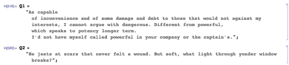
Next, let’s import the quotations used in the online test:
etc
We need to remove the relevant quotes from the Deadwood script file used to train the classifier, of course (otherwise it’s cheating!). We will strip an additional 200 characters before the start of each quotation, and 500 characters after each quotation, just for good measure:
and so on….
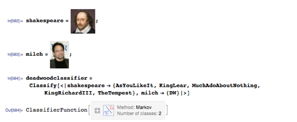
Now we are ready to build our classifier:
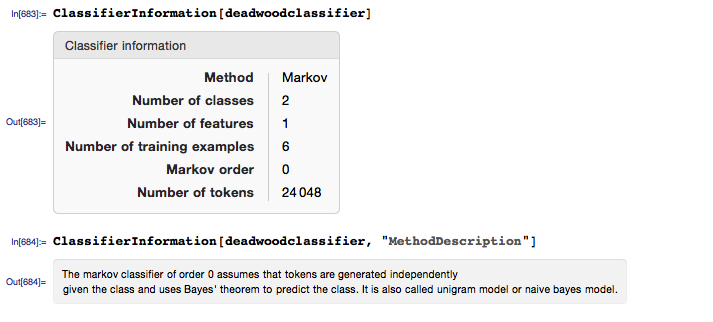
And we can obtain some information about the classifier, as follows:
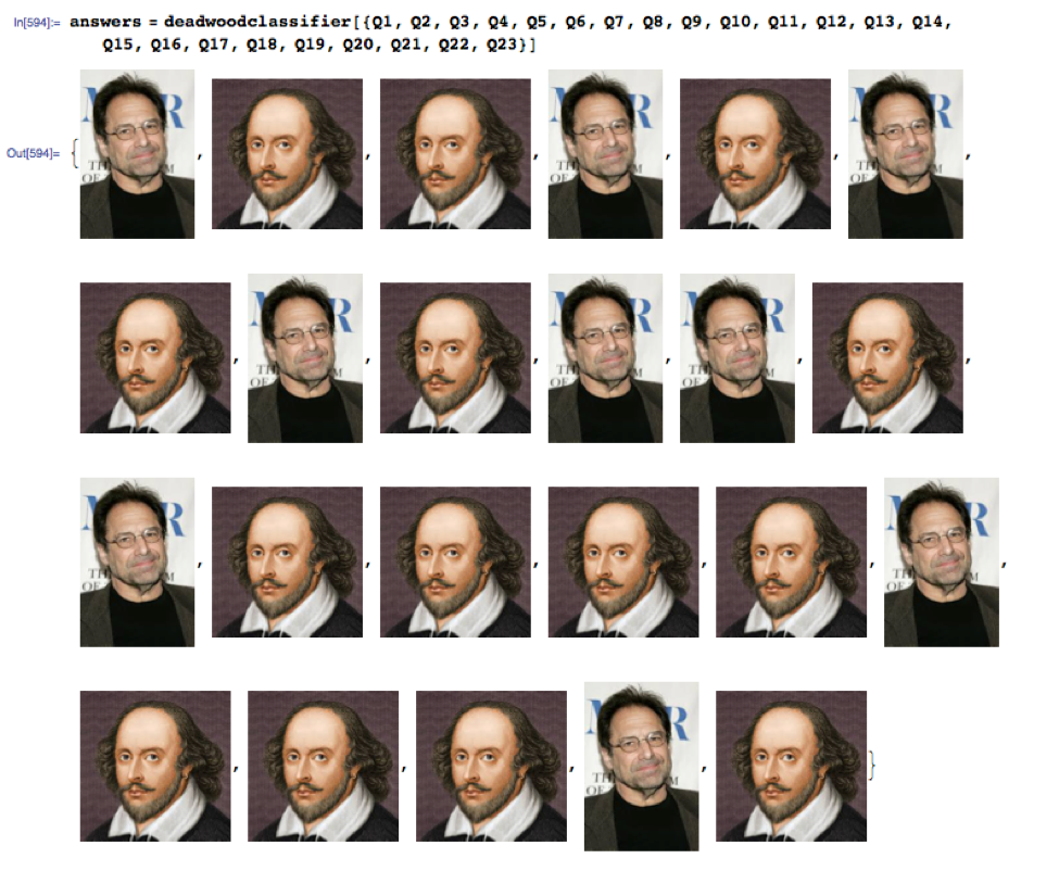
Let’s see how it performs:
Or, if you prefer tabular form:
The machine learning model scored a total of 19 correct answers out of 23, or 82%.
Fooling the Machine
Let’s take a look as some of the questions the algorithm got wrong.
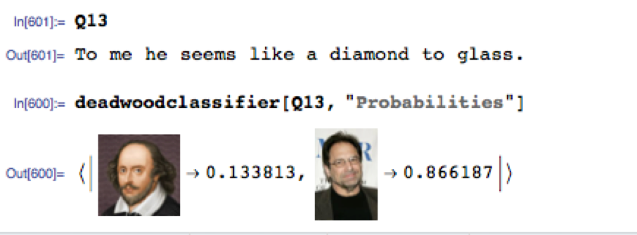
Quotation no. 13 is challenging, as it comes from Pericles, one of Shakespeare’s lesser-know plays and the idiom appears entirely modern. The classifier assigns an 87% probability of Milch being the author (I got it wrong too).
On Quotation no. 15 the algorithm was just as mistaken, but in the other direction (I got this one right, but only because I recalled the monologue from the episode):
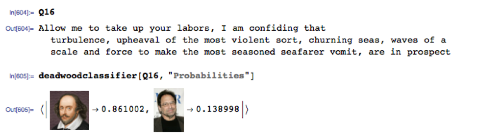
Quotation no.16 strikes me as entirely Shakespearian in form and expression and the classifier thought so too, favoring the Bard by 86% to only 14% for Milch:
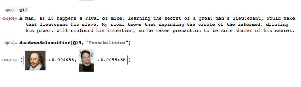
Quotation no. 19 had the algorithm fooled completely. It’s a perfect illustration of a typical kind of circumlocution favored by Shakespeare that is imitated so well by Milch’s Deadwood characters:
Conclusion
The model clearly picked up distinguishing characteristics of the two authors’ writings that enabled it to correctly classify 82% of the quotations, quite a high percentage and much better than we would expect to do by tossing a coin, for example. It’s a respectable performance, but I might have hoped for greater accuracy from the model, which scored about the same as I did.
I guess those who see parallels in the writing of William Shakespeare and David Milch may be onto something.
Postscript
The Hollywood Reporter recently published a story entitled
Winton Capital Management is a renowned quant fund and one of the world’s largest, most successful CTAs. The firm’s flagship investment strategy, the Winton Diversified Program, follows a systematic investment process that is based on statistical research to invest globally long and short, using leverage, in a diversified range of liquid instruments, including exchange traded futures, forwards, currency forwards traded over the counter, equity securities and derivatives linked to such securities.
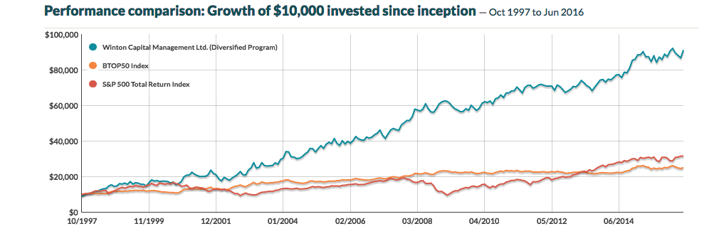
The performance of the program over the last 19 years has been impressive, especially considering its size, which now tops around $13Bn in assets.
Source: CTA Performance
A Meta-Strategy to Beat Winton Capital
With that background, the idea of improving the exceptional results achieved by David Harding and his army of quants seems rather far fetched, but I will take a shot. In what follows, I am assuming that we are permitted to invest and redeem an investment in the program at no additional cost, other than the stipulated fees. This is, of course, something of a stretch, but we will make that assumption based on the further stipulation that we will make no more than two such trades per year.
Using the performance data of the WDP from 1997-2012, we develop a meta-strategy that seeks to time an investment in the program, taking profits after reaching a specified profit target, which is based on the TrueRange, or after holding for a maximum of 8 months. The key part of the strategy code is as follows:
If MarketPosition = 1 then begin
TargPrL = EntryPrice + TargFr * TrueRange;
Sell(“ExTarg-L”) next bar at TargPrL limit;
If Time >= TimeEx or BarsSinceEntry >= NBarEx1 or (BarsSinceEntry >= NBarEx3 and C > EntryPrice)
or (BarsSinceEntry >= NBarEx2 and C < EntryPrice) then
Sell(“ExMark-L”) next bar at market;
end;
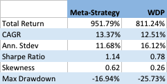
It appears that by timing an investment in the program we can improve the CAGR by around 0.86% per year, and with annual volatility that is lower by around 4.4% annually. As a consequence, the Sharpe ratio of the meta-strategy is considerably higher: 1.14 vs 0.78 for the WDP.
Like most trend-following CTA strategies, Winton’s WDP has positive skewness, an attractive feature that means that the strategy has a preponderance of returns in the positive right tail of the distribution. Also in common with most CTA strategies, on the other hand, the WDP suffers from periodic large drawdowns, in this case amounting to -25.73%.
The meta-strategy improves on the baseline profile of the WDP, increasing the positive skew, while substantially reducing downside risk, leading to a much lower maximum drawdown of -16.94%.
Conclusion
Despite its stellar reputation in the CTA world, investors could theoretically improve on the performance of Winton Capital’s flagship program by using a simple meta-strategy that times entry to and exit from the program using simple technical indicators. The meta-strategy produces higher returns, lower volatility and with higher positive skewness and lower downside risk.
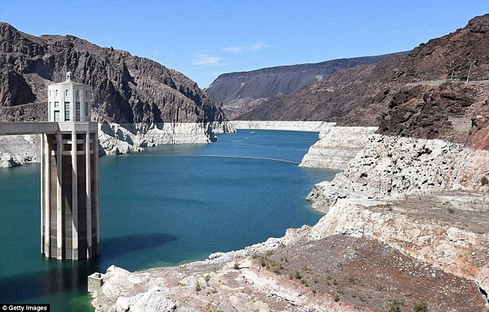
The current 15-year drought in the South West is the most severe since recordkeeping for the Colorado River began in 1906. Lake Mead, which supplies much of the water to Colorado Basin communities, is now more than half empty.
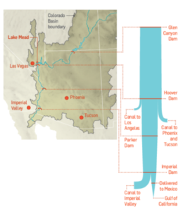
A 120 foot high band of rock, bleached white by the water, and known as the “bathtub ring” encircles the lake, a stark reminder of the water crisis that has enveloped the surrounding region. The Colorado River takes a 1,400 mile journey from the Rockies to Mexico, irrigating over 5 million acres of farmland in the Basin states of Wyoming, Utah, Colorado, New Mexico, Nevada, Arizona, and California.
The Colorado River Compact signed in 1922 enshrined the States’ water rights in law and Mexico was added to the roster in 1994, taking the total allocation to over 16.5 million acre-feet per year. But the average freshwater input to the lake over the century from 1906 to 2005 reached only 15 million acre-feet. The river can’t come close to meeting current demand and the problem is only likely to get worse. A 2009 study found that rainfall in the Colorado Basin could fall as much as 15% over the next 50 years and the shortfall in deliveries could reach 60% to 90% of the time.
Impact on Las Vegas
With an average of only 4 inches of rain a year, and a daily high temperatures of 103 o F during the summer, Las Vegas is perhaps the most hard pressed to meet the demand of its 2 million residents and 40 million visitors annually.
Despite its conspicuous consumption, from the tumbling fountains of the Bellagio to the Venetian’s canals, since 2002, Las Vegas has been obliged to cut its water use by a third, from 314 gallons per capita a day to 212. The region recycles around half of its wastewater which is piped back into Lake Mead, after cleaning and treatment. Residents are allowed to water their gardens no more than one day a week in peak season, and there are stiff fines for noncompliance.
The Third Straw
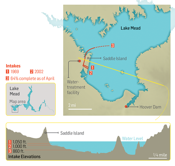
Historically, two intake pipes carried water from Lake Mead to Las Vegas, about 25 miles to the west. In 2012, realizing that the highest of these, at 1050 feet, would soon be sucking air, the Southern Nevada Water Authority began construction of a new pipeline. Known as the Third Straw, Intake No. 3 reaches 200 feet deeper into the lake—to keep water flowing for as long as there’s water to pump. The new pipeline, which commenced operations in 2015, doesn’t draw more water from the lake than before, or make the surface level drop any faster. But it will keep taps flowing in Las Vegas homes and casinos even if drought-stricken Lake Mead drops to its lowest levels.
Modeling Water Levels in Lake Mead
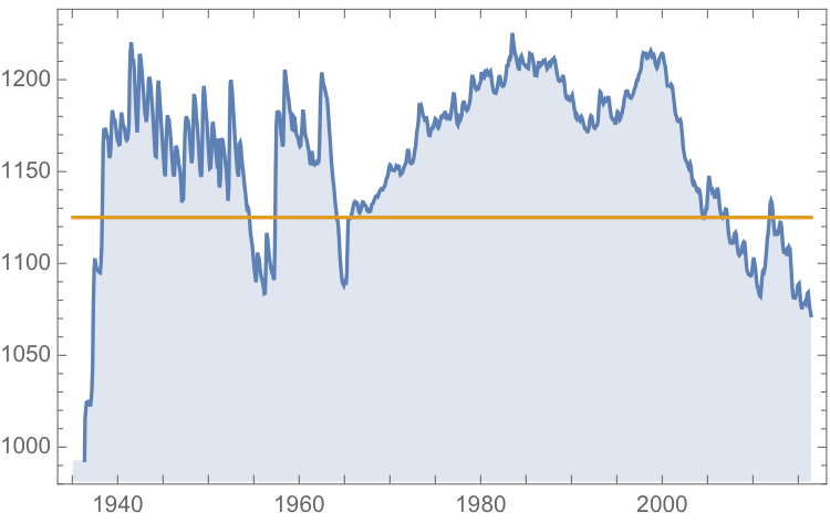
The monthly reported water levels in Lake Mead from Feb 1935 to June 2016 are shown in the chart below. The reference line is the drought level, historically defined as 1,125 feet.
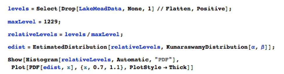
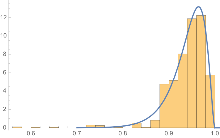
One statistical technique widely applied in hydrology involves fitting a Kumaraswamy distribution to the relative water level. According to the Arizona Game and Fish Department, the maximum lake level is 1229 feet. We model the water level relative to the maximum level, as follows.
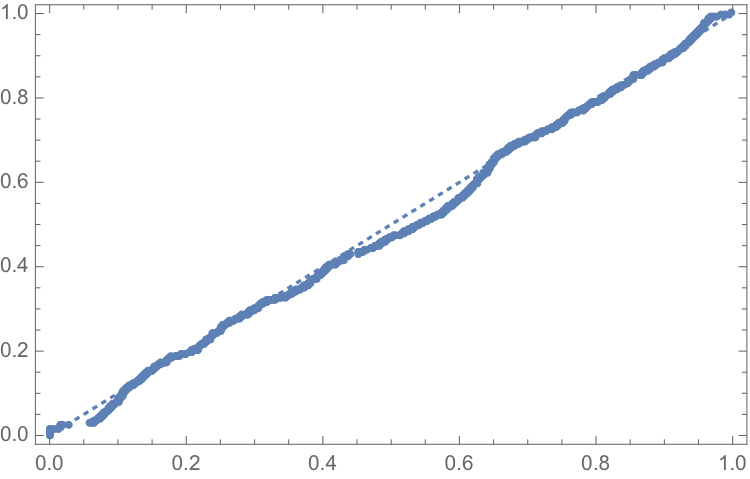
The fit of the distribution appears quite good, even in the tails:
ProbabilityPlot[relativeLevels, edist]
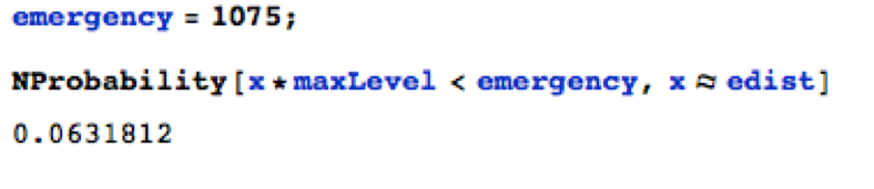
Since water levels have been below the drought level for some time, let’s instead consider the “emergency” level, 1,075 feet. According to this model, there is just over a 6% chance of Lake Mead hitting the emergency level and, consequently, a high probability of breaching the emergency threshold some time over before the end of 2017.
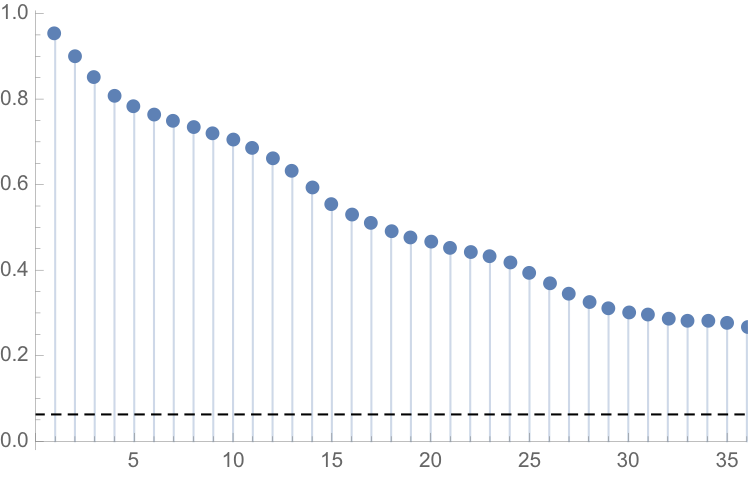
One problem with this approach is that it assumes that each observation is drawn independently from a random variable with the estimated distribution. In reality, there are high levels of autocorrelation in the series, as might be expected: lower levels last month typically increase the likelihood of lower levels this month. The chart of the autocorrelation coefficients makes this pattern clear, with statistically significant coefficients at lags of up to 36 months.
ts[“ACFPlot”]
An alternative methodology that enables us to take account of the autocorrelation in the process is time series analysis. We proceed to fit an autoregressive moving average (ARMA) model as follows:
tsm = TimeSeriesModelFit[ts, “ARMA”]
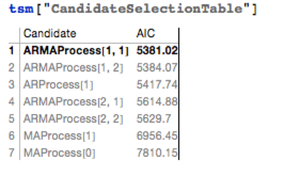
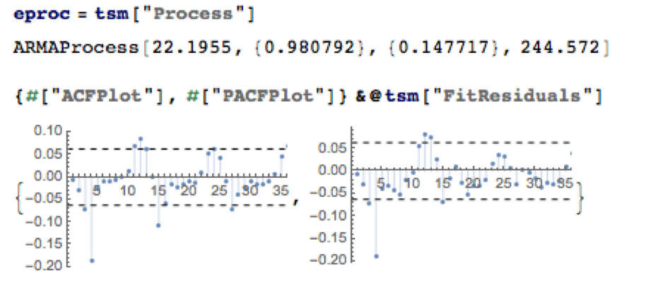
The best fitting model in an ARMA(1,1) model, according to the AIC criterion:
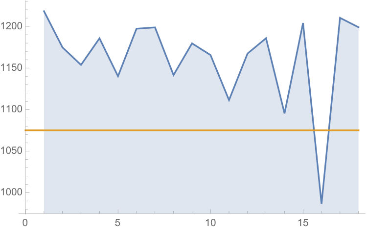
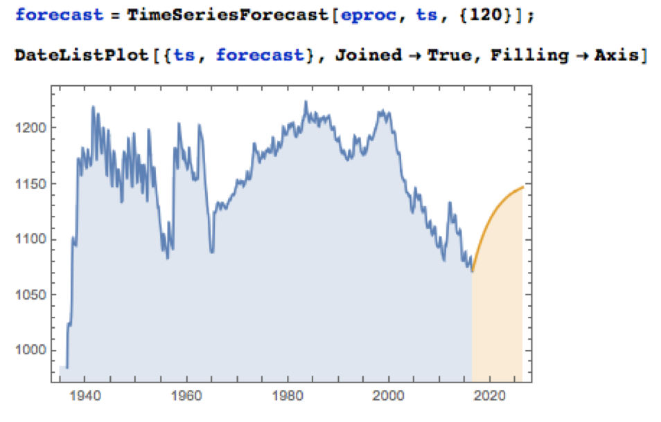
Applying the fitted ARMA model, we forecast the water level in Lake Mead over the next ten years as shown in the chart below. Given the mean-reverting moving average component of the model, it is not surprising to see the model forecasting a return to normal levels.
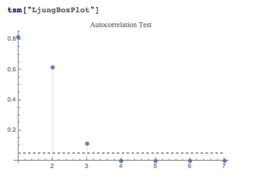
There is some evidence of lack of fit in the ARMA model, as shown in the autocorrelations of the model residuals:
A formal test reveals that residual autocorrelations at lags 4 and higher are jointly statistically significant:
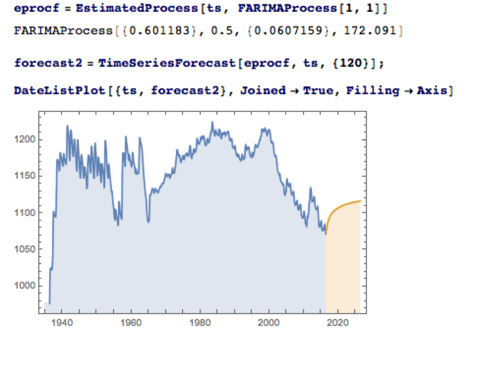
The slowly decaying pattern of autocorrelations in the water level series suggests a possible “long memory” effect, which can be better modelled as a fractionally integrated process. The forecasts from such a model, like the ARMA model forecasts, display a tendency to revert to a long term mean; but the reversion process is dampened by the reinforcing, long-memory effect captured in the FARIMA model.
The Prospects for the Next Decade
Taking the view that the water level in Lake Mead forms a stationary statistical process, the likelihood is that water levels will rise to 1,125 feet or more over the next ten years, easing the current water shortage in the region.
On the other hand, there are good reasons to believe that there are exogenous (deterministic) factors in play, specifically the over-consumption of water at a rate greater than the replenishment rate from average rainfall levels. Added to this, plausible studies suggest that average rainfall in the Colorado Basin is expected to decline over the next fifty years. Under this scenario, the water level in Lake Mead will likely continue to deteriorate, unless more stringent measures are introduced to regulate consumption.
Economic Impact
The drought in the South West affects far more than just the water levels in Lake Mead, of course. One study found that California’s agriculture sector alone had lost $2.2Bn and some 17,00 season and part time jobs in 2014, due to drought. Agriculture uses more than 80% of the State’s water, according to Fortune magazine, which goes on to identify the key industries most affected, including agriculture, food processing, semiconductors, energy, utilities and tourism.
Dry fields and bare trees at Panoche Road, looking west, on Wednesday February 5, 2014, near San Joaquin, CA. California drought has hit the Central Valley hard.
In the energy sector, for example, the loss of hydroelectric power cost CA around $1.4Bn in 2014, according to non-profit research group Pacific Institute. Although Intel pulled its last fabrication plant from California in 2009, semiconductor manufacturing is still a going concern in the state. Maxim Integrated, TowerJazz, and TSI Semiconductors all still have fabrication plants in the state. And they need a lot of water. A single semiconductor fabrication plant can use as much water as a small city. That means the current plants could represent three cities worth of consumption.
The drought is also bad news for water utilities, of course. The need to conserve water raises the priority on repair and maintenance, and that means higher costs and lower profit. Complicating the problem, California lacks any kind of management system for its water supply and can’t measure the inflows and outflows to ground water levels at any particular time.
The Bureau of Reclamation has studied more than two dozen options for conserving and increasing water supply, including importation, desalination and reuse. While some were disregarded for being too costly or difficult, the bureau found that the remaining options, if instituted, could yield 3.7 million acre feet per year in savings and new supplies, increasing to 7 million acre feet per year by 2060. Agriculture is the biggest user by far and has to be part of any solution. In the near term, the agriculture industry could reduce its use by 10 to 15 percent without changing the types of crops it grows by using new technology, such as using drip irrigation instead of flood irrigation and monitoring soil moisture to prevent overwatering, the Pacific Institute found.
Conclusion
We can anticipate that a series of short term fixes, like the “Third Straw”, will be employed to kick the can down the road as far as possible, but research now appears almost unanimous in finding that drought is having a deleterious, long term affect on the economics of the South Western states. Agriculture is likely to have to bear the brunt of the impact, but so too will adverse consequences be felt in industries as disparate as food processing, semiconductors and utilities. California, with the largest agricultural industry, by far, is likely to be hardest hit. The Las Vegas region may be far less vulnerable, having already taken aggressive steps to conserve and reuse water supply and charge economic rents for water usage.
Modeling Water Levels in Lake Mead
The monthly reported water levels in Lake Mead from Feb 1935 to June 2016 are shown in the chart below. The reference line is the drought level, historically defined as 1,125 feet.
One statistical technique widely applied in hydrology involves fitting a Kumaraswamy distribution to the relative water level. According to the Arizona Game and Fish Department, the maximum lake level is 1229 feet. We model the water level relative to the maximum level, as follows.
The fit of the distribution appears quite good, even in the tails:
ProbabilityPlot[relativeLevels, edist]
Since water levels have been below the drought level for some time, let’s instead consider the “emergency” level, 1,075 feet. According to this model, there is just over a 6% chance of Lake Mead hitting the emergency level and, consequently, a high probability of breaching the emergency threshold some time over before the end of 2017.
One problem with this approach is that it assumes that each observation is drawn independently from a random variable with the estimated distribution. In reality, there are high levels of autocorrelation in the series, as might be expected: lower levels last month typically increase the likelihood of lower levels this month. The chart of the autocorrelation coefficients makes this pattern clear, with statistically significant coefficients at lags of up to 36 months.
ts[“ACFPlot”]
An alternative methodology that enables us to take account of the autocorrelation in the process is time series analysis. We proceed to fit an autoregressive moving average (ARMA) model as follows:
tsm = TimeSeriesModelFit[ts, “ARMA”]
The best fitting model in an ARMA(1,1) model, according to the AIC criterion:
Applying the fitted ARMA model, we forecast the water level in Lake Mead over the next ten years as shown in the chart below. Given the mean-reverting moving average component of the model, it is not surprising to see the model forecasting a return to normal levels.
There is some evidence of lack of fit in the ARMA model, as shown in the autocorrelations of the model residuals:
A formal test reveals that residual autocorrelations at lags 4 and higher are jointly statistically significant:
The slowly decaying pattern of autocorrelations in the water level series suggests a possible “long memory” effect, which can be better modelled as a fractionally integrated process. The forecasts from such a model, like the ARMA model forecasts, display a tendency to revert to a long term mean; but the reversion process is dampened by the reinforcing, long-memory effect captured in the FARIMA model.
The Prospects for the Next Decade
Taking the view that the water level in Lake Mead forms a stationary statistical process, the likelihood is that water levels will rise to 1,125 feet or more over the next ten years, easing the current water shortage in the region.
On the other hand, there are good reasons to believe that there are exogenous (deterministic) factors in play, specifically the over-consumption of water at a rate greater than the replenishment rate from average rainfall levels. Added to this, plausible studies suggest that average rainfall in the Colorado Basin is expected to decline over the next fifty years. Under this scenario, the water level in Lake Mead will likely continue to deteriorate, unless more stringent measures are introduced to regulate consumption.
Economic Impact
The drought in the South West affects far more than just the water levels in Lake Mead, of course. One study found that California’s agriculture sector alone had lost $2.2Bn and some 17,00 season and part time jobs in 2014, due to drought. Agriculture uses more than 80% of the State’s water, according to Fortune magazine, which goes on to identify the key industries most affected, including agriculture, food processing, semiconductors, energy, utilities and tourism.
In the energy sector, for example, the loss of hydroelectric power cost CA around $1.4Bn in 2014, according to non-profit research group Pacific Institute.
Although Intel pulled its last fabrication plant from California in 2009, semiconductor manufacturing is still a going concern in the state. Maxim Integrated, TowerJazz, and TSI Semiconductors all still have fabrication plants in the state. And they need a lot of water. A single semiconductor fabrication plant can use as much water as a small city. That means the current plants could represent three cities worth of consumption.
The drought is also bad news for water utilities, of course. The need to conserve water raises the priority on repair and maintenance, and that means higher costs and lower profit. Complicating the problem, California lacks any kind of management system for its water supply and can’t measure the inflows and outflows to ground water levels at any particular time.
The Bureau of Reclamation has studied more than two dozen options for conserving and increasing water supply, including importation, desalination and reuse. While some were disregarded for being too costly or difficult, the bureau found that the remaining options, if instituted, could yield 3.7 million acre feet per year in savings and new supplies, increasing to 7 million acre feet per year by 2060. Agriculture is the biggest user by far and has to be part of any solution. In the near term, the agriculture industry could reduce its use by 10 to 15 percent without changing the types of crops it grows by using new technology, such as using drip irrigation instead of flood irrigation and monitoring soil moisture to prevent overwatering, the Pacific Institute found.
Conclusion
We can anticipate that a series of short term fixes, like the “Third Straw”, will be employed to kick the can down the road as far as possible, but research now appears almost unanimous in finding that drought is having a deleterious, long term affect on the economics of the South Western states. Agriculture is likely to have to bear the brunt of the impact, but so too will adverse consequences be felt in industries as disparate as food processing, semiconductors and utilities. California, with the largest agricultural industry, by far, is likely to be hardest hit. The Las Vegas region may be far less vulnerable, having already taken aggressive steps to conserve and reuse water supply and charge economic rents for water usage.
Amazon (NASDAQ:AMZN) has been on a tear over the last decade, especially since the financial crisis of 2008. If you had been smart (or lucky) enough to buy the stock at the beginning of 2010, each $1,000 you invested would now be worth over $5,700, giving a CAGR of over 31%.
Source: Yahoo! Finance
It’s hard to argue with success, but could you have done better? The answer, surprisingly, is yes – and by a wide margin.
Introducing AMZN+
I am going to reveal this mystery stock in due course and, I promise you, the investment recommendation is fully actionable. For now, let’s just refer to it as AMZN+.
A comparison between investments made in AMZN and AMZN+ over the period from January 2010 to June 2016 is shown the chart following.
Visually, there doesn’t appear to be much of a difference in overall performance. However, it is apparent that AMZN+ is a great deal less volatile than its counterpart.
The table below give a more telling account of the relative outperformance by AMZN+.
The two investments are very highly correlated, with AMZN+ producing an extra 1% per annum in CAGR over the 6 ½ year period.
The telling distinction, however, lies on the risk side of the equation. Here AMZN+ outperforms AMZN by a wide margin, with an annual standard deviation of only 21% compared to 29%. What this means is that AMZN+ produces almost a 50% higher return than AMZN per unit of risk (information ratio 1.51 vs. 1.07).
The more conservative risk profile of AMZN+ is also reflected in lower maximum drawdown (-13.43% vs -23.74%), semi-deviation and higher Sortino Ratio (see this article for an explanation of these terms).
Bottom line: you can produce around the same rate of return with substantially less risk by investing in AMZN+, rather than AMZN.
Comparing Equally Risky Investments
There is another way to make the comparison, which some investors might find more appealing. Risk is, after all, an altogether more esoteric subject than return, which every investor understands.
So let’s say the investor adopts the same risk budget as for his original investment in AMZN, i.e. an annual volatility of just over 29%. We can produce the same overall level of risk in AMZN+, equalizing the riskiness of the two investments, simply by leveraging the investment in AMZN+ by a factor of 1.36, using margin money. i.e. we borrow $360 and invest a total of $1,360 in AMZN+, for each $1,000 we would have invested in AMZN. Look at the difference in performance:
The investor’s total return in AMZN+ would have been 963%, almost double the return in AMZN over the same period and with a CAGR of over 44.5%, more than 13% per annum higher than AMZN.
Note that, despite having an almost identical annual standard deviation, AMZN+ still enjoys a lower maximum drawdown and downside risk than AMZN.
The Big Reveal
Ok, so what is this mystery stock, AMZN+? Actually it isn’t a stock: it’s a simple portfolio, rebalanced monthly, with 66% of the investment being made in AMZN and 34% in the Direxion Daily 20+ Yr Trsy Bull 3X ETF (NYSEArca: TMF).
Well, that’s a little bit of a cheat, although not much of one: it isn’t too much of a challenge to put $667 of every $1,000 in AMZN and the remaining $333 in TMF, rebalancing the portfolio at the end of every month.
The next question an investor might want to ask is: what other stocks could I apply this approach to? The answer is: a great many of them. And where you end up, ultimately, is with the discovery that you can eliminate a great deal of unnecessary risk with a portfolio of around 20-30 well-chosen assets.
The Fundamental Lesson from Portfolio Theory
We saw that AMZN incurred a risk of 29% in annual standard deviation, compared to only 21% for the AMZN+ portfolio. What does the investor gain by taking that extra 8% in annual risk? Nothing at all – in fact he would have achieved a slightly worse return.
The key take-away from this simple example is the fundamental law of modern portfolio theory:
The market will not compensate an investor for taking diversifiable risk
As they say, diversification is the only free lunch on Wall Street. So make the most of it.