
The Holdout That Made the Sharpe Bigger

First, a correction

The panel in my September post was supposed to have zero alpha. It didn’t quite. The market factor carried a drift of 0.0002 per day and the betas were drawn N(1, 0.3), so a book that tilted towards high-beta names had a true Sharpe of about +0.22 on a panel I described as containing nothing. The generator also clipped daily returns asymmetrically, at [−0.5, +1.0], which leaves a name whose shock breaches the floor with a small positive mean that a book ranking on volatility can load on.

I found this while building the generator for this study, and priced both defects rather than describing them. Every one of the 294 books that post reported on its zero-alpha panels — both reporting rules, all five arms — has been re-scored on the published panel and on a twin that differs only in having the drift removed. The twin is bit-identical otherwise: the drift constant consumes no random draws, so the two panels share every innovation. The recomputation reproduces all 294 published Sharpe ratios to machine precision (maximum absolute error 8.9 × 10⁻¹⁶).

The clip is the smaller of the two, and separable the same way. Across the twelve September panels it binds on 7 of 6,000,000 daily returns — a daily return above +50% is not a common event in a panel of 2%-volatility names — and a volatility-ranked book collects +0.003 of out-of-sample Sharpe from it (SE 0.002, largest on any single panel 0.02). The rest of this section is the drift.

September’s headline is an in-sample number, and in sample the drift is worth almost nothing: the median drift component of in-sample Sharpe across all 294 books is +0.006, and for the agent’s own books it is −0.007, against a published 2.24. Out of sample the median by arm runs +0.004 to +0.019, and no arm-and-rule cell exceeds +0.025, against +0.27 for a book constructed deliberately to load on beta — a different measurement from the +0.22 above, which is that book’s absolute Sharpe on the September panels rather than its drift component. Individual books move more — the largest is +0.49 and the smallest −0.22, and book beta loadings run from −0.21 to +0.25 — so the drift is not invisible at the level of a single run. The pre-registered threshold I had set for retracting a September conclusion, a median drift component above 0.101, does not fire.
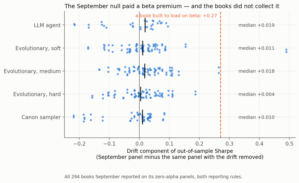
Every book September reported, on the published panel and on its drift-free twin

So September’s headline — that a research agent manufactures an in-sample Sharpe of 2.1 from nothing, and that 88% of it is explained by two integers in the log — stands. The generator does not. It has been replaced, the arithmetic is in the repository, and the correction is in this post rather than in a footnote, because a null you cannot verify is what this entire post is about.

Setup

The null. Factor-structured daily panels: 400 names, regime-switching volatility on the market and three latent factors, Student-t idiosyncratic shocks, lognormal dispersion in volatility. Zero drift, symmetric clipping, and — the part the September generator got wrong — separate random streams for structure (betas, loadings, volatilities, regime paths) and for innovations, so a fresh path can be drawn through the same world.

Verifying that a null is null is harder than writing one. The pre-registered acceptance test probed a constant-beta book and two oracle signals; it passed on two and, on the third, produced a +0.093 on the sixty study seeds that went away on a 120-seed replication. That episode is in the deviations file, and the acceptance file records the pre-registered failure rather than only the replication that passed. It also convinced me the test was too blunt, so there is a better one: 200 expressions drawn from the signal grammar before any panel existed, of which a median of 184 evaluate cleanly on a given panel, across 40 fresh null panels — 7,346 signal-panels, mean annualised Sharpe +0.017, 95% CI [−0.015, +0.048].

Two honest caveats on that. It is measured on the 1,000-day training window, not on the 2,000-day window the books are scored on. And on the exact sixty seeds this study ran, the residual tilt from the acceptance test is bounded at about +0.09 — larger than several of the out-of-sample numbers below. I flag them where they appear.

The pipeline being controlled. An evolutionary search over the same price-only grammar as the September post — returns, moving averages, rolling moments, range position, rolling beta and correlation, with cross-sectional and time-series normalisations. Twelve rounds of twenty-five expressions. The uncontrolled baseline reports the three highest in-sample Sharpes as an equal-weight book. Sixty seeds (9000–9059); 1,000 training days; 2,000 untouched days for scoring.

The two things worth measuring. Every control is placed on two axes.

How much manufactured Sharpe does it remove? Measured on panels with no alpha, and — this matters more than it sounds — measured on the number a user of that control would actually report. If a gate abstains, nothing is reported. If a control re-selects on a validation window, the researcher reports the validation-window number, not the training number they just threw away. If a control searches a shorter window, the researcher reports the shorter window’s Sharpe. Measuring every control on the original training window, which is what I did in the first pass of this study, flatters every re-selection control enormously and is the single largest correction here.

How much real alpha does it destroy? Measured on the same panels with a signal planted in them. Because each seed’s panels are drawn from identical innovations and differ only in the plant, the same book can be scored on both, which separates the exposure a noise-selected book has to the plant by construction from the gain that selecting on the planted panel actually adds. Only the second is “finding alpha”.

Two plants, and why. My first plant was calibrated to an in-sample Sharpe of about 1.0 — below the 1.77 the search manufactures from noise. A pipeline that ranks on in-sample Sharpe must then prefer the noise, so “the search fails to find real alpha” was a property of my calibration rather than a finding. There are now two, both calibrated on thirty seeds (8000–8029) rather than the three the first pass used: a weak plant and a strong one, with realised out-of-sample oracle Sharpes on the study seeds of 0.59 and 2.43.

The analysis plan, the predictions and the estimators were committed before the first search ran. Eighteen departures from them are logged, including several this study’s reviewers forced.

1. Selection manufactures the Sharpe. The search adds nothing.

Start with the uncontrolled pipeline on panels containing nothing:

Uncontrolled pipeline, 60 null panelsValue
Reported in-sample Sharpe1.77 (SE 0.04)
Realised out-of-sample Sharpe, 2,000 days+0.015 (SE 0.051)
One-way turnover, per day19.5%
Net of 5 bp per unit of turnover, at ≈2.5% book volatility−1.00

Familiar enough. Now the part I did not expect. Take 200 expressions drawn at random from the grammar before any panel is generated — no search, no feedback, no breeding — and keep the best three by in-sample Sharpe. On the same kind of null panel that book has an annualised in-sample Sharpe of 1.99 (SE 0.05, 40 panels).

Put the evolutionary search on exactly the same footing — its own logged candidates, the same 700-day window, the same complete-case filter, top three re-selected on that window — and it reports 1.95 (SE 0.05, 60 panels). The difference is 0.04, Welch t = 0.60.

Twelve rounds of adaptive search, three hundred evaluations, mutation and crossover, and the machinery adds nothing measurable to the manufactured number. Picking three things out of a hundred and eighty-odd does all of the work. (The two arms run on different seed sets and are not paired; the pools are matched at 182 against 184 candidates after filtering, with participation ratios of 13 and 15.)

Whatever your research process is — an agent, a grid, a graduate student with a notebook — the quantity that produces the fictitious Sharpe is the size of the set you chose from, and nothing clever has to have happened inside.

2. The holdout that made the number bigger

Here is the reported in-sample Sharpe on panels with no alpha, for each control, measured on the window that control actually reports:

ControlReported Sharpe, null panelsManufactured Sharpe removedAbstains
Internal gate (search 750 days, pick on 250)3.08−0.74—
Internal gate + leg cap of 12.45−0.38—
750-day search, no gate2.15−0.22—
Leg cap 121.78−0.01—
Uncontrolled baseline1.77——
Leg cap 11.650.07—
Budget 6 × 251.590.10—
Budget 12 × 121.560.12—
Budget 6 × 121.420.20—
Out-of-path gate (fresh innovations)1.360.23—
CSCV / PBO gate1.080.3925 of 60
Romano–Wolf stepdown0.410.7748 of 60
Deflated Sharpe hurdle0.001.0060 of 60

Read the last column before the middle one. For the three gates, the removal figure is driven by the abstention rate rather than by any reduction: those gates never make a fiction smaller. They make it rarer — and on the panels where Romano–Wolf does pass, the book it lets through reports 2.04, above the 1.77 it was meant to discipline; the PBO gate’s pass-conditional number is 1.85. That is why each gate’s removal figure sits below its abstention rate — 0.77 against 48 abstentions in 60, 0.39 against 25 — and it means that conditional on getting an answer out of them, you get a worse number than if you had not asked.

Now the top of the table. The train/validate split is the most widely practised control in quantitative research, and on a panel with no alpha it made the reported number 74% larger.

The mechanism is not subtle once you see it. On a panel with no alpha, every point of reported Sharpe is selection. The standard error of a Sharpe estimate scales as one over the square root of the sample, and for a fixed candidate pool the expected maximum scales with that standard error — so the ratio of two reported maxima should be the square root of the inverse ratio of their sample sizes. Those sample sizes are the days the Sharpe is actually computed over, after each book’s warm-up is dropped: 876 for the baseline, 591 for the 750-day search, and a clean 250 for the validation window, which needs no warm-up.

Predicted: √(876/591) = 1.2172 and √(876/250) = 1.872. Observed: 1.2175 and 1.742. The first is right to three decimal places. The gate falls a little short of its prediction because it selects from a pool bred on a different window, so its candidates are not the baseline’s candidates.

Look at the “750-day search, no gate” row, which is there precisely to separate the two effects. Running the same shorter search and reporting its own window’s top three already inflates the number by 22%. The gate adds a further 52 points of the baseline on top of that. Splitting the sample does not remove the selection: it relocates the selection to a shorter window, where selection is cheaper and its rewards are larger — and then hands you that number to report. This is the practical form of a result that is already well established in adaptive data analysis: a holdout reused for selection stops being a holdout [8].

The same logic hits the out-of-path gate, which I expected to be the best control in the study. It re-scores every candidate on a genuinely fresh path through the same world and keeps the best three. A top-three-of-two-hundred maximum over 1,000 fresh days is still worth 1.36. The gate does not remove the manufactured Sharpe. It moves it onto a new path and lets you report it there with a clear conscience.

If a control ends by selecting a maximum, the maximum is the problem, and the control has not addressed it.

One anticipation. A 750/250 split is not a straw split — 70/30 and 80/20 are the conventional choices, and the effect gets worse as the validation window shrinks, so a shop splitting 80/20 on four years is further along this curve than the one measured here.

3. The corrections are fine. You are pointing them at the wrong family.

Three of these controls are formal multiple-testing procedures with published guarantees: the deflated Sharpe ratio [1], the CSCV probability of backtest overfitting [2], and a Romano–Wolf stepdown at 5% familywise error [3], bootstrapped with a stationary block bootstrap [4]. Their realised size on null data is well known to be disappointing in practice. The question that seems not to get asked is whether that is the procedure’s fault.

So I measured each twice: once on the family of candidates the search produced, and once on a family of 200 expressions fixed before the data existed.
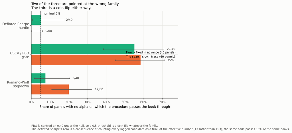
Realised size on a family fixed in advance against the search’s own trace

ProcedureFamily fixed in advance (40 panels)The search’s own trace (60 panels)
Deflated Sharpe hurdle2 of 40 (5%)0 of 60 at N = 193 logged; 9 of 60 (15%) at N effective = 13
CSCV / PBO gate22 of 40 (55%)35 of 60 (58%)
Romano–Wolf stepdown3 of 40 (8%)12 of 60 (20%)

On a family chosen before the data I can detect no inflation in either formal procedure. Forty panels is not enough to certify a 5% test — the Romano–Wolf interval runs from 1.6% to 20.4% — so read that column as the absence of the gross inflation the search family produces, not as a calibration certificate. What is unambiguous is the other side. Pointed at the family the search produced, Romano–Wolf rejects on 12 of 60 panels containing nothing: four times nominal, binomial p < 10⁻⁴. Forty panels against sixty is too little to make the 8%-versus-20% contrast itself significant — Fisher’s exact test on that comparison gives p = 0.15 — so the claim that carries is the one against nominal, not the one across columns. The size inflation on the search family is also not a bootstrap artefact: it holds at expected block lengths of 5, 21 and 63 days and at 500 and 2,000 replications, ranging from 18% to 20% across all four settings.

Why? Not because the bootstrap fails to see the generations that bred the survivors — restrict the family to the search’s round-zero population, random expressions no selection has touched, and rejections fall from 12 panels to 6 (paired exact p = 0.07). That points at adaptive breeding as one contributor rather than the whole story; on sixty panels it is a direction, not a decomposition. The rest is the plainer fact that the family was chosen by looking at the window the test then uses.

The deflated Sharpe ratio is a more uncomfortable case, because its answer is determined by a number you supply. It needs the number of trials; I gave it the count of distinct expressions the search logged, a mean of 193 across panels (range 103 to 258). Those are not independent trials — the participation ratio of their correlation matrix averages 13 (range 5 to 26). Feeding 193 independent trials into a formula that assumes independence pushes the expected-maximum benchmark above the book’s Sharpe on 40 of 60 panels, and leaves the z-statistic short of the 95th percentile on the other twenty — so the hurdle rejects everything. Feed it 13 and the same code, on the same books, passes 9 of 60 — three times nominal (p = 0.003), in the opposite direction. The control’s verdict is a function of a modelling choice nobody documents. To be clear, no published implementation asks for an effective trial count; this is an extension of the method, not a correction to it.

And then there is PBO, which I had been treating as a control and which is not one. CSCV’s logit statistic is symmetric about zero when the candidate strategies are exchangeable and null, so the probability of backtest overfitting is centred on 0.49 — by construction, not by accident. A threshold at 0.5 is therefore a coin flip on data containing nothing: it passes 55% of pre-specified null books and 58% of searched null books. It is not powerless — against the strong plant it passes 95% — but a gate whose false-pass rate is 58% is not a 5% test, whatever it does on real signal.

4. What the controls cost you

Removing fiction is half of a control’s job. The other half is not destroying the thing you are looking for, and you cannot measure that on a null panel.

Against the strong plant — realised out-of-sample oracle Sharpe 2.43, above what the search can manufacture — here is what each control finds of it, alongside what it removes:
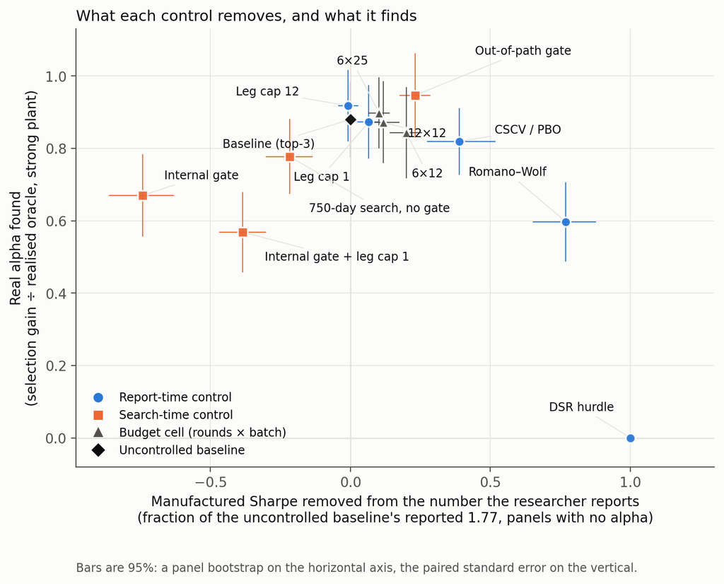
What each control removes and what it keeps

The right-hand column is the selection gain defined in the Setup — what selecting on the planted panel adds over what a null-selected book earns on it by construction. The raw ratio of book Sharpe to oracle is lower, because a book’s exposure to the plant is slightly negative on average: 0.81 for the baseline and 0.85 for the out-of-path gate.

ControlManufactured Sharpe removedReal alpha found (selection gain ÷ oracle)
Out-of-path gate0.230.95
Leg cap 12−0.010.92
Budget 6 × 250.100.90
Uncontrolled baseline—0.88
Leg cap 10.070.87
Budget 12 × 120.120.87
Budget 6 × 120.200.84
CSCV / PBO gate0.390.82
750-day search, no gate−0.220.78
Internal gate−0.740.67
Romano–Wolf stepdown0.770.60
Internal gate + leg cap 1−0.380.57
Deflated Sharpe hurdle1.000.00

The minimum difference detectable at 80% power between the baseline and any of the seven pre-registered controls in that column, after Holm across the whole 84-test scan, runs from 0.05 to 0.21 of the oracle. Differences smaller than that should not be read — including the gap between the out-of-path gate’s 0.95 and the uncontrolled baseline’s 0.88, which is nominally the largest in the table and is not separable at this sample size.

The deflated Sharpe hurdle rejects a genuine 2.4-Sharpe strategy on all sixty panels, and passes exactly one of the sixty carrying the weak plant. Its perfect score in the removal column and its zero in the retention column are the same fact stated twice. A control that abstains on everything is unfalsifiable on null data and useless on real data, and you cannot tell those two properties apart without running a planted arm.

Romano–Wolf is the most defensible trade in the table: it removes 77% of the fiction — by abstaining four times in five — and keeps 60% of a strong real signal. That is a real control with a real price, which is more than most of this column can claim.

The out-of-path gate keeps the most alpha while removing a real 23% of the fiction. It is the only control whose null-panel out-of-sample Sharpe is even marginally negative (−0.086, SE 0.045, 95% CI [−0.17, +0.00]) — a t of 1.9 in a scan across fourteen arms, and inside the residual-tilt bound I flagged in the Setup, so I would not lean on the sign.

Four controls dominate the internal gate on both axes after Holm adjustment: leg cap 1, leg cap 12, the out-of-path gate, and — awkwardly — the PBO gate I have just described as a coin flip. No other pair dominates. That a gate with no size control still dominates the internal gate says more about the internal gate than it does about PBO.

A fourteenth arm, the shorter search with a leg cap of 1, is in the repository and not in these tables: it reports 2.01 on null panels — a little less inflation than the window-matched arm’s 2.15 — and finds 0.78 of the plant, which is the window-matched arm’s figure to within noise.
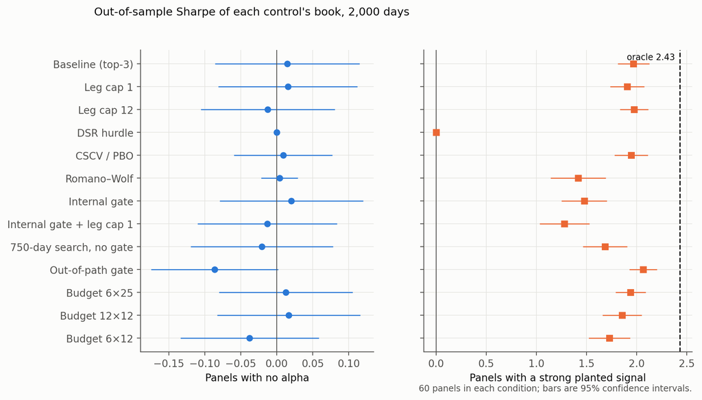
Out-of-sample Sharpe of each control’s book, with no alpha and with a strong plant

One more thing this table only shows because there is a strong plant in the study. Against the weak plant — oracle 0.59 — the uncontrolled pipeline’s selection gain is 11% of the oracle with a minimum detectable effect of 27%. That is not a finding, it is a non-detection, and the first pass of this study reported it as “the search captures 6% of the real signal”. The honest version is conditional and worth stating precisely: a search that ranks on in-sample Sharpe finds real alpha when the real alpha is larger than the alpha it can manufacture, and there is no evidence either way when it is smaller.

5. The agent behaves much like the machine

Eighteen fresh runs of the September research agent through a gated harness, six per condition, with the prompt frozen:

ConditionReported in-sampleRealised out-of-sampleOracleFound the plant
No alpha1.41−0.16 (SE 0.12)——
Weak plant1.52+0.24 (SE 0.17)0.503 of 6 exactly, 4 of 6 by family
Strong plant2.91+2.04 (SE 0.16)2.313 of 6 exactly, 6 of 6 by family

Manufactures on nothing, indistinguishable from noise against a weak signal, and its book earns 88% of the strong plant’s oracle out of sample against the mechanical pipeline’s 81% on the same raw basis. The arms ran on different panels and are not formally compared; qualitatively, whatever an LLM researcher is doing, it is not different enough from an evolutionary search to warrant a different control regime.

The arm is not blinded: the run id the agent types on every harness call carries the condition, K0, K1 or K2. Nothing in the logs refers to it, but it was in front of the agent, and six runs per condition is a small arm.

Two details worth having. The agents worked harder when there was more to find — 4.2 evaluation batches of a permitted 12 against the weak plant, 8.5 against the strong one — but they did not stop early on the null panel, where they used 5.7 batches and one run burned all twelve. That is responsiveness to signal strength, not an ability to notice there is nothing there.

And the twelve September agent traces, re-scored under the report-time controls on drift-free panels, behave as the mechanical arms do: the deflated Sharpe hurdle passes 0 of 12, PBO 5 of 12, Romano–Wolf 7 of 12. The exception is leg caps, which move an agent’s reported Sharpe by +0.02 on average at a cap of one and −0.02 at a cap of twelve — never by more than 0.29 on any single run, and in no consistent direction — because an agent’s legs live inside a single expression rather than in the count of expressions. Any control that counts expressions is close to blind to an agent.

6. One real path, for illustration

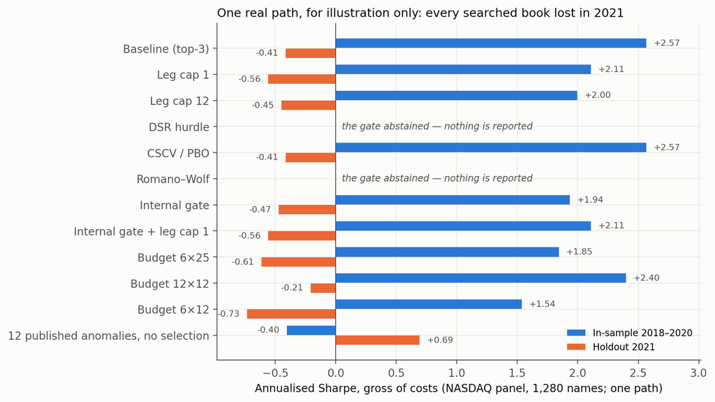
The same pipeline on a real panel — 1,280 NASDAQ names, search 2018–2020, holdout 2021 [5]. One path, a stale and survivorship-conditioned dataset, and a universe filter that looks at the whole sample. It evidences nothing; it is here because it makes the synthetic result legible.

BookIn-sample 2018–2020Holdout 2021Through May 2023
Baseline (top-3)+2.57−0.41−0.24
Leg cap 1+2.11−0.56−0.45
Leg cap 12+2.00−0.45−0.26
CSCV / PBO (passed)+2.57−0.41−0.24
Internal gate+1.94−0.47−0.26
Internal gate + leg cap 1+2.11−0.56−0.45
Budget 6 × 25+1.85−0.61−0.52
Budget 12 × 12+2.40−0.21−0.30
Budget 6 × 12+1.54−0.73−0.64
Deflated Sharpe hurdleabstained——
Romano–Wolfabstained——
Twelve published anomalies, no selection−0.40+0.69+0.69

Every searched book on the real panel, in sample and out

Every searched book turned negative. The unselected canon, which looked worst in sample, was the only thing that worked out of sample. Consistent with the synthetic result, and worth precisely as much as one path is worth.

One inconsistency to flag rather than let a reader find: the in-sample column here is the full 2018–2020 window for every book, including the internal gate, so it is not the reported-window number section 2 corrects to. On this arm the gate therefore appears to lower the in-sample figure when the synthetic result says it raises the number the gate’s user would report. The real panel’s dataset is fetched over the network and I could not re-score that row from the sandbox this study ran in; it is stated here rather than quietly left in the table.

The pre-registration scorecard

PredictionVerdict
P1 the out-of-path gate dominates the DSR hurdle on both axesRefuted, with each control winning one axis: the out-of-path gate removes 1.36 less of the reported Sharpe (CI [−1.45, −1.27]) and finds 2.07 more of the plant (CI [+1.92, +2.21])
P2 a leg cap of 1 removes ≥ 0.20 more than the smallest budget cellRefuted: −0.13, CI [−0.19, −0.07]
P3 the DSR hurdle’s size exceeds 25%Refuted: 0 of 60, conditional on N = logged candidates
P4a the internal gate costs ≥ 0.10 Sharpe on planted panelsConfirmed: −0.49, CI [−0.69, −0.29]
P4b the internal gate removes ≥ 0.50 of the manufactured SharpeRefuted, and in the opposite direction: −0.74

Things that did not work

The leg axis. Capping a book at one leg removes 0.13 less manufactured Sharpe than the smallest search budget does — the budget axis beat the leg axis, and leg caps are close to a no-op on this pipeline. Against an agent they are a complete no-op, for the reason in section 5. This is the one place where I expected a result from the literature to transfer and it didn’t: in-sample statistics do inflate with the number of combined signals [9], but not in a way a cap on the count can reach when the signals are themselves sums.

The pre-registered “oracle frontier” — thresholding candidates on their true out-of-sample Sharpe to trace the best attainable trade-off — is not reported at all. Estimating “true” out-of-sample Sharpe on the same window that scores the books is circular, and on null panels it obligingly produced a frontier that “retained” +0.60 of Sharpe that does not exist. The file is in the repository; the chart does not draw it.

And the first version of this study, which four reviewers took apart before publication. The largest correction was measuring each control on the number a researcher reports rather than the number they discard, which reversed the sign of the headline. The second was noticing that my planted signal had been calibrated to a level the search could beat by fabrication, which made one of my conclusions a property of the experiment rather than of the world. The third was catching three numbers quoted from the weak-plant arm where the text said otherwise. The fourth was showing that this post’s own draft compared the random family and the search on different windows, which inflated the gap in section 1 into a result it is not. All eighteen deviations are logged, and the first-pass tables sit in the repository beside the corrected ones.

What this does and does not show

It does show that on a verified-null panel an in-sample Sharpe of about 1.9 comes out of selecting three candidates from a couple of hundred, on the window the selection is made, and that twelve rounds of adaptive search add nothing measurable to that number.

It does show that a held-out validation window, used the way it is normally used, raises the reported Sharpe rather than lowering it, by roughly the factor the standard error of a Sharpe estimate predicts; and that a fresh-path re-test mostly relocates the manufactured Sharpe rather than removing it.

It does show that two of the three formal procedures show no detectable inflation on a family fixed in advance and are grossly mis-sized on a family the search selected; and that the third is centred on its own threshold under the null and therefore does not decide anything about size.

It does show that a pipeline, mechanical or agentic, recovers most of a planted signal strong enough to beat what it can manufacture — and that the deflated Sharpe hurdle, as conventionally parameterised, destroys all of it.

It does not show that any of these procedures is wrong. Each is implemented here against its published definition and is doing what it was designed to do on the input it is handed.

It does not show anything about faint alpha. Against a signal with a 0.59 oracle Sharpe this design cannot separate “finds nothing” from “finds a quarter of it”. That needs more panels or a longer scoring window.

It does not show a ranking of controls that transfers. The removal axis depends on the reporting convention, the retention axis on a plant that happens to be a single expression the grammar can write exactly — evaluated verbatim by the mechanical search on only 6 of the 60 strong-plant panels, so its findability is not an artefact of expressibility, but a plant the grammar cannot write at all would give a different answer. The leg-cap results depend on a grammar in which a leg is a separate expression, and every net-of-cost number on a book volatility of about 2.5%.

It does not show anything about real markets. One path on a stale dataset is an illustration.

So what do you do?

Report the number you selected on, and say which window it is. Most of the apparent power of every re-selection control in this study came from measuring it on a window the researcher had already discarded: the out-of-path gate’s removal falls from 0.99 to 0.23 when you do this properly, and the internal gate’s flips sign, from +0.47 to −0.74. If your validation split produces a Sharpe of 3.1 where your in-sample fit produced 1.8, the honest headline is 3.1, and the fact that it is larger should alarm you rather than reassure you.

Write down the family before you look. Not the trial count — the family. Every procedure in section 3 shows no inflation on a family fixed in advance and gross inflation on a family your search selected, and the difference between those is a decision you make before the data, not a correction you apply after it.

If you use the deflated Sharpe ratio, state how you counted trials, and report the effective number alongside the raw count. The gap between 193 and 13 on the same candidate set moved the pass rate from 0% to 15%. No published implementation asks for an effective count, so this is an extension rather than a fix — but a DSR quoted without saying how trials were counted is a number with a free parameter in it.

Stop using a PBO threshold of 0.5 as a gate. It is centred on 0.49 under the null. Use the distribution, or use something else.

Run a planted arm. This is the one that costs real effort and is worth it. A control that abstains on everything looks perfect on a null panel; you only find out what it costs when you give it something real to find. And calibrate the plant above what your own pipeline can fabricate, or you will measure your calibration rather than your control — which is exactly what the first version of this study did.

Code and data

The repository holds the pre-registered analysis plan committed before the first run, eighteen logged deviations from it, the corrected generator with its bitwise verification against the September panels, the calibration of both plants, the full study across 180 panels, the pre-specified-family placebo, the erratum arithmetic against all 294 previously published books, the agent harness with every run log and journal, the canary tests, and the analysis and figure code. Seeds: study panels 9000–9059, calibration 8000–8029, placebo panels 9500–9539, pre-specified family drawn from seed 20260921. Everything except the LLM calls reproduces from those seeds; the LLM calls are not re-runnable, which is why the logs are included in full. The repository is at github.com/jkinlay/research-controls; this article refers to commit c11241e.

Two requests of anyone re-running it. Fix your family before you look at the data, and keep the list. And run a planted arm alongside the null arm — half the results here are invisible without one.

References

[1] Bailey & López de Prado, The Deflated Sharpe Ratio: Correcting for Selection Bias, Backtest Overfitting and Non-Normality, Journal of Portfolio Management 40(5), 2014.

[2] Bailey, Borwein, López de Prado & Zhu, The Probability of Backtest Overfitting, Journal of Computational Finance 20(4), 2017; and Pseudo-Mathematics and Financial Charlatanism, Notices of the AMS 61(5), 2014, for the expected-maximum-Sharpe result.

[3] Romano & Wolf, Stepwise Multiple Testing as Formalized Data Snooping, Econometrica 73(4), 2005, 1237–1282. The stepdown implemented here is the one-sided studentised version at 5% familywise error.

[4] Politis & Romano, The Stationary Bootstrap, Journal of the American Statistical Association 89(428), 1994. Expected block length 21 days throughout. The section 3 size result is stable across that choice: 18% at a block length of 5, 20% at 21, 18% at 63, and 18% at 21 with 2,000 replications rather than 500.

[5] skfolio, load_nasdaq_dataset — daily adjusted closes, 1,455 NASDAQ constituents, 2018-01-02 to 2023-05-31, documented by its authors as a stale dataset not intended for investment or commercial use. Filtered here to 1,280 names with median price ≥ $5.

[6] Harvey & Liu, Backtesting, Journal of Portfolio Management 42(1), 2015 — the multiple-testing haircut the report-time controls in section 3 descend from.

[7] Harvey & Liu, False (and Missed) Discoveries in Financial Economics, Journal of Finance 75(5), 2020, on the two-sided cost of correction; section 4 is a direct measurement of the missed-discovery side. See also Chen, The Limits of p-Hacking: Some Thought Experiments, Journal of Finance 76(5), 2021, 2447–2480, for the argument that selection alone cannot account for the observed cross-section — the complement of the measurement in section 1.

[8] Dwork, Feldman, Hardt, Pitassi, Reingold & Roth, The reusable holdout: Preserving validity in adaptive data analysis, Science 349(6248), 2015. Section 2 is the practical, one-reuse form of the result that a holdout used for selection stops being a holdout.

[9] Novy-Marx, Backtesting Strategies Based on Multiple Signals, NBER Working Paper 21329, 2015, on the inflation of in-sample statistics with the number of combined signals — the leg axis that section 4 finds to be a no-op here.

Disclosure: I run systematic strategies. Nothing here is a recommendation, and no strategy discussed is one I trade. These are diagnostic quantities from a methodological experiment on synthetic data and one stale public dataset, not a track record.

Developing Trading Strategies With Synthetic Data

One of the main criticisms levelled at systematic trading over the last few years is that the over-use of historical market data has tended to produce curve-fitted strategies that perform poorly out of sample in a live trading environment. This is indeed a valid criticism – given enough attempts one is bound to arrive eventually at a strategy that performs well in backtest, even on a holdout data sample. But that by no means guarantees that the strategy will continue to perform well going forward.

The solution to the problem has been clear for some time: what is required is a method of producing synthetic market data that can be used to build a strategy and test it under a wide variety of simulated market conditions. A strategy built in this way is more likely to survive the challenge of live trading than one that has been developed using only a single historical data path.

The problem, however, has been in implementation. Up until now all the attempts to produce credible synthetic price data have failed, for one reason or another, as I described in an earlier post:

I have been able to devise a completely new algorithm for generating artificial price series that meet all of the key requirements, as follows:

  • Computational simplicity & efficiency. Important if we are looking to mass-produce synthetic series for a large number of assets, for a variety of different applications. Some deep learning methods would struggle to meet this requirement, even supposing that transfer learning is possible.
  • The ability to produce price series that are internally consistent (i.e High > Low, etc) in every case .
  • Should be able to produce a range of synthetic series that vary widely in their correspondence to the original price series. In some case we want synthetic price series that are highly correlated to the original; in other cases we might want to test our investment portfolio or risk control systems under extreme conditions never before seen in the market.
  • The distribution of returns in the synthetic series should closely match the historical series, being non-Gaussian and with “fat-tails”.
  • The ability to incorporate long memory effects in the sequence of returns.
  • The ability to model GARCH effects in the returns process.

This means that we are now in a position to develop trading strategies without any direct reference to the underlying market data. Consequently we can then use all of the real market data for out-of-sample back-testing.

Developing a Trading Strategy for the S&P 500 Index Using Synthetic Market Data

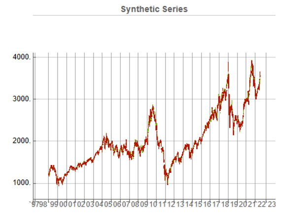
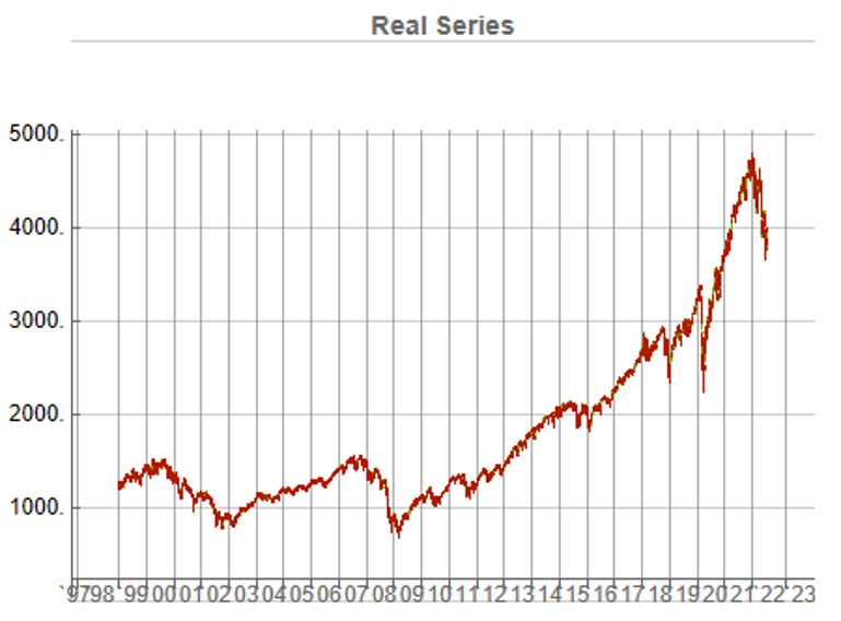
To illustrate the procedure I am going to use daily synthetic price data for the S&P 500 Index over the period from Jan 1999 to July 2022. Details of the the characteristics of the synthetic series are given in the post referred to above.

This image has an empty alt attribute; its file name is Fig3-12.png

Because we want to create a trading strategy that will perform under market conditions close to those currently prevailing, I will downsample the synthetic series to include only those that correlate quite closely, i.e. with a minimum correlation of 0.75, with the real price data.

Why do this? Surely if we want to make a strategy as robust as possible we should use all of the synthetic data series for model development?

The reason is that I believe that some of the more extreme adverse scenarios generated by the algorithm may occur quite rarely, perhaps once in every few decades. However, I am principally interested in a strategy that I can apply under current market conditions and I am prepared to take my chances that the worst-case scenarios are unlikely to come about any time soon. This is a major design decision, one that you may disagree with. Of course, one could make use of every available synthetic data series in the development of the trading model and by doing so it is likely that you would produce a model that is more robust. But the training could take longer and the performance during normal market conditions may not be as good.

Having generated the price series, the process I am going to follow is to use genetic programming to develop trading strategies that will be evaluated on all of the synthetic data series simultaneously. I will then use the performance of the aggregate portfolio, i.e. the outcome of all of the trades generated by the strategy when applied to all of the synthetic series, to assess the overall performance. In order to be considered, candidate strategies have to perform well under all of the different market scenarios, or at least the great majority of them. This ensures that the strategy is likely to prove more robust across different types of market conditions, rather than on just the single type of market scenario observed in the real historical series.

As usual in these cases I will reserve a portion (10%) of each data series for testing each strategy, and a further 10% sample for out-of-sample validation. This isn’t strictly necessary: since the real data series has not be used directly in the development of the trading system, we can later test the strategy on all of the historical data and regard this as an out-of-sample backtest.

To implement the procedure I am going to use Mike Bryant’s excellent Adaptrade Builder software.

This is an exemplar of outstanding software engineering and provides a broad range of features for generating trading strategies of every kind. One feature of Builder that is particularly useful in this context is its ability to construct strategies and test them on up to 20 data series concurrently. This enables us to develop a strategy using all of the synthetic data series simultaneously, showing the performance of each individual strategy as well for as the aggregate portfolio.

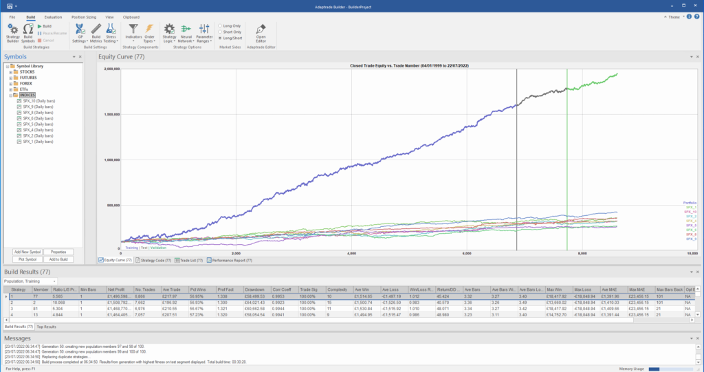
After evolving strategies for 50 generations we arrive at the following outcome:

The equity curve for the aggregate portfolio is shown in blue, while the equity curves for the strategy applied to individual synthetic data series are shown towards the bottom of the chart. Of course, the performance of the aggregate portfolio appears much superior to any of the individual strategies, because it is effectively the arithmetic sum of the individual equity curves. And just because the aggregate portfolio appears to perform well both in-sample and out-of-sample, that doesn’t imply that the strategy works equally well for every individual market scenario. In some scenarios it performs better than in others, as can be observed from the individual equity curves.

But, in any case, our objective here is not to create a stock portfolio strategy, but rather to trade a single asset – the S&P 500 Index. The role of the aggregate portfolio is simply to suggest that we may have found a strategy that is sufficiently robust to work well across a variety of market conditions, as represented by the various synthetic price series.

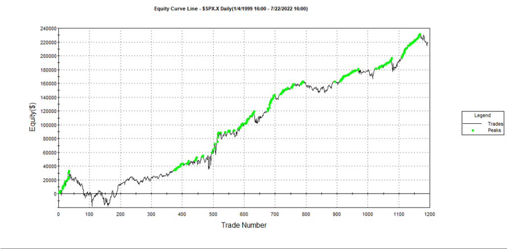
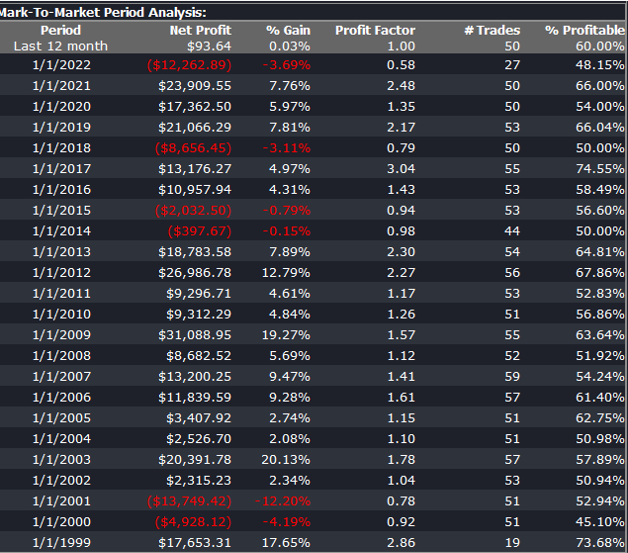
Builder generates code for the strategies it evolves in a number of different languages and in this case we take the EasyLanguage code for the fittest strategy #77 and apply it to a daily chart for the S&P 500 Index – i.e. the real data series – in Tradestation, with the following results:

The strategy appears to work well “out-of-the-box”, i,e, without any further refinement. So our quest for a robust strategy appears to have been quite successful, given that none of the 23-year span of real market data on which the strategy was tested was used in the development process.

We can take the process a little further, however, by “optimizing” the strategy. Traditionally this would mean finding the optimal set of parameters that produces the highest net profit on the test data. But this would be curve fitting in the worst possible sense, and is not at all what I am suggesting.

Instead we use a procedure known as Walk Forward Optimization (WFO), as described in this post:

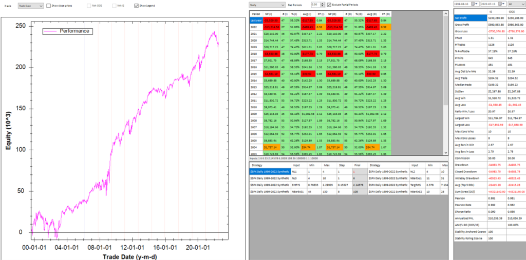
The goal of WFO is not to curve-fit the best parameters, which would entirely defeat the object of using synthetic data. Instead, its purpose is to test the robustness of the strategy. We accomplish this by using a sequence of overlapping in-sample and out-of-sample periods to evaluate how well the strategy stands up, assuming the parameters are optimized on in-sample periods of varying size and start date and tested of similarly varying out-of-sample periods. A strategy that fails a cluster of such tests is unlikely to prove robust in live trading. A strategy that passes a test cluster at least demonstrates some capability to perform well in different market regimes.

To some extent we might regard such a test as unnecessary, given that the strategy has already been observed to perform well under several different market conditions, encapsulated in the different synthetic price series, in addition to the real historical price series. Nonetheless, we conduct a WFO cluster test to further evaluate the robustness of the strategy.

As the goal of the procedure is not to maximize the theoretical profitability of the strategy, but rather to evaluate its robustness, we select a criterion other than net profit as the factor to optimize. Specifically, we select the sum of the areas of the strategy drawdowns as the quantity to minimize (by maximizing the inverse of the sum of drawdown areas, which amounts to the same thing). This requires a little explanation.

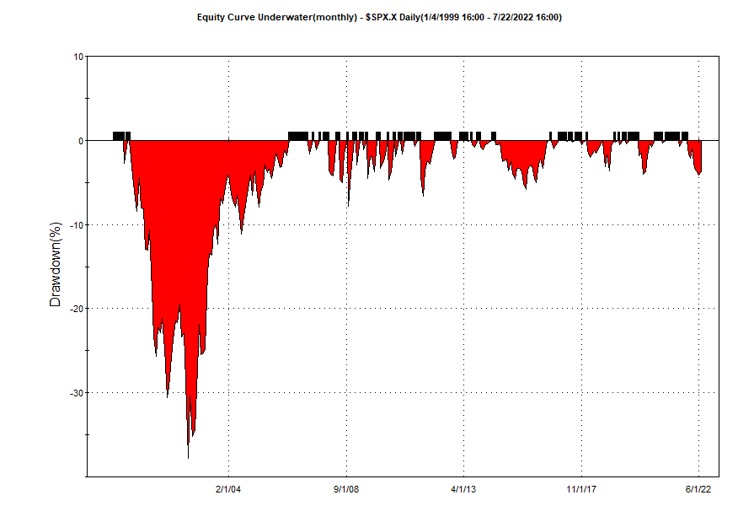
If we look at the strategy drawdown periods of the equity curve, we observe several periods (highlighted in red) in which the strategy was underwater:

The area of each drawdown represents the length and magnitude of the drawdown and our goal here is to minimize the sum of these areas, so that we reduce both the total duration and severity of strategy drawdowns.

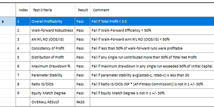
In each WFO test we use different % of OOS data and a different number of runs, assessing the performance of the strategy on a battery of different criteria:

x

These criteria not only include overall profitability, but also factors such as parameter stability, profit consistency in each test, the ratio of in-sample to out-of-sample profits, etc. In other words, this WFO cluster analysis is not about profit maximization, but robustness evaluation, as assessed by these several different metrics. And in this case the strategy passes every test with flying colors:

Other than validating the robustness of the strategy’s performance, the overall effect of the procedure is to slightly improve the equity curve by diminishing the magnitude and duration of the drawdown periods:

Conclusion

We have shown how, by using synthetic price series, we can build a robust trading strategy that performs well under a variety of different market conditions, including on previously “unseen” historical market data. Further analysis using cluster WFO tests strengthens the assessment of the strategy’s robustness.

Capitalizing on the Coming Market Crash

Long-Only Equity Investors

Recently I have been discussing possible areas of collaboration with an RIA contact on LinkedIn, who also happens to be very familiar with the hedge fund world.  He outlined the case of a high net worth investor in equities (long only), who wanted to remain invested, but was becoming increasingly concerned about the prospects for a significant market downturn, or even a market crash, similar to those of 2000 or 2008.

I am guessing he is not alone: hardly a day goes by without the publication of yet another article sounding a warning about stretched equity valuations and the dangerously elevated level of the market.

The question put to me was, what could be done to reduce the risk in the investor’s portfolio?

Typically, conservative investors would have simply moved more of their investment portfolio into fixed income securities, but with yields at such low levels this is hardly an attractive option today. Besides, many see the bond market as representing an even more extreme bubble than equities currently.

SSALGOTRADING AD

Hedging Strategies

The problem with traditional hedging mechanisms such as put options, for example, is that they are relatively expensive and can easily reduce annual returns from the overall portfolio by several hundred basis points.  Even at current low level of volatility the performance drag is noticeable, since the potential upside in the equity portfolio is also lower than it has been for some time.  A further consideration is that many investors are not mandated – or are simply reluctant – to move beyond traditional equity investing into complex ETF products or derivatives.

An equity long/short hedge fund product is one possible solution, but many equity investors are reluctant to consider shorting stocks under any circumstances, even for hedging purposes. And while a short hedge may provide some downside protection it is unlikely to fully safeguard the investor in a crash scenario.  Furthermore, the cost of a hedge fund investment is typically greater than for a long-only product, entailing the payment of a performance fee in addition to management fees that are often higher than for standard investment products.

The Ideal Investment Strategy

Given this background, we can say that the ideal investment strategy is one that:

  • Invests long-only in equities
  • Is inexpensive to implement (reasonable management fees; no performance fees)
  • Does not require shorting stocks, or expensive hedging mechanisms such as options
  • Makes acceptable returns during both bull and bear markets
  • Is likely to produce positive returns in a market crash scenario

A typical buy-and-hold approach is unlikely to meet only the first three requirements, although an argument could be made that a judicious choice of defensive stocks might enable the investment portfolio to generate returns at an “acceptable” level during a downturn (without being prescriptive as to the precise meaning of that term may be).  But no buy-and-hold strategy could ever be expected to prosper during times of severe market stress.  A more sophisticated approach is required.

Market Timing

Market timing is regarded as a “holy grail” by some quantitative strategists.  The idea, simply, is to increase or reduce risk exposure according to the prospects for the overall market.  For a very long time the concept has been dismissed as impossible, by definition, given that markets are mostly efficient.  But analysts have persisted in the attempt to develop market timing techniques, motivated by the enormous benefits that a viable market timing strategy would bring.  And gradually, over time, evidence has accumulated that the market can be timed successfully and profitably.  The rate of progress has accelerated in the last decade by the considerable advances in computing power and the development of machine learning algorithms and application of artificial intelligence to investment finance.

I have written several articles on the subject of market timing that the reader might be interested to review (see below).  In this article, however, I want to focus firstly on the work on another investment strategist, Blair Hull.

http://jonathankinlay.com/2014/07/how-to-bulletproof-your-portfolio/


http://jonathankinlay.com/2014/07/enhancing-mutual-fund-returns-with-market-timing/

The Hull Tactical Fund

Blair Hull rose to prominence in the 1980’s and 1990’s as the founder of the highly successful quantitative option market making firm, the Hull Trading Company which at one time moved nearly a quarter of the entire daily market volume on some markets, and executed over 7% of the index options traded in the US. The firm was sold to Goldman Sachs at the peak of the equity market in 1999, for a staggering $531 million.

Blair used the capital to establish the Hull family office, Hull Investments, and in 2013 founded an RIA, Hull Tactical Asset Allocation LLC.   The firm’s investment thesis is firmly grounded in the theory of market timing, as described in the paper “A Practitioner’s Defense of Return Predictability”,  authored by Blair Hull and Xiao Qiao, in which the issues and opportunities of market timing and return predictability are explored.

In 2015 the firm launched The Hull Tactical Fund (NYSE Arca: HTUS), an actively managed ETF that uses quantitative trading model to take long and short positions in ETFs that seek to track the performance of the S&P 500, as well as leveraged ETFs or inverse ETFs that seek to deliver multiples, or the inverse, of the performance of the S&P 500.  The goal to achieve long-term growth from investments in the U.S. equity and Treasury markets, independent of market direction.

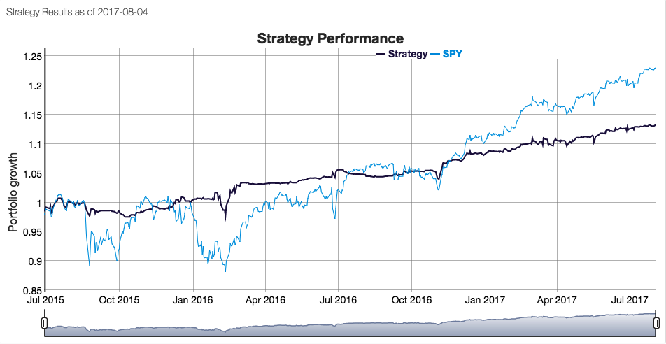
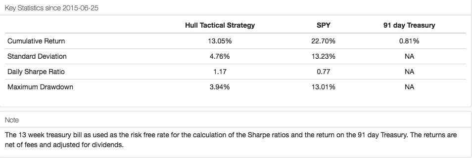
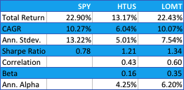
How well has the Hull Tactical strategy performed? Since the fund takes the form of an ETF its performance is a matter in the public domain and is published on the firm’s web site.  I reproduce the results here, which compare the performance of the HTUS ETF relative to the SPDR S&P 500 ETF (NYSE Arca: SPY):


Hull1


Hull3


Although the HTUS ETF has underperformed the benchmark SPY ETF since launching in 2015, it has produced a higher rate of return on a risk-adjusted basis, with a Sharpe ratio of 1.17 vs only 0.77 for SPY, as well as a lower drawdown (-3.94% vs. -13.01%).  This means that for the same “risk budget” as required to buy and hold SPY, (i.e. an annual volatility of 13.23%), the investor could have achieved a total return of around 36% by using margin funds to leverage his investment in HTUS by a factor of 2.8x.

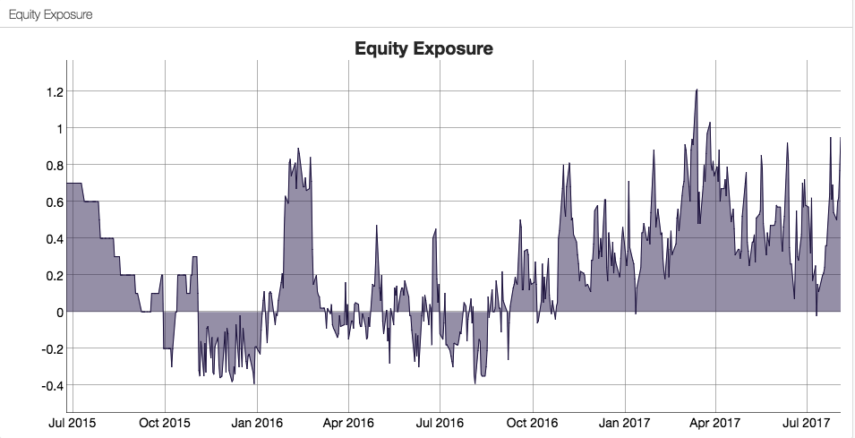
How does the Hull Tactical team achieve these results?  While the detailed specifics are proprietary, we know from the background description that market timing (and machine learning concepts) are central to the strategy and this is confirmed by the dynamic level of the fund’s equity exposure over time:


Hull2


A Long-Only, Crash-Resistant Equity Strategy

A couple of years ago I and my colleagues carried out an investigation of long-only equity strategies as part of a research project.  Our primary focus was on index replication, but in the course of our research we came up with a methodology for developing long-only strategies that are highly crash-resistant.

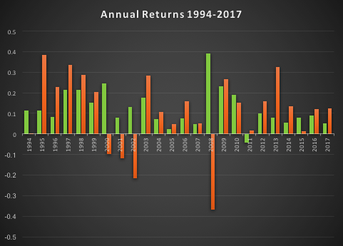
The performance of our Long-Only Market Timing strategy is summarized below and compared with the performance of the HTUS ETF and benchmark SPY ETF (all results are net of fees).  Over the period from inception of the HTUS ETF, our LOMT strategy produced a higher total return than HTUS (22.43% vs. 13.17%), higher CAGR (10.07% vs. 6.04%), higher risk adjusted returns (Sharpe Ratio 1.34 vs 1.21) and larger annual alpha (6.20% vs 4.25%).  In broad terms, over this period the LOMT strategy produced approximately the same overall return as the benchmark SPY ETF, but with a little over half the annual volatility.


Fig4


Fig5

Application of Artificial Intelligence to Market Timing

Like the HTUS ETF, our LOMT strategy operates with very low fees, comparable to an ETF product rather than a hedge fund (1% management fee, no performance fees).  Again, like the HTUS ETF our LOMT products makes no use of leverage.  However, unlike HTUS it avoids complicated (and expensive) inverse or leveraged ETF products and instead invests only in two assets – the SPY ETF and 91-day US Treasury Bills.  In other words, the LOMT strategy is a pure market timing strategy, moving capital between the SPY ETF and Treasury Bills depending on its forecast of future market performance.  These forecasts are derived from machine learning algorithms that are specifically tuned to minimize the downside risk in the investment portfolio.  This not only makes strategy returns less volatile, but also ensures that the strategy is very robust to market downturns.

In fact, even better than that,  not only does the LOMT strategy tend to avoid large losses during periods of market stress, it is capable of capitalizing on the opportunities that more volatile market conditions offer.  Looking at the compounded returns (net of fees) over the period from 1994 (the inception of the SPY ETF) we see that the LOMT strategy produces almost double the total profit of the SPY ETF, despite several years in which it underperforms the benchmark.  The reason is clear from the charts:  during the periods 2000-2002 and again in 2008, when the market crashed and returns in the SPY ETF were substantially negative, the LOMT strategy managed to produce positive returns.  In fact, the banking crisis of 2008 provided an exceptional opportunity for the LOMT strategy, which in that year managed to produce a return nearing +40% at a time when the SPY ETF fell by almost the same amount!


Fig6


Fig7


Long Volatility Strategies

I recall having a conversation with Nassim Taleb, of Black Swan fame, about his Empirica fund around the time of its launch in the early 2000’s.  He explained that his analysis had shown that volatility was often underpriced due to an under-estimation of tail risk, which the fund would seek to exploit by purchasing cheap out-of-the-money options.  My response was that this struck me a great idea for an insurance product, but not a hedge fund – his investors, I explained, were going to hate seeing month after month of negative returns and would flee the fund.  By the time the big event occurred there wouldn’t be sufficient AUM remaining to make up the shortfall.  And so it proved.

A similar problem arises from most long-volatility strategies, whether constructed using options, futures or volatility ETFs:  the combination of premium decay and/or negative carry typically produces continuing losses that are very difficult for the investor to endure.

Conclusion

What investors have been seeking is a strategy that can yield positive returns during normal market conditions while at the same time offering protection against the kind of market gyrations that typically decimate several years of returns from investment portfolios, such as we saw after the market crashes in 2000 and 2008.  With the new breed of long-only strategies now being developed using machine learning algorithms, it appears that investors finally have an opportunity to get what they always wanted, at a reasonable price.

And just in time, if the prognostications of the doom-mongers turn out to be correct.

Contact Hull Tactical

Contact Systematic Strategies

Crash-Proof Investing

As markets continue to make new highs against a backdrop of ever diminishing participation and trading volume, investors have legitimate reasons for being concerned about prospects for the remainder of 2016 and beyond, even without consideration to the myriad of economic and geopolitical risks that now confront the US and global economies. Against that backdrop, remaining fully invested is a test of nerves for those whose instinct is that they may be picking up pennies in front an oncoming steamroller.  On the other hand, there is a sense of frustration in cashing out, only to watch markets surge another several hundred points to new highs.

In this article I am going to outline some steps investors can take to match their investment portfolios to suit current market conditions in a way that allows them to remain fully invested, while safeguarding against downside risk.  In what follows I will be using our own Strategic Volatility Strategy, which invests in volatility ETFs such as the iPath S&P 500 VIX ST Futures ETN (NYSEArca:VXX) and the VelocityShares Daily Inverse VIX ST ETN (NYSEArca:XIV), as an illustrative example, although the principles are no less valid for portfolios comprising other ETFs or equities.

SSALGOTRADING AD

Risk and Volatility

Risk may be defined as the uncertainty of outcome and the most common way of assessing it in the context of investment theory is by means of the standard deviation of returns.  One difficulty here is that one may never ascertain the true rate of volatility – the second moment – of a returns process; one can only estimate it.  Hence, while one can be certain what the closing price of a stock was at yesterday’s market close, one cannot say what the volatility of the stock was over the preceding week – it cannot be observed the way that a stock price can, only estimated.  The most common estimator of asset volatility is, of course, the sample standard deviation.  But there are many others that are arguably superior:  Log-Range, Parkinson, Garman-Klass to name but a few (a starting point for those interested in such theoretical matters is a research paper entitled Estimating Historical Volatility, Brandt & Kinlay, 2005).

Leaving questions of estimation to one side, one issue with using standard deviation as a measure of risk is that it treats upside and downside risk equally – the “risk” that you might double your money in an investment is regarded no differently than the risk that you might see your investment capital cut in half.  This is not, of course, how investors tend to look at things: they typically allocate a far higher cost to downside risk, compared to upside risk.

One way to address the issue is by using a measure of risk known as the semi-deviation.  This is estimated in exactly the same way as the standard deviation, except that it is applied only to negative returns.  In other words, it seeks to isolate the downside risk alone.

This leads directly to a measure of performance known as the Sortino Ratio.  Like the more traditional Sharpe Ratio, the Sortino Ratio is a measure of risk-adjusted performance – the average return produced by an investment per unit of risk.  But, whereas the Sharpe Ratio uses the standard deviation as the measure of risk, for the Sortino Ratio we use the semi-deviation. In other words, we are measuring the expected return per unit of downside risk.

There may be a great deal of variation in the upside returns of a strategy that would penalize the risk-adjusted returns, as measured by its Sharpe Ratio. But using the Sortino Ratio, we ignore the upside volatility entirely and focus exclusively on the volatility of negative returns (technically, the returns falling below a given threshold, such as the risk-free rate.  Here we are using zero as our benchmark).  This is, arguably, closer to the way most investors tend to think about their investment risk and return preferences.

In a scenario where, as an investor, you are particularly concerned about downside risk, it makes sense to focus on downside risk.  It follows that, rather than aiming to maximize the Sharpe Ratio of your investment portfolio, you might do better to focus on the Sortino Ratio.


Factor Risk and Correlation Risk

Another type of market risk that is often present in an investment portfolio is correlation risk.  This is the risk that your investment portfolio correlates to some other asset or investment index.  Such risks are often occluded – hidden from view – only to emerge when least wanted.  For example, it might be supposed that a “dollar-neutral” portfolio, i.e. a portfolio comprising equity long and short positions of equal dollar value, might be uncorrelated with the broad equity market indices.  It might well be.  On the other hand, the portfolio might become correlated with such indices during times of market turbulence; or it might correlate positively with some sector indices and negatively with others; or with market volatility, as measured by the CBOE VIX index, for instance.

Where such dependencies are included by design, they are not a problem;  but when they are unintended and latent in the investment portfolio, they often create difficulties.  The key here is to test for such dependencies against a variety of risk factors that are likely to be of concern.  These might include currency and interest rate risk factors, for example;  sector indices; or commodity risk factors such as oil or gold (in a situation where, for example, you are investing a a portfolio of mining stocks).  Once an unwanted correlation is identified, the next step is to adjust the portfolio holdings to try to eliminate it.  Typically, this can often only be done in the average, meaning that, while there is no correlation bias over the long term, there may be periods of positive, negative, or alternating correlation over shorter time horizons.  Either way, it’s important to know.

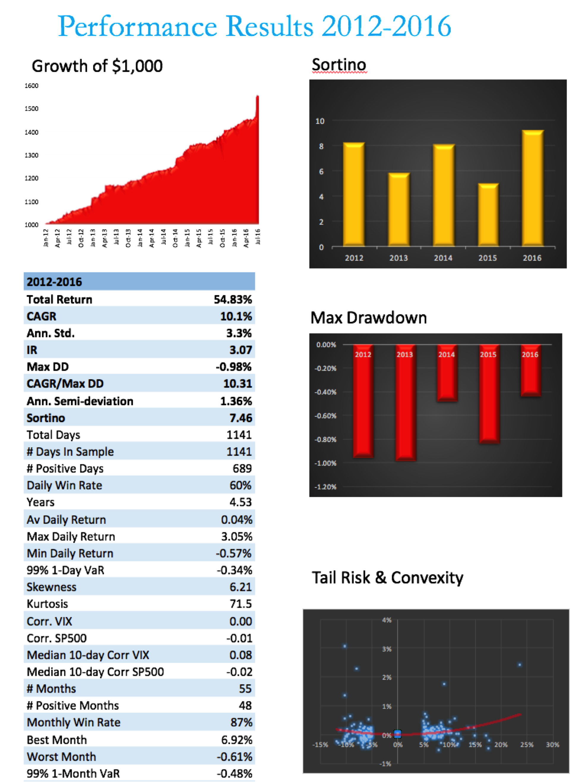
Using the Strategic Volatility Strategy as an example, we target to maximize the Sortino Ratio, subject also to maintaining very lows levels of correlation to the principal risk factors of concern to us, the S&P 500 and VIX indices. Our aim is to create a portfolio that is broadly impervious to changes in the level of the overall market, or in the level of market volatility.


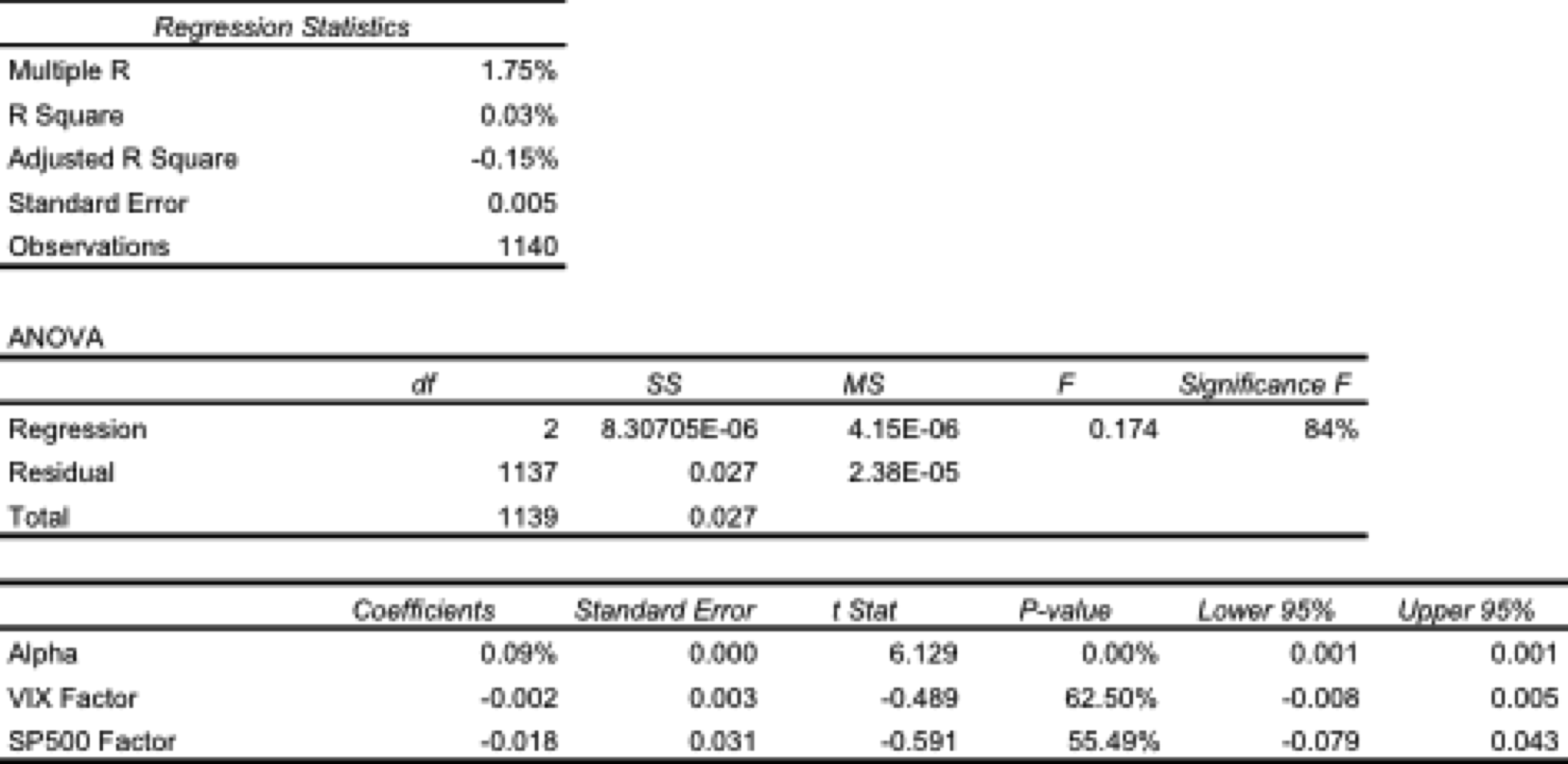
One method of quantifying such dependencies is with linear regression analysis.  By way of illustration, in the table below are shown the results of regressing the daily returns from the Strategic Volatility Strategy against the returns in the VIX and S&P 500 indices.  Both factor coefficients are statistically indistinguishable from zero, i.e. there is significant no (linear) dependency.  However, the constant coefficient, referred to as the strategy alpha, is both positive and statistically significant.  In simple terms, the strategy produces a return that is consistently positive, on average, and which is not dependent on changes in the level of the broad market, or its volatility.  By contrast, for example, a commonplace volatility strategy that entails capturing the VIX futures roll would show a negative correlation to the VIX index and a positive dependency on the S&P500 index.

Regression


Tail Risk

Ever since the publication of Nassim Taleb’s “The Black Swan”, investors have taken a much greater interest in the risk of extreme events.  If the bursting of the tech bubble in 2000 was not painful enough, investors surely appear to have learned the lesson thoroughly after the financial crisis of 2008.  But even if investors understand the concept, the question remains: what can one do about it?

The place to start is by looking at the fundamental characteristics of the portfolio returns.  Here we are not such much concerned with risk, as measured by the second moment, the standard deviation. Instead, we now want to consider the third and forth moments of the distribution, the skewness and kurtosis.

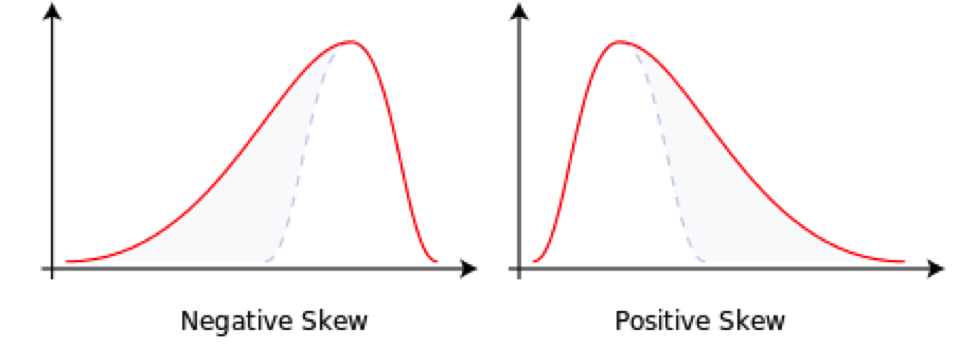
Comparing the two distributions below, we can see that the distribution on the left, with negative skew, has nonzero probability associated with events in the extreme left of the distribution, which in this context, we would associate with negative returns.  The distribution on the right, with positive skew, is likewise “heavy-tailed”; but in this case the tail “risk” is associated with large, positive returns.  That’s the kind of risk most investors can live with.


skewness


Source: Wikipedia


A more direct measure of tail risk is kurtosis, literally, “heavy tailed-ness”, indicating a propensity for extreme events to occur.  Again, the shape of the distribution matters:  a heavy tail in the right hand portion of the distribution is fine;  a heavy tail on the left (indicating the likelihood of large, negative returns) is a no-no.

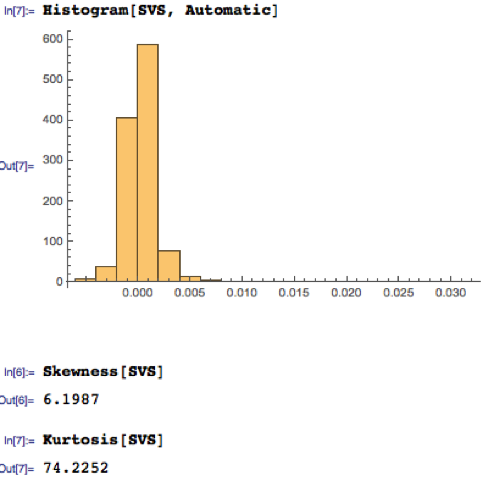
Let’s take a look at the distribution of returns for the Strategic Volatility Strategy.  As you can see, the distribution is very positively skewed, with a very heavy right hand tail.  In other words, the strategy has a tendency to produce extremely positive returns. That’s the kind of tail risk investors prefer.

SVS


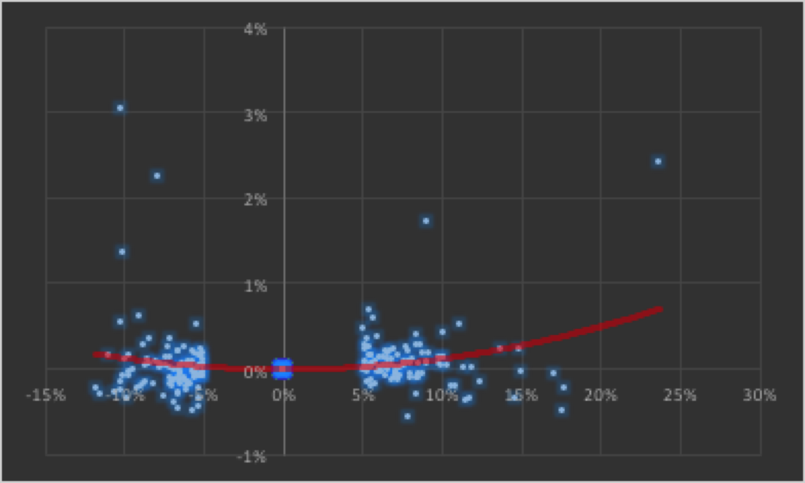
Another way to evaluate tail risk is to examine directly the performance of the strategy during extreme market conditions, when the market makes a major move up or down. Since we are using a volatility strategy as an example, let’s take a look at how it performs on days when the VIX index moves up or down by more than 5%.  As you can see from the chart below, by and large the strategy returns on such days tend to be positive and, furthermore, occasionally the strategy produces exceptionally high returns.


Convexity


The property of producing higher returns to the upside and lower losses to the downside (or, in this case, a tendency to produce positive returns in major market moves in either direction) is known as positive convexity.


Positive convexity, more typically found in fixed income portfolios, is a highly desirable feature, of course.  How can it be achieved?    Those familiar with options will recognize the convexity feature as being similar to the concept of option Gamma and indeed, one way to produce such a payoff is buy adding options to the investment mix:  put options to give positive convexity to the downside, call options to provide positive convexity to the upside (or using a combination of both, i.e. a straddle).


In this case we achieve positive convexity, not by incorporating options, but through a judicious choice of leveraged ETFs, both equity and volatility, for example, the ProShares UltraPro S&P500 ETF (NYSEArca:UPRO) and the ProShares Ultra VIX Short-Term Futures ETN (NYSEArca:UVXY).


Putting It All Together

While we have talked through the various concepts in creating a risk-protected portfolio one-at-a-time, in practice we use nonlinear optimization techniques to construct a portfolio that incorporates all of the desired characteristics simultaneously. This can be a lengthy and tedious procedure, involving lots of trial and error.  And it cannot be emphasized enough how important the choice of the investment universe is from the outset.  In this case, for instance, it would likely be pointless to target an overall positively convex portfolio without including one or more leveraged ETFs in the investment mix.

Let’s see how it turned out in the case of the Strategic Volatility Strategy.


SVS Perf


Note that, while the portfolio Information Ratio is moderate (just above 3), the Sortino Ratio is consistently very high, averaging in excess of 7.  In large part that is due to the exceptionally low downside risk, which at 1.36% is less than half the standard deviation (which is itself quite low at 3.3%).  It is no surprise that the maximum drawdown over the period from 2012 amounts to less than 1%.

A critic might argue that a CAGR of only 10% is rather modest, especially since market conditions have generally been so benign.  I would answer that criticism in two ways.  Firstly, this is an investment that has the risk characteristics of a low-duration government bond; and yet it produces a yield many times that of a typical bond in the current low interest rate environment.

Secondly, I would point out that these results are based on use of standard 2:1 Reg-T leverage. In practice it is entirely feasible to increase the leverage up to 4:1, which would produce a CAGR of around 20%.  Investors can choose where on the spectrum of risk-return they wish to locate the portfolio and the strategy leverage can be adjusted accordingly.


Conclusion

The current investment environment, characterized by low yields and growing downside risk, poses difficult challenges for investors.  A way to address these concerns is to focus on metrics of downside risk in the construction of the investment portfolio, aiming for high Sortino Ratios, low correlation with market risk factors, and positive skewness and convexity in the portfolio returns process.

Such desirable characteristics can be achieved with modern portfolio construction techniques providing the investment universe is chosen carefully and need not include anything more exotic than a collection of commonplace ETF products.

More on Strategy Robustness

Commentators have made the point that a high % win rate is not enough.

Yes, you obviously want to pay attention to other performance metrics also, such as profit factor. In fact, there is no reason why you shouldn’t consider an objective function that explicitly combines various desirable performance measures, for example:

net profit * % win rate * profit factor

Another approach is to build the model using a data set spanning a different period. I did this with WFC using data from 1990, rather than 1970. Not only was the performance from 1990-2014 better, so too was the performance during the OOS period 1970-1989.  Profit factor was 2.49 and %Win rate was 70% across the 44 year period from 1970.  For the period from 1990, the performance metrics increase to 3.04 and 73%, respectively.

SSALGOTRADING AD

So in this case, it appears, a most robust strategy resulted from using less data, rather than more.  At first this appears counterintuitive. But it’s quite possible for a strategy to be over-condition on behavior that is no longer relevant to the market today. Eliminating such conditioning can sometimes enable strategies to emerge that have greater longevity.

WFC from 1970-2014 (1990 data)

Performance

Optimizing Strategy Robustness

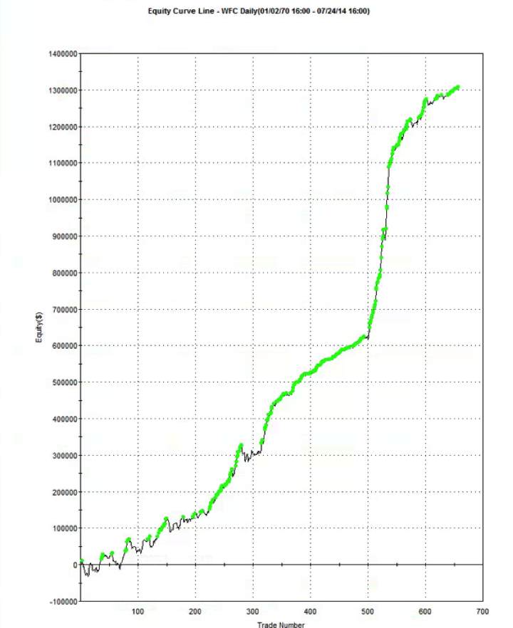
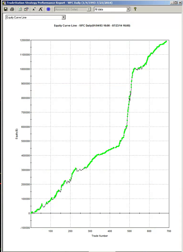
Below is the equity curve for an equity strategy I developed recently, implemented in WFC.  The results appear outstanding:  no losing years in over 20 years, profit factor of 2.76 and average win rate of 75%.  Out-of-sample results (double blind) for 2013 and 2014:  net returns of 27% and 16% YTD.

WFC from 1993-2014


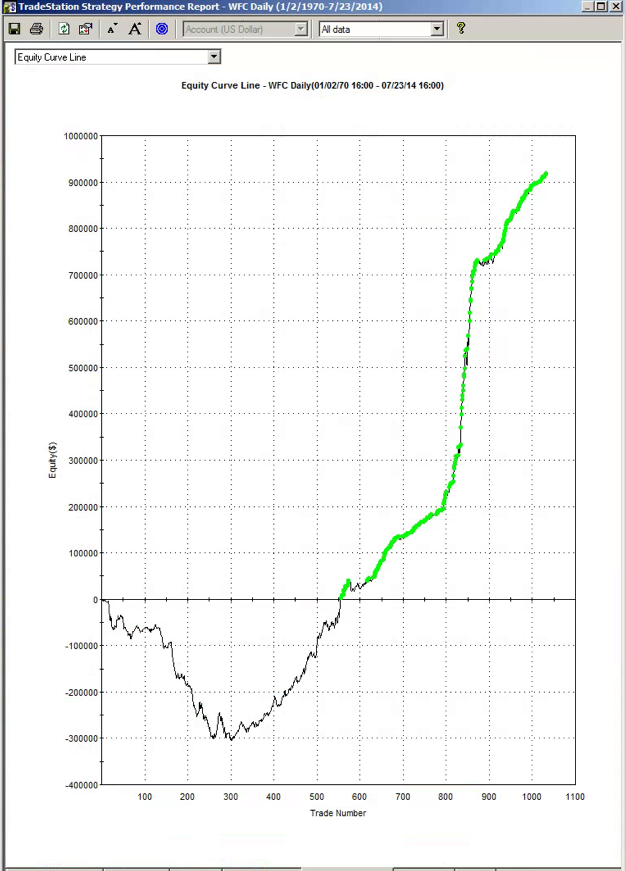
So far so good. However, if we take a step back through the earlier out of sample period, from 1970, the picture is rather less rosy:


WFC from 1970-2014


Now, at this point, some of you will be saying:  nothing to see here – it’s obviously just curve fitting.  To which I would respond that I have seen successful strategies, including several hedge fund products, with far shorter and less impressive back-tests than the initial 20-year history I showed above.

SSALGOTRADING AD

That said, would you be willing to take the risk of trading a strategy such as this one?  I would not:  at the back of my mind would always be the concern that the market might easily revert to the conditions that applied during the 1970s and 1980’s.  I expect many investors would share that concern.

But to the point of this post:  most strategies are designed around the criterion of maximizing net profit.  Occasionally you might come across someone who has considered risk, perhaps in the form of drawdown, or Sharpe ratio.  But, in general, it’s all about optimizing performance.

Suppose that, instead of maximizing performance, your objective was to maximize the robustness of the strategy.  What criteria would you use?

In my own research, I have used a great many different objective functions, often multi-dimensional.  Correlation to the perfect equity curve, net profit / max drawdown and Sortino ratio are just a few examples.  But if I had to guess, I would say that the criteria that tends to produce the most robust strategies and reliable out of sample performance is the maximization of the win rate, subject to a minimum number of trades.

I am not aware of a great deal of theory on this topic. I would be interested to learn of other readers’ experience.


How to Spot a Fake

One of the issues that comes up regularly is how, as an investor or other interested party, one can protect oneself from unscrupulous scam artists posing as professional traders or money managers. This is a particular problem on web sites featuring trader forums, where individuals with unverified track records claiming stellar trading histories use their purported trading “prowess” to try to impress and intimidate other participants, usually impressionable newbies. The purpose of this post is to provide some guidance to help investors, traders and other fellow travelers sort the wheat from the chaff. We’ll be doing some forensic analysis on the track record for a strategy in NG futures that one such character recently posted in one of these forums, as a classic example of the kind of fakery I am describing.

One thing you should understand about scam artists operating on forums, is that they don’t work alone: usually they have a bunch of groupies who will shill for them at every opportunity and who will try to shout down any investigative questioning. Don’t be deterred. These know-it-alls are usually just ignorant dupes, who understand no more about trading than the scam artist. They may just as easily be fellow-scam artists themselves.

THE FIRST BIG RED FLAG: UNWILLINGNESS TO PRODUCE A TRACK RECORD
Anyone claiming to be a CTA or professional money manager (or whose shills claim he is one) has to have a track record that is freely available in the public domain. So how does a scam artist overcome a challenge to produce it? He will claim that he “can’t advertise”, or make some other, similar excuse. Don’t accept that at face value. Ask him to PM it to you. If he won’t, there’s already a high probability he’s a con artist.

THE SECOND BIG RED FLAG: CURVE FITTING
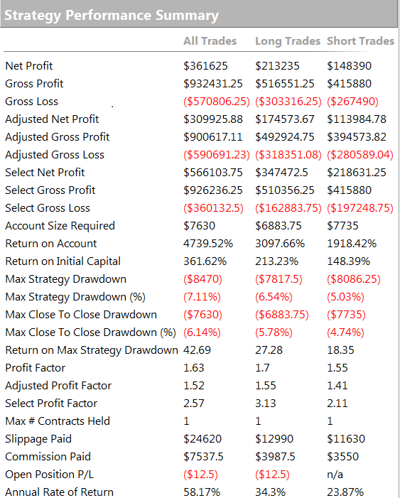
Let’s say our suspect meets the challenge and produces a track record. Ideally this will be an audited P&L statement, but let’s assume for the purposes of this discussion that he produces something along the lines of the Performance Reports produced by a product like Tradestation or MultiCharts, i.e. we are dealing with a simulated back-test.
If your suspect produces a back-test, you can be pretty sure it’s going to look good – otherwise he wouldn’t produce it. The task now is to dig into those reports to spot the red flags that give clues as to whether it might be fake.
Now of course any trading system is going to make assumptions – about fill rates, slippage, commissions, capacity etc. All that is fine, as long as the assumptions are clearly stated. You might want to challenge any or all of the assumptions, and the trader may disagree with you about some or all of them. That’s perfectly ok – it’s an honest, open discussion about a set of investment assumptions that have been revealed at the outset.
But here is what is NOT ok: any opacity about which data was used to build the trading model and which data was used to test it. The former, the in-sample (IS) data set, used to construct the model, must be entirely separate and distinct from the out-of-sample (OOS) data set. It is trivially easy using a tool like Tradestation to produce a trading system that shows stellar results in-sample, but which will immediately crash and burn when it is used in live trading. This is known as curve-fitting. And it’s by far the most common method by which scam artists try to dupe investors.

In order to demonstrate the robustness of the system prior to risking real money, a genuine trader will test his system OOS and show you the results. What you are looking for ideally is congruity between the IS and OOS results. Now by congruity, I don’t mean that they should be identical. Far from it – markets evolve and strategy performance will vary over time. But what you are hoping is that the key performance metrics in the OOS and IS periods, such as annual returns, Sharpe ratio, PNL per contract, profit ratio and win rate, will be comparable. At the very least, you would like to be able to identify some portion of the IS data set for which the strategy performance characteristics are similar to those in the OOS period.

Any – I mean ANY – ambiguity or lack of clarity about which data was used to build the model and which was used for OOS testing is a HUGE red flag. Chances are, your scam artist is already trying to fudge the issue that he curve-fitted the system.
This was the case in the recent forum post we are using as a test case. The trader made no attempt whatsoever to clarify which data was used for model development and which for testing. Immediately, I was suspicious and began looking for other evidence of curve fitting. It didn’t take me long to find it.

THE THIRD BIG RED FLAG: THE EQUITY CURVE
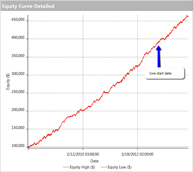
The first item I turned to in the performance reports was the equity curve and I immediately spotted two rather large clues that I was dealing with a fake.

The first clue was the large sign on the chart labelled “live start date”. What does this mean? This is a back-test, so all of the results are theoretical, including those after the supposed “live start date” sometime in 2013. What the faker is trying to do is imply the part of the equity curve shown after that date indicate actual performance results. He doesn’t actually claim this, so he has plausible deniability if you call him on it (“I said it was just a back test”). But he hopes that you won’t, and that, by default, you’ll accept these results are real. But they aren’t.

The second clue of fakery is much more important: the equity curve itself. When someone shows you and equity curve like the one reported by this trader, rising in a straight line from the lower left to upper right quadrants, you can be 99% confident that you are dealing with a fake.
You see, in finance there are almost never any straight lines. They are as rare as unicorns. Especially when it comes to strategy performance. They only time you will EVER see an equity curve like this is when you are looking at the equity curve of (i) a high frequency market making trading system or (ii) a fake, produced by curve fitting a strategy to the ENTIRE data set.
And this strategy was not high frequency – as we shall see, it operated on 15 minute bars, holding positions overnight.

EC Chart

THE FOURTH BIG RED FLAG: GOD’s EQUITY CURVE
I said that straight line equity curve were extremely rare. In fact, even God’s equity curve isn’t often a straight line. What does that mean?

Suppose you had a strategy that could predict with 100% accuracy whether the market would go up or down over the next bar (whether you are using daily bars, or 15 minute bars, as in our example). The system would buy (or hold) when the market was forecast to rise, and sell when the market was predicted to fall. What would the performance of such a perfect system look like? Pretty stellar, obviously. And most people would guess that the system’s equity curve would be a straight line, or maybe even exponential in shape. In fact that’s typically not the case. God’s equity curve will be sloped and kinked, just like any other equity curve. And if your suspect’s equity curve is real, it should show some commonality with God’s equity curve, by which I mean it should show changes in slope and level that reflect those seen in the perfect equity curve.

What does God’s Equity Curve look like in NG futures?

Gods EC

As you can see it’s not straight. In fact it’s concave. So a REAL equity curve should have similar characteristics, like this one, for example:

NG EC

As you can see, the equity curve of the real trading system track’s God’s Equity Curve, albeit at a much lower level. It’s concave, with an upswing during the final few months of trading, just like God’s. That’s a good sign that the strategy back-test is very likely genuine (which it is – I produced it).

Why is Gods’ Equity Curve the shape it is? The answer will vary from market to market. In the case of NG, the suggestion is that the market is becoming more efficient: simple trading strategies based on technical indicators work less well than they did five years ago. We have seen something very similar in F/X markets. During the 1970’s and 1980’s when Soros was active in the field, simple strategies like moving average crossovers made great returns, but these entirely dissipated in the 1990’s, with the advent of widely available computing power.

THE FIFTH BIG RED FLAG: THE SHILL SHOUTDOWN
When I posted my analysis, which clearly indicated fakery by this well known forum participant, I was immediately flamed by one of his supporters who shouted something to the effect that (i) everyone knows that the downward slope of God’s Equity Curve was caused by volatility and (ii) the star trader, unlike God, or me, knows about position sizing.

This attempt at misdirection in the face of awkward facts is a classic sign of fakery. What distinguishes the shill post is:

(i) Immediacy – clearly no attempt has been made to evaluate the argument or analysis. The shill simply attempts to drown out the critic with a lot of noise, as quickly as possible.

(ii) Plausibility – shills will throw around terms that lend plausibility to their objection, but which after a moment’s reflection are entirely irrelevant or, as in this case, detrimental to their own cause.

(iii) Invective – the more intemperate the post, the more likely the shill is simply trying to provide cover for the faker.

So let’s take a moment to dispose of the plausible sounding objections posted by the shill in this example.
I am going to take it as read that everyone understands that trading profitability is positively correlated with volatility. There is a huge amount of empirical research supporting that finding, but to keep it simple we can appeal to one of the cornerstones of modern finance: risk and return. The higher the volatility, i.e. the greater the risk, the greater the return traders and investors in the markets will require on their capital. This is a principle of modern financial theory that even a graduate of the Scranton college of fine art should be expected to appreciate.

So what’s the story with NG volatility? You can see the time series of NG volatility in the chart below. One feature stands out above all others: the upward slope of the curve. NG volatility has RISEN over the sample period from 2008 to 2014. Consequently, returns from trading NG futures should also have RISEN rather than fallen. One thing we can say for sure, whatever caused the concave shape in God’s Equity Curve in NG futures, it was NOT volatility!

NG Volatility

Turning to the shill’s next, plausible sounding, but dubious “explanation”, position sizing: this really is completely irrelevant. Because, as we shall see from an examination of the performance report, the track record was created by trading a constant one-lot! So this was just an attempt to sound “sophisticated” by someone trying to misdirect the reader away from the increasingly obvious evidence of fakery.

THE SIXTH BIG RED FLAG: LOW DRAWDOWNS AND OVERNIGHT GAP RISK
One of the highly unusual features of our faker’s equity curve is it’s exceptional smoothness. Low volatility in the equity curve is, in and of itself, an indicator the track record results from curve fitting. But we can get even more insight by digging into the performance report, shown below.

Perf 1
Perf 2

As you can see from the second page of the report, the strategy holds positions for an average of 57 15-minute bars, equivalent to slightly over 14 hours. So this is a low frequency strategy that takes overnight risk. Now, as any trader will know, overnight gap risk in a product like NG can be very significant and likely to be produce much larger drawdowns over a 5 year period than the $8,470 reported here.

The only other possible explanation is that the strategy is traded continuously through both day and night sessions. But this is not only itself improbable, it gives rise to another implausibility: liquidity in the overnight session is so poor that the strategy is unlikely to be able to trade more than 1-2 contracts, at most. This would be of little value to a CTA, or its customers, whatever the star trader’s protestations that his “clients are happy”.

There is no plausible way to resolve the disconnection between the low drawdown, overnight gap risk and market illiquidity. The most plausible explanation: the back-test is a curve fitting exercise.

THE SEVENTH AN FINAL BIG RED FLAG: INCONSISTENCY BETWEEN PERFORMANCE METRICS
As any experienced strategy developer knows, you can get some of the things you want, but you can never achieve all of them. Amongst the desirable features to be maximized are
• Profit factor
• Average PNL per contract
• Percentage win rate

There is a trade-off between the features. A high PNL per contract typically means you are trading less frequently, with longer hold periods, and consequently the percentage win rate tends to be lower. Alternatively, you can increase the win rate, at the cost of lowering the average PNL per contract and/or the profit factor. And so on.

This strategy purports to have it all: a high average PNL per contract resulting from low frequency trading, coupled with good percentage win rate of over 50% and profit factor. A win rate of much over 40% is highly unusual for a momentum strategy entering and exiting with market or stop orders – and its almost inconceivable for a strategy with a PNL per contract and profit factor as large as suggested here.

CONCLUSION
This back-test fails the sniff test on so many levels, I would rate the chance of it being real as less than 1 in 1000.
The final, conclusive proof of fakery is that the “star trader” responsible for producing the report was unable and/or unwilling to attempt to answer even a single one of the criticisms.

So, be warned. If you see forum members banding about track records like this one, you can be sure that they and their strategies are likely to be fake, and not to be trusted.