A New Approach to Generating Synthetic Market Data

The Importance of Synthetic Market Data

The principal argument in favor of using synthetic data is that it addresses one of the major concerns about using real data series for modelling purposes: i.e. that models designed to fit the historical data produce test results that are unlikely to be replicated, going forward. Such models are not robust to changes that are likely to occur in any dynamical statistical process and will consequently perform poorly out of sample.

By using multiple synthetic data series following a wide range of different price paths, one can hope to build models – both for risk management and investment purposes – that can accommodate a variety of different market scenarios, making them more likely to perform robustly in a live market context.

Producing authentic synthetic data is a significant challenge, one that has eluded researchers for many years. Generating artificial returns series is a considerably simpler task, but even here there are difficulties. For many applications it is simply not sufficient to sample from the empirical distribution, because we want to produce a sequence of returns that closely mirrors the pattern of real returns sequences. In particular, there may be long memory effects (non-zero autocorrelations at long lags) or GARCH effects, in which dependency is introduced into the returns process via the square (or absolute value) of returns. These have the effect of inducing “shocks” to the returns process that persist for some time, causing autocorrelation in the associated volatility process in the process.

But producing a set of synthetic stock price data is even more of a challenge because not only do the above do the above requirements apply, but we also need to ensure that the open, high, low and closing prices are internally consistent, i.e. that on any given bar the High >= {Open, Low and Close) and that the Low <= {Open, Close}. These basic consistency checks have been overlooked in the research thus far.

Econometric Methods

One classical approach to the problem would be to create a Vector Autoregression Model, in which lagged values of the Open, High, Low and Close prices are used to predict the current values (see here for a detailed exposition of the VAR approach). A compelling argument in favor of such models is that, almost by definition, O/H/L/C prices are necessarily cointegrated.

While a VAR model potentially has the ability to model long memory and even GARCH effects, it is unable to produce stock prices that are guaranteed to be consistent, in the sense defined above. Indeed, a failure rate of 35% or higher for basic consistency checks is typical for such a model, making the usefulness of the synthetic prices series highly questionable.

Another approach favored by some researchers is to stitch together sub-samples of the real data series in a varying time-order. This is applicable only to return series and, in any case, can introduce spurious autocorrelations, or overlook important dependencies in the data series. Besides these defects, it is challenging to produce a synthetic series that looks substantially different from the original – both the real and synthetic series exhibit common peaks and troughs, even if they occur in different places in each series.

Deep Learning  Generative Adversarial Networks

In a previous post I looked in some detail at TimeGAN, one of the more recent methods for producing synthetic data series introduced in a paper in 2019 by Yoon, et al (link here).

TimeGAN, which applies deep learning  Generative Adversarial Networks to create synthetic data series, appears to work quite well for certain types of time series. But in my research I found it be inadequate for the purpose of producing synthetic stock data, for three reasons:

(i) The model produces synthetic data of fixed window lengths and stitching these together to form a single series can be problematic.

(ii) The prices fail a significant percentage of the basic consistency tests, regardless of the number of epochs used to train the model

(iii) The methodology introduces spurious correlations in the associated returns process that do not correspond to anything found in real stock return series and which get more pronounced as training continues.

Another GAN model, DoppleGANger, introduced by Lin, et. al. in 2020 (paper here) seeks to improve on TimeGAN and claims “up to 43% better fidelity than baseline models”, including TimeGAN. However, in my research I found that, while DoppleGANger trains much more quickly than TimeGAN, it produces a consistency test failure rate exceeding 30%, even after training for 500,000 epochs.

For both TimeGAN and DoppleGANger, the researchers have tended to benchmark performance using classical data science metrics such as TSNE plots rather than the more prosaic consistency checks that a market data specialist would be interested in, while the more advanced requirements such as long memory and GARCH effects are passed by without a mention.

The conclusion is that current methods fail to provide an adequate means of generating synthetic price series for financial assets that are consistent and sufficiently representative to be practically useful.

The Ideal Algorithm for Producing Synthetic Data Series

What are we looking for in the ideal algorithm for generating stock prices? The list would include:

(i) Computational simplicity & efficiency. Important if we are looking to mass-produce synthetic series for a large number of assets, for a variety of different applications. Some deep learning methods would struggle to meet this requirement, even supposing that transfer learning is possible.

(ii) The ability to produce price series that are internally consistent (i.e High > Low, etc) in every case .

(iii) Should be able to produce a range of synthetic series that vary widely in their correspondence to the original price series. In some case we want synthetic price series that are highly correlated to the original; in other cases we might want to test our investment portfolio or risk control systems under extreme conditions never before seen in the market.

(iv) The distribution of returns in the synthetic series should closely match the historical series, being non-Gaussian and with “fat-tails”.

(v) The ability to incorporate long memory effects in the sequence of returns.

(vi) The ability to model GARCH effects in the returns process.

After researching the problem over the course of many years, I have at last succeeded in developing an algorithm that meets these requirements. Before delving into the mechanics, let me begin by illustrating its application.

Application of the Ideal Algorithm

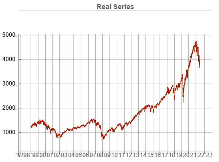
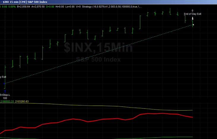
In this demonstration I am using daily O/H/L/C prices for the S&P 500 index for the period from Jan 1999 to July 2022, comprising four price series over 5,297 daily periods.

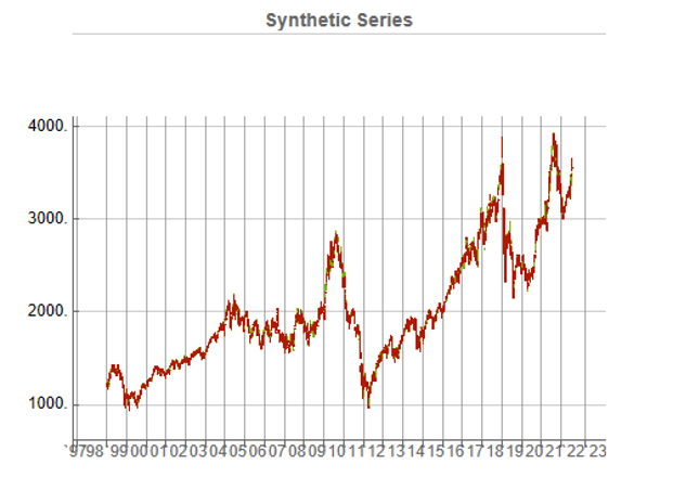
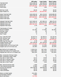
Synthetic Price Series

Generating ten synthetic series using the algorithm takes around 2 seconds with parallelization. I chose to generate series of the same length as the original, although I could just as easily have produced shorter, or longer sequences.

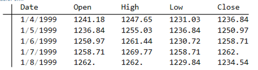
The first task is to confirm that the synthetic data are internally consistent, and indeed is guaranteed to be so because of the way the algorithm is designed. For example, here are the first few daily bars from the first synthetic series:

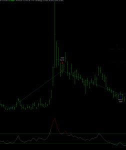
This means, of course, that we can immediately plot the synthetic series in a candlestick chart, just as we did with the real data series, above.

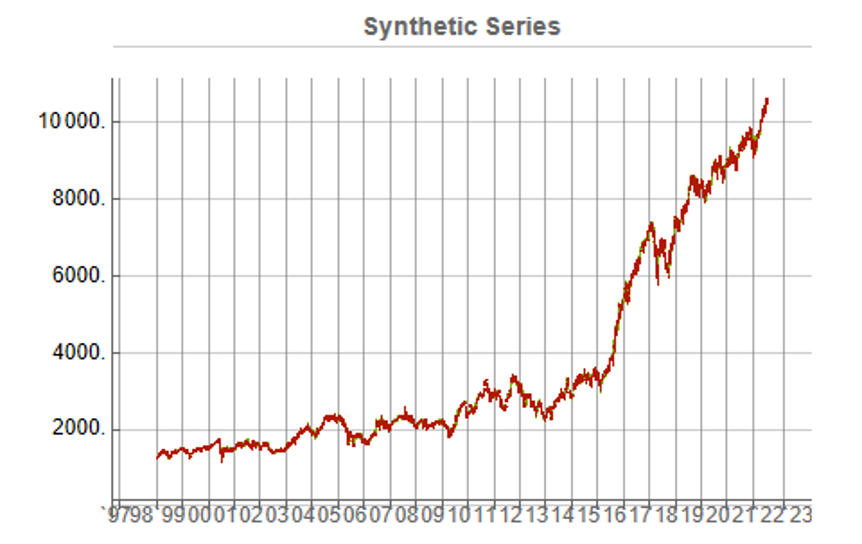
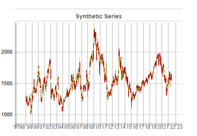
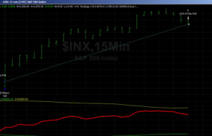
While the real and synthetic series are clearly different, the pattern of peaks and troughs somehow looks recognizably familiar. So, too, is the upward drift in the series, which is this case carries the synthetic S&P 500 Index to a high above 10,000 in 2022. Obviously this is a much more bullish scenario that we have seen in reality. But in fact this is just one example taken from the more “optimistic” end of the spectrum of possibilities. An illustration from the opposite end of the spectrum is shown in the chart below, in which the Index moves sideways over the entire 23 year span, with several very large drawdowns of -20% or more:

A more typical scenario might look something like our third chart, below. Here, too, we see several very large drawdowns, especially in the period from 2010-2011, but there is also a general upward drift in the process that enables the Index to reach levels comparable to those achieved by the real series:

Price Correlations

Reflecting these very different price path evolutions, we observe large variation in the correlations between the real and synthetic price series. For example:

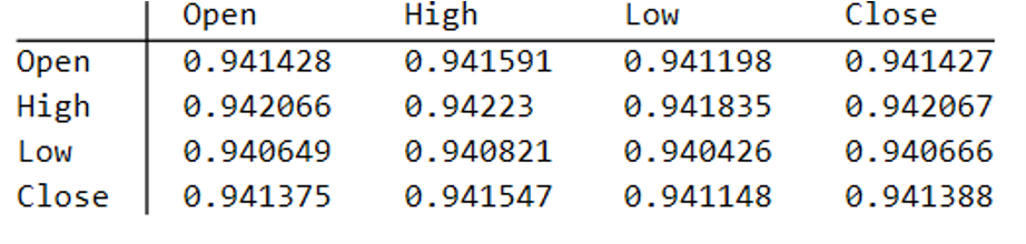
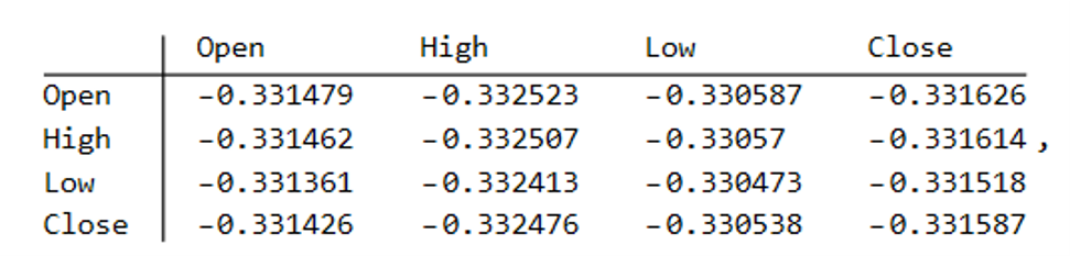
As these tables indicate, the algorithm is capable of producing replica series that either mimic the original, real price series very closely, or which show completely different behavior, as in the second example.

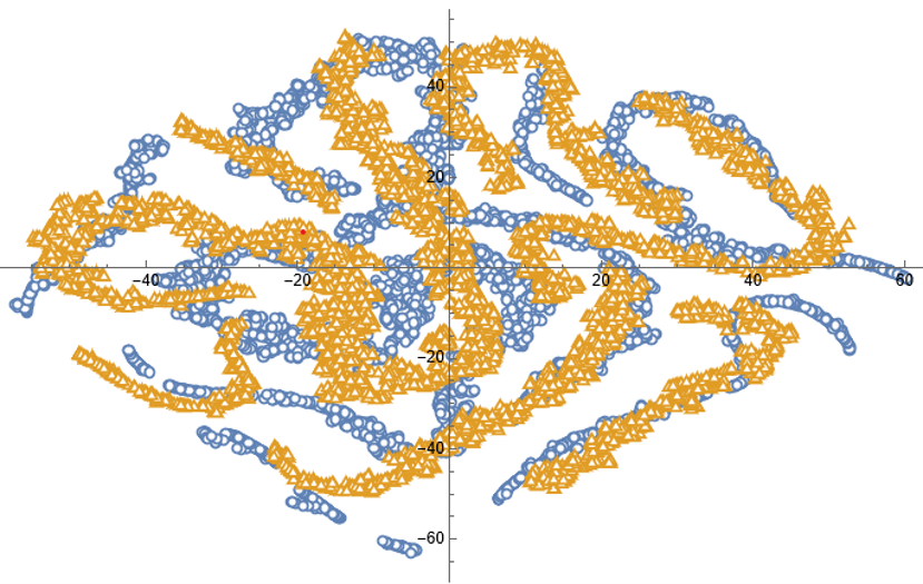
Dimensionality Reduction

For completeness, as have previous researchers, we apply t-SNE dimensionality reduction and plot the two-factor weightings for both real (yellow) and synthetic data (blue). We observe that while there is considerable overlap in reduced dimensional space, it is not as pronounced as for the synthetic data produced by TimeGAN, for instance. However, as previously explained, we are less concerned by this than we are about the tests previously described, which in our view provide a more appropriate analysis benchmark, so far as market data is concerned. Furthermore, for the reasons previously given, we want synthetic market data that in some cases tracks well beyond the range seen in historical price series.

Returns Distributions

Moving on, we next consider the characteristics of the returns in the synthetic series in comparison to the real data series, where returns are measured as the differences in the Log-Close prices, in the usual way.

Histograms of the returns for the most “optimistic” and “pessimistic” scenarios charted previously are shown below:

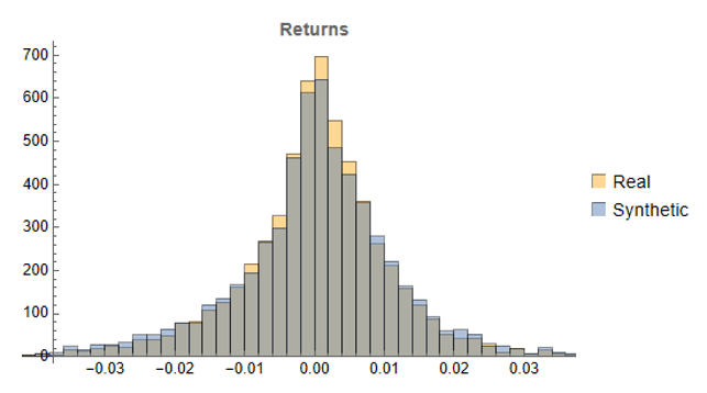
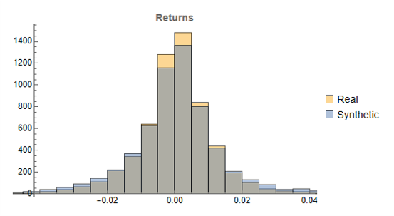
In both cases the distribution of returns in the synthetic series closely matches that of the real returns process and are clearly non-Gaussian, with an over-weighting in the distribution tails. A more detailed look at the distribution characteristics for the first four synthetic series indicates that there is a very good match to the real returns process in each case (the results for other series are very similar):

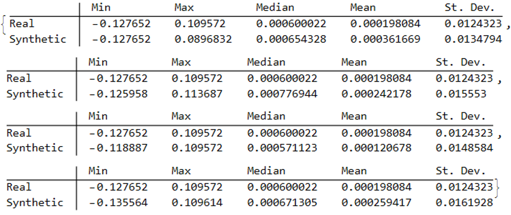
We observe that the minimum and maximum returns of the synthetic series sometimes exceed those of the real series, which can be a useful characteristic for risk management applications. The median and mean of the real and synthetic series are broadly similar, sometimes higher, in other cases lower. Only for the standard deviation of returns do we observe a systematic pattern, in which returns volatility in the synthetic series is consistently higher than in the real series.

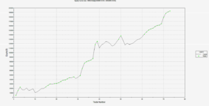
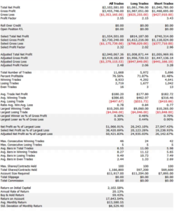
This feature, I would argue, is both appropriate and useful. Standard deviations should generally be higher, because there is indeed greater uncertainty about the prices and returns in artificially generated synthetic data, compared to the real series. Moreover, this characteristic is useful, because it will impose a greater stress-test burden on risk management systems compared to simply drawing from the distribution of real returns using Monte Carlo simulation. Put simply, there will be a greater number of more extreme tail events in scenarios using synthetic data, and this will cause risk control parameters to be set more conservatively than they otherwise might. This same characteristic – the greater variation in prices and returns – will also pose a tougher challenge for AI systems that attempt to create trading strategies using genetic programming, meaning that any such strategies are more likely to perform robustly in a live trading environment. I will be returning to this issue in a follow-up post.

Returns Process Characteristics

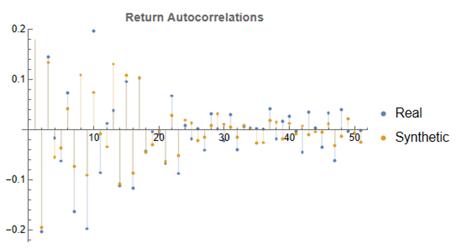
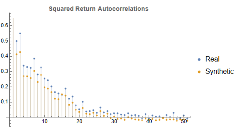
In the following plot we take a look at the autocorrelations in the returns process for a typical synthetic series. These compare closely with the autocorrelations in the real returns series up to 50 lags, which means that any long memory effects are likely to be conserved.

Finally, when we come to consider the autocorrelations in the square of the returns, we observe slowly decaying coefficients over long lags – evidence of so-called GARCH effects – for both real and synthetic series:

Summary

Overall, we observe that the algorithm is capable of generating consistent stock price series that correlate highly with the real price series. It is also capable of generating price series that have low, or even negative, correlation, a feature that may have important applications in the context of risk management. The distribution of returns in the synthetic series closely match those of the real returns process, and moreover retain important features such as long memory and GARCH effects.

Objections to the Use of Synthetic Data

Criticism of synthetic market data (including from myself) has hitherto focused on the inadequacy of such data in terms of representing important characteristics of real data series. Now that such technical issues have been addressed, I will try to anticipate some of the additional concerns that are likely to surface, going forward.

  1. The Synthetic Data is “Unrealistic”

What is meant here is that there is no plausible set of real, economic factors that would be likely to combine in a way to produce the pattern of prices shown in some of the synthetic data series. The idea that, as observed in one of the artificial scenarios above, the Fed would stand idly by while the market plunged by 50% to 60%, seems highly implausible. Equally unlikely is a scenario in which the market moves sideways for an extended period of a decade, or longer.

To a limited extent, I would agree with this. However, just because such scenarios are currently unlikely doesn’t mean they can never happen. For instance, take a look at the performance of the S&P 500 Index over the period from 1966 through 1979:

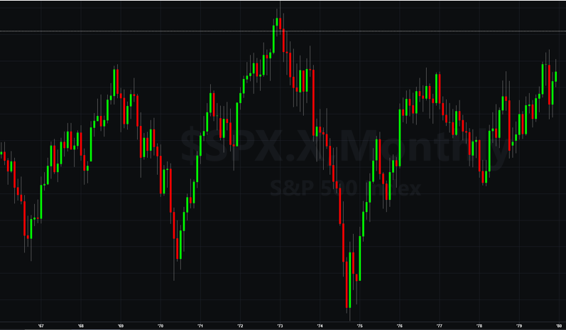
The market index barely made any progress throughout the entire 13-year period, which was characterized by a vicious bout of stagflation. Note, too, the precipitous drop in the index following the oil shock in 1973.

So to say that such scenarios – however implausible they may appear to be – can never happen is simply mistaken.

Finally, let’s not forget that, while the focus of this article is on the US market index, there are many economies, such as Mexico, Brazil or Argentina, for which such adverse developments are much more credible than they might currently be for the United States. We may wish to produce synthetic data for the markets in such economies for modelling purposes, in which case we will want to generate synthetic data capturing the full range of possible market outcomes, including some of the worst-case scenarios.

2. Extreme Scenarios Occur Too Frequently in Synthetic Data

Actually this is not the case – the generator tends to produce extreme scenarios with a frequency that is plausible, given the history and characteristics of the underlying, real price process. But there can be good reasons for wanting to control the frequency of such scenarios.

For instance, an investment manager may be looking to develop a “long-only” investment portfolio because, given his investment remit, that is the only type of investment strategy permitted. He would likely want to limit his focus to the more benign market outcomes for two reasons: (i) his investment thesis is that the market is likely to perform well, going forward (or else how does he pitch his strategy to investors?) and (ii) while he accepts that he may be wrong, it is not his job to hedge a possible market downturn – the responsibility for dealing with an adverse outcome falls to his risk manager, or to the investor.

Conversely, a risk manager is much more likely to be interested in adverse scenarios and, if anything, is likely to want to see such outcomes over-represented in a sample of synthetic data.

The point is, there is no “correct” answer: one has to decide which types of scenarios best suit the application one has in mind and sample the data accordingly. This can be done in a variety of ways such as setting a minimum required correlation between the synthetic and real price series, or designing a system of stratified sampling in which the desired outcomes are sampled according to a stipulated frequency distribution.

3. Synthetic Data Does Not Prevent Data Snooping and Curve Fitting

A critic might argue that, in fact, the real market data is “unseen” only in a theoretical sense, since its essential attributes have been baked into the synthetic series produced by the generator. This applies to an even greater extent if the synthetic series are sampled in some way, as described above.

I think this is a fair point. To take an extreme scenario, one could choose to select only synthetic series for which the correlation with the real data is 99.9%, or higher. Clearly this runs counter to the spirit of what one is trying to achieve with synthetic data and one might just as well use real data for modelling purposes. In practice, of course, even where a sampling methodology is applied, it is unlikely to be as crudely biased as in this example.

But, in any case, what is the alternative? The only option I can see is one in which a pure mathematical model is used to produce synthetic data, without any reference to the underlying real series. But, in that case, how would one assess the validity of the model assumptions, or how representative the synthetic series it produces might be?

There is no alternative but to have recourse to the real data at some point in the modelling process. In this procedure, however, the impact of snooping bias or curve fitting, even though it can never be totally extinguished, is very much diminished and it plays a less central role in model development.

Conclusion

It is now possible to produce synthetic data series that have all of the hallmark characteristics of real price data. This permits the analyst to investigate market models without direct recourse to the real price series, thereby minimizing data snooping and curve fitting bias. Models developed using synthetic data describing many different price path evolutions are more likely to prove robust across a wider range of plausible market scenarios in the real world.

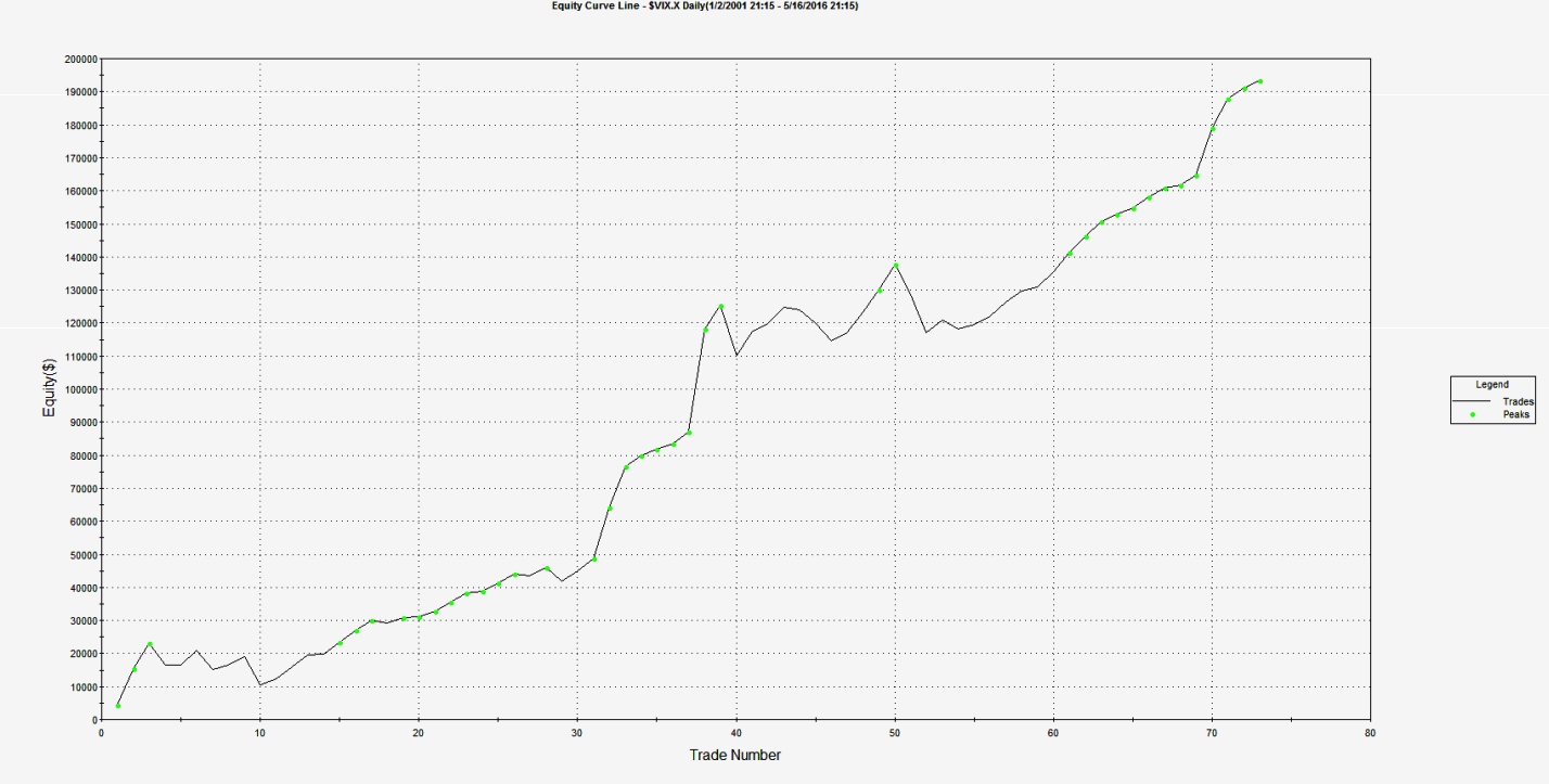
In the next, follow-up post I will illustrate the application of synthetic data to the development of a robust investment strategy.

Applications of Graph Theory In Finance

Analyzing Big Data

Very large datasets – comprising voluminous numbers of symbols – present challenges for the analyst, not least of which is the difficulty of visualizing relationships between the individual component assets.  Absent the visual clues that are often highlighted by graphical images, it is easy for the analyst to overlook important changes in relationships.   One means of tackling the problem is with the use of graph theory.

SSALGOTRADING AD

DOW 30 Index Member Stocks Correlation Graph

In this example I have selected a universe of the Dow 30 stocks, together with a sample of commodities and bonds and compiled a database of daily returns over the period from Jan 2012 to Dec 2013.  If we want to look at how the assets are correlated, one way is to created an adjacency graph that maps the interrelations between assets that are correlated at some specified level (0.5 of higher, in this illustration).

g1

Obviously the choice of correlation threshold is somewhat arbitrary, and it is easy to evaluate the results dynamically, across a wide range of different threshold parameters, say in the range from 0.3 to 0.75:

animation


The choice of parameter (and time frame) may be dependent on the purpose of the analysis:  to construct a portfolio we might select a lower threshold value;  but if the purpose is to identify pairs for possible statistical arbitrage strategies, one will typically be looking for much higher levels of correlation.

Correlated Cliques

Reverting to the original graph, there is a core group of highly inter-correlated stocks that we can easily identify more clearly using the Mathematica function FindClique to specify graph nodes that have multiple connections:

g2


We might, for example, explore the relative performance of members of this sub-group over time and perhaps investigate the question as to whether relative out-performance or under-performance is likely to persist, or, given the correlation characteristics of this group, reverse over time to give a mean-reversion effect.


 g3

Constructing a Replicating Portfolio

An obvious application might be to construct a replicating portfolio comprising this equally-weighted sub-group of stocks, and explore how well it tracks the Dow index over time (here I am using the DIA ETF as a proxy for the index, for the sake of convenience):

g4


The correlation between the Dow index (DIA ETF) and the portfolio remains strong (around 0.91) throughout the out-of-sample period from 2014-2016, although the performance of the portfolio is distinctly weaker than that of the index ETF after the early part of 2014:

g7


Constructing Robust Portfolios

Another application might be to construct robust portfolios of lower-correlated assets.  Here for example we use the graph to identify independent vertices that have very few correlated relationships (designated using the star symbol in the graph below).  We can then create an equally weighted portfolio comprising the assets with the lowest correlations and compare its performance against that of the Dow Index.

The new portfolio underperforms the index during 2014, but with lower volatility and average drawdown.

g10


Conclusion – Graph Theory has Applications in Portfolio Constructions and Index Replication

Graph theory clearly has a great many potential applications in finance. It is especially useful as a means of providing a graphical summary of data sets involving a large number of complex interrelationships, which is at the heart of portfolio theory and index replication.  Another useful application would be to identify and evaluate correlation and cointegration relationships between pairs or small portfolios of stocks, as they evolve over time, in the context of statistical arbitrage.


The Internal Bar Strength Indicator

Internal Bar Strength (IBS) is an idea that has been around for some time.  IBS is based on the position of the day’s close in relation to the day’s range: it takes a value of 0 if the closing price is the lowest price of the day, and 1 if the closing price is the highest price of the day.

More formally:

IBS  =  (Close – Low) / (High – Low)

The IBS effect may be related to intraday over-reaction to news or market movements, which are then ”corrected” the next day.  It serves as a measure of the tendency of a price series to mean-revert over daily horizons.  I use the term “daily” advisedly: so far as I am aware, there has been no research (including my own) demonstrating the existence of an IBS effect at time horizons shorter, or longer, than one day.  Indeed, there has been very little in the way of academic research into the concept of any kind, which is strange considering how compelling are the results it is capable of producing.  Practitioners have been happy enough with that state of affairs, content to deploy this neglected indicator in their trading strategies, where it has often proved to be extremely useful (we use IBS in one of our volatility strategies). Since 2013, however, the cat has been let out of the bag, thanks to an excellent research paper by Alexander Pagonidis, who writes an interesting quantitative finance blog.

The essence of the idea is that stocks that close in the lowest part of the daily range, with an IBS of below, say, 0.2, will tend to rally the next day, while stocks that close in the highest quintile will often decline in value in the following session.  In his paper “The IBS Effect: Mean Reversion in Equity ETFs” (2013), Pagonidis researches the IBS effect in equity index ETFs in the US and several international markets.  He confirms that low IBS values in these assets are associated with high returns in the following day session, while high IBS values are associated with low returns. Average returns when IBS is below 0.20 are .35% ,while average returns when IBS is above 0.80 are -0.13%. According to his research, this effect has been present in equity ETFs since the early 90s and has been highly consistent through time.

SSALGOTRADING AD

IBS Strategy Performance

To give the reader some idea of the potential of the IBS effect, I have reproduced below equity curves for the IBS strategy for the SPDR S&P 500 ETF Trust (SPY) and iShares MSCI Singapore ETF (EWS) index ETFs over the period from 1999 to 2016.  The strategy buys at the close when IBS is below 0.2, and sells at the close when IBS exceeds 0.8, liquidating the position at the following market close. Strategy CAGR over the period has been of the order of 13% for SPY and as high as 40% for EWS, ignoring transaction costs.

IBS Strategy Chart SPY EWS


Note that in both cases strategy returns for SPY and EWS have diminished in recent years, turning negative in 2015 and 2016 YTD and this is true for ETFs in general.  It remains to be seen whether this deterioration in strategy performance is temporary or permanent.  There are some indications that the latter holds true, but the evidence is not quite definitive.  For example, the chart below shows daily equity curve for the SPY IBS strategy, with 95% confidence intervals for the latest 100 trades (up to the end of May 2016), constructed using Monte-Carlo bootstrap.  The equity curve appears to have penetrated the lower bound, indicating a statistically significant deterioration in the performance of the IBS strategy for SPY over the last year or so (EWS is similar).  That said, the equity curve does fall inside the boundaries of the 99% confidence interval, so those looking for greater certainty about the possible breakdown of the effect will need to wait a little longer for confirmation.


SPY IBS MSA


Whatever the outcome may be for SPY and other ETFs going forward, it is certainly true that IBS effects persist strongly for some individual equities, Exxon-Mobil Corp. (XOM) being a case in point (see below).  It’s worth taking note of the exceptional performance of the XOM IBS strategy during the latter quarter of 2008.  I will have much more to say on the application of the IBS indicator for individual equities in a future blog post.


XOM IBS Strategy


The Role of Range, Volume, Bull/Bear Markets, Volatility and Seasonality

Pagonidis goes on to detail several further important findings in relation to IBS.  It is clear from his research that high volatility is related to increased predictability of returns and a more powerful IBS effect, in particular the high IBS-negative return aspect.  As might be expected, the effect is also larger after days with high range, both for high and low IBS extremes.

Volume turns out to be especially important for  U.S. index ETFs:  in fact, the IBS effect only appears to work on high-volume days.

Pagonidis also separates the data into bull and bear market environments, based on whether 200-day returns are positive or not.  The size of the effect is roughly similar in each environment (slightly larger in bear markets), but it is greater in the direction of the overall trend: high IBS readings are followed by larger negative returns during bear markets, and vice versa.

Day of Week Effect

The IBS effect is also strongly seasonal, having the greatest impact on returns from Monday’s close to Tuesday’s close, as illustrated for the SPY ETF in the chart below.  This accounts for the phenomenon known popularly as “Turnaround Tuesday”, i.e. the tendency for the market to recover strongly from losses on a Monday.  The day-of-week effect is weakest for Fridays.


SPY DOW


The mean of the returns distribution is not the only aspect that IBS can predict. Skewness also varies significantly between IBS buckets, with low IBS readings being followed by highly skewed returns, and vice versa. Close-to-close returns after a bottom-bucket IBS day have average skewness of 0.65 across Equity Index ETF products, while top-bucket IBS days are followed by returns with skewness of 0.03. This finding has very useful risk management applications for investors concerned with tail risk.

IBS as a Filter for a Swing Trading Strategy in QQQ

The returns to an IBS-only strategy are both statistically and economically significant. However, commissions will greatly decrease the returns and increase the maximum drawdowns, however, making such an approach challenging in the real world. One alternative is to combine the IBS effect with mean reversion on longer timescales and only take trades when they align.

Pagonidis offers a simple demonstration using the Cutler’s RSI indicator that shows how the IBS effect can be used to boost returns of a swing trading strategy while significantly decreasing the number of trades needed.

Cutler’s RSI at time t is calculated as follows:


RSI


Pagonidis tests a simple, long-only strategy that trades the PowerShares QQQ Trust, Series 1 (QQQ) ETF using the Cutler’s RSI(3) indicator:

• Go long at the close if RSI(3) < 10

• Maintain the position while RSI(3) ≤ 40

 filter these returns by adding an additional rule based on the value of IBS:

• Enter or maintain long position only if IBS ≤ 0.5

Pangonis claims that the strategy produces rather promising results that “easily beats commissions”;  however, my own rendition of the strategy, assuming commissions of $0.005 per share and slippage of a further $0.02 per share produces results that are distinctly less encouraging:

EC0


Pef0

Strategy Code

For those interested, the code is as follows:

Inputs:
RSILen(3),
RSI_Entry(10),
RSI_Exit(40),
IBS_Threshold(0.5),
Initial_Capital(100000);
Vars:
nShares(100),
RSIval(0),
IBS(0);
RSIval=RSI(C,RSILen);
IBS = (C-L)/(H-L);

nShares = Round(Initial_Capital / Close,0);

If Marketposition = 0 and RSIval > RSI_Entry and IBS < IBS_Threshold then begin
Buy nShares contracts next bar at market;
end;
If Marketposition > 0 and ((RSIval > RSI_Exit) or (IBS_Threshold > IBS_Threshold)) then begin
Sell next bar at market;
end;

Strategy Optimization and Robustness Testing

One can further improve performance by optimizing the trading system parameters, using Tradestation’s excellent Walk Forward Optimization (WFO) module.  This allows us to examine the effect of re-calibrating the strategy parameters are regular intervals, testing the optimized model on out-of-sample data sets of various sizes.  WFO can be used, not only optimize a strategy, but also to examine the sensitivity of its performance to changes in the levels of key parameters.  For example, in the case of the QQQ swing trading strategy, we find that profitability increases monotonically with the length of the RSI indicator, and this effect is especially marked when an IBS threshold level of 0.2 is used:

Sensitivity


Likewise we can test the consistency of the day-of-the-week effect over several OS data sets of  varying size and these tests are consistent with the pattern seen earlier for the IBS indicator, confirming its role as a filter rule in enhancing system profitability:

Distribution Analysis


A model that is regularly re-calibrated using WFO is subjected to a series of tests designed to ensure its robustness and consistency in live trading.   The tests include the following:


WFO


In order to achieve an overall pass rating, the system is required to pass all five tests of its out-of-sample performance, from which Tradestation deems it likely that the system will continue to perform well in live trading.  The results from this procedure appear much more promising than the strategy in its original form, as can be seen from the performance table and equity curve chart shown below.

EC1

Perf1


However, these results include both in-sample and out-of-sample periods.  An examination of the results from the WFO indicate that the overall efficiency of the strategy is around 55%, meaning that the P&L produced by the system in out-of-sample periods amounts to a little over one half of the rate of profit produced during in-sample periods.  Going forward, therefore, we might expect the performance of the system in live trading to be only around half as good as shown here.  While this is still superior to the original system, it may not be considered good enough.  Nonetheless, for the purpose of illustrating the benefits of the IBS indicator as a trade filter, it makes the point.

Another interesting example of an IBS-based trading strategy in the QQQ and SPY ETFs can be found in the following blog post.

Conclusion

Internal Bar Strength is a powerful mean-reversion indicator for equity products traded at daily frequencies, with a consistent effect that has continued from the 1990s through to the current decade. IBS can be used on its own in mean-reversion strategies that have worked well for both US equities and US and International equity index ETFs, or used as a trade filter when combined with other alpha signals.

While there is evidence of a weakening of the IBS effect since around 2013 this is not yet confirmed statistically (at the 99% confidence level) and may simply be the result of normal statistical variation in its efficacy.


Trading With Indices

In this post I want to discuss ways to make use of signals from relevant market indices in your trading.  These signals can add value regardless of whether you trade algorithmically or manually.  The techniques described here are one of the most widely applicable in the quantitative analyst’s arsenal.

Let’s motivate the discussion by looking an example of a simple trading system trading the VIX on weekly bars.  Performance results for the system are summarized in the chart and table below.  The system outperforms the buy and hold return by a substantial margin, with a profit factor of over 3 and a win rate exceeding 82%.  What’s not to like?

VIX EC

VIX Performance

Well, for one thing, this isn’t really a trading system – because the VIX Index itself isn’t tradable. So the performance results are purely notional (and, if you didn’t already notice, no slippage or commission is included).

It is very easy to build high-performing trading system in indices – because they are not traded products,  index prices are often stale and tend to “follow” the price action in the equivalent traded market.

This particular system for the VIX Index took me less than ten minutes to develop and comprises only a few lines of code.  The system makes use of a simple RSI indicator to decide when to buy or sell the index.  I optimized the indicator parameters (separately for long and short) over the period to 2012, and tested it out-of-sample on the data from 2013-2016.

inputs:
Price( Close ) ,
Length( 14 ) ,
OverSold( 30 ) ;

variables:
RSIValue( 0 );

RSIValue = RSI( Price, Length );
if CurrentBar > 1 and RSIValue crosses over OverSold then
Buy ( !( “RsiLE” ) ) next bar at market;

.

The daily system I built for the S&P 500 Index is a little more sophisticated than the VIX model, and produces the following results.

SP500 EC

SP500 Perf


Using Index Trading Systems

We have seen that its trivially easy to build profitable trading systems for index products.  But since they can’t be traded, what’s the point?

The analyst might be tempted by the idea of using the signals generated by an index trading system to trade a corresponding market, such as VIX or eMini futures.  However, this approach is certain to fail.  Index prices lag the prices of equivalent futures products, where traders first monetize their view on the market.  So using an index strategy directly to trade a cash or futures market would be like trying to trade using prices delayed by a few seconds, or minutes – a recipe for losing money.

SSALGOTRADING AD

Nor is it likely that a trading system developed for an index product will generalize to a traded market.  What I mean by this is that if you were to take an index strategy, such as the VIX RSI strategy, transfer it to VIX futures and tweak the parameters in the hope of producing a profitable system, you are likely to be disappointed. As I have shown, you can produce a profitable index trading system using the simplest and most antiquated trading concepts (such as the RSI index) that long ago ceased to offer any predictive value in actual traded markets.  Index markets are actually inefficient – the prices of index products often fail to fully reflect all relevant, available information in a timely way. Such simple inefficiencies are easily revealed by indicators such as moving averages.  Traded markets, by contrast, are highly efficient and, with the exception of HFT, it is going to take a great deal more than a simple moving average to provide insight into the few inefficiencies that do arise.

bullbear

Strategies in index products are best thought of, not as trading strategies, but rather as a means of providing broad guidance as to the general condition of the market and its likely direction over the longer term.  To take the VIX index strategy as an example, you can see that each “trade” spans several weeks.  So one might regard a “buy” signal from the VIX index system as an indication that volatility is expected to rise over the next month or two.  A trader might use that information to lean on the side of being long volatility, perhaps even avoiding any short volatility positions altogether for the next several weeks.  Following the model’s guidance in that way would would certainly have helped many equity and volatility traders during the market sell off during August 2015, for example:


Vix Example

The S&P 500 Index model is one I use to provide guidance as to market conditions for the current trading day.  It is a useful input to my thinking as to how aggressive I want my trading models to be during the upcoming session. If the index model suggests a positive tone to the market, with muted volatility, I might be inclined to take a more aggressive stance.  If the model starts trading to the short side, however, I am likely to want to be much more cautious.    Yesterday (May 16, 2016), for example, the index model took an early long trade, providing confirmation of the positive tenor to the market and encouraging me to trade volatility to the short side more aggressively.


SP500 Example


In general, I would tend to classify index trading systems as “decision support” tools that provide a means of shading opinion on the market, or perhaps providing a means of calibrating trading models to the anticipated market conditions. However, they can be used in a more direct way, short of actual trading.  For example, one of our volatility trading systems uses the trading signals from a trading system designed for the VVIX volatility-of-volatility index.  Another approach is to use the signals from an index trading system as an indicator of the market regime in a regime switching model.

Designing Index Trading Models

Whereas it is profitability that is typically the primary design criterion for an actual trading system, given the purpose of an index trading system there are other criteria that are at least as important.

It should be obvious from these few illustrations that you want to design your index model to trade less frequently than the system you are intending to trade live: if you are swing-trading the eminis on daily bars, it doesn’t help to see 50 trades a day from your index system.  What you want is an indication as to whether the market action over the next several days is likely to be positive or negative.  This means that, typically, you will design your index system using bar frequencies at least as long as for your live system.

Another way to slow down the signals coming from your index trading system is to design it for very high accuracy – a win rate of  70%, or higher.  It is actually quite easy to do this:  I have systems that trade the eminis on daily bars that have win rates of over 90%.  The trick is simply that you have to be prepared to wait a long time for the trade to come good.  For a live system that can often be a problem – no-one like to nurse an underwater position for days or weeks on end.  But for an index trading system it matters far less and, in fact, it helps:  because you want trading signals over longer horizons than the time intervals you are using in your live trading system.

Since the index system doesn’t have to trade live, it means of course that the usual trading costs and frictions do not apply.  The advantage here is that you can come up with concepts for trading systems that would be uneconomic in the real world, but which work perfectly well in the frictionless world of index trading.  The downside, however, is that this might lead you to develop index systems that trade far too frequently.  So, even though they should not apply, you might seek to introduce trading costs in order to penalize higher frequency trading systems and benefit systems that trade less frequently.

Designing index trading systems in an area in which genetic programming algorithms excel.  There are two main reasons for this.  Firstly, as I have previously discussed, simple technical indicators of the kind employed by GP modeling systems work well in index markets.  Secondly, and more importantly, you can use the GP system to tailor an index trading system to meet the precise criteria you have in mind, such as the % win rate, trading frequency, etc.

An outstanding product that I can highly recommend in this context is Mike Bryant’s Adaptrade Builder.  Builder is a superb piece of software whose power and ease of use reflects Mike’s engineering background and systems development expertise.


Adaptrade