Finding Alpha in 2018

Given the current macro-economic environment, where should investors focus their search for sources of alpha in the year ahead?  By asking enough economists or investment managers you will find as many different opinions on the subject as would care to, no doubt many of them conflicting.  These are some thoughts on the subject from my perspective, as a quantitative hedge fund manager.

SSALGOTRADING AD

Global Market Performance in 2017

Let’s begin by reviewing some of the best and worst performing assets of 2017 (I am going to exclude cryptocurrencies from the ensuing discussion).  Broadly speaking, the story across the piste has been one of strong appreciation in emerging markets, both in equities and currencies, especially in several of the Eastern European economies.  In Government bond markets Greece has been the star of the show, having stepped back from the brink of the economic abyss.  Overall, international diversification has been a key to investment success in 2017 and I believe that pattern will hold in 2018.

BestWorstEquityMkts2017

BestWorstCurrencies2017

BestWorstGvtBond


US Yield Curve and Its Implications

Another key development that investors need to take account of is the extraordinary degree of flattening of the yield curve in US fixed income over the course of 2017:

YieldCurve


This process has now likely reached the end point and will begin to reverse as the Fed and other central banks in developed economies start raising rates.  In 2018 investors should seek to protect their fixed income portfolios by shortening duration, moving towards the front end of the curve.

US Volatility and Equity Markets

A prominent feature of US markets during 2017 has been the continuing collapse of equity index volatility, specifically the VIX Index, which reached an all-time low of 9.14 in November and continues to languish at less than half the average level of the last decade:

VIX Index

Source: Wolfram Alpha

One consequence of the long term decline in volatility has been to drastically reduce the profitability of derivatives markets, for both traders and market makers. Firms have struggled to keep up with the high cost of technology and the expense of being connected to the fragmented U.S. options market, which is spread across 15 exchanges. Earlier in 2017, Interactive Brokers Group Inc. sold its Timber Hill options market-making unit — a pioneer of electronic trading — to Two Sigma Securities.   Then, in November, Goldman Sachs announced it was shuttering its option market making business in US exchanges, citing high costs, sluggish volume and low volatility.

The impact has likewise been felt by volatility strategies, which performed well in 2015 and 2016, only to see returns decline substantially in 2017.  Our own Systematic Volatility strategy, for example, finished the year up only 8.08%, having produced over 28% in the prior year.

One side-effect of low levels of index volatility has been a fall in stock return correlations, and, conversely, a rise in the dispersion of stock returns.   It turns out that index volatility and stock correlation are themselves correlated and indeed, cointegrated:

http://jonathankinlay.com/2017/08/correlation-cointegration/


In simple terms, stocks have a tendency to disperse more widely around an increasingly sluggish index.  The “kinetic energy” of markets has to disperse somewhere and if movements in the index are muted then relative movement in individual equity returns will become more accentuated.  This is an environment that ought to favor stock picking and both equity long/short and market neutral strategies  should outperform.  This certainly proved to be the case for our Quantitative Equity long/short strategy, which produced a net return of 17.79% in 2017, but with an annual volatility of under 5%:

QE Perf


Looking ahead to 2018, I expect index volatility and equity correlations rise as  the yield curve begins to steepen, producing better opportunities for volatility strategies.  Returns from equity long/short and market neutral strategies may moderate a little as dispersion diminishes.

Futures Markets

Big increases in commodity prices and dispersion levels also lead to improvements in the performance of many CTA strategies in 2017. In the low frequency space our Futures WealthBuilder strategy produced a net return of 13.02% in 2017, with a Sharpe Ratio above 3 (CAGR from inception in 2013 is now at 20.53%, with an average annual standard deviation of 6.36%).  The star performer, however, was our High Frequency Futures strategy.  Since launch in March 2017 this has produce a net return of 32.72%, with an annual standard deviation of 5.02%, on track to generate an annual Sharpe Ratio above 8 :

HFT Perf

Looking ahead, the World Bank has forecast an increase of around 4% in energy prices during 2018, with smaller increases in the price of agricultural products.   This is likely to be helpful to many CTA strategies, which will likely see further enhancements in performance over the course of the year.  Higher frequency strategies are more dependent on commodity market volatility, which is seen more likely to rise than fall in the year ahead.

Conclusion

US fixed income investors are likely to want to shorten duration as the yield curve begins to steepen in 2018, bringing with it higher levels of index volatility that will favor equity high frequency and volatility strategies.  As in 2017, there is likely much benefit to be gained in diversifying across international equity and currency markets.  Strengthening energy prices are likely to sustain higher rates of return in futures strategies during the coming year.

Correlation Cointegration

In a previous post I looked at ways of modeling the relationship between the CBOE VIX Index and the Year 1 and Year 2 CBOE Correlation Indices:

http://jonathankinlay.com/2017/08/modeling-volatility-correlation/


The question was put to me whether the VIX and correlation indices might be cointegrated.

Let’s begin by looking at the pattern of correlation between the three indices:

VIX-Correlation1 VIX-Correlation2 VIX-Correlation3

If you recall from my previous post, we were able to fit a linear regression model with the Year 1 and Year 2 Correlation Indices that accounts for around 50% in the variation in the VIX index.  While the model certainly has its shortcomings, as explained in the post, it will serve the purpose of demonstrating that the three series are cointegrated.  The standard Dickey-Fuller test rejects the null hypothesis of a unit root in the residuals of the linear model, confirming that the three series are cointegrated, order 1.

SSALGOTRADING AD

UnitRootTest


Vector Autoregression

We can attempt to take the modeling a little further by fitting a VAR model.  We begin by splitting the data into an in-sample period from Jan 2007 to Dec 2015 and an out-of-sample test period from Jan 2016  to Aug 2017.  We then fit a vector autoregression model to the in-sample data:

VAR Model

When we examine how the model performs on the out-of-sample data, we find that it fails to pick up on much of the variation in the series – the forecasts are fairly flat and provide quite poor predictions of the trends in the three series over the period from 2016-2017:

VIX-CorrelationForecast

Conclusion

The VIX and Correlation Indices are not only highly correlated, but also cointegrated, in the sense that a linear combination of the series is stationary.

One can fit a weakly stationary VAR process model to the three series, but the fit is quite poor and forecasts from the model don’t appear to add much value.  It is conceivable that a more comprehensive model involving longer lags would improve forecasting performance.


Modeling Volatility and Correlation

In a previous blog post I mentioned the VVIX/VIX Ratio, which is measured as the ratio of the CBOE VVIX Index to the VIX Index. The former measures the volatility of the VIX, or the volatility of volatility.

http://jonathankinlay.com/2017/07/market-stress-test-signals-danger-ahead/

A follow-up article in ZeroHedge shortly afterwards pointed out that the VVIX/VIX ratio had reached record highs, prompting Goldman Sachs analyst Ian Wright to comment that this could signal the ending of the current low-volatility regime:

vvix to vix 2_0


A linkedIn reader pointed out that individual stock volatility was currently quite high and when selling index volatility one is effectively selling stock correlations, which had now reached historically low levels. I concurred:

What’s driving the low vol regime is the exceptionally low level of cross-sectional correlations. And, as correlations tighten, index vol will rise. Worse, we are likely to see a feedback loop – higher vol leading to higher correlations, further accelerating the rise in index vol. So there is a second order, Gamma effect going on. We see that is the very high levels of the VVIX index, which shot up to 130 last week. The all-time high in the VVIX prior to Aug 2015 was around 120. The intra-day high in Aug 2015 reached 225. I’m guessing it will get back up there at some point, possibly this year.

SSALGOTRADING AD

As there appears to be some interest in the subject I decided to add a further blog post looking a little further into the relationship between volatility and correlation.  To gain some additional insight we are going to make use of the CBOE implied correlation indices.  The CBOE web site explains:

Using SPX options prices, together with the prices of options on the 50 largest stocks in the S&P 500 Index, the CBOE S&P 500 Implied Correlation Indexes offers insight into the relative cost of SPX options compared to the price of options on individual stocks that comprise the S&P 500.

  • CBOE calculates and disseminates two indexes tied to two different maturities, usually one year and two years out. The index values are published every 15 seconds throughout the trading day.
  • Both are measures of the expected average correlation of price returns of S&P 500 Index components, implied through SPX option prices and prices of single-stock options on the 50 largest components of the SPX.

Dispersion Trading

One application is dispersion trading, which the CBOE site does a good job of summarizing:

The CBOE S&P 500 Implied Correlation Indexes may be used to provide trading signals for a strategy known as volatility dispersion (or correlation) trading. For example, a long volatility dispersion trade is characterized by selling at-the-money index option straddles and purchasing at-the-money straddles in options on index components. One interpretation of this strategy is that when implied correlation is high, index option premiums are rich relative to single-stock options. Therefore, it may be profitable to sell the rich index options and buy the relatively inexpensive equity options.

The VIX Index and the Implied Correlation Indices

Again, the CBOE web site is worth quoting:

The CBOE S&P 500 Implied Correlation Indexes measure changes in the relative premium between index options and single-stock options. A single stock’s volatility level is driven by factors that are different from what drives the volatility of an Index (which is a basket of stocks). The implied volatility of a single-stock option simply reflects the market’s expectation of the future volatility of that stock’s price returns. Similarly, the implied volatility of an index option reflects the market’s expectation of the future volatility of that index’s price returns. However, index volatility is driven by a combination of two factors: the individual volatilities of index components and the correlation of index component price returns.

Let’s dig into this analytically.  We first download and plot the daily for the VIX and Correlation Indices from the CBOE web site, from which it is evident that all three series are highly correlated:

Fig1

An inspection reveals significant correlations between the VIX index and the two implied correlation indices, which are themselves highly correlated.  The S&P 500 Index is, of course, negatively correlated with all three indices:

Fig8

Modeling Volatility-Correlation

The response surface that describes the relationship between the VIX index and the two implied correlation indices is locally very irregular, but the slope of the surface is generally positive, as we would expect, since the level of VIX correlates positively with that of the two correlation indices.

Fig2

The most straightforward approach is to use a simple linear regression specification to model the VIX level as a function of the two correlation indices.  We create a VIX Model Surface object using this specification with the  Mathematica Predict function:Fig3The linear model does quite a good job of capturing the positive gradient of the response surface, and in fact has a considerable amount of explanatory power, accounting for a little under half the variance in the level of the VIX index:

Fig 4

However, there are limitations.  To begin with, the assumption of independence between the explanatory variables, the correlation indices, clearly does not hold.  In cases such as this, where explanatory variables are multicolinear, we are unable to draw inferences about the explanatory power of individual regressors, even though the model as a whole may be highly statistically significant, as here.

Secondly, a linear regression model is not going to capture non-linearities in the volatility-correlation relationship that are evident in the surface plot.  This is confirmed by a comparison plot, which shows that the regression model underestimates the VIX level for both low and high values of the index:

Fig5

We can achieve a better outcome using a machine learning algorithm such as nearest neighbor, which is able to account for non-linearities in the response surface:

Fig6

The comparison plot shows a much closer correspondence between actual and predicted values of the VIX index,  even though there is evidence of some remaining heteroscedasticity in the model residuals:

Fig7

Conclusion

A useful way to think about index volatility is as a two dimensional process, with time-series volatility measured on one dimension and dispersion (cross-sectional volatility, the inverse of correlation) measured on the second.  The two factors are correlated and, as we have shown here, interact in a complicated, non-linear way.

The low levels of index volatility we have seen in recent months result, not from low levels of volatility in component stocks, but in the historically low levels of correlation (high levels of dispersion) in the underlying stock returns processes. As correlations begin to revert to historical averages, the impact will be felt in an upsurge in index volatility, compounded by the non-linear interaction between the two factors.


Applications of Graph Theory In Finance

Analyzing Big Data

Very large datasets – comprising voluminous numbers of symbols – present challenges for the analyst, not least of which is the difficulty of visualizing relationships between the individual component assets.  Absent the visual clues that are often highlighted by graphical images, it is easy for the analyst to overlook important changes in relationships.   One means of tackling the problem is with the use of graph theory.

SSALGOTRADING AD

DOW 30 Index Member Stocks Correlation Graph

In this example I have selected a universe of the Dow 30 stocks, together with a sample of commodities and bonds and compiled a database of daily returns over the period from Jan 2012 to Dec 2013.  If we want to look at how the assets are correlated, one way is to created an adjacency graph that maps the interrelations between assets that are correlated at some specified level (0.5 of higher, in this illustration).

g1

Obviously the choice of correlation threshold is somewhat arbitrary, and it is easy to evaluate the results dynamically, across a wide range of different threshold parameters, say in the range from 0.3 to 0.75:

animation


The choice of parameter (and time frame) may be dependent on the purpose of the analysis:  to construct a portfolio we might select a lower threshold value;  but if the purpose is to identify pairs for possible statistical arbitrage strategies, one will typically be looking for much higher levels of correlation.

Correlated Cliques

Reverting to the original graph, there is a core group of highly inter-correlated stocks that we can easily identify more clearly using the Mathematica function FindClique to specify graph nodes that have multiple connections:

g2


We might, for example, explore the relative performance of members of this sub-group over time and perhaps investigate the question as to whether relative out-performance or under-performance is likely to persist, or, given the correlation characteristics of this group, reverse over time to give a mean-reversion effect.


 g3

Constructing a Replicating Portfolio

An obvious application might be to construct a replicating portfolio comprising this equally-weighted sub-group of stocks, and explore how well it tracks the Dow index over time (here I am using the DIA ETF as a proxy for the index, for the sake of convenience):

g4


The correlation between the Dow index (DIA ETF) and the portfolio remains strong (around 0.91) throughout the out-of-sample period from 2014-2016, although the performance of the portfolio is distinctly weaker than that of the index ETF after the early part of 2014:

g7


Constructing Robust Portfolios

Another application might be to construct robust portfolios of lower-correlated assets.  Here for example we use the graph to identify independent vertices that have very few correlated relationships (designated using the star symbol in the graph below).  We can then create an equally weighted portfolio comprising the assets with the lowest correlations and compare its performance against that of the Dow Index.

The new portfolio underperforms the index during 2014, but with lower volatility and average drawdown.

g10


Conclusion – Graph Theory has Applications in Portfolio Constructions and Index Replication

Graph theory clearly has a great many potential applications in finance. It is especially useful as a means of providing a graphical summary of data sets involving a large number of complex interrelationships, which is at the heart of portfolio theory and index replication.  Another useful application would be to identify and evaluate correlation and cointegration relationships between pairs or small portfolios of stocks, as they evolve over time, in the context of statistical arbitrage.


Crash-Proof Investing

As markets continue to make new highs against a backdrop of ever diminishing participation and trading volume, investors have legitimate reasons for being concerned about prospects for the remainder of 2016 and beyond, even without consideration to the myriad of economic and geopolitical risks that now confront the US and global economies. Against that backdrop, remaining fully invested is a test of nerves for those whose instinct is that they may be picking up pennies in front an oncoming steamroller.  On the other hand, there is a sense of frustration in cashing out, only to watch markets surge another several hundred points to new highs.

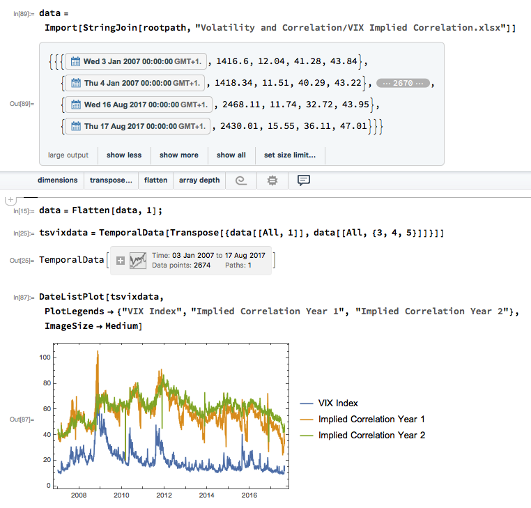
In this article I am going to outline some steps investors can take to match their investment portfolios to suit current market conditions in a way that allows them to remain fully invested, while safeguarding against downside risk.  In what follows I will be using our own Strategic Volatility Strategy, which invests in volatility ETFs such as the iPath S&P 500 VIX ST Futures ETN (NYSEArca:VXX) and the VelocityShares Daily Inverse VIX ST ETN (NYSEArca:XIV), as an illustrative example, although the principles are no less valid for portfolios comprising other ETFs or equities.

SSALGOTRADING AD

Risk and Volatility

Risk may be defined as the uncertainty of outcome and the most common way of assessing it in the context of investment theory is by means of the standard deviation of returns.  One difficulty here is that one may never ascertain the true rate of volatility – the second moment – of a returns process; one can only estimate it.  Hence, while one can be certain what the closing price of a stock was at yesterday’s market close, one cannot say what the volatility of the stock was over the preceding week – it cannot be observed the way that a stock price can, only estimated.  The most common estimator of asset volatility is, of course, the sample standard deviation.  But there are many others that are arguably superior:  Log-Range, Parkinson, Garman-Klass to name but a few (a starting point for those interested in such theoretical matters is a research paper entitled Estimating Historical Volatility, Brandt & Kinlay, 2005).

Leaving questions of estimation to one side, one issue with using standard deviation as a measure of risk is that it treats upside and downside risk equally – the “risk” that you might double your money in an investment is regarded no differently than the risk that you might see your investment capital cut in half.  This is not, of course, how investors tend to look at things: they typically allocate a far higher cost to downside risk, compared to upside risk.

One way to address the issue is by using a measure of risk known as the semi-deviation.  This is estimated in exactly the same way as the standard deviation, except that it is applied only to negative returns.  In other words, it seeks to isolate the downside risk alone.

This leads directly to a measure of performance known as the Sortino Ratio.  Like the more traditional Sharpe Ratio, the Sortino Ratio is a measure of risk-adjusted performance – the average return produced by an investment per unit of risk.  But, whereas the Sharpe Ratio uses the standard deviation as the measure of risk, for the Sortino Ratio we use the semi-deviation. In other words, we are measuring the expected return per unit of downside risk.

There may be a great deal of variation in the upside returns of a strategy that would penalize the risk-adjusted returns, as measured by its Sharpe Ratio. But using the Sortino Ratio, we ignore the upside volatility entirely and focus exclusively on the volatility of negative returns (technically, the returns falling below a given threshold, such as the risk-free rate.  Here we are using zero as our benchmark).  This is, arguably, closer to the way most investors tend to think about their investment risk and return preferences.

In a scenario where, as an investor, you are particularly concerned about downside risk, it makes sense to focus on downside risk.  It follows that, rather than aiming to maximize the Sharpe Ratio of your investment portfolio, you might do better to focus on the Sortino Ratio.


Factor Risk and Correlation Risk

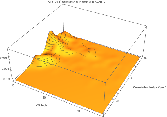
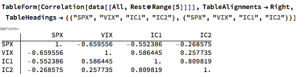
Another type of market risk that is often present in an investment portfolio is correlation risk.  This is the risk that your investment portfolio correlates to some other asset or investment index.  Such risks are often occluded – hidden from view – only to emerge when least wanted.  For example, it might be supposed that a “dollar-neutral” portfolio, i.e. a portfolio comprising equity long and short positions of equal dollar value, might be uncorrelated with the broad equity market indices.  It might well be.  On the other hand, the portfolio might become correlated with such indices during times of market turbulence; or it might correlate positively with some sector indices and negatively with others; or with market volatility, as measured by the CBOE VIX index, for instance.

Where such dependencies are included by design, they are not a problem;  but when they are unintended and latent in the investment portfolio, they often create difficulties.  The key here is to test for such dependencies against a variety of risk factors that are likely to be of concern.  These might include currency and interest rate risk factors, for example;  sector indices; or commodity risk factors such as oil or gold (in a situation where, for example, you are investing a a portfolio of mining stocks).  Once an unwanted correlation is identified, the next step is to adjust the portfolio holdings to try to eliminate it.  Typically, this can often only be done in the average, meaning that, while there is no correlation bias over the long term, there may be periods of positive, negative, or alternating correlation over shorter time horizons.  Either way, it’s important to know.

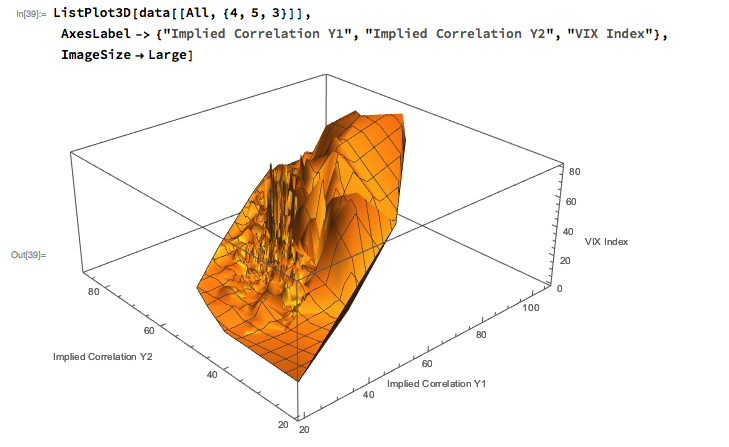
Using the Strategic Volatility Strategy as an example, we target to maximize the Sortino Ratio, subject also to maintaining very lows levels of correlation to the principal risk factors of concern to us, the S&P 500 and VIX indices. Our aim is to create a portfolio that is broadly impervious to changes in the level of the overall market, or in the level of market volatility.


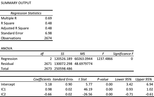
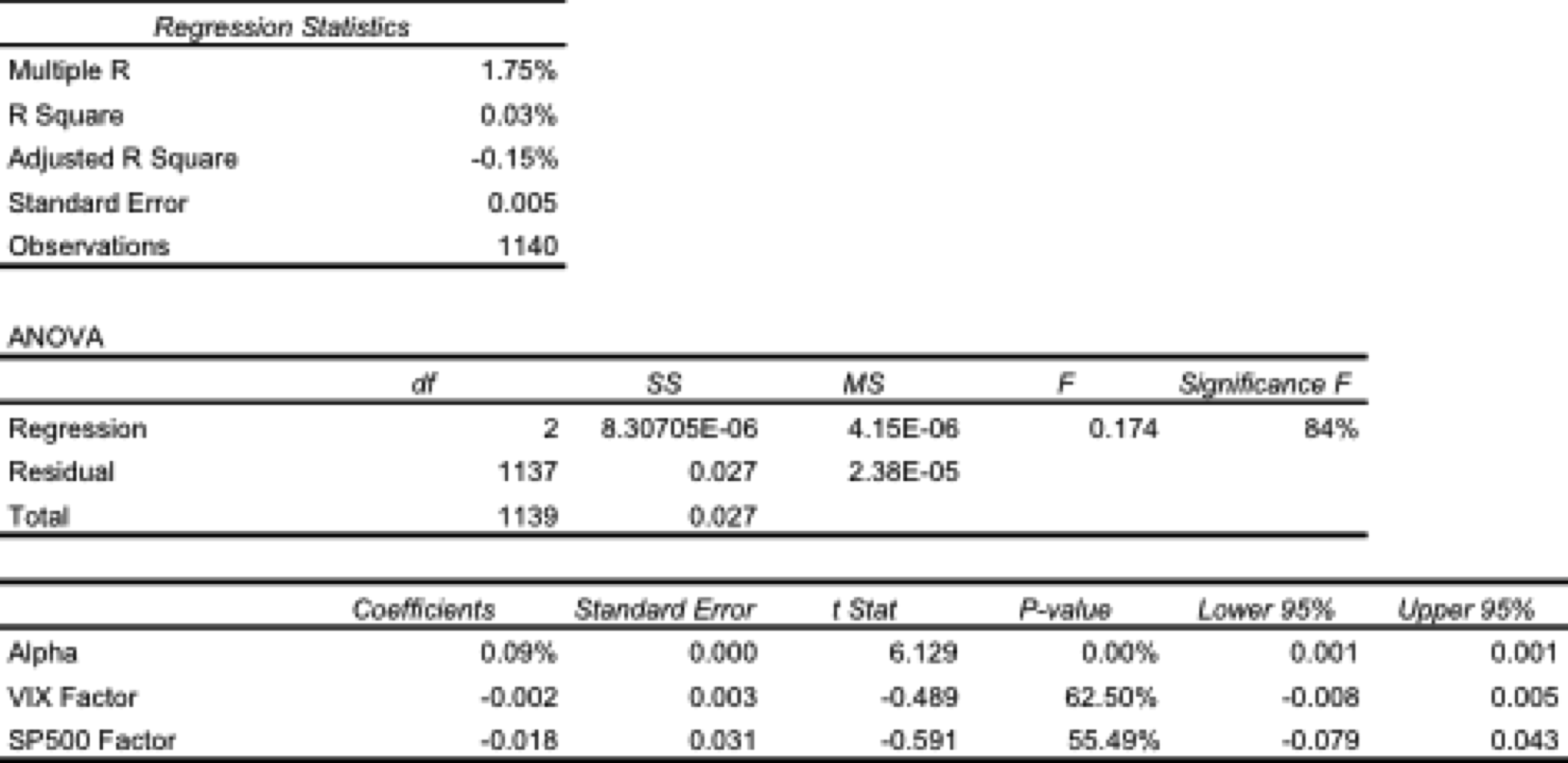
One method of quantifying such dependencies is with linear regression analysis.  By way of illustration, in the table below are shown the results of regressing the daily returns from the Strategic Volatility Strategy against the returns in the VIX and S&P 500 indices.  Both factor coefficients are statistically indistinguishable from zero, i.e. there is significant no (linear) dependency.  However, the constant coefficient, referred to as the strategy alpha, is both positive and statistically significant.  In simple terms, the strategy produces a return that is consistently positive, on average, and which is not dependent on changes in the level of the broad market, or its volatility.  By contrast, for example, a commonplace volatility strategy that entails capturing the VIX futures roll would show a negative correlation to the VIX index and a positive dependency on the S&P500 index.

Regression


Tail Risk

Ever since the publication of Nassim Taleb’s “The Black Swan”, investors have taken a much greater interest in the risk of extreme events.  If the bursting of the tech bubble in 2000 was not painful enough, investors surely appear to have learned the lesson thoroughly after the financial crisis of 2008.  But even if investors understand the concept, the question remains: what can one do about it?

The place to start is by looking at the fundamental characteristics of the portfolio returns.  Here we are not such much concerned with risk, as measured by the second moment, the standard deviation. Instead, we now want to consider the third and forth moments of the distribution, the skewness and kurtosis.

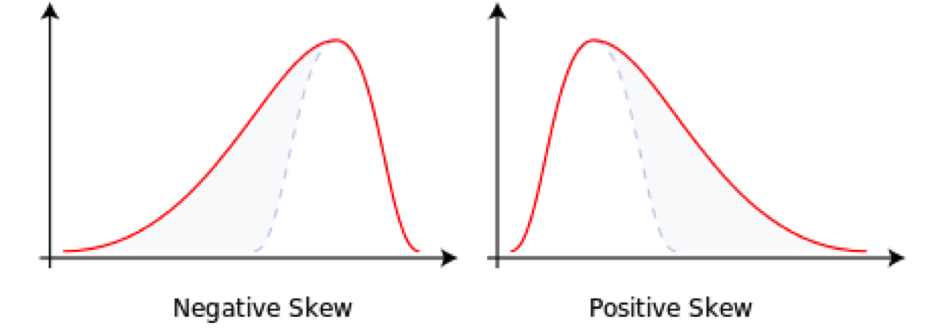
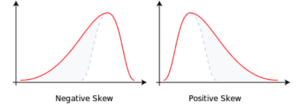
Comparing the two distributions below, we can see that the distribution on the left, with negative skew, has nonzero probability associated with events in the extreme left of the distribution, which in this context, we would associate with negative returns.  The distribution on the right, with positive skew, is likewise “heavy-tailed”; but in this case the tail “risk” is associated with large, positive returns.  That’s the kind of risk most investors can live with.


skewness


Source: Wikipedia


A more direct measure of tail risk is kurtosis, literally, “heavy tailed-ness”, indicating a propensity for extreme events to occur.  Again, the shape of the distribution matters:  a heavy tail in the right hand portion of the distribution is fine;  a heavy tail on the left (indicating the likelihood of large, negative returns) is a no-no.

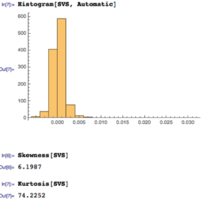
Let’s take a look at the distribution of returns for the Strategic Volatility Strategy.  As you can see, the distribution is very positively skewed, with a very heavy right hand tail.  In other words, the strategy has a tendency to produce extremely positive returns. That’s the kind of tail risk investors prefer.

SVS


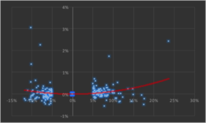
Another way to evaluate tail risk is to examine directly the performance of the strategy during extreme market conditions, when the market makes a major move up or down. Since we are using a volatility strategy as an example, let’s take a look at how it performs on days when the VIX index moves up or down by more than 5%.  As you can see from the chart below, by and large the strategy returns on such days tend to be positive and, furthermore, occasionally the strategy produces exceptionally high returns.


Convexity


The property of producing higher returns to the upside and lower losses to the downside (or, in this case, a tendency to produce positive returns in major market moves in either direction) is known as positive convexity.


Positive convexity, more typically found in fixed income portfolios, is a highly desirable feature, of course.  How can it be achieved?    Those familiar with options will recognize the convexity feature as being similar to the concept of option Gamma and indeed, one way to produce such a payoff is buy adding options to the investment mix:  put options to give positive convexity to the downside, call options to provide positive convexity to the upside (or using a combination of both, i.e. a straddle).


In this case we achieve positive convexity, not by incorporating options, but through a judicious choice of leveraged ETFs, both equity and volatility, for example, the ProShares UltraPro S&P500 ETF (NYSEArca:UPRO) and the ProShares Ultra VIX Short-Term Futures ETN (NYSEArca:UVXY).


Putting It All Together

While we have talked through the various concepts in creating a risk-protected portfolio one-at-a-time, in practice we use nonlinear optimization techniques to construct a portfolio that incorporates all of the desired characteristics simultaneously. This can be a lengthy and tedious procedure, involving lots of trial and error.  And it cannot be emphasized enough how important the choice of the investment universe is from the outset.  In this case, for instance, it would likely be pointless to target an overall positively convex portfolio without including one or more leveraged ETFs in the investment mix.

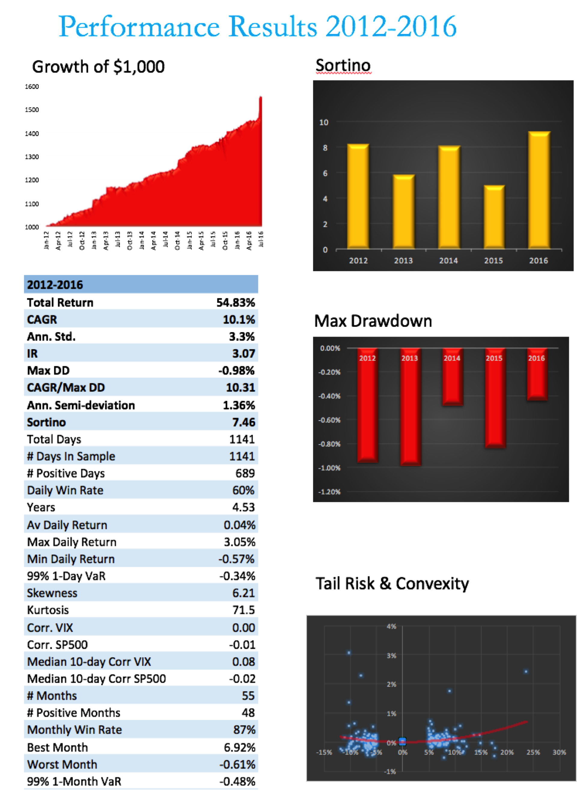
Let’s see how it turned out in the case of the Strategic Volatility Strategy.


SVS Perf


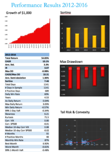
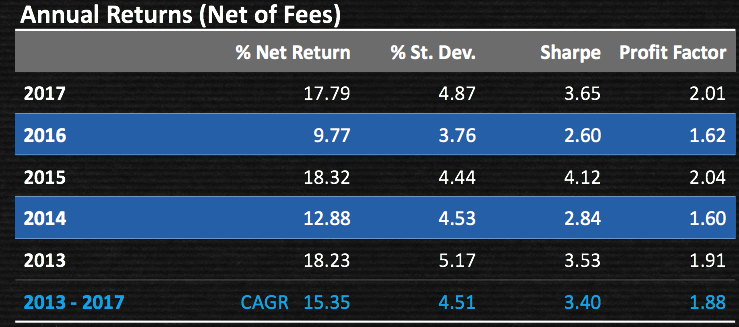
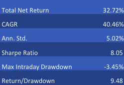
Note that, while the portfolio Information Ratio is moderate (just above 3), the Sortino Ratio is consistently very high, averaging in excess of 7.  In large part that is due to the exceptionally low downside risk, which at 1.36% is less than half the standard deviation (which is itself quite low at 3.3%).  It is no surprise that the maximum drawdown over the period from 2012 amounts to less than 1%.

A critic might argue that a CAGR of only 10% is rather modest, especially since market conditions have generally been so benign.  I would answer that criticism in two ways.  Firstly, this is an investment that has the risk characteristics of a low-duration government bond; and yet it produces a yield many times that of a typical bond in the current low interest rate environment.

Secondly, I would point out that these results are based on use of standard 2:1 Reg-T leverage. In practice it is entirely feasible to increase the leverage up to 4:1, which would produce a CAGR of around 20%.  Investors can choose where on the spectrum of risk-return they wish to locate the portfolio and the strategy leverage can be adjusted accordingly.


Conclusion

The current investment environment, characterized by low yields and growing downside risk, poses difficult challenges for investors.  A way to address these concerns is to focus on metrics of downside risk in the construction of the investment portfolio, aiming for high Sortino Ratios, low correlation with market risk factors, and positive skewness and convexity in the portfolio returns process.

Such desirable characteristics can be achieved with modern portfolio construction techniques providing the investment universe is chosen carefully and need not include anything more exotic than a collection of commonplace ETF products.

Cointegration Breakdown

The Low Power of Cointegration Tests

One of the perennial difficulties in developing statistical arbitrage strategies is the lack of reliable methods of estimating a stationary portfolio comprising two or more securities. In a prior post (below) I discussed at some length one of the primary reasons for this, i.e. the lower power of cointegration tests. In this post I want to explore the issue in more depth, looking at the standard Johansen test Procedure to estimate cointegrating vectors.

Johansen Test for Cointegration

Start with some weekly data for an ETF triplet analyzed in Ernie Chan’s book:

After downloading the weekly close prices for the three ETFs we divide the data into 14 years of in-sample data and 1 year out of sample:

We next apply the Johansen test, using code kindly provided by Amanda Gerrish:

We find evidence of up to three cointegrating vectors at the 95% confidence level:


Let’s take a look at the vector coefficients (laid out in rows, in Amanda’s function):

In-Sample vs. Out-of-Sample testing

We now calculate the in-sample and out-of-sample portfolio values using the first cointegrating vector:

The portfolio does indeed appear to be stationary, in-sample, and this is confirmed by the unit root test, which rejects the null hypothesis of a unit root:

Unfortunately (and this is typically the case) the same is not true for the out of sample period:

More Data Doesn’t Help

The problem with the nonstationarity of the out-of-sample estimated portfolio values is not mitigated by adding more in-sample data points and re-estimating the cointegrating vector(s):

We continue to add more in-sample data points, reducing the size of the out-of-sample dataset correspondingly. But none of the tests for any of the out-of-sample datasets is able to reject the null hypothesis of a unit root in the portfolio price process:


The Challenge of Cointegration Testing in Real Time

In our toy problem we know the out-of-sample prices of the constituent ETFs, and can therefore test the stationarity of the portfolio process out of sample. In a real world application, that discovery could only be made in real time, when the unknown, future ETFs prices are formed. In that scenario, all the researcher has to go on are the results of in-sample cointegration analysis, which demonstrate that the first cointegrating vector consistently yields a portfolio price process that is very likely stationary in sample (with high probability).

The researcher might understandably be persuaded, wrongly, that the same is likely to hold true in future. Only when the assumed cointegration relationship falls apart in real time will the researcher then discover that it’s not true, incurring significant losses in the process, assuming the research has been translated into some kind of trading strategy.

A great many analysts have been down exactly this path, learning this important lesson the hard way. Nor do additional “safety checks” such as, for example, also requiring high levels of correlation between the constituent processes add much value. They might offer the researcher comfort that a “belt and braces” approach is more likely to succeed, but in my experience it is not the case: the problem of non-stationarity in the out of sample price process persists.

Conclusion:  Why Cointegration Breaks Down

We have seen how a portfolio of ETFs consistently estimated to be cointegrated in-sample, turns out to be non-stationary when tested out-of-sample.  This goes to the issue of the low power of cointegration test, and their inability to estimate cointegrating vectors with sufficient accuracy.  Analysts relying on standard tests such as the Johansen procedure to design their statistical arbitrage strategies are likely to be disappointed by the regularity with which their strategies break down in live trading.


The Correlation Signal

The use of correlations is widespread in investment management theory and practice, from the construction of portfolios to the design of hedge trades to statistical arbitrage strategies.

A common difficulty encountered in all of these applications is the variation in correlation: assets that at one time appear to be suitably uncorrelated for hedging purposes, may become much more highly correlated at other times, such as periods of market stress. Conversely, stocks that appear suitable for pairs trading due to the high correlation in their prices or returns, may de-couple at a later time, causing significant losses.

The instability in the level of correlation is further aggravated by the empirical finding that the volatility in correlation is itself time-dependent:  at times the correlations between assets may appear to fluctuate smoothly within a tight range; at other times we might see several fluctuations in the sign of the correlation  coefficient over the course of a few days.

One tool I have found useful in this context is a concept I refer to as the correlation signal, defined at the average correlation divided by the standard deviation of the correlation coefficient.  The chart below illustrates a typical pattern for a pair of Oil and Gas industry stocks.  The blue line is the average daily correlation between the stocks, measured at 5-minute intervals.  The red line is the correlation signal – the average daily correlation divided by the standard deviation in the intra-day correlation.  The stochastic nature of both the correlation coefficient and the correlation signal is quite evident.  Note that the correlation signal, unlike the coefficient, is not constrained within the limits of +/- 1.  At times when the variation in correlation is low the signal an easily exceed those limits by as much as an order of magnitude.

CorrSig Plot

In later posts I will illustrate the usefulness of the correlation signal in portfolio construction and statistical arbitrage.  For now, let me just say that it is a measure of the strength of the correlation as a signal, relative to the noise of random variation in the correlation process.   It can be used to identify situations in which a relationship – whether a positive or negative correlation – appears to be stable or unstable, and therefore viable as a basis for inference, or not.