Is Your Trading Strategy Still Working?

The Challenge of Validating Strategy Performance

One of the challenges faced by investment strategists is to assess whether a strategy is continuing to perform as it should.  This applies whether it is a new strategy that has been backtested and is now being traded in production, or a strategy that has been live for a while.
All strategies have a limited lifespan.  Markets change, and a trading strategy that can’t accommodate that change will get out of sync with the market and start to lose money. Unless you have a way to identify when a strategy is no longer in sync with the market, months of profitable trading can be undone very quickly.

The issue is particularly important for quantitative strategies.  Firstly, quantitative strategies are susceptible to the risk of over-fitting.  Secondly, unlike a strategy based on fundamental factors, it may be difficult for the analyst to verify that the drivers of strategy profitability remain intact.

Savvy investors are well aware of the risk of quantitative strategies breaking down and are likely to require reassurance that a period of underperformance is a purely temporary phenomenon.

It might be tempting to believe that you will simply stop trading when the strategy stops working.  But given the stochastic nature of investment returns, how do you distinguish a losing streak from a system breakdown?

SSALGOTRADING AD

Stochastic Process Control

One approach to the problem derives from the field of Monte Carlo simulation and stochastic process control.  Here we random draw samples from the distribution of strategy returns and use these to construct a prediction envelope to forecast the range of future returns.  If the equity curve of the strategy over the forecast period  falls outside of the envelope, it would raise serious concerns that the strategy may have broken down.  In those circumstances you would almost certainly want to trade the strategy in smaller size for a while to see if it recovers, or even exit the strategy altogether it it does not.

I will illustrate the procedure for the long/short ETF strategy that I described in an earlier post, making use of Michael Bryant’s excellent Market System Analyzer software.

To briefly refresh, the strategy is built using cointegration theory to construct long/short portfolios is a selection of ETFs that provide exposure to US and international equity, currency, real estate and fixed income markets.  The out of sample back-test performance of the strategy is very encouraging:

Fig 2


Fig 1

There was evidently a significant slowdown during 2014, with a reduction in the risk-adjusted returns and win rate for the strategy:

Fig 1

This period might itself have raised questions about the continuing effectiveness of the strategy.  However, we have the benefit of hindsight in seeing that, during the first two months of 2015, performance appeared to be recovering.

Consequently we put the strategy into production testing at the beginning of March 2015 and we now wish to evaluate whether the strategy is continuing on track.   The results indicate that strategy performance has been somewhat weaker than we might have hoped, although this is compensated for by a significant reduction in strategy volatility, so that the net risk-adjusted returns remain somewhat in line with recent back-test history.

Fig 3

Using the MSA software we sample the most recent back-test returns for the period to the end of Feb 2015, and create a 95% prediction envelope for the returns since the beginning of March, as follows:

Fig 2

As we surmised, during the production period the strategy has slightly underperformed the projected median of the forecast range, but overall the equity curve still falls within the prediction envelope.  As this stage we would tentatively conclude that the strategy is continuing to perform within expected tolerance.

Had we seen a pattern like the one shown in the chart below, our conclusion would have been very different.

Fig 4

As shown in the illustration, the equity curve lies below the lower boundary of the prediction envelope, suggesting that the strategy has failed. In statistical terms, the trades in the validation segment appear not to belong to the same statistical distribution of trades that preceded the validation segment.

This strategy failure can also be explained as follows: The equity curve prior to the validation segment displays relatively little volatility. The drawdowns are modest, and the equity curve follows a fairly straight trajectory. As a result, the prediction envelope is fairly narrow, and the drawdown at the start of the validation segment is so large that the equity curve is unable to rise back above the lower boundary of the envelope. If the history prior to the validation period had been more volatile, it’s possible that the envelope would have been large enough to encompass the equity curve in the validation period.

 CONCLUSION

Systematic trading has the advantage of reducing emotion from trading because the trading system tells you when to buy or sell, eliminating the difficult decision of when to “pull the trigger.” However, when a trading system starts to fail a conflict arises between the need to follow the system without question and the need to stop following the system when it’s no longer working.

Stochastic process control provides a technical, objective method to determine when a trading strategy is no longer working and should be modified or taken offline. The prediction envelope method extrapolates the past trade history using Monte Carlo analysis and compares the actual equity curve to the range of probable equity curves based on the extrapolation.

Next we will look at nonparametric distributions tests  as an alternative method for assessing strategy performance.

Developing Statistical Arbitrage Strategies Using Cointegration

In his latest book (Algorithmic Trading: Winning Strategies and their Rationale, Wiley, 2013) Ernie Chan does an excellent job of setting out the procedures for developing statistical arbitrage strategies using cointegration.  In such mean-reverting strategies, long positions are taken in under-performing stocks and short positions in stocks that have recently outperformed.

I will leave a detailed description of the procedure to Ernie (see pp 47 – 60), which in essence involves:

(i) estimating a cointegrating relationship between two or more stocks, using the Johansen procedure

(ii) computing the half-life of mean reversion of the cointegrated process, based on an Ornstein-Uhlenbeck  representation, using this as a basis for deciding the amount of recent historical data to be used for estimation in (iii)

(iii) Taking a position proportionate to the Z-score of the market value of the cointegrated portfolio (subtracting the recent mean and dividing by the recent standard deviation, where “recent” is defined with reference to the half-life of mean reversion)

Countless researchers have followed this well worn track, many of them reporting excellent results.  In this post I would like to discuss a few of many considerations  in the procedure and variations in its implementation.  We will follow Ernie’s example, using daily data for the EWF-EWG-ITG triplet of ETFs from April 2006 – April 2012. The analysis runs as follows (I am using an adapted version of the Matlab code provided with Ernie’s book):

Johansen test We reject the null hypothesis of fewer then three cointegrating relationships at the 95% level. The eigenvalues and eigenvectors are as follows:

Eigenvalues The eignevectors are sorted by the size of their eigenvalues, so we pick the first of them, which is expected to have the shortest half-life of mean reversion, and create a portfolio based on the eigenvector weights (-1.046, 0.76, 0.2233).  From there, it requires a simple linear regression to estimate the half-life of mean reversion:

Halflife From which we estimate the half-life of mean reversion to be 23 days.  This estimate gets used during the final, stage 3, of the process, when we choose a look-back period for estimating the running mean and standard deviation of the cointegrated portfolio.  The position in each stock (numUnits) is sized according to the standardized deviation from the mean (i.e. the greater the deviation the larger the allocation). Apply Ci The results appear very promising, with an annual APR of 12.6% and Sharpe ratio of 1.4:   Returns EWA-EWC-IGE

Ernie is at pains to point out that, in this and other examples in the book, he pays no attention to transaction costs, nor to the out-of-sample performance of the strategies he evaluates, which is fair enough.

The great majority of the academic studies that examine the cointegration approach to statistical arbitrage for a variety of investment universes do take account of transaction costs.  For the most part such studies report very impressive returns and Sharpe ratios that frequently exceed 3.  Furthermore, unlike Ernie’s example which is entirely in-sample, these studies typically report consistent out-of-sample performance results also.

But the single, most common failing of such studies is that they fail to consider the per share performance of the strategy.  If the net P&L per share is less than the average bid-offer spread of the securities in the investment portfolio, the theoretical performance of the strategy is unlikely to survive the transition to implementation.  It is not at all hard to achieve a theoretical Sharpe ratio of 3 or higher, if you are prepared to ignore the fact that the net P&L per share is lower than the average bid-offer spread.  In practice, however, any such profits are likely to be whittled away to zero in trading frictions – the costs incurred in entering, adjusting and exiting positions across multiple symbols in the portfolio.

Put another way, you would want to see a P&L per share of at least 1c, after transaction costs, before contemplating implementation of the strategy.  In the case of the EWA-EWC-IGC portfolio the P&L per share is around 3.5 cents.  Even after allowing, say, commissions of 0.5 cents per share and a bid-offer spread of 1c per share on both entry and exit, there remains a profit of around 2 cents per share – more than enough to meet this threshold test.

Let’s address the second concern regarding out-of-sample testing.   We’ll introduce a parameter to allow us to select the number of in-sample days, re-estimate the model parameters using only the in-sample data, and test the performance out of sample.  With a in-sample size of 1,000 days, for instance, we find that we can no longer reject the null hypothesis of fewer than 3 cointegrating relationships and the weights for the best linear portfolio differ significantly from those estimated using the entire data set.

Johansen 2

Repeating the regression analysis using the eigenvector weights of the maximum eigenvalue vector (-1.4308, 0.6558, 0.5806), we now estimate the half-life to be only 14 days.  The out-of-sample APR of the strategy over the remaining 500 days drops to around 5.15%, with a considerably less impressive Sharpe ratio of only 1.09.

osPerfOut-of-sample cumulative returns

One way to improve the strategy performance is to relax the assumption of strict proportionality between the portfolio holdings and the standardized deviation in the market value of the cointegrated portfolio.  Instead, we now require  the standardized deviation of the portfolio market value to exceed some chosen threshold level before we open a position (and we close any open positions when the deviation falls below the threshold).  If we choose a threshold level of 1, (i.e. we require the market value of the portfolio to deviate 1 standard deviation from its mean before opening a position), the out-of-sample performance improves considerably:

osPerf 2

The out-of-sample APR is now over 7%, with a Sharpe ratio of 1.45.

The strict proportionality requirement, while logical,  is rather unusual:  in practice, it is much more common to apply a threshold, as I have done here.  This addresses the need to ensure an adequate P&L per share, which will typically increase with higher thresholds.  A countervailing concern, however, is that as the threshold is increased the number of trades will decline, making the results less reliable statistically.  Balancing the two considerations, a threshold of around 1-2 standard deviations is a popular and sensible choice.

Of course, introducing thresholds opens up a new set of possibilities:  just because you decide to enter based on a 2x SD trigger level doesn’t mean that you have to exit a position at the same level.  You might consider the outcome of entering at 2x SD, while exiting at 1x SD, 0x SD, or even -2x SD.  The possible nuances are endless.

Unfortunately, the inconsistency in the estimates of the cointegrating relationships over different data samples is very common.  In fact, from my own research, it is often the case that cointegrating relationships break down entirely out-of-sample, just as do correlations.  A recent study by Matthew Clegg of over 860,000 pairs confirms this finding (On the Persistence of Cointegration in Pais Trading, 2014) that cointegration is not a persistent property.

I shall examine one approach to  addressing the shortcomings  of the cointegration methodology  in a future post.


Matlab code (adapted from Ernie Chan’s book):

Continue reading “Developing Statistical Arbitrage Strategies Using Cointegration”

Building Systematic Strategies – A New Approach

Anyone active in the quantitative space will tell you that it has become a great deal more competitive in recent years.  Many quantitative trades and strategies are a lot more crowded than they used to be and returns from existing  strategies are on the decline.

THE CHALLENGE

The Challenge

Meanwhile, costs have been steadily rising, as the technology arms race has accelerated, with more money being spent on hardware, communications and software than ever before.  As lead times to develop new strategies have risen, the cost of acquiring and maintaining expensive development resources have spiraled upwards.  It is getting harder to find new, profitable strategies, due in part to the over-grazing of existing methodologies and data sets (like the E-Mini futures, for example). There has, too, been a change in the direction of quantitative research in recent years.  Where once it was simply a matter of acquiring the fastest pipe to as many relevant locations as possible, the marginal benefit of each extra $ spent on infrastructure has since fallen rapidly.  New strategy research and development is now more model-driven than technology driven.


THE OPPORTUNITY

The Opportunity

What is needed at this point is a new approach:  one that accelerates the process of identifying new alpha signals, prototyping and testing new strategies and bringing them into production, leveraging existing battle-tested technologies and trading platforms.


GENETIC PROGRAMMING

Genetic programming, which has been around since the 1990’s when its use was pioneered in proteomics, enjoys significant advantages over traditional research and development methodologies.

GP

GP is an evolutionary-based algorithmic methodology in which a system is given a set of simple rules, some data, and a fitness function that produces desired outcomes from combining the rules and applying them to the data.   The idea is that, by testing large numbers of possible combinations of rules, typically in the  millions, and allowing the most successful rules to propagate, eventually we will arrive at a strategy solution that offers the required characteristics.

ADVANTAGES OF GENETIC PROGRAMMING

AdvantagesThe potential benefits of the GP approach are considerable:  not only are strategies developed much more quickly and cost effectively (the price of some software and a single CPU vs. a small army of developers), the process is much more flexible. The inflexibility of the traditional approach to R&D is one of its principle shortcomings.  The researcher produces a piece of research that is subsequently passed on to the development team.  Developers are usually extremely rigid in their approach: when asked to deliver X, they will deliver X, not some variation on X.  Unfortunately research is not an exact science: what looks good in a back-test environment may not pass muster when implemented in live trading.  So researchers need to “iterate around” the idea, trying different combinations of entry and exit logic, for example, until they find a variant that works.  Developers are lousy at this;  GP systems excel at it.

CHALLENGES FOR THE GENETIC PROGRAMMING APPROACH

So enticing are the potential benefits of GP that it begs the question as to why the approach hasn’t been adopted more widely.  One reason is the strong preference amongst researchers for an understandable – and testable – investment thesis.  Researchers – and, more importantly, investors –  are much more comfortable if they can articulate the premise behind a strategy.  Even if a trade turns out to be a loser, we are generally more comfortable buying a stock on the supposition of, say,  a positive outcome of a pending drug trial, than we are if required to trust the judgment of a black box, whose criteria are inherently unobservable.

GP Challenges

Added to this, the GP approach suffers from three key drawbacks:  data sufficiency, data mining and over-fitting.  These are so well known that they hardly require further rehearsal.  There have been many adverse outcomes resulting from poorly designed mechanical systems curve fitted to the data. Anyone who was active in the space in the 1990s will recall the hype over neural networks and the over-exaggerated claims made for their efficacy in trading system design.  Genetic Programming, a far more general and powerful concept,  suffered unfairly from the ensuing adverse publicity, although it does face many of the same challenges.

A NEW APPROACH

I began working in the field of genetic programming in the 1990’s, with my former colleague Haftan Eckholdt, at that time head of neuroscience at Yeshiva University, and we founded a hedge fund, Proteom Capital, based on that approach (large due to Haftan’s research).  I and my colleagues at Systematic Strategies have continued to work on GP related ideas over the last twenty years, and during that period we have developed a methodology that address the weaknesses that have held back genetic programming from widespread adoption.

Advances

Firstly, we have evolved methods for transforming original data series that enables us to avoid over-using the same old data-sets and, more importantly, allows new patterns to be revealed in the underlying market structure.   This effectively eliminates the data mining bias that has plagued the GP approach. At the same time, because our process produces a stronger signal relative to the background noise, we consume far less data – typically no more than a couple of years worth.

Secondly, we have found we can enhance the robustness of prototype strategies by using double-blind testing: i.e. data sets on which the performance of the model remains unknown to the machine, or the researcher, prior to the final model selection.

Finally, we are able to test not only the alpha signal, but also multiple variations of the trade expression, including different types of entry and exit logic, as well as profit targets and stop loss constraints.

OUTCOMES:  ROBUST, PROFITABLE STRATEGIES

outcomes

Taken together, these measures enable our GP system to produce strategies that not only have very high performance characteristics, but are also extremely robust.  So, for example, having constructed a model using data only from the continuing bull market in equities in 2012 and 2013, the system is nonetheless capable of producing strategies that perform extremely well when tested out of sample over the highly volatility bear market conditions of 2008/09.

So stable are the results produced by many of the strategies, and so well risk-controlled, that it is possible to deploy leveraged money-managed techniques, such as Vince’s fixed fractional approach.  Money management schemes take advantage of the high level of consistency in performance to increase the capital allocation to the strategy in a way that boosts returns without incurring a high risk of catastrophic loss.  You can judge the benefits of applying these kinds of techniques in some of the strategies we have developed in equity, fixed income, commodity and energy futures which are described below.

CONCLUSION

After 20-30 years of incubation, the Genetic Programming approach to strategy research and development has come of age. It is now entirely feasible to develop trading systems that far outperform the overwhelming majority of strategies produced by human researchers, in a fraction of the time and for a fraction of the cost.

SAMPLE GP SYSTEMS

Sample

SSALGOTRADING AD

emini    emini MM

NG  NG MM

SI MMSI

US US MM


More on Strategy Robustness

Commentators have made the point that a high % win rate is not enough.

Yes, you obviously want to pay attention to other performance metrics also, such as profit factor. In fact, there is no reason why you shouldn’t consider an objective function that explicitly combines various desirable performance measures, for example:

net profit * % win rate * profit factor

Another approach is to build the model using a data set spanning a different period. I did this with WFC using data from 1990, rather than 1970. Not only was the performance from 1990-2014 better, so too was the performance during the OOS period 1970-1989.  Profit factor was 2.49 and %Win rate was 70% across the 44 year period from 1970.  For the period from 1990, the performance metrics increase to 3.04 and 73%, respectively.

SSALGOTRADING AD

So in this case, it appears, a most robust strategy resulted from using less data, rather than more.  At first this appears counterintuitive. But it’s quite possible for a strategy to be over-condition on behavior that is no longer relevant to the market today. Eliminating such conditioning can sometimes enable strategies to emerge that have greater longevity.

WFC from 1970-2014 (1990 data)

Performance

Optimizing Strategy Robustness

Below is the equity curve for an equity strategy I developed recently, implemented in WFC.  The results appear outstanding:  no losing years in over 20 years, profit factor of 2.76 and average win rate of 75%.  Out-of-sample results (double blind) for 2013 and 2014:  net returns of 27% and 16% YTD.

WFC from 1993-2014


So far so good. However, if we take a step back through the earlier out of sample period, from 1970, the picture is rather less rosy:


WFC from 1970-2014


Now, at this point, some of you will be saying:  nothing to see here – it’s obviously just curve fitting.  To which I would respond that I have seen successful strategies, including several hedge fund products, with far shorter and less impressive back-tests than the initial 20-year history I showed above.

SSALGOTRADING AD

That said, would you be willing to take the risk of trading a strategy such as this one?  I would not:  at the back of my mind would always be the concern that the market might easily revert to the conditions that applied during the 1970s and 1980’s.  I expect many investors would share that concern.

But to the point of this post:  most strategies are designed around the criterion of maximizing net profit.  Occasionally you might come across someone who has considered risk, perhaps in the form of drawdown, or Sharpe ratio.  But, in general, it’s all about optimizing performance.

Suppose that, instead of maximizing performance, your objective was to maximize the robustness of the strategy.  What criteria would you use?

In my own research, I have used a great many different objective functions, often multi-dimensional.  Correlation to the perfect equity curve, net profit / max drawdown and Sortino ratio are just a few examples.  But if I had to guess, I would say that the criteria that tends to produce the most robust strategies and reliable out of sample performance is the maximization of the win rate, subject to a minimum number of trades.

I am not aware of a great deal of theory on this topic. I would be interested to learn of other readers’ experience.


How to Spot a Fake

One of the issues that comes up regularly is how, as an investor or other interested party, one can protect oneself from unscrupulous scam artists posing as professional traders or money managers. This is a particular problem on web sites featuring trader forums, where individuals with unverified track records claiming stellar trading histories use their purported trading “prowess” to try to impress and intimidate other participants, usually impressionable newbies. The purpose of this post is to provide some guidance to help investors, traders and other fellow travelers sort the wheat from the chaff. We’ll be doing some forensic analysis on the track record for a strategy in NG futures that one such character recently posted in one of these forums, as a classic example of the kind of fakery I am describing.

One thing you should understand about scam artists operating on forums, is that they don’t work alone: usually they have a bunch of groupies who will shill for them at every opportunity and who will try to shout down any investigative questioning. Don’t be deterred. These know-it-alls are usually just ignorant dupes, who understand no more about trading than the scam artist. They may just as easily be fellow-scam artists themselves.

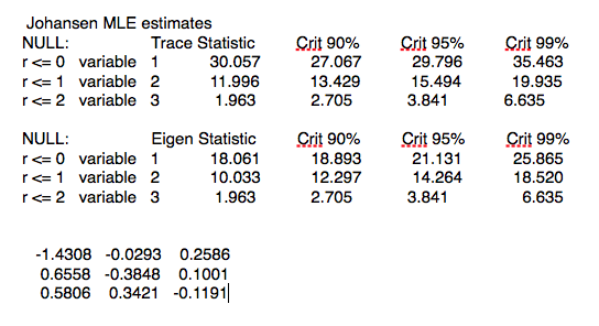
THE FIRST BIG RED FLAG: UNWILLINGNESS TO PRODUCE A TRACK RECORD
Anyone claiming to be a CTA or professional money manager (or whose shills claim he is one) has to have a track record that is freely available in the public domain. So how does a scam artist overcome a challenge to produce it? He will claim that he “can’t advertise”, or make some other, similar excuse. Don’t accept that at face value. Ask him to PM it to you. If he won’t, there’s already a high probability he’s a con artist.

THE SECOND BIG RED FLAG: CURVE FITTING
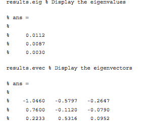
Let’s say our suspect meets the challenge and produces a track record. Ideally this will be an audited P&L statement, but let’s assume for the purposes of this discussion that he produces something along the lines of the Performance Reports produced by a product like Tradestation or MultiCharts, i.e. we are dealing with a simulated back-test.

If your suspect produces a back-test, you can be pretty sure it’s going to look good – otherwise he wouldn’t produce it. The task now is to dig into those reports to spot the red flags that give clues as to whether it might be fake.
Now of course any trading system is going to make assumptions – about fill rates, slippage, commissions, capacity etc. All that is fine, as long as the assumptions are clearly stated. You might want to challenge any or all of the assumptions, and the trader may disagree with you about some or all of them. That’s perfectly ok – it’s an honest, open discussion about a set of investment assumptions that have been revealed at the outset.

But here is what is NOT ok: any opacity about which data was used to build the trading model and which data was used to test it. The former, the in-sample (IS) data set, used to construct the model, must be entirely separate and distinct from the out-of-sample (OOS) data set. It is trivially easy using a tool like Tradestation to produce a trading system that shows stellar results in-sample, but which will immediately crash and burn when it is used in live trading. This is known as curve-fitting. And it’s by far the most common method by which scam artists try to dupe investors.

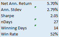
In order to demonstrate the robustness of the system prior to risking real money, a genuine trader will test his system OOS and show you the results. What you are looking for ideally is congruity between the IS and OOS results. Now by congruity, I don’t mean that they should be identical. Far from it – markets evolve and strategy performance will vary over time. But what you are hoping is that the key performance metrics in the OOS and IS periods, such as annual returns, Sharpe ratio, PNL per contract, profit ratio and win rate, will be comparable. At the very least, you would like to be able to identify some portion of the IS data set for which the strategy performance characteristics are similar to those in the OOS period.

Any – I mean ANY – ambiguity or lack of clarity about which data was used to build the model and which was used for OOS testing is a HUGE red flag. Chances are, your scam artist is already trying to fudge the issue that he curve-fitted the system.
This was the case in the recent forum post we are using as a test case. The trader made no attempt whatsoever to clarify which data was used for model development and which for testing. Immediately, I was suspicious and began looking for other evidence of curve fitting. It didn’t take me long to find it.

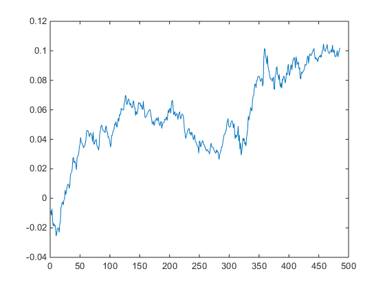
THE THIRD BIG RED FLAG: THE EQUITY CURVE
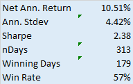
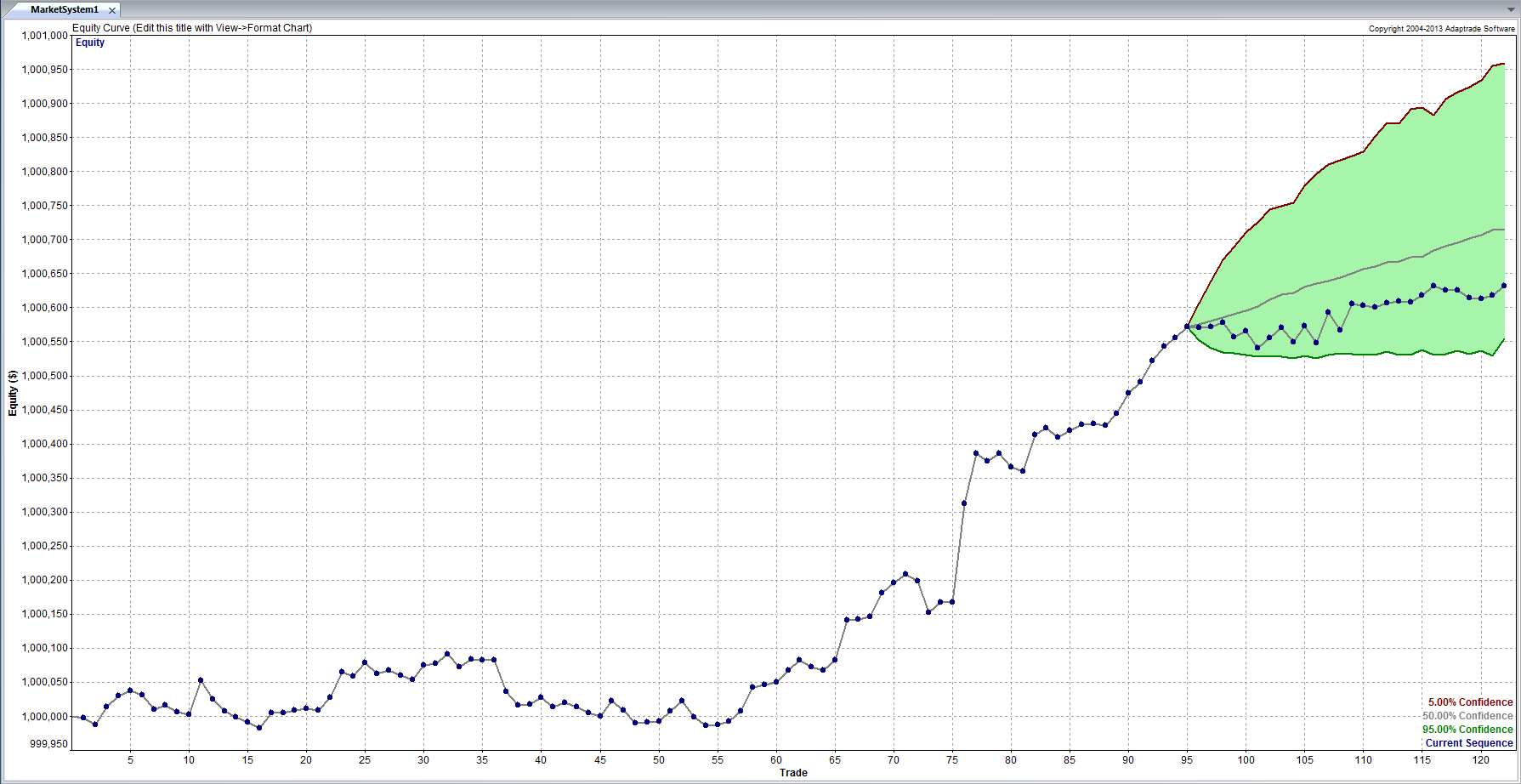
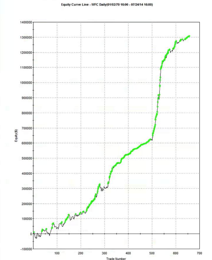
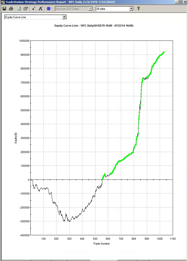
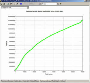
The first item I turned to in the performance reports was the equity curve and I immediately spotted two rather large clues that I was dealing with a fake.

The first clue was the large sign on the chart labelled “live start date”. What does this mean? This is a back-test, so all of the results are theoretical, including those after the supposed “live start date” sometime in 2013. What the faker is trying to do is imply the part of the equity curve shown after that date indicate actual performance results. He doesn’t actually claim this, so he has plausible deniability if you call him on it (“I said it was just a back test”). But he hopes that you won’t, and that, by default, you’ll accept these results are real. But they aren’t.

The second clue of fakery is much more important: the equity curve itself. When someone shows you and equity curve like the one reported by this trader, rising in a straight line from the lower left to upper right quadrants, you can be 99% confident that you are dealing with a fake.
You see, in finance there are almost never any straight lines. They are as rare as unicorns. Especially when it comes to strategy performance. They only time you will EVER see an equity curve like this is when you are looking at the equity curve of (i) a high frequency market making trading system or (ii) a fake, produced by curve fitting a strategy to the ENTIRE data set.
And this strategy was not high frequency – as we shall see, it operated on 15 minute bars, holding positions overnight.

EC Chart

THE FOURTH BIG RED FLAG: GOD’s EQUITY CURVE
I said that straight line equity curve were extremely rare. In fact, even God’s equity curve isn’t often a straight line. What does that mean?

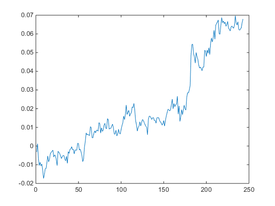
Suppose you had a strategy that could predict with 100% accuracy whether the market would go up or down over the next bar (whether you are using daily bars, or 15 minute bars, as in our example). The system would buy (or hold) when the market was forecast to rise, and sell when the market was predicted to fall. What would the performance of such a perfect system look like? Pretty stellar, obviously. And most people would guess that the system’s equity curve would be a straight line, or maybe even exponential in shape. In fact that’s typically not the case. God’s equity curve will be sloped and kinked, just like any other equity curve. And if your suspect’s equity curve is real, it should show some commonality with God’s equity curve, by which I mean it should show changes in slope and level that reflect those seen in the perfect equity curve.

What does God’s Equity Curve look like in NG futures?

Gods EC

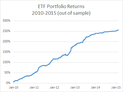
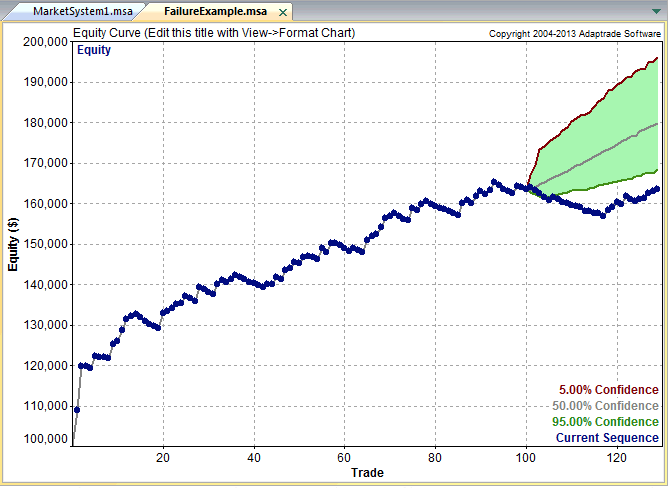
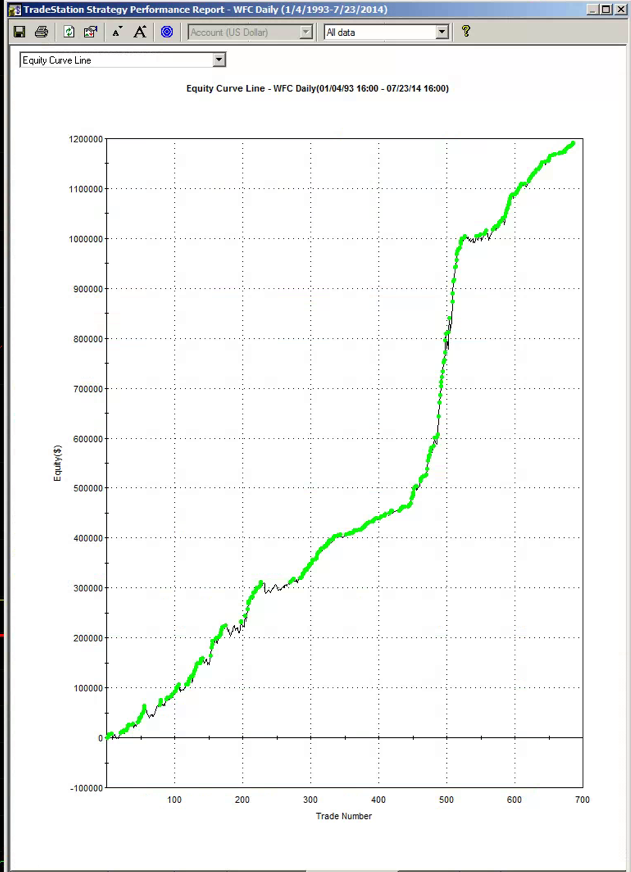
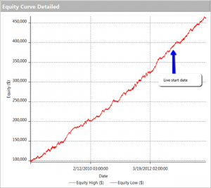
As you can see it’s not straight. In fact it’s concave. So a REAL equity curve should have similar characteristics, like this one, for example:

NG EC

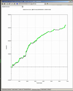
As you can see, the equity curve of the real trading system track’s God’s Equity Curve, albeit at a much lower level. It’s concave, with an upswing during the final few months of trading, just like God’s. That’s a good sign that the strategy back-test is very likely genuine (which it is – I produced it).

Why is Gods’ Equity Curve the shape it is? The answer will vary from market to market. In the case of NG, the suggestion is that the market is becoming more efficient: simple trading strategies based on technical indicators work less well than they did five years ago. We have seen something very similar in F/X markets. During the 1970’s and 1980’s when Soros was active in the field, simple strategies like moving average crossovers made great returns, but these entirely dissipated in the 1990’s, with the advent of widely available computing power.

THE FIFTH BIG RED FLAG: THE SHILL SHOUTDOWN
When I posted my analysis, which clearly indicated fakery by this well known forum participant, I was immediately flamed by one of his supporters who shouted something to the effect that (i) everyone knows that the downward slope of God’s Equity Curve was caused by volatility and (ii) the star trader, unlike God, or me, knows about position sizing.

This attempt at misdirection in the face of awkward facts is a classic sign of fakery. What distinguishes the shill post is:

(i) Immediacy – clearly no attempt has been made to evaluate the argument or analysis. The shill simply attempts to drown out the critic with a lot of noise, as quickly as possible.

(ii) Plausibility – shills will throw around terms that lend plausibility to their objection, but which after a moment’s reflection are entirely irrelevant or, as in this case, detrimental to their own cause.

(iii) Invective – the more intemperate the post, the more likely the shill is simply trying to provide cover for the faker.

So let’s take a moment to dispose of the plausible sounding objections posted by the shill in this example.
I am going to take it as read that everyone understands that trading profitability is positively correlated with volatility. There is a huge amount of empirical research supporting that finding, but to keep it simple we can appeal to one of the cornerstones of modern finance: risk and return. The higher the volatility, i.e. the greater the risk, the greater the return traders and investors in the markets will require on their capital. This is a principle of modern financial theory that even a graduate of the Scranton college of fine art should be expected to appreciate.

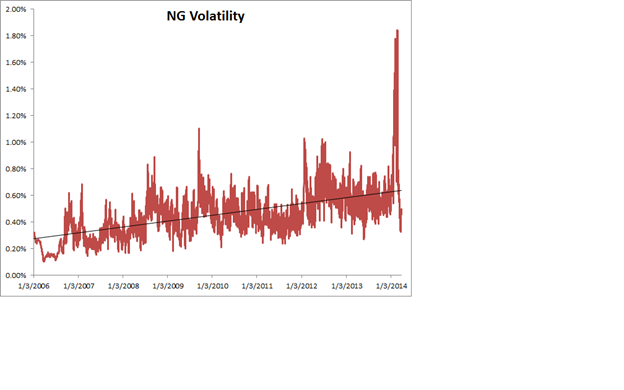
So what’s the story with NG volatility? You can see the time series of NG volatility in the chart below. One feature stands out above all others: the upward slope of the curve. NG volatility has RISEN over the sample period from 2008 to 2014. Consequently, returns from trading NG futures should also have RISEN rather than fallen. One thing we can say for sure, whatever caused the concave shape in God’s Equity Curve in NG futures, it was NOT volatility!

NG Volatility

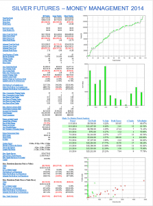
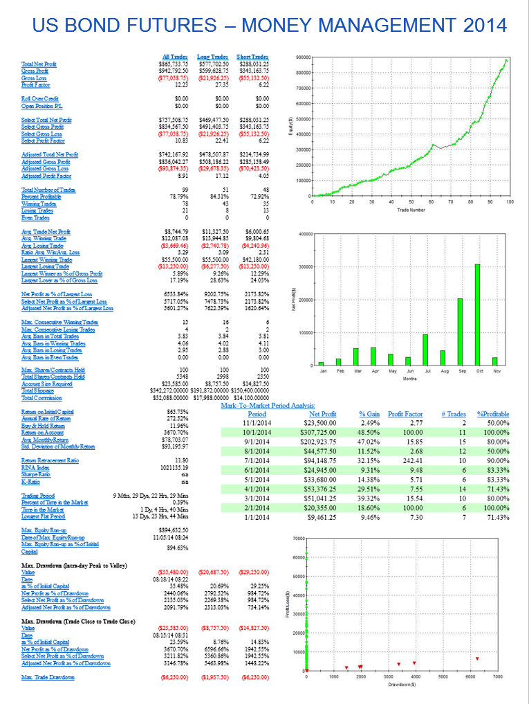
Turning to the shill’s next, plausible sounding, but dubious “explanation”, position sizing: this really is completely irrelevant. Because, as we shall see from an examination of the performance report, the track record was created by trading a constant one-lot! So this was just an attempt to sound “sophisticated” by someone trying to misdirect the reader away from the increasingly obvious evidence of fakery.

THE SIXTH BIG RED FLAG: LOW DRAWDOWNS AND OVERNIGHT GAP RISK
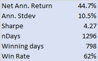
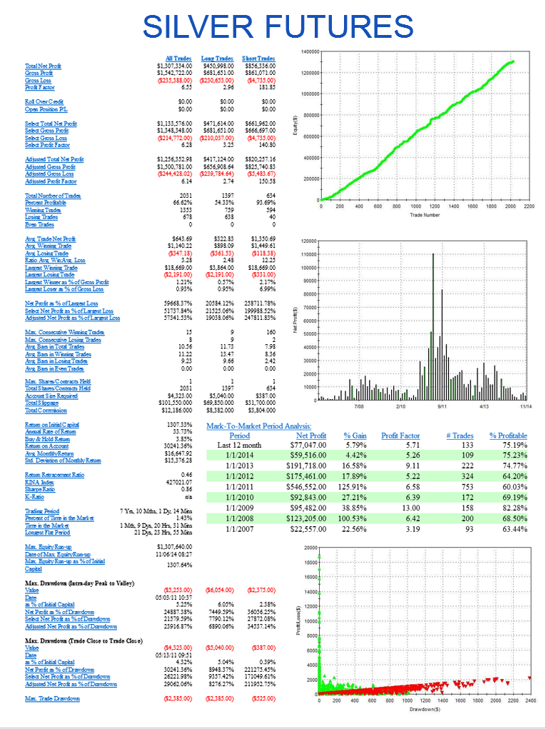
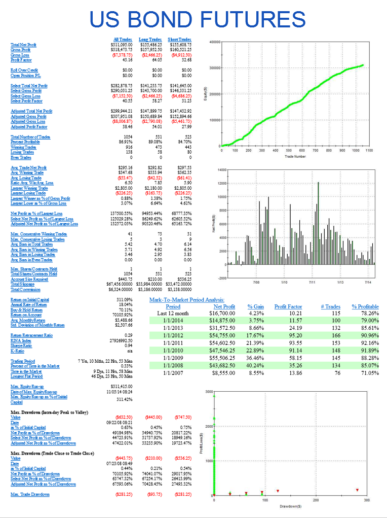
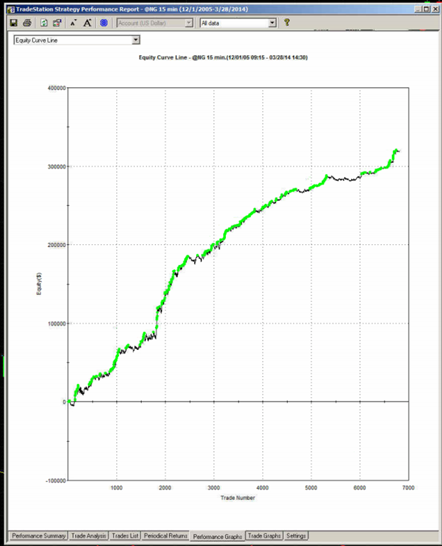
One of the highly unusual features of our faker’s equity curve is it’s exceptional smoothness. Low volatility in the equity curve is, in and of itself, an indicator the track record results from curve fitting. But we can get even more insight by digging into the performance report, shown below.

Perf 1
Perf 2

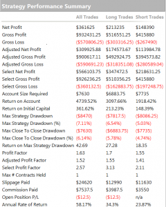
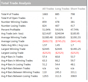
As you can see from the second page of the report, the strategy holds positions for an average of 57 15-minute bars, equivalent to slightly over 14 hours. So this is a low frequency strategy that takes overnight risk. Now, as any trader will know, overnight gap risk in a product like NG can be very significant and likely to be produce much larger drawdowns over a 5 year period than the $8,470 reported here.

The only other possible explanation is that the strategy is traded continuously through both day and night sessions. But this is not only itself improbable, it gives rise to another implausibility: liquidity in the overnight session is so poor that the strategy is unlikely to be able to trade more than 1-2 contracts, at most. This would be of little value to a CTA, or its customers, whatever the star trader’s protestations that his “clients are happy”.

There is no plausible way to resolve the disconnection between the low drawdown, overnight gap risk and market illiquidity. The most plausible explanation: the back-test is a curve fitting exercise.

THE SEVENTH AN FINAL BIG RED FLAG: INCONSISTENCY BETWEEN PERFORMANCE METRICS
As any experienced strategy developer knows, you can get some of the things you want, but you can never achieve all of them. Amongst the desirable features to be maximized are
• Profit factor
• Average PNL per contract
• Percentage win rate

There is a trade-off between the features. A high PNL per contract typically means you are trading less frequently, with longer hold periods, and consequently the percentage win rate tends to be lower. Alternatively, you can increase the win rate, at the cost of lowering the average PNL per contract and/or the profit factor. And so on.

This strategy purports to have it all: a high average PNL per contract resulting from low frequency trading, coupled with good percentage win rate of over 50% and profit factor. A win rate of much over 40% is highly unusual for a momentum strategy entering and exiting with market or stop orders – and its almost inconceivable for a strategy with a PNL per contract and profit factor as large as suggested here.

CONCLUSION
This back-test fails the sniff test on so many levels, I would rate the chance of it being real as less than 1 in 1000.
The final, conclusive proof of fakery is that the “star trader” responsible for producing the report was unable and/or unwilling to attempt to answer even a single one of the criticisms.

So, be warned. If you see forum members banding about track records like this one, you can be sure that they and their strategies are likely to be fake, and not to be trusted.